Blackletter
| Latin script (Blackletter hand) | |
|---|---|
 | |
| Type | |
| Languages | European languages |
Time period | 12th century – 1946 |
Parent systems |
Latin script
|
Child systems | Fraktur,¹ Kurrentschrift, including Sütterlin |
| Direction | Varies |
| ISO 15924 |
Latf, 217 |
1D504–1D537² | |
Blackletter (sometimes black letter), also known as Gothic script, Gothic minuscule, or Textura, was a script used throughout Western Europe from approximately 1150 to well into the 17th century.[1] It continued to be used for the Danish language until 1875,[2] and for German and Latvian until the 20th century. Fraktur is a notable script of this type, and sometimes the entire group of blackletter faces is incorrectly referred to as Fraktur. Blackletter is sometimes referred to as Old English, but it is not to be confused with the Old English (or Anglo-Saxon) language, which predates blackletter by many centuries, and was written in the insular script, or in Futhorc runes before that.
Origins
Carolingian minuscule was the direct ancestor of blackletter. Blackletter developed from Carolingian as an increasingly literate 12th-century Europe required new books in many different subjects. New universities were founded, each producing books for business, law, grammar, history, and other pursuits, not solely religious works for which earlier scripts typically had been used.
These books needed to be produced quickly to keep up with demand. Carolingian, though legible, was time-consuming and labour-intensive to produce. Its large size consumed a lot of manuscript space in a time when writing materials were very costly. As early as the 11th century, different forms of Carolingian were already being used, and by the mid-12th century, a clearly distinguishable form, able to be written more quickly to meet the demand for new books, was being used in northeastern France and the Low Countries.
Etymology

The term Gothic was first used to describe this script in 15th-century Italy, in the midst of the Renaissance, because Renaissance Humanists believed it was barbaric. Gothic was a synonym for barbaric. Flavio Biondo, in Italia Illustrata (1531) thought it was invented by the Lombards after their invasion of Italy in the 6th century.
Not only were blackletter forms called Gothic script, but any other seemingly barbarian script, such as Visigothic, Beneventan, and Merovingian, were also labeled "Gothic". This in contrast to Carolingian minuscule, a highly legible script which the Humanists called littera antiqua ("the ancient letter"), wrongly believing that it was the script used by the Romans. It was in fact invented in the reign of Charlemagne, although only used significantly after that era, and actually formed the basis for the later development of blackletter.[3]
The blackletter should not be confused either with the ancient alphabet of the Gothic language, nor with the sans-serif typefaces that are also sometimes called Gothic.
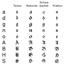
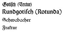
Forms of blackletter
Textualis
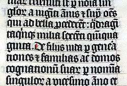
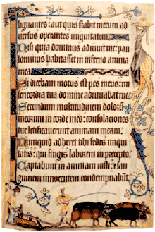
Textualis, also known as textura or Gothic bookhand, was the most calligraphic form of blackletter, and today is the form most associated with "Gothic". Johannes Gutenberg carved a textualis typeface – including a large number of ligatures and common abbreviations – when he printed his 42-line Bible. However, the textualis was rarely used for typefaces afterwards.
According to Dutch scholar Gerard Lieftinck, the pinnacle of blackletter use occurred in the 14th and 15th centuries. For Lieftinck, the highest form of textualis was littera textualis formata, used for de luxe manuscripts. The usual form, simply littera textualis, was used for literary works and university texts. Lieftinck's third form, littera textualis currens, was the cursive form of blackletter, extremely difficult to read and used for textual glosses, and less important books.
Textualis was most widely used in France, the Low Countries, England, and Germany. Some characteristics of the script are:
- tall, narrow letters, as compared to their Carolingian counterparts.
- letters formed by sharp, straight, angular lines, unlike the typically round Carolingian; as a result, there is a high degree of "breaking", i.e. lines that do not necessarily connect with each other, especially in curved letters.
- ascenders (in letters such as b, d, h) are vertical and often end in sharp finials
- when a letter with a bow (in b, d, p, q) is followed by another letter with a bow (such as "be" or "po"), the bows overlap and the letters are joined by a straight line (this is known as "biting").
- a related characteristic is the half r (also called r rotunda), the shape of r when attached to other letters with bows; only the bow and tail were written, connected to the bow of the previous letter. In other scripts, this only occurred in a ligature with the letter o.
- similarly related is the form of the letter d when followed by a letter with a bow; its ascender is then curved to the left, like the uncial d. Otherwise the ascender is vertical.
- the letters g, j, p, q, y, and the hook of h have descenders, but no other letters are written below the line.
- the letter a has a straight back stroke, and the top loop eventually became closed, somewhat resembling the number 8. The letter s often has a diagonal line connecting its two bows, also somewhat resembling an 8, but the long s is frequently used in the middle of words.
- minims, especially in the later period of the script, do not connect with each other. This makes it very difficult to distinguish i, u, m, and n. A 14th-century example of the difficulty minims produced is, mimi numinum niuium minimi munium nimium uini muniminum imminui uiui minimum uolunt ("the smallest mimes of the gods of snow do not wish at all in their life that the great duty of the defences of the wine be diminished"). In blackletter this would look like a series of single strokes. Dotted i and the letter j developed because of this. Minims may also have finials of their own.
- the script has many more scribal abbreviations than Carolingian, adding to the speed in which it could be written.
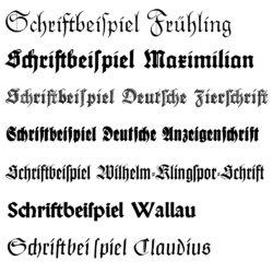
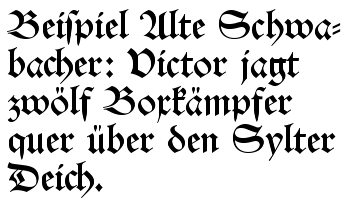
Schwabacher
Schwabacher was a blackletter form that was much used in early German print typefaces. It continued to be used occasionally until the 20th century. Characteristics of Schwabacher are:
- The small letter o is rounded on both sides, though at the top and at the bottom, the two strokes join in an angle. Other small letters have analogous forms.
- The small letter g has a horizontal stroke at its top that forms crosses with the two downward strokes.
- The capital letter H has a peculiar form somewhat reminiscent of the small letter h.
Fraktur
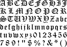
Fraktur is a form of blackletter that became the most common German blackletter typeface by the mid 16th century. Its use was so common that often any blackletter form is called Fraktur in Germany. Characteristics of Fraktur are:
- The left side of the small letter o is formed by an angular stroke, the right side by a rounded stroke. At the top and at the bottom, both strokes join in an angle. Other small letters have analogous forms.
- The capital letters are compound of rounded c-shaped or s-shaped strokes.
Here is the entire alphabet in Fraktur (minus the long s and the sharp s (ß)), using the AMS Euler Fraktur typeface:


Cursiva
Cursiva refers to a very large variety of forms of blackletter; as with modern cursive writing, there is no real standard form. It developed in the 14th century as a simplified form of textualis, with influence from the form of textualis as used for writing charters. Cursiva developed partly because of the introduction of paper, which was smoother than parchment. It was therefore, easier to write quickly on paper in a cursive script.
In cursiva, descenders are more frequent, especially in the letters f and s, and ascenders are curved and looped rather than vertical (seen especially in the letter d). The letters a, g, and s (at the end of a word) are very similar to their Carolingian forms. However, not all of these features are found in every example of cursiva, which makes it difficult to determine whether or not a script may be called cursiva at all.
Lieftinck also divided cursiva into three styles: littera cursiva formata was the most legible and calligraphic style. Littera cursiva textualis (or libraria) was the usual form, used for writing standard books, and it generally was written with a larger pen, leading to larger letters. Littera cursiva currens was used for textbooks and other unimportant books and it had very little standardization in forms.
Hybrida
Hybrida is also called bastarda (especially in France), and as its name suggests, is a hybrid form of the script. It is a mixture of textualis and cursiva, developed in the early 15th century. From textualis, it borrowed vertical ascenders, while from cursiva, it borrowed long f and ſ, single-looped a, and g with an open descender (similar to Carolingian forms).
Donatus-Kalender
The Donatus-Kalender (also known as Donatus-und-Kalender or D-K) is the name for the metal type design that Gutenberg used in his earliest surviving printed works, dating from the early 1450s. The name is taken from two works: the Ars grammatica of Aelius Donatus, a Latin grammar, and the Kalender (calendar).[4] It is a form of textura.
Blackletter typesetting
While an antiqua typeface is usually compound of roman types and italic types since the 16th-century French typographers, the blackletter typefaces never developed a similar distinction. Instead, they use letterspacing (German Sperrung) for emphasis. When using that method, blackletter ligatures like ch, ck, tz or ſt remain together without additional letterspacing (ſt is dissolved, though). The use of bold text for emphasis is also alien to blackletter typefaces.
Words from other languages, especially from Romance languages including Latin, are usually typeset in antiqua instead of blackletter.[5] Like that, single antiqua words or phrases may occur within a blackletter text. This does not apply, however, to loanwords that have been incorporated into the language.
National forms
England
Textualis
English blackletter developed from the form of Caroline minuscule used there after the Norman Conquest, sometimes called "Romanesque minuscule". Textualis forms developed after 1190 and were used most often until approximately 1300, afterward being used mainly for de luxe manuscripts. English forms of blackletter have been studied extensively and may be divided into many categories. Textualis formata ("Old English" or "blackLetter"), textualis prescissa (or textualis sine pedibus, as it generally lacks feet on its minims), textualis quadrata (or psalterialis) and semi-quadrata, and textualis rotunda are various forms of high-grade formata styles of blackletter.
The University of Oxford borrowed the littera parisiensis in the 13th century and early 14th century, and the littera oxoniensis form is almost indistinguishable from its Parisian counterpart; however, there are a few differences, such as the round final "s" forms, resembling the number 8, rather than the long "s" used in the final position in the Paris script.
Chaucer's works were originally printed in blackletter, but most presses were switched over to Roman type around 1590, following the trend of the Renaissance.[6] Horace Walpole wrote in 1781 that "I am too, though a Goth, so modern a Goth that I hate the black letter, and I love Chaucer better in Dryden and Baskerville than in his own language and dress".[7] The final uses of blackletter in the 17th century were for printing ballads, chivalric romances, and jokebooks.[8]
Cursiva
English cursiva began to be used in the 13th century, and soon replaced littera oxoniensis as the standard university script. The earliest cursive blackletter form is Anglicana, a very round and looped script, which also had a squarer and angular counterpart, Anglicana formata. The formata form was used until the 15th century and also was used to write vernacular texts. An Anglicana bastarda form developed from a mixture of Anglicana and textualis, but by the 16th century the principal cursive blackletter used in England was the Secretary script, which originated in Italy and came to England by way of France. Secretary script has a somewhat haphazard appearance, and its forms of the letters a, g, r, and s are unique, unlike any forms in any other English script.
France
Textualis
French textualis was tall and narrow compared to other national forms, and was most fully developed in the late 13th century in Paris. In the 13th century there also was an extremely small version of textualis used to write miniature Bibles, known as "pearl script". Another form of French textualis in this century was the script developed at the University of Paris, littera parisiensis, which also is small in size and designed to be written quickly, not calligraphically.
Cursiva
French cursiva was used from the 13th to the 16th century, when it became highly looped, messy, and slanted. Bastarda, the "hybrid" mixture of cursiva and textualis, developed in the 15th century and was used for vernacular texts as well as Latin. A more angular form of bastarda was used in Burgundy, the lettre de forme or lettre bourgouignonne, for books of hours such as the Très Riches Heures of John, Duke of Berry.
Germany
Despite the frequent association of blackletter with German, the script was actually very slow to develop in German-speaking areas. It developed first in those areas closest to France and then spread to the east and south in the 13th century. The German-speaking areas are, however, where blackletter remained in use the longest.
Schwabacher typefaces dominated in Germany from about 1480 to 1530, and the style continued in use occasionally until the 20th century. Most importantly, all of the works of Martin Luther, leading to the Protestant Reformation, as well as the Apocalypse of Albrecht Dürer (1498) used this typeface. Johann Bämler, a printer from Augsburg, probably first used it as early as 1472. The origins of the name remain unclear; some assume that a typeface-carver from the village of Schwabach—one who worked externally and who thus became known as the Schwabacher—designed the typeface.
Textualis
German Textualis is usually very heavy and angular, and there are few features that are common to all occurrences of the script. One common feature is the use of the letter "w" for Latin "vu" or "uu". Textualis was used in the 13th and 14th centuries, afterward becoming more elaborate and decorated and used for liturgical works only.
Johann Gutenberg used a textualis typeface for his famous Gutenberg Bible in 1455. Schwabacher, a blackletter with more rounded letters, soon became the usual printed typeface, but it was replaced by Fraktur in the early 17th century.

Fraktur came into use when Emperor Maximilian I (1493–1519) established a series of books and had a new typeface created specifically for this purpose. In the 19th century, the use of antiqua alongside Fraktur increased, leading to the Antiqua-Fraktur dispute, which lasted until the Nazis abandoned Fraktur in 1941. Since it was so common, all kinds of blackletter tend to be called Fraktur in German.
Cursiva
German cursiva is similar to the cursive scripts in other areas, but forms of "a", "s" and other letters are more varied; here too, the letter "w" is often used. A hybrida form, which was basically cursiva with fewer looped letters and with similar square proportions as textualis, was used in the 15th and 16th centuries.
In the 18th century, the pointed quill was adopted for blackletter handwriting. In the early 20th century, the Sütterlin script was introduced in the schools.
Italy
Rotunda
Italian blackletter also is known as rotunda, as it was less angular than in northern centres. The most usual form of Italian rotunda was littera bononiensis, used at the University of Bologna in the 13th century. Biting is a common feature in rotunda, but breaking is not.
Italian Rotunda also is characterized by unique abbreviations, such as q with a line beneath the bow signifying "qui", and unusual spellings, such as x for s ("milex" rather than "miles").
Cursiva
Italian cursive developed in the 13th century from scripts used by notaries. The more calligraphic form is known as minuscola cancelleresca italiana (or simply cancelleresca, chancery hand), which developed into a book hand, a script used for writing books rather than charters, in the 14th century. Cancelleresca influenced the development of bastarda in France and secretary hand in England.
The Netherlands
Textualis
A textualis form, commonly known as Gotisch or "Gothic script" was used for general publications from the fifteenth century on, but became restricted to official documents and religious publications during the seventeenth century. Its use persisted into the nineteenth century for editions of the State Translation of the Bible, but had otherwise become obsolete.
Unicode
Mathematical blackletter characters are separately encoded in Unicode in the Mathematical alphanumeric symbols range at U+1D504-1D537 and U+1D56C-1D59F (bold), except for individual letters already encoded in the Letterlike Symbols range (plus long s at U+017F).
This block of characters should be used only for setting mathematical text, as mathematical texts use blackletter symbols contrastively to other letter styles. For stylized blackletter prose, the normal Latin letters should be used, with font choice or other markup used to indicate blackletter styling. The character names use "Fraktur" for the mathematical alphanumeric symbols, while "blackletter" is used for those symbol characters in the letterlike symbols range.
Mathematical Fraktur:
- 𝔄 𝔅 ℭ 𝔇 𝔈 𝔉 𝔊 ℌ ℑ 𝔍 𝔎 𝔏 𝔐 𝔑 𝔒 𝔓 𝔔 ℜ 𝔖 𝔗 𝔘 𝔙 𝔚 𝔛 𝔜 ℨ
𝔞 𝔟 𝔠 𝔡 𝔢 𝔣 𝔤 𝔥 𝔦 𝔧 𝔨 𝔩 𝔪 𝔫 𝔬 𝔭 𝔮 𝔯 𝔰 𝔱 𝔲 𝔳 𝔴 𝔵 𝔶 𝔷
Mathematical Bold Fraktur:
- 𝕬 𝕭 𝕮 𝕯 𝕰 𝕱 𝕲 𝕳 𝕴 𝕵 𝕶 𝕷 𝕸 𝕹 𝕺 𝕻 𝕼 𝕽 𝕾 𝕿 𝖀 𝖁 𝖂 𝖃 𝖄 𝖅
𝖆 𝖇 𝖈 𝖉 𝖊 𝖋 𝖌 𝖍 𝖎 𝖏 𝖐 𝖑 𝖒 𝖓 𝖔 𝖕 𝖖 𝖗 𝖘 𝖙 𝖚 𝖛 𝖜 𝖝 𝖞 𝖟
Note: (The above may not render fully in all web browsers.)
Fonts supporting the range include Code2001, Cambria Math, and Quivira (textura style).
For normal text writing, the ordinary Latin code points are used. The blackletter style is then determined by a font with blackletter glyphs. The glyphs in the SMP should only be used for mathematical typesetting, not for ordinary text. They are of limited use for writing German, as they lack umlaut diacritics and the ligature ß.
See also
References
- ↑ Dowding, Geoffrey (1962). An introduction to the history of printing types; an illustrated summary of main stages in the development of type design from 1440 up to the present day: an aid to type face identification. Clerkenwell [London]: Wace. p. 5.
- ↑ "Styles of Handwriting". Rigsarkivet. The Danish National Archives. Retrieved March 26, 2017.
- ↑ Berthold Louis Ullman, The Origin and Development of Humanistic Script. (Rome), 1960, p. 12.
- ↑ John Man, How One Man Remade the World with Words
- ↑ Distler, Hugo (c. 1935). Neues Chorliederbuch. Kassel: Bärenreiter-Verlag. Retrieved 1 September 2015.
- ↑ Pica Roman Type in Elizabethan England (1989)
- ↑ Caroline F.E. Spurgeon, Five Hundred Years of Chaucer Criticism and Allusion (1357–1900), “Introduction” (London: Chaucer Society, 1923) xliv – xx.
- ↑ "Black Letter as a Social Discriminant in the Seventeenth Century" Proceedings of the Modern Language Association of America 68.3
Further reading
- Bernhard Bischoff, Latin Palaeography: Antiquity and the Middle Ages, Cambridge University Press, 1989.
- Bain, Peter; Shaw, Paul, eds. (1998). Blackletter: type and national identity. Cooper Union for the Advancement of Science and Art. Princeton Architectural Press. ISBN 978-1-56898-125-3.
External links
| Wikimedia Commons has media related to Blackletter. |
| Look up black letter in Wiktionary, the free dictionary. |
- 'Manual of Latin Palaeography' (A comprehensive PDF file containing 82 pages profusely illustrated, June 2014).
- Learn Blackletter Online
- Association for the German Script and Language
- Pfeffer Simpelgotisch A simple OpenType blackletter font setting ſ and s by itself
- London Review of Books article about blackletter fonts and font history in general
- The Mexican Blackletter Typographic Tradition
- Public domain English font archive
Types of handwritten European scripts | ||
|---|---|---|
| Ancient and medieval | | |
| Modern | ||
Typography terminology | |||||||||
|---|---|---|---|---|---|---|---|---|---|
| Page | |||||||||
| Paragraph | |||||||||
| Character |
| ||||||||
| Classifications |
| ||||||||
| Punctuation | |||||||||
| Typesetting | |||||||||
| Typographic units | |||||||||
| Digital typography |
| ||||||||
| Related | |||||||||
| |||||||||
