Color scheme
In color theory, a color scheme is the choice of colors used in design for a range of media. For example, the "Achromatic" use of a white background with black text is an example of a basic and commonly default color scheme in web design.

Color schemes are used to create style and appeal. Colors that create an aesthetic feeling when used together will commonly accompany each other in color schemes. A basic color scheme will use two colors that look appealing together. More advanced color schemes involve several related colors in "Analogous" combination, for example, text with such colors as red, yellow, and orange arranged together on a black background in a magazine article. The addition of light blue creates an "Accented Analogous" color scheme.
Color schemes can contain different "Monochromatic" shades of a single color; for example, a color scheme that mixes different shades of green, ranging from very light (white), to very neutral (gray), to very dark (black).
Use of the phrase color scheme may also and commonly does refer to choice and use of colors used outside typical aesthetic media and context, although may still be used for purely aesthetic effect as well as for purely practical reasons. This most typically refers to color patterns and designs as seen on vehicles, particularly those used in the military when concerning color patterns and designs used for identification of friend or foe, identification of specific military units, or as camouflage. In hotel room designs, the relationship between preferences of color schemes and gender was detected. Male guests tend to prefer masculine color schemes, while female guests favor feminine color schemes.[1]
A color scheme in marketing is referred to as a trade dress and can sometimes be protected by trademark or trade dress laws, as is the pink color of Owens Corning fiberglass.[2]
Color schemes are often described in terms of logical combinations of colors on a color wheel. Different types of schemes are used.[3][4][5]
Types
Monochromatic

Monochromatic colors are all the colors (tints, tones, and shades) of a single hue. Monochromatic color schemes are derived from a single base hue, and extended using its shades, tones and tints (that is, a hue modified by the addition of black, gray (black + white) and white. As a result, the energy is more subtle and peaceful due to a lack of contrast of hue.
Complementary
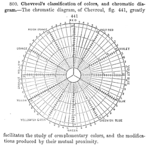
For the mixing of colored light, Newton's color wheel is often used to describe complementary colors, which are colors which cancel each other's hue to produce an achromatic (white, gray or black) light mixture. Newton offered as a conjecture that colors exactly opposite one another on the hue circle cancel out each other's hue; this concept was demonstrated more thoroughly in the 19th century.
A key assumption in Newton's hue circle was that the "fiery" or maximum saturated hues are located on the outer circumference of the circle, while achromatic white is at the center. Then the saturation of the mixture of two spectral hues was predicted by the straight line between them; the mixture of three colors was predicted by the "center of gravity" or centroid of three triangle points, and so on.
Split-Complementary: The split-complementary (also called 'Compound Harmony') color scheme is a variation of the complementary color scheme. In addition to the base color, it uses the two "Analogous" colors adjacent to its complement. Split-complementary color scheme has the same strong visual contrast as the complementary color scheme, but has less pressure.
Achromatic
Any color that lacks strong chromatic content is said to be 'unsaturated, achromatic, or near neutral'. Pure achromatic colors include black, white, all grays and beiges; near neutrals include browns, tans, pastels and darker colors. Near neutrals can be of any hue or lightness.
Neutrals are obtained by mixing pure colors with white, black or gray, or by mixing two complementary colors. In color theory, neutral colors are colors easily modified by adjacent more saturated colors and they appear to take on the hue complementary to the saturated color. Next to a bright red couch, a gray wall will appear distinctly greenish.
Black and white have long been known to combine well with almost any other colors; black decreases the apparent saturation or brightness of colors paired with it, and white shows off all hues to equal effect.[6]
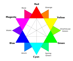
Analogous
Analogous colors (also called Dominance Harmony) color scheme are groups of colors that are adjacent to each other on the color wheel, with one being the dominant color, which tends to be a primary or secondary color, and two on either side complementing, which tend to be tertiary.
The term analogous refers to the having analogy, or corresponding to something in particular. An analogous color scheme creates a rich, monochromatic look. It’s best used with either warm or cool colors, creating a look that has a certain temperature as well as proper color harmony. While this is true, the scheme also lacks contrast and is less vibrant than complementary schemes.
Red, reddish-orange, orange, yellow-orange is one example of a set of analogous colors.
Accented analogous
An accented analogous complementary scheme utilizes related hues lying adjacent on the color wheel with a hue directly opposite to these. This direct complement becomes the accent color, used to create a dominant color grouping of three similar colors accented with the direct complement (or the near complement) of one of them. The complementary accent color creates an interesting contrast against the dominant color grouping. This scheme is frequently used to put a warm accent color with a cool analogous color palette, or a cool accent color with a warm palette.
Triadic
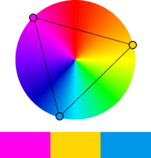
The triadic color scheme uses three colors equally spaced around the color wheel. The easiest way to place them on the wheel is by using a triangle of equal sides. Triadic color schemes tend to be quite vibrant, even when using pale or unsaturated versions of hues, offers a higher degree of contrast while at the same time retains the color harmony. This scheme is very popular among artists because it offers strong visual contrast while retaining balance, and color richness. The triadic scheme is not as contrasting as the complementary scheme, but it is easier to accomplish balance and harmony with these colors.
The primary colors are an example of a triadic color scheme.
Tetradic
The tetradic (double complementary) colors scheme is the richest of all the schemes because it uses four colors arranged into two complementary color pairs. This scheme is hard to harmonize and requires a color to be dominant or subdue the colors; if all four colors are used in equal amounts, the scheme may look unbalanced.
Rectangle
The rectangle color scheme uses four colors arranged into two complementary pairs and offers plenty of possibilities for variation. Rectangle color schemes work best when one color is dominant.
Square
The square color scheme is similar to the rectangle, but with all four colors spaced evenly around the color circle. Square color schemes works best when all colors are evenly balanced.
Polychromatic
The term polychromatic means having several colors.
It is used to describe light that exhibits more than one color, which also means that it contains radiation of more than one wavelength. The study of polychromatics is particularly useful in the production of diffraction gratings.
See also
- Color gradient
- Light-on-dark color scheme
- Color tool
- Monochromatic color
- Complementary color
- Analogous colors
- Achromatic colors
- Palette (computing)
- Palette (painting)
References
- Bogicevic, Vanja; Bujisic, Milos; Cobanoglu, Cihan; Feinstein, Andrew Hale (2018-02-12). "Gender and age preferences of hotel room design". International Journal of Contemporary Hospitality Management. 30 (2): 874–899. doi:10.1108/IJCHM-08-2016-0450. ISSN 0959-6119.
- Gordon V. Smith and Russell L. Parr (2005). Intellectual Property: Valuation, Exploitation, and Infringement Damages. John Wiley and Sons. ISBN 0-471-72433-5. Archived from the original on 2014-01-02.
- Stephen Quiller (2002). Color Choices. Watson–Guptill. ISBN 0-8230-0697-2. Archived from the original on 2017-12-24.
- Jackie Shaw (1994). The Big Book of Decorative Painting: How to paint if you don't know how – and how to improve if you do. Watson–Guptill. p. 49. ISBN 0-8230-0265-9.
monochromatic split-complementary analogous color-scheme.
- Edith Anderson Feisner (2006). Colour: How to Use Colour in Art and Design. Laurence King Publishing. ISBN 1-85669-441-0. Archived from the original on 2017-12-24.
- "Theory of Color". zedbi.com/. Archived from the original on 24 October 2014. Retrieved 23 October 2014.
- designer, Jacci Howard Bear Writer A. graphic; writer; About, Artist Who Writes; Print, Teaches; Bear, web design our editorial process Jacci Howard. "What Are the Fundamentals of Contrasting Colors of the Color Wheel?". Lifewire. Retrieved 20 April 2020.
External links
- Color Harmonies
- ColorHexa.com - web-based color tool that supports several color schemes
Color topics | ||||||||
|---|---|---|---|---|---|---|---|---|
| Color science |
|  | ||||||
| Color philosophy |
| |||||||
| Color terms |
| |||||||
| Color organizations | ||||||||
| Lists | ||||||||
| Related |
| |||||||
| ||||||||