Color psychology
[[File:Goethe Schiller Die Temperamentenrose.jpg|thumb|280px|The "rose of temperaments" (Temperamenten-Rose) compiled by Goethe and Schiller in 1798/9. The diagram matches twelve colors to human occupations or their character traits, grouped in the [[four teoutfit color impacting that of men.[1] Although color associations can vary contextually between cultures, color preference is to be relatively uniform across gender and race.[2]
Color psychology is also widely used in marketing and branding. Marketers see color as important, as color and can influence a consumers' emotions and perceptions about goods and services. Logos for companies are important since the logos can attract more customers. This happens when customers believe the company logo matches the personality of the goods and services, such as the color pink heavily used on Victoria's Secret branding.[3] Colors are also important for window displays in stores. Research shows that colors such as red tended to attract spontaneous purchasers, despite cool colors such as blue being more favorable.[4]
Influence of color on perception
Color has a large impact on food. Color affects how people perceive the edibility and flavor of foods and drinks.[5] Not only the color of the food itself but also that of everything in the eater's field of vision can affect this. For example, in food stores, bread is normally sold in packaging decorated or tinted with golden or brown tones to promote the idea of home baked and oven freshness.[6] People can mistake a cherry flavored drink for being lime or lemon flavored if that drink was a green color. Additionally, a flavor can be intensified by a color. People can rate a brown M&M as more chocolate flavored than a green M&M based on color.[5]
Placebo effect
The color of placebo pills is reported to be a factor in their effectiveness, with "hot-colored" pills working better as stimulants and "cool-colored" pills working better as depressants. This relationship is believed to be a consequence of the patient's expectations and not a direct effect of the color itself.[7] Consequently, these effects appear to be culture-dependent.[8]
Blue public lighting
Blue light causes people to feel relaxed, which lead countries to add blue street lights in order to decrease suicide rates.[9] In 2000, the city of Glasgow installed blue street lighting in certain neighborhoods and subsequently reported the anecdotal finding of reduced crime in these areas.[10][11] A railroad company in Japan installed blue lighting on its stations in October 2009 in an effort to reduce the number of suicide attempts,[12] although the effect of this technique has been questioned.[13]
Color preference and associations between color and emotion
How people are affected by different color stimuli varies from person to person. Blue is the top choice for 35% of Americans, followed by green (16%), purple (10%) and red (9%).[14] A preference for blue and green may be due to a preference for certain habitats that were beneficial in the ancestral environment as explained in evolutionary aesthetics.[15] The colours orange, yellow, and brown, are the three least popular colours, respectively.[16]
Color preference may also depend on ambient temperature. People who are cold prefer warm colors such as red or yellow while people who are hot prefer cool colors like blue and green.[4] Introverted individuals are also found to be more attracted to cool colours, while extroverts prefer warmer colours.[17]
Gender has also shown to influence how colours are received, with some research has suggesting that women and men respectively prefer "warm" and "cool" colors.[4] Black, white, and gray are also shown to be received more positively by males than females. [18]
Psychologist Andrew J. Elliot tested to see if the color of a person's clothing could make them appear more sexually appealing. He found that, to heterosexual men, women dressed in the color red were significantly more likely to attract romantic attention than women dressed in any other color. The color did not affect heterosexual women's assessment of other women's attractiveness. Other studies have shown a preference for men dressed in red among heterosexual women.[1]
Contrary to the unanimous adult preference for blue, in children the colour yellow is the most favoured colour, perhaps owing to its associations with happiness.[19] However, children's preferences for colors they find to be pleasant and comforting are mutable and can vary, while adult color preference is usually non-malleable.[4]
Cultural background has been shown to have a strong influence on color associations & preference. Studies have shown that while people from the same region regardless of race will have the same color preferences, common associations connecting a color to a particular emotion may differ cross-culturally.[4] For instance, one study that examined color associations with emotion with participants from Germany, Mexico, Poland, Russia, and the United States found that in all nations the color red was associated with anger and was perceived as strong and active.[20] However, only Poles associated purple with both anger and jealousy while Germans associated jealousy with yellow, highlighting how the influence of different cultures can potentially change perceptions of color and its relationship to emotion.[21]
Light, color, and surroundings
Light and color can influence how people perceive the area around them. Different light sources affect how the colors of walls and other objects are seen. Specific hues of colors seen under natural sunlight may vary when seen under the light from an incandescent (tungsten) light-bulb: lighter colors may appear to be more orange or "brownish" and darker colors may appear even darker.[21] Light and the color of an object can affect how one perceives its positioning. If light or shadow, or the color of the object, masks an object's true contour (outline of a figure) it can appear to be shaped differently from reality.[21] Objects under a uniform light-source will promote better impression of three-dimensional shape.[21] The color of an object may affect whether or not it seems to be in motion. In particular, the trajectories of objects under a light source whose intensity varies with space are more difficult to determine than identical objects under a uniform light source. This could possibly be interpreted as interference between motion and color perception, both of which are more difficult under variable lighting.[21]
Carl Jung is most prominently associated with the pioneering stages of color psychology. Jung was most interested in colors' properties and meanings, as well as in art's potential as a tool for psychotherapy. His studies in and writings on color symbolism cover a broad range of topics, from mandalas to the works of Picasso to the near-universal sovereignty of the color gold, the lattermost of which, according to Charles A. Riley II, "expresses ... the apex of spirituality, and intuition".[22] In pursuing his studies of color usage and effects across cultures and time periods, as well as in examining his patients' self-created mandalas, Jung attempted to unlock and develop a language, or code, the ciphers of which would be colors. He looked to alchemy to further his understanding of the secret language of color, finding the key to his research in alchemical transmutation. His work has historically informed the modern field of color psychology.
General model
The general model of color psychology relies on six basic principles:
- Color can carry a specific meaning.
- Color meaning is either based in learned meaning or biologically innate meaning.
- The perception of a color causes evaluation automatically by the person perceiving.
- The evaluation process forces color-motivated behavior.
- Color usually exerts its influence automatically.
- Color meaning and effect has to do with context as well.[4]
Uses in marketing
Since color is an important factor in the visual appearance of products as well as in brand recognition, color psychology has become important to marketing. Recent work in marketing has shown that color can be used to communicate brand personality.[23]
Marketers must be aware of the application of color in different media (e.g. print vs. web), as well as the varying meanings and emotions that a particular audience can assign to color. Even though there are attempts to classify consumer response to different colors, everyone perceives color differently. The physiological and emotional effect of color in each person is influenced by several factors such as past experiences, culture, religion, natural environment, gender, race, and nationality. When making color decisions, it is important to determine the target audience in order to convey the right message. Color decisions can influence both direct messages and secondary brand values and attributes in any communication. Color should be carefully selected to align with the key message and emotions being conveyed in a piece.[24]
Research on the effects of color on product preference and marketing shows that product color could affect consumer preference and hence purchasing culture. This is mostly due to associative learning. Most results show that it is not a specific color that attracts all audiences, but that certain colors are deemed appropriate for certain products.[25]
Brand meaning
Color is a very influential source of information when people are making a purchasing decision.[18] Customers generally make an initial judgment on a product within 90 seconds of interaction with that product and about 62%-90% of that judgment is based on color.[18] People often see the logo of a brand or company as a representation of that company. Without prior experience to a logo, we begin to associate a brand with certain characteristics based on the primary logo color.[26]
Color mapping provides a means of identifying potential logo colors for new brands and ensuring brand differentiation within a visually cluttered marketplace.[27]
A study on logo color asked participants to rate how appropriate the logo color was for fictional companies based on the products each company produced. Participants were presented with fictional products in eight different colors and had to rate the appropriateness of the color for each product. This study showed a pattern of logo color appropriateness based on product function. If the product was considered functional, fulfills a need or solves a problem, then a functional color was seen as most appropriate. If the product was seen as sensory-social, conveys attitudes, status, or social approval, then sensory-social colors were seen as more appropriate.[26] Companies should decide what types of products to produce and then choose a logo color that is connotative with their products' functions.
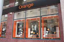
Company logos can portray meaning just through the use of color.[28] Color affects people's perceptions of a new or unknown company. Some companies such as Victoria's Secret and H&R Block used color to change their corporate image and create a new brand personality for a specific target audience.[28] Research done on the relationship between logo color and five personality traits had participants rate a computer-made logo in different colors on scales relating to the dimensions of brand personality. Relationships were found between color and sincerity, excitement, competence, sophistication, and ruggedness. A follow up study tested the effects of perceived brand personality and purchasing intentions.[28] Participants were presented with a product and a summary of the preferred brand personality and had to rate the likelihood of purchasing a product based on packaging color. Purchasing intent was greater if the perceived personality matched the marketed product or service. In turn color affects perceived brand personality and brand personality affects purchasing intent.[28]
Although color can be useful in marketing, its value and extent of use depends on how it is used and the audience it is used on.[29] The use of color will have different effects on different people, therefore experimental findings cannot be taken as universally true.
Specific color meaning
Different colors are perceived to mean different things. For example, tones of red lead to feelings of arousal while blue tones are often associated with feelings of relaxation. Both of these emotions are pleasant, so therefore, the colors themselves can procure positive feelings in advertisements. The chart below gives perceived meanings of different colors in the United States.
Functional (F): fulfills a need or solves a problem[26]
Sensory-Social (S): conveys attitudes, status, or social approval[26]
| Red | Yellow | Green | Blue | Pink | Violet/Purple | Orange | Brown | Black | White |
|---|---|---|---|---|---|---|---|---|---|
| Lust (S)[19] | Competence (S)[28] | Good Taste (F)[19] | Masculine (S)[19] | Sophistication (S)[28] | Authority (S)[19] | Warmth (S)[30] | Ruggedness (S)[28] | Grief (S)[19] | Happiness (S)[19] |
| Power (S)[31] | Happiness (S)[19] | Envy (S)[19] | Competence (S)[28] | Sincerity (S)[28] | Sophistication (S)[28] | Excitement (S)[30] | Sophistication (S)[28] | Sincerity (S)[28] | |
| Excitement (S)[28] | Inexpensive (F)[16] | Eco-Friendly (F) [32] | High quality (F)[19] | Feminine (S)[19] | Power (S)[19] | Expensive (F)[19] | Purity (S)[19] | ||
| Love (S)[19] | Low Quality (F)[16] | Health (S) [32] | Corporate (F)[19] | Fear (S)[19] | |||||
| Speed (S) [2] | Reliability (F) [16] | Death (S)[33] | |||||||
| Anger (S)[34] |
Combining colors
Although some companies use a single color to represent their brand, many other companies use a combination of colors in their logo, and can be perceived in different ways than those colors independently. When asked to rate color pair preference of preselected pairs, people generally prefer color pairs with similar hues when the two colors are both in the foreground; however, greater contrast between the figure and the background is preferred.[35]
In contrast to a strong preference for similar color combinations, some people like to accent with a highly contrasting color.[36] In a study on color preference for Nike, Inc. sneakers, people generally combined colors near each other on the color wheel, such as blue and dark blue. However, a smaller segment preferred to have the Nike swoosh accentuated in a different, and contrasting, color. Most of the people also used a relatively small number of colors when designing their ideal athletic shoe. This finding has relevance for companies that produce multicolored merchandise, suggesting that to appeal to consumer preferences, companies should consider minimizing the number of colors visible and using similar hues in any one product.[37]
Color name
Although different colors can be perceived in different ways, the names of those colors matters as well.[37][38] Many products and companies focus on producing a wide range of product colors to attract the largest population of consumers. For example, cosmetics brands produce a rainbow of colors for eye shadow and nail polish, to appeal to every type of person. Even companies such as Apple Inc. and Dell who make iPods and laptops do so with a certain amount of color personalization available to attract buyers. Moreover, color name, not only the actual color, can attract or repel buyers as well. When asked to rate color swatches and products with either generic color names (such as brown) or "fancy" color names (such as mocha), participants rated items with fancy names as significantly more likable than items with generic names.[37] In fact, the same paint color swatch with two different names produced different rating levels, and the same effect was found when participants rated the pleasantness of towels given fancy or generic color names,[37] showing an overall pattern of preference for fancy color names over generic ones when describing exactly the same color.
Furthermore, it would appear that in addition to fancy names being preferred for their aural appeal, they may actually contribute to the product they represent itself being liked more, and hence in this manner impact sales.[39] A yellow jelly bean with an atypical color name such as razzmatazz is more likely to be selected than one with a more typical name such as lemon yellow. This could be due to greater interest in atypical names, as well as curiosity and willingness to "figure out" why that name was chosen. Purchasing intent patterns regarding custom sweatshirts from an online vendor also revealed a preference for atypical names. Participants were asked to imagine buying sweatshirts and were provided with a variety of color name options, some typical, some atypical. Color names that were atypical were selected more often than typical color names, again confirming a preference for atypical color names and for item descriptions using those names.[39] Moreover, those who chose sweatshirts bearing atypical color names were described as more content with their purchase than those who selected similar items bearing typical color names.
Attracting attention
Color is used as a means to attract consumer attention to a product that then influences buying behavior.[40] Consumers use color to identify for known brands or search for new alternatives. Variety seekers look for non-typical colors when selecting new brands. Attractive color packaging receives more consumer attention than unattractive color packaging, which can then influence buying behavior. A study that looked at visual color cues focused on predicted purchasing behavior for known and unknown brands.[40] Participants were shown the same product in four different colors and brands. The results showed that people picked packages based on colors that attracted their voluntary and involuntary attention. Associations made with that color such as 'green fits menthol', also affected their decision. Based on these findings implications can be made on the best color choices for packages. New companies or new products could consider using dissimilar colors to attract attention to the brand, however, off brand companies could consider using similar colors to the leading brand to emphasize product similarity. If a company is changing the look of a product, but keeping the product the same, they consider keeping the same color scheme since people use color to identify and search for brands.[40] This can be seen in Crayola crayons, where the logo has changed many times since 1934, but the basic package colors, gold and green, have been kept throughout.
Attention is captured subconsciously before people can consciously attend to something.[41] Research looking at electroencephalography (EEGs) while people made decisions on color preference found brain activation when a favorite color is present before the participants consciously focused on it. When looking at various colors on a screen people focus on their favorite color, or the color that stands out more, before they purposefully turn their attention to it. This implies that products can capture someone's attention based on color, before the person willingly looks at the product.[41]
In interactive design and behavioral design, color is used to develop visual hierarchies where colors are placed into saliency hierarchies that match other hierarchies. Examples include matching a color hierarchy to a navigational structure hierarchy, or matching a behavioral science hierarchy to the most salient colors in a visual hierarchy, to increase the odds that important behavior change principles are noticed by a target audience and processed by them.[42]
Store and display color
Color is not only used in products to attract attention, but also in window displays and stores.[43] When people are exposed to different colored walls and images of window displays and store interiors they tend to be drawn to some colors and not to others. Findings showed that people were physically drawn to warm colored displays; however, they rated cool colored displays as more favorable. This implies that warm colored store displays are more appropriate for spontaneous and unplanned purchases, whereas cool colored displays and store entrances may be a better fit for purchases where a lot of planning and customer deliberation occurs. This is especially relevant in shopping malls where patrons could easily walk into a store that attracts their attention without previous planning.[43]
Other research has confirmed that store color, and not just the product, influences buying behavior.[38] When people are exposed to different store color scenarios and then surveyed on intended buying behavior, store color, among various other factors, seems important for purchasing intentions. Particularly blue, a cool color, was rated as more favorable and produced higher purchasing intentions than orange, a warm color. However, all negative effects to orange were neutralized when orange store color was paired with soft lighting. This shows that store color and lighting actually interact.[38]
Lighting color could have a strong effect on perceived experience in stores and other situation. For example, time seems to pass more slowly under red lights and time seems to pass quickly under blue light.[18] Casinos take full advantage of this phenomenon by using color to get people to spend more time and hence more money in their casino.[18] However, a presumed influence of coloured light (red vs. blue) on risk behaviour could not be demonstrated.[44]
Individual differences
Gender
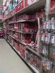
Children's toys are often categorized as either boys or girls toys solely based on color. In a study on color effects on perception, adult participants were shown blurred images of children's toys where the only decipherable feature visible was the toy's color.[45] In general participants categorized the toys into girl and boy toys based on the visible color of the image. This can be seen in companies interested in marketing masculine toys, such as building sets, to boys. For example, Lego uses pink to specifically advertise some sets to girls rather than boys. The classification of 'girl' and 'boy' toys on the Disney Store website also uses color associations for each gender.[46] An analysis of the colors used showed that bold colored toys, such as red and black, were generally classified as 'boy only' toys and pastel colored toys, such as pink and purple, were classified as 'girl only' toys. Toys that were classified as both boy and girl toys took on 'boy only' toy colors. This again emphasizes the distinction in color use for children's toys.[46]
Gender differences in color associations can also be seen amongst adults.[47] Differences were noted for male and female participants, where the two genders did not agree on which color pairs they enjoyed the most when presented with a variety of colors.[45][48] Men and women also did not agree on which colors should be classified as masculine and feminine. This could imply that men and women generally prefer different colors when purchasing items. Men and women also misperceive what colors the opposite gender views as fitting for them.
Age
Children's toys for younger age groups are often marketed based on color, however, as the age group increases color becomes less gender-stereotyped.[45] In general many toys become gender neutral and hence adopt gender-neutral colors. In the United States it is common to associate baby girls with pink and baby boys with blue. This difference in young children is a learned difference rather than an inborn one.[49] Research has looked at young children's, ages 7 months to 5 years, preference for small objects in different colors. The results showed that by the age of 2–2.5 years socially constructed gendered colors affects children's color preference, where girls prefer pink and boys avoid pink, but show no preference for other colors.[49]
Slightly older children who have developed a sense of favorite color often tend to pick items that are in that color.[50]
Culture
Many cultural differences exist on perceived color personality, meaning, and preference. When deciding on brand and product logos, companies should take into account their target consumer, since cultural differences exist. A study looked at color preference in British and Chinese participants.[47] Each participant was presented with a total of 20 color swatches one at a time and had to rate the color on 10 different emotions. Results showed that British participants and Chinese participants differed on the like-dislike scale the most. Chinese participants tended to like colors that they self rated as clean, fresh, and modern, whereas British participants showed no such pattern. When evaluating purchasing intent, color preference affects buying behavior, where liked colors are more likely to be bought than disliked colors.[40] This implies that companies should consider choosing their target consumer first and then make product colors based on the target's color preferences.
Wollard, (2000)[51] seems to think that color can affect one's mood, but the effect also can depend on one's culture and what one's personal reflection may be. For example, someone from Japan may not associate red with anger, as people from the U.S. tend to do. Also, a person who likes the color brown may associate brown with happiness. However, Wollard does think that colors can make everyone feel the same, or close to the same, mood.
Color and sports performance
In particular, the color red has been found to influence sports performance. During the 2004 Summer Olympics the competitors in boxing, taekwondo, freestyle wrestling, and Greco-Roman wrestling were randomly given blue or red uniforms. A later study found that those wearing red won 55% of all the bouts which was a statistically significant increase over the expected 50%. The colors affected bouts where the competitors were closely matched in ability, where those wearing red won 60% of the bouts, but not bouts between more unevenly matched competitors. In England, since WWII, teams wearing red uniforms have averaged higher league positions and have had more league winners than teams using other colors. In cities with more than one team, the teams wearing red outperformed the teams wearing other colors. A study of the UEFA Euro 2004 found similar results. Another study found that those taking penalty kicks performed worst when the goalkeeper had a red uniform. More anecdotal is the historical dominance of the domestic honors by red-wearing teams such AFC Ajax, FC Bayern Munich, Liverpool F.C., and Manchester United F.C. Videos of taekwondo bouts were manipulated in one study so that the red and blue colors of the protective gears were reversed. Both the original and the manipulated videos were shown to referees. The competitors wearing red were given higher scores despite the videos otherwise being identical. A study on experienced players of first-person shooters found that those assigned to wear red instead of blue won 55% of the matches.[20]
There are several different explanations for this effect. Red is used in stop signs and traffic lights which may associate the color with halting. Red is also perceived as a strong and active color which may influence both the person wearing it and others. An evolutionary psychology explanation is that red may signal health as opposed to anemic paleness, or indicate anger due to flushing instead of paleness due to fear. It has been argued that detecting flushing may have influenced the development of primate trichromate vision. Primate studies have found that some species evaluate rivals and possible mates depending on red color characteristics. Facial redness is associated with testosterone levels in humans, and male skin tends to be redder than female skin.[20]
Color and time perception
Recent results[52] showed that the perceived duration of a red screen was longer than was that of a blue screen. The results reflected sex differences; men, but not women, overestimated the duration of the red screen. Additionally, the reaction times to a red screen were faster than those to a blue screen. Participants who reacted quickly to a red screen overestimated its duration. In a demo with 150 people chosen at random, it was found that inside a pod bathed in blue color the average perceived duration of a minute was 11 seconds shorter than in a pod bathed in red color.[53]
Game immersion
Since color is such an important element in how people interpret their environment, color psychology can enhance the feeling of immersion in people that play video games. By using color psychology to cause immersion in players, players can have less errors playing video games and felt more a part of the game they were playing in comparison to a game that did not have color psychology immersion.[54]
References
- Alter A (March 21, 2013). "I See Red". Slate.
- Birren F (1961). Colour Psychology & Colour Therapy. Secaucus, N. J: The Citadel Press. p. 198. ISBN 0806506539.
- Elliot AJ, Maier MA (2014). "Color psychology: effects of perceiving color on psychological functioning in humans". Annual Review of Psychology. 65: 95–120. doi:10.1146/annurev-psych-010213-115035. PMID 23808916.
- Whitfield TW, Wiltshire TJ (November 1990). "Color psychology: a critical review". Genetic, Social, and General Psychology Monographs. 116 (4): 385–411. PMID 2289687.
- Shankar MU, Levitan CA, Prescott J, Spence C (2009-04-28). "The Influence of Color and Label Information on Flavor Perception". Chemosensory Perception. 2 (2): 53–58. doi:10.1007/s12078-009-9046-4. ISSN 1936-5802.
- Bleicher S (2012). Contemporary Colour: Theory & Use. New York: Delmar. pp. 48, 50. ISBN 978-1-1335-7997-7.
- de Craen AJ, Roos PJ, de Vries AL, Kleijnen J (1996). "Effect of colour of drugs: systematic review of perceived effect of drugs and of their effectiveness". BMJ. 313 (7072): 1624–6. doi:10.1136/bmj.313.7072.1624. PMC 2359128. PMID 8991013.
- Dolinska B (1999). "Empirical investigation into placebo effectiveness" (PDF). Irish Journal of Psychological Medicine. 16 (2): 57–58. doi:10.1017/s0790966700005176. Archived from the original (w) on 2011-07-22. Retrieved 2009-04-29.
- Baraniuk C. "Can blue lights prevent suicide at train stations?". www.bbc.com. Retrieved 2020-03-11.
- "Blue streetlights believed to prevent suicides, street crime". The Seattle Times. 2008-12-11. Archived from the original on September 13, 2010.
- Shimbun Y (December 10, 2008). "Blue streetlights may prevent crime, suicide". Archived from the original on 2009-10-09. Retrieved 2010-02-18.
- Can Blue-Colored Light Prevent Suicide?
- Will Blue Lights Reduce Suicides in Japan?
- Lamancusa K. "Emotional Reactions to Color". Creative Latitude. Archived from the original on 2016-03-11. Retrieved 2016-03-30.
- Dutton, Denis. 2003. 'Aesthetics and Evolutionary Psychology' in "The Oxford Handbook for Aesthetics". Oxford University Press.
- "Colour Assignment - By Joe Hallock". www.joehallock.com. Retrieved 2020-03-26.
- Lichtlé M (2007-01-01). "The effect of an advertisement's colour on emotions evoked by attitude towards the ad". International Journal of Advertising. 26 (1): 37–62. doi:10.1080/02650487.2007.11072995. ISSN 0265-0487.
- Singh S (2006). "Impact of color on marketing". Management Decision. 44 (6): 783–789. doi:10.1108/00251740610673332.
- Aslam MM (2006). "Are You Selling the Right Colour? A Cross-cultural Review of Colour as a Marketing Cue". Journal of Marketing Communications. 12 (1): 15–30. doi:10.1080/13527260500247827.
- Diana Widermann, Robert A. Barton, and Russel A. Hill. Evolutionary perspectives on sport and competition. In Roberts SC (2011). Roberts SC (ed.). Applied Evolutionary Psychology. Oxford University Press. doi:10.1093/acprof:oso/9780199586073.001.0001. ISBN 9780199586073.
- Shevell SK, Kingdom FA (2008). "Color in complex scenes". Annual Review of Psychology. 59: 143–66. doi:10.1146/annurev.psych.59.103006.093619. PMID 18154500. S2CID 24460261.
- Riley, Charles A. II. "Color Codes: Modern Theories of Color in Philosophy, Painting and Architecture, Literature, Music, and Psychology". Hanover: University Press of New England, 1995, p. 307.
- Labrecque LI, Milne GR (2012). "Exciting Red and Competent Blue: The Importance of Color in Marketing". Journal of the Academy of Marketing Science. 40 (5): 711–727. doi:10.1007/s11747-010-0245-y.
- Connecting With Color
- Fernández-Vázquez R (2011). "Visual and Instrumental Evaluation of Orange Juice Color: A Consumers' Preference Study". Journal of Sensory Studies. 26 (6): 436–444. doi:10.1111/j.1745-459X.2011.00360.x.
- Bottomley PA, Doyle JR (2006). "The interactive effects of colors and products on perceptions of brand logo appropriateness". Marketing Theory. 6 (1): 63–83. doi:10.1177/1470593106061263. S2CID 53464180.
- O'Connor Z. "Logo colour and differentiation: A new application of colour mapping". Color Research & Application, 36 (1), p55-60. Retrieved 2016-03-30.
- Labrecque LI, Milne GR (2011). "Exciting red and competent blue: the importance of color in marketing". Journal of the Academy of Marketing Science. 40 (5): 711–727. doi:10.1007/s11747-010-0245-y.
- Warner L, Franzen R (June 1947). "Value of color in advertising". The Journal of Applied Psychology. 31 (3): 260–70. doi:10.1037/h0057772. PMID 20241978.
- Elliot AJ (2015-04-02). "Color and psychological functioning: a review of theoretical and empirical work". Frontiers in Psychology. 6: 368. doi:10.3389/fpsyg.2015.00368. PMC 4383146. PMID 25883578.
- Piotrowski C, Armstrong T (2012). "Color Red: Implications for applied psychology and marketing research". Psychology and Education: An Interdisciplinary Journal. 49 (1–2): 55–57.
- Lupton E (2017). Design is storytelling. New York, NY. ISBN 978-1-942303-19-0. OCLC 982650081.
- Meier B, Robinson M, Clore G (2004-03-01). "Why good guys wear white". Psychological Science. 15 (2): 82–7. doi:10.1111/j.0963-7214.2004.01502002.x. PMID 14738513.
- Kauppinen-Räisänen H, Jauffret M (2018-01-08). "Using colour semiotics to explore colour meanings". Qualitative Market Research. 21 (1): 101–117. doi:10.1108/QMR-03-2016-0033. ISSN 1352-2752.
- Schloss KB, Palmer SE (February 2011). "Aesthetic response to color combinations: preference, harmony, and similarity". Attention, Perception & Psychophysics. 73 (2): 551–71. doi:10.3758/s13414-010-0027-0. PMC 3037488. PMID 21264737.
- Deng X, Hui SK, Huntchinson J (2010). "Consumer preferences for color combinations: An empirical analysis of similarity-based color". Journal of Consumer Psychology. 20 (4): 476–484. doi:10.1016/j.jcps.2010.07.005.
- Skorinko JL, Kemmer S, Hebl MR, Lane DM (2006). "15. A Rose by Any Other Name...: Color-Naming Influences on Decision Making". Psychology & Marketing. 23 (12): 975–993. CiteSeerX 10.1.1.581.1374. doi:10.1002/mar.20142.
- Babin BJ, Hardesty DM, Suter TA (2003). "Color and shopping intentions". Journal of Business Research. 56 (7): 541–551. doi:10.1016/S0148-2963(01)00246-6.
- Miller EG, Kahn BE (2005). "Shades of Meaning: The Effect of Color and Flavor Names on Consumer Choice". Journal of Consumer Research. 32 (1): 86–92. CiteSeerX 10.1.1.488.3177. doi:10.1086/429602.
- Kauppinen-Raisanen H, Luomala HT (2010). "Exploring consumers' product-specific color meanings". Qualitative Market Research. 13 (3): 287–308. doi:10.1108/13522751011053644.
- Kawasaki M, Yamaguchi Y (January 2012). "Effects of subjective preference of colors on attention-related occipital theta oscillations". NeuroImage. 59 (1): 808–14. doi:10.1016/j.neuroimage.2011.07.042. PMID 21820064.
- Cugelman, B. Cugeman, R. et al. (2019) Color Psychology. AlterSpark. https://www.alterspark.com/color-psychology
- Bellizzi JA, Crowley AE, Hasty RW (1983). "The effects of color in store design". Journal of Retailing. 59 (1): 21–45.
- Mao, T.; Yang, J.; Ru, T.; Chen, Q.; Shi, H.; Zhou, J.; Zhou, G. (2018). "Does red light induce people to be riskier? Exploring the colored light effect on the Balloon Analogue Risk Task (BART)". Journal of Environmental Psychology. 57: 73–82. doi:10.1016/j.jenvp.2018.07.001.
- Hull JH, Hull DB, Knopp C (2011). "The Impact of color on ratings of 'girl' and 'boy' toys". North American Journal of Psychology. 13 (3): 549–562. 276353296. Archived from the original on 2016-10-06. Retrieved 2017-02-14.
- Auster CJ, Mansbach CS (2012). "The Gender Marketing of Toys: An Analysis of Color and Type of Toy on the Disney Store Website". Sex Roles. 67 (7–8): 375–388. doi:10.1007/s11199-012-0177-8.
- Ou L, Luo MR, Woodcock A, Wright A (2004). "A study of colour emotion and colour preference. Part I: Colour emotions for single colours". Color Research & Application. 29 (3): 232–240. doi:10.1002/col.20010.
- Ou L, Luo MR, Woodcock A, Wright A (2004). "A study of colour emotion and colour preference. Part II: Colour emotions for two-colour combinations". Color Research & Application. 29 (4): 292–298. doi:10.1002/col.20024.
- Lobue V, Deloache JS (September 2011). "Pretty in pink: The early development of gender-stereotyped colour preferences". The British Journal of Developmental Psychology. 29 (Pt 3): 656–67. doi:10.1111/j.2044-835X.2011.02027.x. PMID 21848751. S2CID 23219132.
- Gollety M, Guichard N (2011). "The dilemma of flavor and color in the choice of packaging by children". Young Consumers. 12 (1): 82–90. doi:10.1108/17473611111114803.
- "Wollard, K. (2000). Orange you glad you're not blue?".
- Masahiro Shibasaki, Nobuo Masataka (2014) "The color red distorts time perception for men, but not for women" Scientific Reports 4, Article number: 5899 doi:10.1038/srep05899
- Beau Lotto in "Do You See What I See" (2011)
- Roohi S, Forouzandeh A (May 2019). "Regarding color psychology principles in adventure games to enhance the sense of immersion". Entertainment Computing. 30: 100298. doi:10.1016/j.entcom.2019.100298. ISSN 1875-9521.
Color topics | ||||||||
|---|---|---|---|---|---|---|---|---|
| Color science |
|  | ||||||
| Color philosophy |
| |||||||
| Color terms |
| |||||||
| Color organizations | ||||||||
| Lists | ||||||||
| Related |
| |||||||
| ||||||||