Sankey diagram
Sankey diagrams are a type of flow diagram in which the width of the arrows is proportional to the flow rate.

The illustration shows a Sankey diagram that represents all the primary energy flows into a factory. The widths of the bands are linearly proportional to energy production, utilization and loss. The primary energy inputs enter the left side of the diagram, and are differentiated into gas, electricity and coal/oil.
Sankey diagrams can also visualize the energy accounts, material flow accounts on a regional or national level, and cost breakdowns[1] .
Sankey diagrams emphasize the major transfers or flows within a system. They help locate the most important contributions to a flow. They often show conserved quantities within defined system boundaries.
History
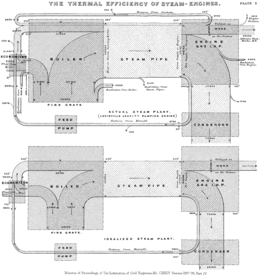
Sankey diagrams are named after Irish Captain Matthew Henry Phineas Riall Sankey, who used this type of diagram in 1898 in a classic figure [2] (see diagram) showing the energy efficiency of a steam engine. The original charts in black and white displayed just one type of flow (e.g. steam); using colors for different types of flows lets the diagram express additional variables.
Over time, it became a standard model used in science and engineering to represent heat balance, energy flows, material flows, and since the 1990s this visual model has been used in life-cycle assessment of products [3].
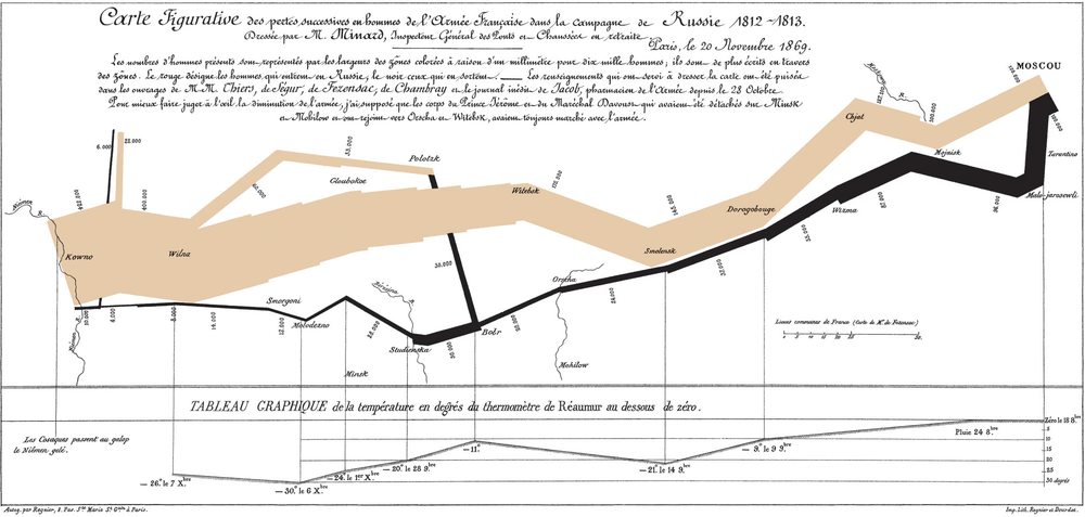
One of the most famous Sankey diagrams is Charles Minard's Map of Napoleon's Russian Campaign of 1812. It is a flow map, overlaying a Sankey diagram onto a geographical map. It was created in 1869, so it actually predates Sankey's 'first' Sankey diagram of 1898.
Science

Sankey diagrams are often used in fields of science, especially physics. They are used to represent energy inputs, useful output, and wasted output.
Active examples
The United States Energy Information Administration (EIA) produces numerous Sankey diagrams annually in its Annual Energy Review[4] which illustrate the production and consumption of various forms of energy.
The US Department of Energy's Lawrence Livermore Laboratory maintains a site of Sankey diagrams, including US energy flow and carbon flow.[5]
Eurostat, the Statistical Office of the European Union, has developed an interactive Sankey web tool to visualise energy data by means of flow diagrams.[6] The tool allows the building and customisation of diagrams by playing with different options (country, year, fuel, level of detail).
The International Energy Agency (IEA) created an interactive Sankey web application that details the flow of energy for the entire planet.[7] Users can select specific countries, points of time back to 1973, and modify the arrangement of various flows within the Sankey diagram.
Ben Schmidt, an assistant professor of history at Northeastern University, created a Sankey diagram relating majors in college to eventual careers.[8]
See also
- Alluvial diagram – a type of Sankey diagram that uses the same kind of representation to depict how items re-group
- Material flow management
- Thermodynamics
- Time geography
References
- Schmidt, Mario (2008). "The Sankey Diagram in Energy and Material Flow Management - Part II: Methodology and Current Applications". Journal of Industrial Ecology. 12 (2): 173–185. doi:10.1111/j.1530-9290.2008.00015.x. ISSN 1530-9290.
- Kennedy, Alex B. W.; Sankey, H. Riall (1898). "The Thermal Efficiency Of Steam Engines". Minutes of the Proceedings of the Institution of Civil Engineers. 134 (1898): 278–312. doi:10.1680/imotp.1898.19100.
- Schmidt, Mario (2008). "The Sankey Diagram in Energy and Material Flow Management - Part I: History". Journal of Industrial Ecology. 12 (1): 82–94. doi:10.1111/j.1530-9290.2008.00004.x.
- "Annual Energy Review". Energy Information Administration. Retrieved 15 December 2017.
- "LLNL Flow Charts". Lawrence Livermore National Laboratory. Retrieved 15 December 2017.
- "Energy balance flow for European Union (28 countries) 2015". Eurostat. Retrieved 15 December 2017.
- "World Balance (2015)". International Energy Agency (IEA). Retrieved 15 December 2017.
- Schmidt, Ben. "What are you going to do with that degree?". Ben Schmidt. Retrieved 15 December 2017.
External links
| Wikimedia Commons has media related to Sankey diagrams. |
- Scottish Executive – Energy in Scotland: Supply and Demand
- Irish Environmental Protection Agency – Material Flow Accounts (MFAs) – Demonstration for Ireland – 2001
- sankey-diagrams.com – Blog discussing the usage of Sankey diagrams
- IEA Energy Balance Flows – Containing International Energy Agency's data on over 150 countries and regions
- Eurostat energy flow diagrams – Interactive visualisation tool for the annual energy balance data of 42 countries reporting to Eurostat
- Grassmann diagrams (exergy flow, destruction, and loss)