Cartography
Cartography (/kɑːrˈtɒɡrəfi/; from Greek χάρτης chartēs, "papyrus, sheet of paper, map"; and γράφειν graphein, "write") is the study and practice of making maps. Combining science, aesthetics, and technique, cartography builds on the premise that reality can be modeled in ways that communicate spatial information effectively.
The fundamental uses of traditional cartography are to:
- Set the map's agenda and select traits of the object to be mapped. This is the concern of map editing. Traits may be physical, such as roads or land masses, or may be abstract, such as toponyms or political boundaries.
- Represent the terrain of the mapped object on flat media. This is the concern of map projections.
- Eliminate characteristics of the mapped object that are not relevant to the map's purpose. This is the concern of generalization.
- Reduce the complexity of the characteristics that will be mapped. This is also the concern of generalization.
- Orchestrate the elements of the map to best convey its message to its audience. This is the concern of map design.
Modern cartography constitutes many theoretical and practical foundations of geographic information systems.
History
Ancient times
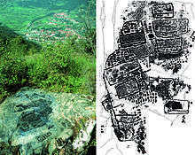
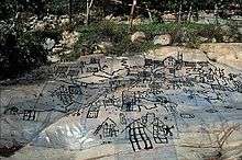
What is the earliest known map is a matter of some debate, both because the term "map" is not well-defined and because some artifacts that might be maps might actually be something else. A wall painting that might depict the ancient Anatolian city of Çatalhöyük (previously known as Catal Huyuk or Çatal Hüyük) has been dated to the late 7th millennium BCE.[1][2] Among the prehistoric alpine rock carvings of Mount Bego (France) and Valcamonica (Italy), dated to the 4th millennium BCE, geometric patterns consisting of dotted rectangles and lines are widely interpreted[3][4] in archaeological literature as a depiction of cultivated plots.[5] Other known maps of the ancient world include the Minoan "House of the Admiral" wall painting from c. 1600 BCE, showing a seaside community in an oblique perspective, and an engraved map of the holy Babylonian city of Nippur, from the Kassite period (14th – 12th centuries BCE).[6] The oldest surviving world maps are from 9th century BCE Babylonia.[7] One shows Babylon on the Euphrates, surrounded by Assyria, Urartu[8] and several cities, all, in turn, surrounded by a "bitter river" (Oceanus).[9] Another depicts Babylon as being north of the center of the world.[7]
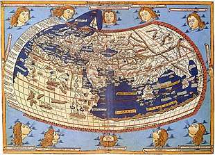
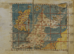
The ancient Greeks and Romans created maps from the time of Anaximander in the 6th century BCE.[10] In the 2nd century CE, Ptolemy wrote his treatise on cartography, Geographia.[11] This contained Ptolemy's world map – the world then known to Western society (Ecumene). As early as the 8th century, Arab scholars were translating the works of the Greek geographers into Arabic.[12]
In ancient China, geographical literature dates to the 5th century BCE. The oldest extant Chinese maps come from the State of Qin, dated back to the 4th century BCE, during the Warring States period. In the book of the Xin Yi Xiang Fa Yao, published in 1092 by the Chinese scientist Su Song, a star map on the equidistant cylindrical projection.[13][14] Although this method of charting seems to have existed in China even before this publication and scientist, the greatest significance of the star maps by Su Song is that they represent the oldest existent star maps in printed form.
Early forms of cartography of India included depictions of the pole star and surrounding constellations.[15] These charts may have been used for navigation.[15]
Middle Ages and Renaissance
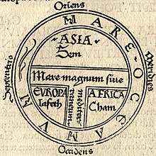
Mappae mundi ("maps of the world") are the medieval European maps of the world. About 1,100 of these are known to have survived: of these, some 900 are found illustrating manuscripts and the remainder exist as stand-alone documents.[16]
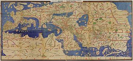
The Arab geographer Muhammad al-Idrisi produced his medieval atlas Tabula Rogeriana (Book of Roger) in 1154. By combining the knowledge of Africa, the Indian Ocean, Europe, and the Far East (which he learned through contemporary accounts from Arab merchants and explorers) with the information he inherited from the classical geographers, he was able to write detailed descriptions of a multitude of countries. Along with the substantial text he had written, he created a world map influenced mostly by the Ptolemaic conception of the world, but with significant influence from multiple Arab geographers. It remained the most accurate world map for the next three centuries.[17][18] The map was divided into seven climatic zones, with detailed descriptions of each zone. As part of this work, a smaller, circular map was made depicting the south on top and Arabia in the center. Al-Idrisi also made an estimate of the circumference of the world, accurate to within 10%.[19]
In the Age of Exploration, from the 15th century to the 17th century, European cartographers both copied earlier maps (some of which had been passed down for centuries) and drew their own, based on explorers' observations and new surveying techniques. The invention of the magnetic compass, telescope and sextant enabled increasing accuracy. In 1492, Martin Behaim, a German cartographer, made the oldest extant globe of the Earth.[20]
In 1507, Martin Waldseemüller produced a globular world map and a large 12-panel world wall map (Universalis Cosmographia) bearing the first use of the name "America". Portuguese cartographer Diego Ribero was the author of the first known planisphere with a graduated Equator (1527). Italian cartographer Battista Agnese produced at least 71 manuscript atlases of sea charts. Johannes Werner refined and promoted the Werner projection. This was an equal-area, heart-shaped world map projection (generally called a cordiform projection) which was used in the 16th and 17th centuries. Over time, other iterations of this map type arose; most notable are the sinusoidal projection and the Bonne projection. The Werner projection places its standard parallel at the North Pole; a sinusoidal projection places its standard parallel at the equator; and the Bonne projection is intermediate between the two.[21][22]
In 1569, mapmaker Gerardus Mercator first published a map based on his Mercator projection, which uses equally-spaced parallel vertical lines of longitude and parallel latitude lines spaced farther apart as they get farther away from the equator. By this construction, courses of constant bearing are conveniently represented as straight lines for navigation. The same property limits its value as a general-purpose world map because regions are shown as increasingly larger than they actually are the further from the equator they are. Mercator is also credited as the first to use the word "atlas" to describe a collection of maps. In the later years of his life, Mercator resolved to create his Atlas, a book filled with many maps of different regions of the world, as well as a chronological history of the world from the Earth's creation by God until 1568. He was unable to complete it to his satisfaction before he died. Still, some additions were made to the Atlas after his death and new editions were published after his death.[23][24]
In the Renaissance, maps were used to impress viewers and establish the owner's reputation as sophisticated, educated, and worldly. Because of this, towards the end of the Renaissance, maps were displayed with equal importance of painting, sculptures, and other pieces of art.[25] In the sixteenth century, maps were becoming increasingly available to consumers through the introduction of printmaking, with about 10% of Venetian homes having some sort of map by the late 1500s.
There were three main functions of maps in the Renaissance:[26]
- General descriptions of the world
- Navigation and wayfinding
- Land surveying and property management
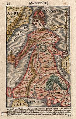
In medieval times, written directions of how to get somewhere were more common than the use of maps. With the Renaissance, cartography began to be seen as a metaphor for power.[26] Political leaders could lay claim on territories through the use of maps and this was greatly aided by the religious and colonial expansion of Europe. The most commonly mapped places during the Renaissance were the Holy Land and other religious places.
In the late 1400s to the late 1500s, Rome, Florence, and Venice dominated map making and trade. It started in Florence in the mid to late 1400s. Map trade quickly shifted to Rome and Venice but then was overtaken by atlas makers in the late 16th century.[27] Map publishing in Venice was completed with humanities and book publishing in mind, rather than just informational use.
Printing technology
There were two main printmaking technologies in the Renaissance: woodcut and copper-plate intaglio, referring to the medium used to transfer the image onto paper.
In woodcut, the map image is created as a relief chiseled from medium-grain hardwood. The areas intended to be printed are inked and pressed against the sheet. Being raised from the rest of the block, the map lines cause indentations in the paper that can often be felt on the back of the map. There are advantages to using relief to make maps. For one, a printmaker doesn't need a press because the maps could be developed as rubbings. Woodblock is durable enough to be used many times before defects appear. Existing printing presses can be used to create the prints rather than having to create a new one. On the other hand, it is hard to achieve fine detail with the relief technique. Inconsistencies in linework are more apparent in woodcut than in intaglio. To improve quality in the late fifteenth century, a style of relief craftsmanship developed using fine chisels to carve the wood, rather than the more commonly used knife.
In intaglio, lines are engraved into workable metals, typically copper but sometimes brass. The engraver spreads a thin sheet of wax over the metal plate and uses ink to draw the details. Then, the engraver traces the lines with a stylus to etch them into the plate beneath.[28] The engraver can also use styli to prick holes along the drawn lines, trace along them with colored chalk, and then engrave the map. Lines going in the same direction are carved at the same time, and then the plate is turned to carve lines going in a different direction. To print from the finished plate, ink is spread over the metal surface and scraped off such that it remains only in the etched channels. Then the plate is pressed forcibly against the paper so that the ink in the channels is transferred to the paper. The pressing is so forceful that it leaves a "plate mark" around the border of the map at the edge of the plate, within which the paper is depressed compared to the margins.[29] Copper and other metals were expensive at the time, so the plate was often reused for new maps or melted down for other purposes.[29]
Whether woodcut or intaglio, the printed map is hung out to dry. Once dry, it is usually placed in another press of flatten the paper. Any type of paper that was available at the time could be used to print the map on, but thicker paper was more durable.
Both relief and intaglio were used about equally by the end of the fifteenth century.
Lettering
Lettering in mapmaking is important for denoting information. Fine lettering is difficult in woodcut, where it often turned out square and blocky, contrary to the stylized, rounded writing style popular in Italy at the time.[29] To improve quality, mapmakers developed fine chisels to carve the relief. Intaglio lettering did not suffer the troubles of a coarse medium and so was able to express the looping cursive that came to be known as cancellaresca.[29] There were custom-made reverse punches that were also used in metal engraving alongside freehand lettering.[28]
Color
The first use of color in map making cannot be narrowed down to one reason. There are arguments that color started as a way to indicate information on the map, with aesthetics coming second. There are also arguments that color was first used on maps for aesthetics but then evolved into conveying information.[29] Either way, many maps of the Renaissance left the publisher without being colored, a practice that continued all the way into the 1800s. However, most publishers accepted orders from their patrons to have their maps or atlases colored if they wished. Because all coloring was done by hand, the patron could request simple, cheap color, or more expensive, elaborate color, even going so far as silver or gold gilding. The simplest coloring was merely outlines, such as of borders and along rivers. Wash color meant painting regions with inks or watercolors. Limning meant adding silver and gold leaf to the map to illuminate lettering, heraldic arms, or other decorative elements.
The Enlightenment
Maps of the Enlightenment period practically universally used copper plate intaglio, having abandoned the fragile, coarse woodcut technology. Use of map projections evolved, with the double hemisphere being very common and Mercator's prestigious navigational projection gradually making more appearances.
Due to the paucity of information and the immense difficulty of surveying during the period, mapmakers frequently plagiarized material without giving credit to the original cartographer. For example, a famous map of North America known as the "Beaver Map" was published in 1715 by Herman Moll. This map is a close reproduction of a 1698 work by Nicolas de Fer. De Fer, in turn, had copied images that were first printed in books by Louis Hennepin, published in 1697, and François Du Creux, in 1664. By the late 18th century, mapmakers often credited the original publisher with something along the lines of, "After [the original cartographer]" in the map's title or cartouche.[30]
Modern period
In cartography, technology has continually changed in order to meet the demands of new generations of mapmakers and map users. The first maps were produced manually, with brushes and parchment; so they varied in quality and were limited in distribution. The advent of magnetic devices, such as the compass and much later, magnetic storage devices, allowed for the creation of far more accurate maps and the ability to store and manipulate them digitally.
Advances in mechanical devices such as the printing press, quadrant and vernier, allowed the mass production of maps and the creation of accurate reproductions from more accurate data. Hartmann Schedel was one of the first cartographers to use the printing press to make maps more widely available. Optical technology, such as the telescope, sextant and other devices that use telescopes, allowed accurate land surveys and allowed mapmakers and navigators to find their latitude by measuring angles to the North Star at night or the Sun at noon.
Advances in photochemical technology, such as the lithographic and photochemical processes, make possible maps with fine details, which do not distort in shape and which resist moisture and wear. This also eliminated the need for engraving, which further speeded up map production.
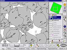
In the 20th century, aerial photography, satellite imagery, and remote sensing provided efficient, precise methods for mapping physical features, such as coastlines, roads, buildings, watersheds, and topography. The United States Geological Survey has devised multiple new map projections, notably the Space Oblique Mercator for interpreting satellite ground tracks for mapping the surface. The use of satellites and space telescopes now allows researchers to map other planets and moons in outer space.[31] Advances in electronic technology ushered in another revolution in cartography: ready availability of computers and peripherals such as monitors, plotters, printers, scanners (remote and document) and analytic stereo plotters, along with computer programs for visualization, image processing, spatial analysis, and database management, democratized and greatly expanded the making of maps. The ability to superimpose spatially located variables onto existing maps created new uses for maps and new industries to explore and exploit these potentials. See also digital raster graphic.
These days most commercial-quality maps are made using software of three main types: CAD, GIS and specialized illustration software. Spatial information can be stored in a database, from which it can be extracted on demand. These tools lead to increasingly dynamic, interactive maps that can be manipulated digitally.
Field-rugged computers, GPS, and laser rangefinders make it possible to create maps directly from measurements made on site.
Deconstruction
There are technical and cultural aspects to producing maps. In this sense, maps can sometimes be said to be biased. The study of bias, influence, and agenda in making a map is what comprise a map's deconstruction. A central tenet of deconstructionism is that maps have power. Other assertions are that maps are inherently biased and that we search for metaphor and rhetoric in maps.[32]
It is claimed that the Europeans promoted an "epistemological" understanding of the map as early as the 17th century.[32] An example of this understanding is that "[European reproduction of terrain on maps] reality can be expressed in mathematical terms; that systematic observation and measurement offer the only route to cartographic truth…".[32] 17th-century map-makers were careful and precise in their strategic approaches to maps based on a scientific model of knowledge. Popular belief at the time was that this scientific approach to cartography was immune to the social atmosphere.
A common belief is that science heads in a direction of progress, and thus leads to more accurate representations of maps. In this belief European maps must be superior to others, which necessarily employed different map-making skills. "There was a 'not cartography' land where lurked an army of inaccurate, heretical, subjective, valuative, and ideologically distorted images. Cartographers developed a 'sense of the other' in relation to nonconforming maps."[32]
Although cartography has been a target of much criticism in recent decades, a cartographer's 'black box' always seemed to be naturally defended to the point where it overcame the criticism. However, to later scholars in the field, it was evident that cultural influences dominate map-making.[32] For instance, certain abstracts on maps and the map-making society itself describe the social influences on the production of maps. This social play on cartographic knowledge "…produces the 'order' of [maps'] features and the 'hierarchies of its practices.'"[33]
Depictions of Africa are a common target of deconstructionism.[34] According to deconstructionist models, cartography was used for strategic purposes associated with imperialism and as instruments and representations of power[35] during the conquest of Africa. The depiction of Africa and the low latitudes in general on the Mercator projection has been interpreted as imperialistic and as symbolic of subjugation due to the diminished proportions of those regions compared to higher latitudes where the European powers were concentrated.[36]
Maps furthered imperialism and colonization of Africa in practical ways by showing basic information like roads, terrain, natural resources, settlements, and communities. Through this, maps made European commerce in Africa possible by showing potential commercial routes and made natural resource extraction possible by depicting locations of resources. Such maps also enabled military conquests and made them more efficient, and imperial nations further used them to put their conquests on display. These same maps were then used to cement territorial claims, such as at the Berlin Conference of 1884–1885.[35]
Before 1749, maps of the African continent had African kingdoms drawn with assumed or contrived boundaries, with unknown or unexplored areas having drawings of animals, imaginary physical geographic features, and descriptive texts. In 1748, Jean B. B. d'Anville created the first map of the African continent that had blank spaces to represent the unknown territory.[35] This was revolutionary in cartography and the representation of power associated with map making.
Map types
General vs. thematic cartography
In understanding basic maps, the field of cartography can be divided into two general categories: general cartography and thematic cartography. General cartography involves those maps that are constructed for a general audience and thus contain a variety of features. General maps exhibit many reference and location systems and often are produced in a series. For example, the 1:24,000 scale topographic maps of the United States Geological Survey (USGS) are a standard as compared to the 1:50,000 scale Canadian maps. The government of the UK produces the classic 1:50,000 (replacing the older 1 inch to 1 mile) "Ordnance Survey" maps of the entire UK and with a range of correlated larger- and smaller-scale maps of great detail. Many private mapping companies have also produced thematic map series.
Thematic cartography involves maps of specific geographic themes, oriented toward specific audiences. A couple of examples might be a dot map showing corn production in Indiana or a shaded area map of Ohio counties, divided into numerical choropleth classes. As the volume of geographic data has exploded over the last century, thematic cartography has become increasingly useful and necessary to interpret spatial, cultural and social data.
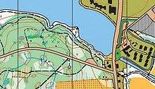
A third type of map is known as an "orienteering," or special purpose map. This type of map falls somewhere between thematic and general maps. They combine general map elements with thematic attributes in order to design a map with a specific audience in mind. Oftentimes, the type of audience an orienteering map is made for is in a particular industry or occupation. An example of this kind of map would be a municipal utility map.[37]
Topographic vs. topological
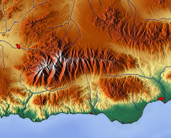
A topographic map is primarily concerned with the topographic description of a place, including (especially in the 20th and 21st centuries) the use of contour lines showing elevation. Terrain or relief can be shown in a variety of ways (see Cartographic relief depiction). In the present era, one of the most widespread and advanced methods used to form topographic maps is to use computer software to generate digital elevation models which show shaded relief. Before such software existed, cartographers had to draw shaded relief by hand. One cartographer who is respected as a master of hand-drawn shaded relief is the Swiss professor Eduard Imhof whose efforts in hill shading were so influential that his method became used around the world despite it being so labor-intensive.[38][39]
A topological map is a very general type of map, the kind one might sketch on a napkin. It often disregards scale and detail in the interest of clarity of communicating specific route or relational information. Beck's London Underground map is an iconic example. Although the most widely used map of "The Tube," it preserves little of reality: it varies scale constantly and abruptly, it straightens curved tracks, and it contorts directions. The only topography on it is the River Thames, letting the reader know whether a station is north or south of the river. That and the topology of station order and interchanges between train lines are all that is left of the geographic space.[40] Yet those are all a typical passenger wishes to know, so the map fulfills its purpose.[41]
Map design
Map purpose and selection of information
Arthur H. Robinson, an American cartographer influential in thematic cartography, stated that a map not properly designed "will be a cartographic failure." He also claimed, when considering all aspects of cartography, that "map design is perhaps the most complex."[42] Robinson codified the mapmaker's understanding that a map must be designed foremost with consideration to the audience and its needs. Map layout is an important part of map design.
From the very beginning of mapmaking, maps "have been made for some particular purpose or set of purposes".[43] The intent of the map should be illustrated in a manner in which the percipient acknowledges its purpose in a timely fashion. The term percipient refers to the person receiving information and was coined by Robinson.[44] The principle of figure-ground refers to this notion of engaging the user by presenting a clear presentation, leaving no confusion concerning the purpose of the map. This will enhance the user's experience and keep their attention. If the user is unable to identify what is being demonstrated in a reasonable fashion, the map may be regarded as useless.
Making a meaningful map is the ultimate goal. Alan MacEachren explains that a well designed map "is convincing because it implies authenticity".[45] An interesting map will no doubt engage a reader. Information richness or a map that is multivariate shows relationships within the map. Showing several variables allows comparison, which adds to the meaningfulness of the map. This also generates hypothesis and stimulates ideas and perhaps further research. In order to convey the message of the map, the creator must design it in a manner which will aid the reader in the overall understanding of its purpose. The title of a map may provide the "needed link" necessary for communicating that message, but the overall design of the map fosters the manner in which the reader interprets it.[46]
In the 21st century it is possible to find a map of virtually anything from the inner workings of the human body to the virtual worlds of cyberspace. Therefore, there are now a huge variety of different styles and types of map – for example, one area which has evolved a specific and recognisable variation are those used by public transport organisations to guide passengers, namely urban rail and metro maps, many of which are loosely based on 45 degree angles as originally perfected by Harry Beck and George Dow.
Cartographic process
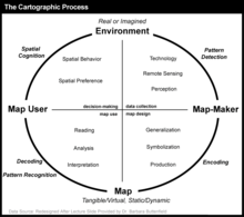
The cartographic process begins with a real or imagined environment or setting. As map makers gather data on the subject they are mapping (usually through technology and/or remote sensing), they begin to recognize and detect patterns that can be used to arrange the data for map creation (i.e., they think about the data and its patterns as well as how to best visualize them on a map). After this, the cartographer compiles the data and experiments with the many different methods of map design and production (including generalization, symbolization, and other production methods) in an attempt to encode and portray the data on a map that will allow the map user to decode and interpret the map in the way that matches the intended purpose of the map maker. Next, the user of the map reads and analyzes the map by recognizing and interpreting the symbols and patterns that are found on the map. This leads the user to take action and draw conclusions based on the information that they find on the map. In this way, maps help shape how we view the world based on the spatial perspectives and viewpoints that they help create in our mind.[47]
Naming conventions
Most maps use text to label places and for such things as the map title, legend and other information. Although maps are often made in one specific language, place names often differ between languages. So a map made in English may use the name Germany for that country, while a German map would use Deutschland and a French map Allemagne. A non-native term for a place is referred to as an exonym.
In some cases the correct name is not clear. For example, the nation of Burma officially changed its name to Myanmar, but many nations do not recognize the ruling junta and continue to use Burma. Sometimes an official name change is resisted in other languages and the older name may remain in common use. Examples include the use of Saigon for Ho Chi Minh City, Bangkok for Krung Thep and Ivory Coast for Côte d'Ivoire.
Difficulties arise when transliteration or transcription between writing systems is required. Some well-known places have well-established names in other languages and writing systems, such as Russia or Rußland for Росси́я, but in other cases a system of transliteration or transcription is required. Even in the former case, the exclusive use of an exonym may be unhelpful for the map user. It will not be much use for an English user of a map of Italy to show Livorno only as "Leghorn" when road signs and railway timetables show it as "Livorno". In transliteration, the characters in one script are represented by characters in another. For example, the Cyrillic letter Р is usually written as R in the Latin script, although in many cases it is not as simple as a one-for-one equivalence. Systems exist for transliteration of Arabic, but the results may vary. For example, the Yemeni city of Mocha is written variously in English as Mocha, Al Mukha, al-Mukhā, Mocca and Moka. Transliteration systems are based on relating written symbols to one another, while transcription is the attempt to spell in one language the phonetic sounds of another. Chinese writing is now usually converted to the Latin alphabet through the Pinyin phonetic transcription systems. Other systems were used in the past, such as Wade-Giles, resulting in the city being spelled Beijing on newer English maps and Peking on older ones.
Further difficulties arise when countries, especially former colonies, do not have a strong national geographic naming standard. In such cases, cartographers may have to choose between various phonetic spellings of local names versus older imposed, sometimes resented, colonial names. Some countries have multiple official languages, resulting in multiple official placenames. For example, the capital of Belgium is both Brussel and Bruxelles. In Canada, English and French are official languages and places have names in both languages. British Columbia is also officially named la Colombie-Britannique. English maps rarely show the French names outside of Quebec, which itself is spelled Québec in French.[48]
The study of placenames is called toponymy, while that of the origin and historical usage of placenames as words is etymology.
In order to improve legibility or to aid the illiterate, some maps have been produced using pictograms to represent places. The iconic example of this practice is Lance Wyman's early plans for the Mexico City Metro, on which stations were shown simply as stylized logos. Wyman also prototyped such a map for the Washington Metro, though ultimately the idea was rejected. Other cities experimenting with such maps are Fukuoka, Guadalajara and Monterrey.[40]
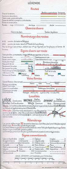
Map symbology
Cartographic symbology encodes information on the map in ways intended to convey information to the map reader efficiently, taking into consideration the limited space on the map, models of human understanding through visual means, and the likely cultural background and education of the map reader. Symbology may be implicit, using universal elements of design, or may be more specific to cartography or even to the map. National topographic map series, for example, adopt a standardised symbology, which varies from country to country.[49]
A map may have any of many kinds of symbolization. The following list provides some examples. These items are also elements of map layout.
- A legend, or key, explains the map's pictorial language.
- A title indicates the region and perhaps the theme that the map portrays.
- A neatline frames the entire map image.
- A compass rose or north arrow provides orientation.
- An overview map gives global context for the primary map.
- A bar scale translates between map measurements and real distances.
- A map projection provides a way to represent the curved surface on the plane of the map.
The map may declare its sources, accuracy, publication date and authorship, and so forth. The map image itself portrays the region.
Map coloring is another form of symbology, one whose importance can reach beyond aesthetic. In complex thematic maps, for example, the color scheme's structure can critically affect the reader's ability to understand the map's information. Modern computer displays and print technologies can reproduce much of the gamut that humans can perceive, allowing for intricate exploitation of human visual discrimination in order to convey detailed information.
Quantitative symbols give a visual indication of the magnitude of the phenomenon that the symbol represents. Two major classes of symbols are used to portray quantity. Proportional symbols change size according to phenomenon's magnitude, making them appropriate for representing statistics. Choropleth maps portray data collection areas, such as counties or census tracts, with color. Using color this way, the darkness and intensity (or value) of the color is evaluated by the eye as a measure of intensity or concentration.
Examples of point symbols
| Symbol | Explanation |
|---|---|
| mine (Hammer and pick symbol), former mine | |
| castle, Burg | |
| church, chapel, monastery (♁) | |
| monument | |
| Hotel | |
| airport | |
| railway station | |
| Tourist information |
Map labeling
Most maps label features so that the map reader can know features' names. For example, country names may be printed on a world map, each label within the outline of the country it names. Features and background may be in any color, which can make reading labels printed over them harder to read than reading text from a book.[50] Two traits of good labels are legibility and easy feature association. In order for a label to be legible, it must have a type, size and color that are easy to read. Ideally, a label would not interfere with other map features or labels. A halo may be placed around the label to contrast it against the background. A label must also be easily associated with the feature it names, regardless of the feature's category or extent. Choosing a location for a label to enhance this association while avoiding clutter and conflict with other labels is an art that incorporates many techniques. One technique is to use a different font per category of feature. For example, using an italicized, dark blue font for a water label can suggest waves. Or, labels for contour lines can be thin and have the same color as the contours. In difficult cases where there is not enough space to place the label near the feature to form an unambiguous association, a leader line can connect the label to the feature.
Map generalization
A good map has to compromise between portraying the items of interest (or themes) in the right place on the map, and the need to show that item using text or a symbol, which take up space on the map and might displace some other item of information. The cartographer is thus constantly making judgements about what to include, what to leave out and what to show in a slightly incorrect place. This issue assumes more importance as the scale of the map gets smaller (i.e. the map shows a larger area) because the information shown on the map takes up more space on the ground. A good example from the late 1980s was the Ordnance Survey's first digital maps, where the absolute positions of major roads were sometimes a scale distance of hundreds of meters away from ground truth, when shown on digital maps at scales of 1:250,000 and 1:625,000, because of the overriding need to annotate the features.
Map projections
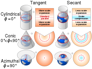
The Earth being spherical, any flat representation generates distortions such that shapes and areas cannot both be conserved simultaneously, and distances can never all be preserved.[51] The mapmaker must choose a suitable map projection according to the space to be mapped and the purpose of the map.
Cartographic errors
Some maps contain deliberate errors or distortions, either as propaganda or as a "watermark" to help the copyright owner identify infringement if the error appears in competitors' maps. The latter often come in the form of nonexistent, misnamed, or misspelled "trap streets".[52] Other names and forms for this are paper townsites, fictitious entries, and copyright easter eggs.[53]
Another motive for deliberate errors is cartographic "vandalism": a mapmaker wishing to leave his or her mark on the work. Mount Richard, for example, was a fictitious peak on the Rocky Mountains' continental divide that appeared on a Boulder County, Colorado map in the early 1970s. It is believed to be the work of draftsman Richard Ciacci. The fiction was not discovered until two years later.
Sandy Island (New Caledonia) is an example of a fictitious location that stubbornly survives, reappearing on new maps copied from older maps while being deleted from other new editions.
See also
- Animated mapping – The application of animation to add a temporal component to a map displaying change
- Cartogram – Map in which geographic space is distorted based on the value of a thematic mapping variable
- Terrain cartography, also known as Cartographic relief depiction
- City map
- Counter-mapping
- Critical cartography – Mapping practices and methods of analysis grounded in critical theory
- Fantasy map – A visual representation of an imaginary or fictional geography
- Figure-ground in map design
- Geoinformatics – The application of information science methods in geography, cartography, and geosciences
- Geovisualization
- Geo warping – Adjustment of geo-referenced radar video data to be consistent with a geographical projection
- History of cartography – The development of cartography, or mapmaking technology
- History of Cartography Project – A publishing project in the Department of Geography at the University of Wisconsin–Madison
- List of cartographers – Wikipedia list article
- Locator map – Simple map used in cartography to show the location of a particular geographic area within its larger and presumably more familiar context;can be used on its own or as an inset or addition to a larger map
- OpenStreetMap – Collaboratively edited world map available under free Open Database License
- Pictorial map – Map that uses pictures to represent features
- Planetary cartography – Cartography of solid objects outside of the Earth
- Seafloor mapping – The measurement and presentation of water depth of a given body of water
- Scribing (cartography)
- Toponymy – Branch of onomastics, study of place names
- World map
- Page layout (cartography)
References
- Robert Kunzig (May 1999). "A Tale of two obsessed archeologists, one ancient city, and nagging doubts about whether science can ever hope to reveal the past". Discover Magazine.
- Stephanie Meece (2006). "A bird's eye view – of a leopard's spots. The Çatalhöyük 'map' and the development of cartographic representation in prehistory". Anatolian Studies. 56: 1–16. doi:10.1017/S0066154600000727. JSTOR 20065543.
- Bicknell, Clarence (1913). A Guide to the prehistoric Engravings in the Italian Maritime Alps, Bordighera.
- Delano Smith, Catherine (1987). Cartography in the Prehistoric Period in the Old World: Europe, the Middle East, and North Africa. In: Harley J.B., Woodward D. (eds.), The History of Cartography: Cartography in Prehistoric, Ancient and Mediaeval Europe and the Mediterranean v. 1, Chicago: 54-101 online, retrieved December 2, 2014.
- Arcà, Andrea (2004). The topographic engravings of the Alpine rock-art: fields, settlements and agricultural landscapes. In Chippindale C., Nash G. (eds.) The figured landscapes of Rock-Art, Cambridge University Press, pp. 318-349; online academia.edu, retrieved December 2, 2014.
- Uchicago.edu The Nippur Expedition
- Kurt A. Raaflaub; Richard J. A. Talbert (2009). Geography and Ethnography: Perceptions of the World in Pre-Modern Societies. John Wiley & Sons. p. 147. ISBN 978-1-4051-9146-3.
- Catherine Delano Smith (1996). "Imago Mundi's Logo the Babylonian Map of the World". Imago Mundi. 48: 209–211. doi:10.1080/03085699608592846. JSTOR 1151277.
- Finel, Irving (1995). "A join to the map of the world: A notable discovery". British Museum Magazine. 23: 26–27.
- "History of Cartography". Archived from the original on 2006-05-02.
- J. L. Berggren, Alexander Jones; Ptolemy's Geography By Ptolemy, Princeton University Press, 2001 ISBN 0-691-09259-1
- Geography. Archived from the original on 2009-10-30.
- Miyajima, Kazuhiko (1997). "Projection methods in Chinese, Korean and Japanese star maps". In Johannes Andersen (ed.). Highlights of Astronomy. 11B. Norwell: Kluwer Academic Publishers. p. 714. ISBN 978-0-7923-5556-4.
- Needham, Joseph (1971). Part 3: Civil Engineering and Nautics. Science and Civilization in China. 4. Cambridge University Press. p. 569. ISBN 978-0-521-07060-7.
- Sircar, D. C. C. (1990). Studies in the Geography of Ancient and Medieval India. Motilal Banarsidass Publishers. p. 330. ISBN 978-81-208-0690-0.
- Woodward, p. 286
- S. P. Scott (1904), History of the Moorish Empire, pp. 461–462.
- "Muhammad ibn Muhammad al-Idrisi". Encyclopedia of World Biography. Retrieved 27 Jul 2018.
- Parry, James (January 2004). "Mapping Arabia". Saudi Aramco World. 55: 20–37.
- Globes and Terrain Models – Geography and Maps: An Illustrated Guide, Library of Congress
- Henry Bottomley, « Between the Sinusoidal projection and the Werner: an alternative to the Bonne », Cybergeo : European Journal of Geography [Online], Cartography, Images, GIS, document 241, Online since 13 June 2003, connection on 27 July 2018. URL : http://journals.openedition.org/cybergeo/3977 ; DOI : 10.4000/cybergeo.3977
- Snyder, John (2007-09-01). "Map Projections in the Renaissance" (PDF). University of Chicago Press.
- Britannica, Encyclopedia (2018-01-25). "Mercator Projection". Encyclopedia Britannica.
- Britannica, Encyclopedia (2018-02-26). "Gerardus Mercator". Encyclopedia Britannica.
- Carlton, Genevieve (2011). "Worldly Consumer: The Demand for Maps in Renaissance Italy". Imago Mundi. 63: 123–126.
- Woodward, David. "Cartography and the Renaissance: Continuity and Change". The History of Cartography. 3: 3–24.
- Woodward, David. "The Italian Map Trade: 1480-1650". The History of Cartography. 3: 773–790.
- Delano-Smith, Catherine (2005). "Stamped Signs on Manuscripts Maps in the Renaissance". Imago Mundi. 57: 59–62. doi:10.1080/0308569042000289842.
- Woodward, David. "Techniques of Map Engraving, Printing, and Coloring in the European Renaissance". The History of Cartography. 3: 591–610.
- "Map Imitation" in Detecting the Truth: Fakes, Forgeries and Trickery, a virtual museum exhibition at Library and Archives Canada
- Snyder, John (1987). "Map projections: A Working Manual". United States Geological Survey.
- Harley, J. B. (1989). "Deconstructing the Map". Cartographica, Vol. 26, No. 2. pp 1-5
- Michel Foucault, The Order of Things: An Archaeology of the Human Sciences. A Translation of Les mots et les choses. New York: Vintage Books, 1973.
- Stone, Jeffrey C. (1988). "Imperialism, Colonialism and Cartography". Transactions of the Institute of British Geographers, N.S. 13. Pp 57.
- Bassett, J. T. (1994). "Cartography and Empire Building in the Nineteenth-Century West Africa". Geographical Review. 84 (3): 316–335. doi:10.2307/215456. JSTOR 215456.
- Monmonier, Mark (2004). Rhumb Lines and Map Wars: A Social History of the Mercator Projection p. 152. Chicago: The University of Chicago Press. (Thorough treatment of the social history of the Mercator projection and Gall–Peters projections.)
- Dutton, John. "Cartography and Visualization Part I: Types of Maps". Penn State University E-Education.
- Kennelly, Patrick (2006). "A Uniform Sky Illumination Model to Enhance Shading of Terrain and Urban Areas". Cartography and Geographic Information Science. 33: 21–36. doi:10.1559/152304006777323118. S2CID 12196808.
- Ormeling, F.J. (1986-12-31). "Eduard Imhof (1895–1986)". International Cartographic Association.
- Ovenden, Mark (2007). Transit Maps of the World. New York, New York: Penguin Books. pp. 22, 60, 131, 132, 135. ISBN 978-0-14-311265-5.
- Devlin, Keith (2002). The Millennium Problems. New York, New York: Basic Books. pp. 162–163. ISBN 978-0-465-01730-0.
- Robinson, A.H. (1953). Elements of Cartography. New York: John Wiley & Sons. ISBN 978-0-471-72805-4.
- Robinson, A.H. (1982). Early Thematic Mapping: In the History of Cartography. Chicago: The University of Chicago Press. ISBN 978-0-226-72285-6.
- MacEachren, A.M. (1995). How Maps Work. New York: The Guilford Press. ISBN 978-1-57230-040-8.
- MacEachren, A.M. (1994). Some Truth with Maps: A Primer on Symbolization & Design. University Park: The Pennsylvania State University. ISBN 978-0-89291-214-8. (p. 9)
- Monmonier, Mark (1993). Mapping It Out. Chicago: University of Chicago Press. ISBN 978-0-226-53417-6. p. 93
- "3.1 The Cartographic Process | GEOG 160: Mapping our Changing World". www.e-education.psu.edu. Retrieved 2019-12-14.
- Illustrated Atlas of the World. Rand McNally. 1992. ISBN 978-0-528-83492-9.
- Kent, Alexander; Vujakovic, Peter (2009). "Stylistic Diversity in European State 1 : 50 000 Topographic Maps". The Cartographic Journal. 46 (3): 179–213. doi:10.1179/000870409X12488753453453.
- Jill Saligoe-Simmel,"Using Text on Maps: Typography in Cartography"
- Albrecht, Jochen. "Maps projections". Introduction to Mapping Sciences, 2005. Retrieved 2013-08-13.
- Monmonier, Mark (1996). 2nd. (ed.). How to Lie with Maps. Chicago: University of Chicago Press. p. 51. ISBN 978-0-226-53421-3.
- Openstreetmap.org Copyright Easter Eggs
Bibliography
- Ovenden, Mark (2007). Transit Maps of the World. New York, New York: Penguin Books. ISBN 978-0-14-311265-5.CS1 maint: ref=harv (link)
Further reading
- Mapmaking
- MacEachren, A.M. (1994). Some Truth with Maps: A Primer on Symbolization & Design. University Park: The Pennsylvania State University. ISBN 978-0-89291-214-8.
- Monmonier, Mark (1993). Mapping It Out. Chicago: University of Chicago Press. ISBN 978-0-226-53417-6.
- Kraak, Menno-Jan; Ormeling, Ferjan (2002). Cartography: Visualization of Spatial Data. Prentice Hall. ISBN 978-0-13-088890-7.
- Peterson, Michael P. (1995). Interactive and Animated Cartography. Upper Saddle River, New Jersey: Prentice Hall. ISBN 978-0-13-079104-7.
- Slocum, T. (2003). Thematic Cartography and Geographic Visualization. Upper Saddle River, New Jersey: Prentice Hall. ISBN 978-0-13-035123-4.
- History
- Ralph E Ehrenberg (October 11, 2005). Mapping the World: An Illustrated History of Cartography. National Geographic. p. 256. ISBN 978-0-7922-6525-2.
- J. B. Harley and David Woodward (eds) (1987). The History of Cartography Volume 1: Cartography in Prehistoric, Ancient, and Medieval Europe and the Mediterranean. Chicago and London: University of Chicago Press. ISBN 978-0-226-31633-8.CS1 maint: extra text: authors list (link)
- J. B. Harley and David Woodward (eds) (1992). The History of Cartography Volume 2, Book 1: Cartography in the Traditional Islamic and South Asian Societies. Chicago and London: University of Chicago Press. ISBN 978-0-226-31635-2.CS1 maint: extra text: authors list (link)
- J. B. Harley and David Woodward (eds) (1994). The History of Cartography Volume 2, Book 2: Cartography in the Traditional East and Southeast Asian Societies. Chicago and London: University of Chicago Press. ISBN 978-0-226-31637-6.CS1 maint: extra text: authors list (link)
- David Woodward and G. Malcolm Lewis (eds) (1998). The History of Cartography Volume 2, Book 3: Cartography in the Traditional African, American, Arctic, Australian, and Pacific Societies [Full text of the Introduction by David Woodward and G. Malcolm Lewis]. Chicago and London: University of Chicago Press. ISBN 978-0-226-90728-4.CS1 maint: extra text: authors list (link)
- David Woodward (ed) (2007). The History of Cartography Volume 3: Cartography in the European Renaissance. Chicago and London: University of Chicago Press. ISBN 978-0-226-90733-8.CS1 maint: extra text: authors list (link)
- Mark Monmonier (ed) (2015). The History of Cartography Volume 6: Cartography in the Twentieth Century. Chicago and London: University of Chicago Press. ISBN 9780226534695.CS1 maint: extra text: authors list (link)
- Matthew Edney and Mary S. Pedley (eds). The History of Cartography Volume 4: Cartography in the European Enlightenment. Chicago and London: University of Chicago Press. ISBN 978-0-226-31633-8.CS1 maint: extra text: authors list (link)
- Roger J. P. Kain et al. (eds). The History of Cartography Volume 5: Cartography in the Nineteenth Century. Chicago and London: University of Chicago Press.CS1 maint: extra text: authors list (link)
- Meanings
- Monmonier, Mark (1991). How to Lie with Maps. Chicago: University of Chicago Press. ISBN 978-0-226-53421-3.
- Wood, Denis (1992). The Power of Maps. New York/London: The Guilford Press. ISBN 978-0-89862-493-9.
External links
- International Cartographic Association (ICA), the world body for mapping and GIScience professionals
- Cartography and Geographic Information Society (CaGIS), USA The CaGIS(ociety) promotes research, education, and practice to improve the understanding, creation, analysis, and use of maps and geographic information. The society serves as a forum for the exchange of original concepts, techniques, approaches, and experiences by those who design, implement, and use cartography, geographical information systems, and related geospatial technologies.
- Society of Cartographers supports the practising cartographer and encourages and maintains a high standard of cartographic illustration
- North American Cartographic Information Society (NACIS), A North American-based cartography society that is aimed at improving communication, coordination and cooperation among the producers, disseminators, curators, and users of cartographic information. Their members are located worldwide and the meetings are on an annual basis
- Mapping History – a learning resource from the British Library
- Geography and Maps, an Illustrated Guide, by the staff of the US Library of Congress.
- Antique Maps by Carl Moreland and David Bannister – complete text of the book, with information both on mapmaking and on mapmakers, including short biographies of many cartographers
- Concise Bibliography of the History of Cartography, Newberry Library
- cartographers on the net SVG, scalable vector graphics: tutorials, examples, widgets and libraries
- Persuasive Cartography, The PJ Mode Collection, Cornell University Library
|
| Branches |
| ||||||
|---|---|---|---|---|---|---|---|
| Techniques and tools | |||||||
| Institutions |
| ||||||
| Education |
| ||||||
| |||||||
| Continents |  | |
|---|---|---|
| Oceans | ||
| Geology | ||
| Atmosphere | ||
| Environment | ||
| Culture and society |
| |
| Planetary science |
| |
| ||