Small caps
In typography, small capitals (usually abbreviated small caps) are lowercase characters typeset with glyphs that resemble uppercase letters ("capitals") but reduced in height and weight, close to the surrounding lowercase (small) letters or text figures.[1] This is technically not a case-transformation, but a substitution of glyphs, although the effect is often simulated by case-transformation and scaling. Small caps are used in running text as a form of emphasis that is less dominant than all uppercase text, and as a method of emphasis or distinctiveness for text alongside or instead of italics, or when boldface is inappropriate. For example, the text "Text in small caps" appears as Tᴇxᴛ ɪɴ sᴍᴀʟʟ ᴄᴀᴘs in small caps. Small caps can be used to draw attention to the opening phrase or line of a new section of text, or to provide an additional style in a dictionary entry where many parts must be typographically differentiated.

Well-designed small capitals are not simply scaled-down versions of normal capitals; they normally retain the same stroke weight as other letters and have a wider aspect ratio for readability.
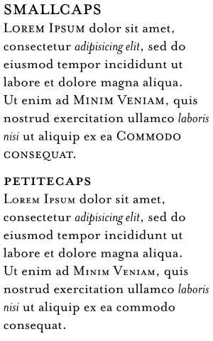
Typically, the height of a small capital glyph will be one ex, the same height as most lowercase characters in the font. In fonts with relatively low x-height, however, small caps may be somewhat larger than this. For example, in some Tiro Typeworks fonts, small caps glyphs are 30% larger than x-height, and 70% the height of full capitals. To differentiate between these two alternatives, the x-height form is sometimes called petite caps,[2] (Petite Caps) preserving the name "small caps" for the larger variant. OpenType fonts can define both forms via the "small caps" and the "petite caps" features. When the support for the petite caps feature is absent from a desktop-publishing program, x-height small caps are often substituted.
Many word processors and text-formatting systems include an option to format text in caps and small caps, which leaves uppercase letters as they are, but converts lowercase letters to small caps. How this is implemented depends on the typesetting system; some can use true small caps glyphs that are included in modern professional font sets; but less complex digital fonts do not have a small-caps glyphs, so the typesetting system simply reduces the uppercase letters by a fraction (often 1.5 to 2 points less than the base scale). However, this will make the characters look somewhat out of proportion. A work-around to simulate real small capitals is to use a one-level bolder version of the small caps generated by such systems, to match well with the normal weights of capitals and lowercase, especially when such small caps are extended about 5% or letter-spaced a half point or a point.
Uses
Small caps are often used for sections of text that should be emphasized and where a run of uppercase capital letters would appear jarring to the reader. For example, the style of many American publications, including the Atlantic Monthly and USA Today, is to use small caps for acronyms and initialisms longer than three letters—thus "U.S." in normal caps, but "ɴᴀᴛᴏ" in small caps. The initialisms ᴄᴇ, ʙᴄᴇ, ᴀᴍ, and ᴘᴍ are often typeset in small caps.
In printed plays and stage directions, small caps are usually used for the names of characters before their lines.
French and some British publications use small caps to indicate the surname by which someone with a long formal name is to be designated in the rest of a written work. An elementary example is Don Qᴜɪxᴏᴛᴇ de La Mancha. Similarly, they are used for those languages in which the surname comes first, such as the Romanization Mᴀᴏ Zedong.
In many versions of the Old Testament of the Bible, the word "Lᴏʀᴅ" is set in small caps.[3] Typically, an ordinary "Lord" corresponds to the use of the word Adonai in the original Hebrew, but the small caps "Lᴏʀᴅ" corresponds to the use of Yahweh in the original; in some versions the compound "Lord Gᴏᴅ" represents the Hebrew compound Adonai Yahweh.
In zoological and botanical nomenclature, it is common use to print names of the family group in small caps.
Linguists use small caps to analyze the morphology and tag (gloss) the parts of speech in a sentence; e.g.,
She love-s you. 3fs.subj love-3sg.pres.ind 2
The Bluebook prescribes small caps for some titles and names in United States legal citations.
In many books, when one part of the book mentions another part of the same book, or mentions the work as a whole, the name is set in small caps (sometimes typesetting small caps after transforming to Title Case), not italics and not roman type within quotation marks. For example, articles in The World Book Encyclopedia refer to the encyclopedia as a whole and to the encyclopedia's other articles in small caps, as in the "Insurance" article's direction, at one point, to "See Nᴏ-Fᴀᴜʟᴛ Iɴsᴜʀᴀɴᴄᴇ", "No-Fault Insurance" being another of the encyclopedia's articles.
Criticism
George Eliot's 1856 essay "Silly Novels by Lady Novelists" is critical of Victorian novelists for using excessive small caps and italics to indicate unnecessary emphasis.[4]
Computer support for small caps
Fonts
The OpenType font standard provides support for transformations from normal letters to small caps by two feature tags, smcp and c2sc.[5] A font may use the tag smcp to indicate how to transform lower-case letters to small caps, and the tag c2sc to indicate how to transform upper-case letters to small caps.
Small capitals are not found in all fonts, as they were primarily used within body text and so are often not found in fonts that are not intended for this purpose, such as many sans-serif families.[6] Some font families, especially digitisations of older metal type designs, often lack small caps in bold or italics, only having them in the regular or roman style.[7] This is because they were normally only used in body text and cutting bold and italic small caps was thought unnecessary.[lower-alpha 1]
Word processors
Professional desktop publishing applications supporting genuine small caps include Quark XPress, and Adobe Creative Suite applications.[10]
Most word processing applications, including Microsoft Word and Pages, do not automatically substitute true small caps when working with OpenType fonts such as Hoefler Text that include them, instead generating scaled ones. These applications must therefore work with fonts that have true small caps as a completely separate style, similar to bold or italic. Few free and open-source fonts have this feature; an exception is Georg Duffner's EB Garamond, in open beta.[11] LibreOffice Writer started allowing true small caps for OpenType fonts since version 5.3, they can be enabled via a syntax used in the Font Name input box, including font name, a colon, feature tag, an equals sign and feature value, for example, EB Garamond 12:smcp=1,[12][13] and version 6.2 added a dialog to switch.[14]
Unicode
Although small caps are not usually "semantically important", the Unicode standard does define a number of "small capital" characters in the IPA extensions, Phonetic Extensions and Latin Extended-D ranges (0250–02AF, 1D00–1D7F, A720–A7FF). These characters, with official names such as latin letter small capital a, are meant for use in phonetic representations. For example, ʀ represents a uvular trill.
As of Unicode 13.0, the only character missing from the ISO basic Latin alphabet is the small-capital version of X.[15][16]
The following table shows the existing Unicode small capital characters for the ISO basic Latin alphabet:
| A | B | C | D | E | F | G | H | I | J | K | L | M | N | O | P | Q | R | S | T | U | V | W | X | Y | Z |
| ᴀ | ʙ | ᴄ | ᴅ | ᴇ | ꜰ | ɢ | ʜ | ɪ | ᴊ | ᴋ | ʟ | ᴍ | ɴ | ᴏ | ᴘ | ꞯ | ʀ | ꜱ | ᴛ | ᴜ | ᴠ | ᴡ | – | ʏ | ᴢ |
Additionally, a few less-common Latin characters, several Greek characters and a single Cyrillic character used in Latin-script notation (ᴫ, small capital Л) also have small capitals encoded:
| Latin | ||||||||||||||||||
| Æ | Ƀ | Ð | Ʒ | Ǝ | Ɠ | Ɨ | Ł | ꟽ/Ɯ | Œ | Ɔ | Ȣ | ꝵ | Ʉ | |||||
| ᴁ | ᴃ | ᴆ | ᴣ | ⱻ | ʛ | ᵻ | ᴌ | ꟺ | ᴎ | ɶ | ᴐ | ᴕ | ᴙ | ᴚ | ʁ | ꭆ | ꝶ | ᵾ |
| Greek | ||||||||||
| Γ | Δ | Θ | Λ | Ξ | Π | Ρ | Σ | Φ | Ψ | Ω |
| ᴦ | – | – | ᴧ | – | ᴨ | ᴩ | – | – | ᴪ | ꭥ |
Superscript small caps are the following: ᶦ ᶧ ᶫ ᶰ ʶ ᶸ.
Combining small caps are the following: ◌ᷛ ◌ᷞ ◌ᷟ ◌ᷡ ◌ᷢ.
Since these glyphs come from different ranges, they may not be of the same size and style, because few typefaces supply all of them.
These "small capital" characters should not be confused with the Unicode Standard's typographical convention of using small caps for formal Unicode character names in running text. For example, the name of U+0416 Ж is conventionally shown as CYRILLIC CAPITAL LETTER ZHE.[17]
Cascading Style Sheets
Small caps can be specified in the web page presentation language CSS using font-variant: small-caps;. For example, the HTML
<span style="font-variant: small-caps;">Jane Doe</span><span style="font-variant: small-caps;">AaBbCcDdEeFfGgHhIiJjKkLlMmNnOoPpQqRrSsTtUuVvWwXxYyZz</span>
renders as
- Jane Doe
- AaBbCcDdEeFfGgHhIiJjKkLlMmNnOoPpQqRrSsTtUuVvWwXxYyZz.
Since the CSS styles the text, and no actual case transformation is applied, readers are still able to copy the normally-capitalized plain text from the web page as rendered by a browser.
CSS3 can specify OpenType small caps (given the 'smcp' feature in the font replaces glyphs with proper small caps glyphs) by using font-variant-caps: small-caps;, which is the recommended way, or font-feature-settings: 'smcp';, which is (as of May 2014) the most widely used way. If the font does not have small-cap glyphs, lowercase letters are displayed.
<span style="font-variant-caps: small-caps;">Jane Doe</span><span style="font-feature-settings: 'smcp';">AaBbCcDdEeFfGgHhIiJjKkLlMmNnOoPpQqRrSsTtUuVvWwXxYyZz</span>
renders as
- Jane Doe
- AaBbCcDdEeFfGgHhIiJjKkLlMmNnOoPpQqRrSsTtUuVvWwXxYyZz
(font-variant-caps: small-caps; is exactly equivalent to font-variant: small-caps;.)
Computer support for petite caps
Fonts
The OpenType font standard provides support for transformations from normal letters to petite caps by two feature tags, pcap and c2pc.[18] A font may use the tag pcap to indicate how to transform lower-case letters to petite caps, and the tag c2pc to indicate how to transform upper-case letters to petite caps.
Desktop publishing applications, as well as web browsers, can use these features to display petite caps. However, only a few currently do so.[19] LibreOffice can use the fontname:pcap=1 method.
References
- Smith, Margaret M. "The Pre-history of 'Small caps': from all caps to smaller capitals to small caps". Journal of the Printing Historical Society. 22 (79–106).
- "OpenType Layout tag registry". Microsoft.com. 2008-11-19. Retrieved 2014-05-15.
- Holman Illustrated Bible Dictionary. Nashville, TN: Holman Bible Publishers. 2003. p. 1046. ISBN 0-8054-2836-4.
- "Silly Novels by Lady Novelists", The Westminster Review (October 1856), Vol. 66 (old series), Vol. 10 (new series), pp. 442–461
- ""Microsoft OpenType Layout tag registry"". Microsoft.com. 2017-01-04. Retrieved 2017-07-29.
- Shaw, Paul. "The Evolution of Metro and its Reimagination as Metro Nova". Typographica. Retrieved 21 December 2016.
- Heller, Steven. "Jonathan Hoefler on type design". Design Dialogues. Retrieved 2 August 2016.
- Williamson, Hugh (1956). Methods of Book Design. London: Oxford University Press. pp. 75–104.
- Hoefler, Jonathan. "Hoefler Text Font Features: Grand Italics". Hoefler & Co. Archived from the original on 15 April 2019. Retrieved 15 April 2019.
- "What's OpenType?". Hoefler & Frere-Jones. Retrieved 11 August 2014.
- Duffner, Georg. "Design of EB Garamond". Retrieved 11 August 2014.
- "Release Notes 5.3". Wiki. The Document Foundation. Retrieved 29 December 2016.
- "Opentype features now enabled? Documentation?". Ask LibreOffice. Retrieved 29 December 2016.
- "ReleaseNotes/6.2". Wiki. The Document Foundation. Retrieved 26 February 2019.
- "Unicode character database". The Unicode Standard. Retrieved 2016-07-09.
- "Enumerated Versions of The Unicode Standard". The Unicode Standard. Retrieved 2019-04-10.
- Appendix A, The Unicode Standard 5.2.0
- ""Microsoft OpenType Layout tag registry"". Microsoft.com. 2008-10-08. Retrieved 2014-05-15.
- "OpenType feature support"". "Typotheque. Retrieved 2014-05-15.
- ""W3C Recommendation: CSS Fonts Module Level 3"". W3.org. 2018-09-20. Retrieved 2019-11-21.
- Hugh Williamson's Methods of Book Design (1956) notes that "one of the most conspicuous defects" of contemporary book faces was that they did not generally feature italic small capitals: "these would certainly be widely used if they were generally available". Exceptions of the time included Linotype's Pilgrilm, Janson and their cut of Monotype Garamond, and from Monotype Romulus.[8] More have appeared since, especially in the digital period, such as in Hoefler Text.[7][9]
Further reading
- Willberg, Hans and Forssman, Friedrich (2010). Lesetypografie. Verlag Hermann Schmitz, Mainz. ISBN 978-3-87439-800-8.
- Bringhurst, Robert (2004). The Elements of Typographic Style (version 3.0). Vancouver: Hartley & Marks. ISBN 0-88179-205-5.
External links
- A proposal for supplementary characters in Unicode: Medieval Nordic. Subrange 3: Small capitals at Medieval Unicode Font Initiative
| Page | |||||||||
|---|---|---|---|---|---|---|---|---|---|
| Paragraph | |||||||||
| Character |
| ||||||||
| Classifications |
| ||||||||
| Punctuation | |||||||||
| Typesetting | |||||||||
| Typographic units | |||||||||
| Digital typography | |||||||||
| Related articles | |||||||||
| Related tables |
| ||||||||
| |||||||||