Monospaced font
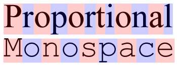
A monospaced font, also called a fixed-pitch, fixed-width, or non-proportional font, is a font whose letters and characters each occupy the same amount of horizontal space.[1] This contrasts with variable-width fonts, where the letters and spacings have different widths.
Monospaced fonts are customary on typewriters and for typesetting computer code.
Monospaced fonts were widely used in early computers and computer terminals, which often had extremely limited graphical capabilities. Hardware implementation was simplified by using a text mode where the screen layout was addressed as a regular grid of tiles, each of which could be set to display a character by indexing into the hardware's character map. Some systems allowed colored text to be displayed by varying the foreground and background color for each tile. Other effects included reverse video and blinking text. Nevertheless, these early systems were typically limited to a single console font.
Even though computers can now display a wide variety of fonts, the majority of IDEs and software text editors employ a monospaced font as the default typeface. This increases the readability of source code, which is often heavily reliant on distinctions involving individual symbols, and makes differences between letters more unambiguous in situations like password entry boxes where typing mistakes are unacceptable.[2] Monospaced fonts are also used in terminal emulation and for laying out tabulated data in plain text documents. In technical manuals and resources for programming languages, a monospaced font is often used to distinguish code from natural-language text. Monospaced fonts are also used by disassembler output, causing the information to align in vertical columns.
Optical character recognition has better accuracy with monospaced fonts. Examples are OCR-A and OCR-B.
The term modern is sometimes used as a synonym for monospace generic font family. The term modern can be used for a fixed-pitch generic font family name, which is used in OpenDocument format (ISO/IEC 26300:2006) and Rich Text Format.[3][4]
Examples of monospaced fonts include Courier, Courier New, Lucida Console, Monaco, Consolas and Inconsolata.
Other uses
In biochemistry, monospaced fonts are preferred for displaying nucleic acid and protein sequences, as they ensure that the representation of every nucleotide or amino acid occupies the same amount of space. Alignment of the letters makes it easier to compare different sequences visually.
Both screenplays and stage play scripts frequently use monospaced fonts, to make it easier to judge the time a script will last for from the number of pages. The industry standard is 12 point Courier. A tradition holds that on this format one page of script will take one minute of screen or stage time.[14]
Monospaced fonts are frequently used in tablature music for guitar and bass guitar. Each line in a tabulature represents a guitar string, which requires that chords played across multiple strings be tabbed in vertical sequence, a feat accomplished only with the predictability of fixed width.
References
- Rosendorf, Theodore (2009). The Typographic Desk Reference. New Castle, Delaware: Oak Knoll Press. p. 12. ISBN 978-1-58456-231-3.
- Spolsky, Joel. "User Interface Design For Programmers". Joel On Software. Retrieved 17 November 2014.
- OpenDocument v1.1 specification (PDF), retrieved 2010-05-01.
- Microsoft Corporation (June 1992), Microsoft Product Support Services Application Note (Text File) – GC0165: RICH-TEXT FORMAT (RTF) SPECIFICATION (TXT), retrieved 2010-03-13.
- "A New Face for Adobe". Typekit Blog. Adobe. Retrieved 8 January 2016.
- Shinn, Nick. "Shinntype Modern Suite specification" (PDF). Shinntype. Retrieved 16 October 2015.
- Strizver, Elaine. "Proportional vs. Tabular Figures". fonts.com. Monotype Imaging. Retrieved 4 August 2014.
- "Revenue". Hoefler & Frere-Jones. Retrieved 4 August 2014.
- "Gotham Numerics". Hoefler & Frere-Jones. Retrieved 27 September 2014.
- "Gotham: Numerics". Hoefler & Frere-Jones. Retrieved 4 August 2014.
- Butterick, Matthew. "Alternate figures: consider the context". Butternick's Practical Typography.
- Saller, Carol. "Old-Style Versus Lining Figures". Chronicle of Higher Education. Retrieved 4 August 2014.
- Bergsland, David. "Using numbers in the proper case". Design & Publishing Center. Retrieved 4 August 2014.
- August, John. "How accurate is the page-per-minute rule?". Retrieved 17 November 2014.
External links
| Page | |||||||||
|---|---|---|---|---|---|---|---|---|---|
| Paragraph | |||||||||
| Character |
| ||||||||
| Classifications |
| ||||||||
| Punctuation | |||||||||
| Typesetting | |||||||||
| Typographic units | |||||||||
| Digital typography | |||||||||
| Related articles | |||||||||
| Related tables |
| ||||||||
| |||||||||