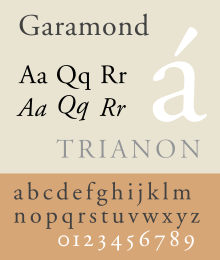
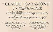
Garamond
Garamond is a group of many old-style serif typefaces, named for sixteenth-century Parisian engraver Claude Garamond (generally spelled as Garamont in his lifetime). Garamond-style typefaces are popular and often used, particularly for printing body text and books.
 | |
| Category | Serif |
|---|---|
| Classification | Old-style |
| Designer(s) | Claude Garamond Also: Robert Granjon Jean Jannon |
| Shown here | Adobe Garamond Pro (regular style based on Garamond's work; italic on the work of Robert Granjon) |
Garamond worked as an engraver of punches, the masters used to stamp matrices, the moulds used to cast metal type.[lower-alpha 1] His designs followed the model of an influential design cut for Venetian printer Aldus Manutius by his punchcutter Francesco Griffo in 1495, and helped to establish what is now called the old-style of serif letter design, letters with a relatively organic structure resembling handwriting with a pen, but with a slightly more structured and upright design.
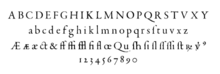
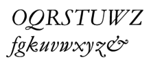
Some distinctive characteristics in Garamond's letterforms are an 'e' with a small eye and the bowl of the 'a' which has a sharp hook upwards at top left.[1] Other general features are limited but clear stroke contrast and capital letters on the model of Roman square capitals. The 'M' is slightly splayed with outward-facing serifs at the top (sometimes only on the left) and the leg of the 'R' extends outwards from the letter. The x-height (height of lower-case letters) is low, especially at larger sizes, making the capitals large relative to the lower case, while the top serifs on the ascenders of letters like 'd' have a downward slope and ride above the cap height.[1] The axis of letters like the ‘o’ is diagonal and the bottom right of the italic 'h' bends inwards.[2]
Following an eclipse in popularity in the eighteenth and nineteenth century, many modern revival faces in the Garamond style have been developed. It is common to pair these with italics based on those created by his contemporary Robert Granjon, who was well known for his proficiency in this genre.[3] However, although Garamond himself remains considered a major figure in French printing of the sixteenth century, historical research has increasingly placed him in context as one artisan punchcutter among many active at a time of rapid production of new typefaces in sixteenth-century France, and research has only slowly developed into which fonts were cut by him and which by contemporaries; Robert Bringhurst commented that "it was a widespread custom for many years to attribute almost any good sixteenth-century French font" to Garamond.[4][5][6] As a result, while "Garamond" is a common term in the printing industry, the terms "French Renaissance antiqua" and "Garalde" have been used in academic writing to refer generally to fonts on the Aldus-French Renaissance model by Garamond and others.[7][8] In particular, many 'Garamond' revivals of the early twentieth century are actually based on the work of a later punch-cutter, Jean Jannon, whose noticeably different work was for some years misattributed to Garamond. Modern Garamond revivals also often add a matching bold and 'lining' numbers at the height of capital letters, neither of which were used during the Renaissance.[9][10][lower-alpha 2]
The most common digital font named Garamond is Monotype Garamond. Developed in the early 1920s and bundled with many Microsoft products, it is a revival of Jannon's work.
History
Garamond’s life and career
Garamond cut type in the 'roman', or upright style, in italic, and Greek. In the period of Garamond's early life roman type had been displacing the blackletter or Gothic type which was used in some (although not all) early French printing.[14][15][16] (Though his name was generally written as 'Garamont' in his lifetime, the spelling 'Garamond' became the most commonly used form after his death.[17][18] Professor Hendrik Vervliet, the leading contemporary expert on French Renaissance printing, uses Garamont consistently.)
The roman designs of Garamond which are his most imitated were based on a font cut around 1495 for the Venetian printer Aldus Manutius by engraver Francesco Griffo.[19][20] This was first used in the book De Aetna, a short work by poet and cleric Pietro Bembo which was Manutius' first printing in the Latin alphabet after a long series of publications of classics of Greek literature that won him an international reputation. Historian Beatrice Warde has assessed De Aetna as something of a pilot project, a small book printed to a higher standard than Manutius' norm.[21][22][23] Among other details, this font popularised the idea that in printing the cross-stroke of the 'e' should be level instead of slanting upwards to the right like handwriting, something imitated in almost all type designs since.[19][18]
French typefounders of the 16th century assiduously examined Manutius's work (and, it is thought, De Aetna in particular) as a source of inspiration.[23][24] This examination extended to in some cases copying his first 'M' shown in De Aetna which had no serif pointing out of the letter at top right, a design considered very eccentric.[25][26] (It has been suggested to be the result of defective casting, especially since Manutius' later fonts do not show it.) The Griffo font was only cut in a single size, so French punchcutters made modified versions of the design to suit different sizes, with a more delicate structure at larger sizes.
The period from 1520 to around 1560, encompassing Garamond's career, was an extremely busy period for typeface creation. Many fonts were cut, some such as Robert Estienne's for a single printer's exclusive use, others sold or traded between them. Confusion about which engravers created which typefaces is natural since many were active over this time, creating typefaces not just in the Latin alphabet in roman and italic, but also in Greek and Hebrew for scholarly use. These included Garamond himself, Granjon, Guillaume Le Bé, particularly respected for his Hebrew fonts,[27][28] Pierre Hautin, Antoine Augereau (who may have been Garamond's mentor), Estienne's stepfather Simon de Colines and others.[29] This period saw the creation of a pool of high-quality punches and matrices that would supply the French and European printing industry, to a large extent, for the next two centuries.[23][29]
Very little is known about Garamond's life or work before 1540, although he wrote in a preface of having cut punches for type since childhood.[30] He worked for a variety of employers on commission, creating punches and selling matrices to publishers and the government.[31] Garamond's typefaces were popular abroad, and replaced Griffo's original roman type at the Aldine Press in Venice.[24][32] He also worked as a publisher and bookseller.[30][33][34] By 1549, a document from theologian Jean de Gagny specified that the goldsmith Charles Chiffin, who had cut an italic for his private printing press, should receive payment at the rate of "the best punchcutter in this city after master Claude Garamont", clearly showing that he was considered the pre-eminent punchcutter in Paris at this time.[25] Vervliet concludes that Garamond created thirty-four typefaces for which an attribution can be confidently made (17 roman, 7 italic, 8 Greek, 2 Hebrew) and another three for which the attribution is problematic (one each of roman, Greek and Hebrew).[29] If Garamond distributed specimens of his typefaces, as later punchcutters and typefounders did, none is known to survive, although one unsigned specimen in the Plantin-Moretus Museum collection, presenting a synopsis of his late Paragonne type, may have been made around the time of his death or soon after.[35]
While some records such as Christophe Plantin's exist of what exact types were cut by Garamond himself, many details of his career remain uncertain: early estimates placed Garamond's date of birth 1480, but modern opinion proposes much later estimates.[18] A document called the Le Bé Memorandum (based on the memories of Guillaume Le Bé, but collated by one of his sons around 1643) suggests that Garamond finished his apprenticeship around 1510.[36][37] This is considered unlikely by modern historians since his mother was still alive when he died in 1561 and little is known of him before around 1540.[18][30][38] It has been suggested that the first Roman types designed by Claude Garamond were a set created for Robert Estienne and first used by him around 1530–3, that were the first typefaces used in Paris to copy the Manutius model.[23] However, Vervliet suggests that these 'Estienne typefaces' were not designed by Garamond and that his career began somewhat later.[39][40][41][42] Vervliet suggests that the creator of this set of typefaces to a unified design may have been a 'Master Constantin', recorded in the Le Bé Memorandum as a master type designer of the period before Garamond but about whom nothing is otherwise known and to whom no obvious other body of work can be ascribed.[43][lower-alpha 3] If so, his disappearance from history (perhaps due to an early death, since all his presumed work appeared in just four years from 1530 to 1533) and the execution of Augereau on a charge of heresy in 1534 may have allowed Garamond's reputation to develop in the following decade.[44] (A counter-suggestion is that of Kay Amert, who proposed that Estienne's typefaces were variant states of ones used, and probably cut by, his stepfather Simon de Colines,[45][46] but Vervliet rejects this as unlikely: "it seems unlikely that Estienne would have parted from his punches or that Colines would have refurbished them to an inferior level."[47])
Italics
Garamond may have been less interested in italics, which at the time were conceived separately to roman types rather than designed alongside them as complementary matches.[48] While his italics have been considered less impressive than his roman typefaces, he (alongside, according to Vervliet, Granjon in particular) was one of the early printers to establish the modern tradition that the italic capitals should slope as the lower case does, rather than remain upright as Roman square capitals do.[lower-alpha 4][1]
Greek

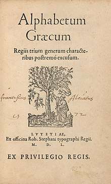
Garamond designed type for the Greek alphabet from the beginning of his attested career, but his most celebrated work in Greek, the Grecs du roi fonts, commissioned for the French government in 1540,[50] are very different to his Latin designs: they attempt to simulate the elegant handwriting of Cretan scribe Angelo Vergecio and include a vast variety of alternate letters and ligatures to achieve this.[51][52][53][54] This style is impractical for modern setting of body text, since it requires careful manual choice of characters for every word.[55][lower-alpha 5] Several 'Garamond' releases such as Adobe's contain Greek designs that are either a compromise between Garamond's upright Latin designs and his slanted Greek ones or primarily inspired by his Latin designs. The grecs du roi type, the contract for which survives, is the type with which Garamond enters the historical record, although it is clearly not the work of a beginner. Earlier fonts that may have been cut by Garamond have been suggested but the attribution is less certain.
After Garamond's death
Garamond died in 1561 and his punches and matrices were sold off by his widow. Purchasers included the Le Bé type foundry in Paris run by the family of Guillaume Le Bé and master printer Christophe Plantin of Antwerp who was in Paris at the time; the Frankfurt foundry often referred to by historians as Egenolff-Berner also came to acquire materials of Garamond's.[57][58][59][36] These sales spread Garamond's work and reputation across Europe, but the division of materials caused problems for printers: Le Bé's son is known to have written to Plantin's successor Moretus offering to trade matrices so they could both have complementary type in a range of sizes.[25][60] Egelhoff-Berner showcased various types of Garamond's and other French engravers in a specimen in 1592, which would later be a source for historians.[3][lower-alpha 6]
.jpg)
Plantin's collection of original Garamond punches and matrices survives at the Plantin-Moretus Museum in Antwerp, together with many other typefaces collected by Plantin from other typefounders of the period.[63] The collection has been used extensively for research, for example by historians Harry Carter and Hendrik Vervliet.[36] Carter's son Matthew would later describe his research as helping to demonstrate "that the finest collection of printing types made in typography's golden age was in perfect condition (some muddle aside) [along with] Plantin's accounts and inventories which names the cutters of his types."[64] Plantin also commissioned punchcutter Robert Granjon to create alternate characters for three Garamond fonts with shortened ascenders and descenders to allow tighter linespacing.[65]
Robert Granjon
Many modern revival fonts based on French renaissance printing are influenced by the work of Robert Granjon (c. 1513-90), particularly in italic. An engraver with a long and wide-ranging career, Granjon's work seems to have ranged much more widely than Garamond's focus on roman and Greek type, cutting type in italic, civilité (a cursive blackletter), and for the Vatican type in exotic alphabets including Arabic, Armenian and Hebrew. His career also took in stops in the Netherlands, Switzerland, Germany and finally for the last twelve years of his life Rome, where he ended his career in the service of the Vatican.
Vervliet comments that Granjon "laid the foundation for our image of the way an Italic should look." Although he was not quite the first designer to use the idea of italics having capitals sloped to complement the roman, he "solved successfully the problem of a balanced inclination of the capitals, a feature much ahead of the designs with a more irregular slope of his Viennese and Mainz predecessors...and even compared to...Garamont. A proper optical harmony of the angle of slope is characteristic for all Granjon’s Italics; it allowed the compositor to use whole lines of capitals without causing too much giddiness."[66][67] Granjon also cut many swash capitals, which Vervliet describes as "deliciously daring" and have often been copied, for instance in Robert Slimbach's revivals for Adobe (discussed below).[68][69]
Jean Jannon
In 1621, sixty years after Garamond's death, the French printer Jean Jannon released a specimen of typefaces that had some characteristics similar to the Garamond designs.[1][70] The French Royal Printing Office (Imprimerie Royale) appears to have bought matrices from him in 1641 in three large sizes, roman and italic at roughly 18, 24 and 36 point sizes. (The contract is actually made for one 'Nicholas Jannon', which historians have concluded to be a mistake.[71]) Despite the purchase, it is not clear that the office ever much used Jannon's type: historian James Mosley has reported being unable to find books printed by the Imprimerie that use more than two sizes of italic, although "it is not easy to prove a negative".[18][72] His type would later be misattributed to Garamond.[73] Jannon wrote in his specimen that:
Seeing that for some time many persons have had to do with the art [of printing] who have greatly lowered it ... the desire came upon me to try if I might imitate, after some fashion, some one among those who honourably busied themselves with the art, [men whose deaths] I hear regretted every day [Jannon mentions some eminent printers of the previous century] ... and inasmuch as I could not accomplish this design for lack of types which I needed ... [some typefounders] would not, and others could not furnish me with what I lacked [so] I resolved, about six years ago, to turn my hand in good earnest to the making of punches, matrices and moulds for all sorts of characters, for the accommodation both of the public and of myself.[25]
Jannon's career took place during a politically tense period. Jannon was a Protestant in mostly Catholic France. After apparently working with the Estienne family in Paris he set up an independent career as printer in Sedan in what is now north-eastern France, becoming printer for the Protestant Academy. By his report he took up punchcutting seriously in his thirties, although according to Williamson he would have cut decorative material and engravings at least before this.[74][17] Sedan the time enjoyed an unstable independence as a principality at a time when the French government had conceded through the Edict of Nantes to allowing a complicated system of restricted liberties for Protestants.[75] While acknowledging his talent and commissioning equipment from him, as documented by the surviving purchase order, it is known that authorities in 1644 raided an office in Caen where he had been commissioned to do printing.[76] Warde initially assumed that this was the source of the Jannon materials in the Imprimerie Nationale before the government's purchase order came to light.[17][25][73][77] Jannon's types and their descendants are recognizable by the triangular serifs on the top left of such characters as 'm', 'n' and 'r', which have a very steep slant in Jannon's design compared to Garamond's. The italics are also very different to Garamond's own or Granjon's, being much more ornate and with considerable variation in angle of the capitals.[25] Opinions of Jannon's engraving quality have varied; Warde found them "of slight value as a book face" (the surviving Jannon sizes were intended as display faces, cut at 18pt or larger) and Vervliet described them as "famous not so much for the quality of the design but as for the long-term confusion it created", although many reproductions of his work were successful in printing in the twentieth century.[78] Jannon cut far more types than those surviving in the Imprimerie collection: before the misattribution to Garamond, he was particularly respected for his engraving of an extremely small size of type, known for his workplace as sédanoise, which was popular.[74][79][80]
By the nineteenth century, Jannon's matrices had come to be known as the Caractères de l'Université (Characters of the University).[17][72][81] It has sometimes been claimed that this term was an official name designated for the Jannon type by Cardinal Richelieu,[82] while Warde in 1926 more plausibly suggested it might be a garbled recollection of Jannon's work with the Sedan Academy, which operated much like a university despite not using the name. Carter in the 1970s followed this conclusion.[71] Mosley, however, concludes that no report of the term (or much use of Jannon's matrices at all) exists before the nineteenth century, and it may originate from a generic term of the eighteenth century simply meaning older or more conservative typeface designs, perhaps those preferred in academic publishing.[81]
The fate of Garamond's work
.jpg)
The old-style typefaces of Garamond and his contemporaries and successors remained in use in printing for over two hundred years after Garamond's death, and became influential on Dutch printing during the period known as Dutch golden age, when Dutch printing was itself very influential across Europe. Dutch and German printers and punchcutters, however, often favoured more solid, darker designs than Garamond's, which would come to be known as the “Dutch taste” (“Goût Hollandois”) style.[83][84][85][86]
The matrices of sixteenth-century punchcutters such as Garamond and Granjon continued to be regularly used and kept in the stock of European typefounders until the end of the eighteenth century and in some areas into the nineteenth, and were shown prominently in the major French specimen books of the eighteenth century, those of typefounders Delacolonge,[87][88] Lamesle,[12] and Gando.[89] In Delacolonge's book, many fonts were shown in alternate versions with cut-down descenders for tighter linespacing.[87]
In 1756, Parisian typefounder Jean-Pierre Fournier, who had taken over the Le Bé foundry, wrote of his collection of vintage equipment that "I am the owner of the foundry of Garamond, the Le Bé family and Granjon. I shall be happy to display my punches and matrices to all those who are lovers of true beauty ... these are the types that made the reputations of the Estiennes, Plantin and the Elzevirs," and referred to an inventory that he said was in his possession that had been drawn up after Garamond's death in 1561.[90][91] (The comment was made in a journal during a public dispute with a fellow printer of more modern tastes who preferred to remain anonymous and may have been his younger brother.[17][92]) Unfortunately, the 1561 inventory does not survive, although some later inventories do, nor did Fournier issue any full specimen of his foundry; Lane suggests his foundry may have become rather inactive.[35]
Old-style serif typefaces by Garamond and his contemporaries finally fell out of use altogether with the arrival of what is now called the Didone, or modern-face, style of printing in the eighteenth and early nineteenth centuries, promoted by the Didot family in France and others.[17][93][94] This favoured a much more geometric, constructed style of letter which could show off the increasingly refined paper and printing technologies of the period.[95] Lane suggests Fournier's type foundry may have finally disposed of its ancient assets around 1805; in contrast, the collections of the Plantin-Moretus Museum survive almost intact.[35] Mosley comments:
The upheavals of the Revolution coincided with the major shift in the style of printing types that is associated with the family of Didot, and the stock of old materials abruptly lost its value, except as scrap. Punches rust, and the copper of matrices is recyclable. All traces of the early types that had been in the hands of the trade typefounders like Le Bé, Sanlecque and Lamesle in Paris vanished completely. No relics of them were saved anywhere, except in commercial centres that had become relative backwaters, like Antwerp, where the Plantin-Moretus printing office piously preserved the collection of its founder ... the term caractères de l'Université became attached by default to the set of apparently early matrices that had survived, its provenance forgotten, in the mixed stock of materials of the national printing-office.[81]
Garamond's reputation remained respected, even by members of the Didot family whose type designs came to dominate French printing.[18]
Revival era
A revival of interest in 'old-style' serif typefaces took place in the late nineteenth and early twentieth century. This saw a revival of the Imprimerie royale typefaces (the office was now called the Imprimerie nationale following the end of the French monarchy), which, unlike Garamond's own work, had survived in Paris. The attribution came to be considered certain by the Imprimerie's director Arthur Christian, who commissioned the cutting of additional sizes in a matching style.[18]
Early revivals were often based directly on the Imprimerie nationale types, one of the first by Peignot and then by American Type Founders (ATF).[96][97] These revivals could be made using pantograph machine engraving systems, which gave a cleaner result than historic typefaces whose master punches had been hand-carved, and allowed rapid development of a family in a large range of sizes.[98][99] In addition, the new hot metal typesetting technology of the period created increasing availability and demand for new fonts. Among hot metal typesetting companies, Monotype's branches in Britain and the United States brought out separate versions, and the American branch of Linotype licensed that of ATF.[25][100]
A number of historians began in the early twentieth century to question if the Imprimerie nationale Latin-alphabet type was really the work of Garamond, as the Grecs du Roi undoubtedly were. Doubt was raised by French historian Jean Paillard, but he died in the First World War soon after publishing his conclusions in 1914 and his work remained little-read.[17][18][101][102] ATF's historian Henry Lewis Bullen secretly doubted that the 'Garamond' his company was reviving was really Garamond's work, noting that he had never seen it in a sixteenth-century book. He discussed his concerns with ATF junior librarian Beatrice Warde, who would later move to Europe and become a prominent writer on printing advising the British branch of Monotype.[77][82][103]
In a 1926 paper published on the British typography journal The Fleuron, Beatrice Warde revealed her discovery that the Imprimerie nationale type had been created by Jean Jannon, something she had discovered by examining printing credited to him in London and Paris and through reading the work of Paillard, and perhaps with advice from French bibliographer Marius Audin.[25][103][17][104] (Warde's article was originally published pseudonymously as the work of 'Paul Beaujon', a persona Warde later said she imagined to have "[a] long grey beard, four grandchildren, a great interest in antique furniture and a rather vague address in Montparesse." Typifying her sense of humour, she reported her conclusions to Morison, a convert to Catholicism, with a telegram beginning "JANNON SPECIMEN SIMPLY GORGEOUS SHOWS ALL SIZES HIS TYPES WERE APPROPRIATED BY RAPACIOUS PAPIST GOVERNMENT ..."[105] She also noted in later life that some of her readers were surprised to see an article supposedly by a Frenchman quoting The Hunting of the Snark.[106])
By the time Warde's article was published some revivals had been released that were more authentic revivals of Garamond's work, based on period books and printing specimens. The German company Stempel brought out a crisp revival of the original Garamond typefaces in the 1920s, inspired by a rediscovered specimen from the Egenolff-Berner foundry in Frankfurt, as did Linotype in Britain.[107][lower-alpha 8]
Timeline
.jpg)
The Renaissance
- 1470 – first book printed in France, by a Swiss/German team at the Sorbonne, Paris.[110] Early books printed in France generally use type of a blackletter design or roman type with blackletter characteristics.
- 1496 – Aldus Manutius publishes De Aetna, a short text of poetry that serves as his first printing in the Latin alphabet. Its roman type sets a standard that would later be imitated by French printers.[111]
Late Renaissance
- 1510 – Garamond may have been born around this time.
- 1530 – Robert Estienne begins to publish in a new and more elegant style of 'roman' type, influenced by De Aetna with its asymmetrical 'M'.
- 1540 – Garamond first clearly enters the historical record, being advanced money to cut the Grecs du Roi type.
- 1561 – Death of Garamond.
- 1563 – Christophe Plantin buys matrices and other equipment in Paris at auction, some from Garamond's widow, for his partnership in Antwerp. Other equipment is bought by other Parisian and German printers; a specimen sheet identifying his types is issued by a Frankfurt foundry in 1592.
- 1560–70s – The work of Garamond and his contemporaries becomes very influential in the Low Countries and western Germany. A decline sets into the production of new typefaces, probably mostly due to simple saturation of the market with typefaces of acceptable quality, and possibly also due to economic and religious factors causing the emigration of printers and typefounders to other countries.[29]
Early modern period
- 1580 – birth of Jannon
- 1621 – Jannon issues a specimen of his type.
- 1640 – Jannon leaves Sedan for Paris.[112]
- 1641 – foundation of the Imprimerie Royale, which buys matrices from Jannon
- 1644 – Jannon's printing office in Caen is raided by authorities concerned that he may have been publishing banned material. Jannon is not imprisoned, but returns to Sedan.[112]
- 1658 – death of Jannon[25]
Eighteenth century
- 1756 – Parisian printer Jean-Pierre Fournier quotes from the 1561 inventory of Garamond's work and writes about his possession of Garamond's equipment. However, his extensive collections are dispersed after his death in 1783 and ultimately 'traditional' old-style type falls out of use in France around the end of the century.
Early revival era
- Late nineteenth century – revival in interest in 'old-style' typefaces such as the Caslon type (1730s, England) and that of Jenson (1470s, Venice).
- 1912 – revival of the Imprimerie Royale (now Imprimerie nationale, following the revolution) type by the Peignot foundry.[18] A revival by Ollière of "Garamond" type based on photographing sixteenth-century books follows
- 1914 – Jean Paillard writes and Ollière publishes an essay showcasing Ollière's Garamond revival arguing that the Imprimerie nationale type was not created by Garamond but his work attracts little attention.[102][18] He is killed serving in the First World War a few months later.
- 1920 – a copy of the 1592 Berner specimen of typefaces is published in facsimile.[18]
- 1923 – ATF issue a specimen of their Garamond revival, in development for several years prior.[18] ATF's historian Henry Bullen privately tells Beatrice Warde, then a junior librarian, that he suspects that Garamond had nothing to do with the type, since he had never seen it in a contemporary book, but has no better candidate for its creator. Warde subsequently moves to Europe, becoming a freelance writer on printing and adviser to Monotype in London.
- 1925 – Based on the Egelhoff-Berner specimen, Stempel Garamond is released in Germany: later also released by Linotype, it is the first Garamond revival actually based on his work.
- 1923 – Monotype Garamond is published based on the Imprimerie nationale type.
- 1926 – Warde discovers and reveals that the Imprimerie nationale type was created by Jannon, and that all revivals based on it are not directly based on Garamond's work.
Contemporary versions
Based on Garamond's design
Adobe Garamond
Released in 1989, Adobe Garamond is designed by Robert Slimbach for Adobe Systems, based on a Roman type by Garamond and an italic type by Robert Granjon.[113][114][115][116][117][118] The font family contains regular, semibold, and bold weights and was developed through viewing fifteenth-century equipment at the Plantin-Moretus Museum. Its quite even, mature design attracted attention on release for its authenticity to Garamond's work, a contrast to the much more aggressive ITC Garamond popular at the time.[119][120][121] The OpenType version of the font family was released in 2000 as Adobe Garamond Pro, with enhanced support for its alternate glyphs such as ligatures, small caps and italic swash capitals, and is sold through Adobe's Adobe Fonts service. It is one of the most popular versions of Garamond in books and fine printing.[122]
Garamond Premier
Slimbach started planning for a second interpretation of Garamond after visiting the Plantin-Moretus Museum in 1988, during the production of Adobe Garamond. He concluded that a digital revival would not be definitive unless it offered optical sizes, with different fonts designed for different sizes of text.[123][124][125] Unable to create such a large range of styles practically with the technology and business requirements of the 1980s, he completed the project in 2005 with several optical sizes, each designed in four weights (regular, medium, semibold and bold, with an additional light weight for display sizes) using the OpenType font format.[126][127][128] It features glyph coverage for Central European, Cyrillic and Greek characters including polytonics.[128][129][130] Professor Gerry Leonidas, an expert in Greek-language printing, described it in 2005 as "bar none, the most accomplished typeface you can get for complex Greek texts".[131] Adobe executive Thomas Phinney characterized Garamond Premier as a "more directly authentic revival" than their earlier Garamond, which he described as "a more restrained and modernized interpretation".[132]
Stempel Garamond
A 1920s adaptation created by the Stempel Type Foundry and released for hot metal typesetting by Linotype, that has remained popular. It is sharp, somewhat angular design with a crisp hook rather than a teardrop at top left of the 'a'. Stempel Garamond has relatively short descenders, allowing it to be particularly tightly linespaced.[25][100][133] An unusual feature is the digit 0, which has reversed contrast, with the thickest points of the number on the top and bottom of the digit to make it more distinguishable from an 'o'.[134][135] The Klingspor Museum credits it to Stempel's head of typeface development Dr. Rudolf Wolf.[136]
URW++ Garamond No. 8
Garamond No. 8 is a freeware version of Garamond contributed by URW++ to the Ghostscript project, based on Stempel Garamond.[lower-alpha 9] Featuring a bold weight, small capitals, optional text figures and automatic ligature insertion, it is particularly popular in the TeX community and is also included on some Linux distributions.[138] Originally released as a PostScript Type 1, it has been converted into the TrueType format, usable by most current software.[139] It is distributed under the AFP license, which allows it to be used freely (without support) but not sold or have its distribution charged for.[140]
Granjon
Granjon, designed by George W. Jones for the English branch of Linotype, follows the Garamond/Granjon style of roman and italic, based on a 1582 history textbook and also influenced by Caslon.[25][141][142][143][144] It was the favourite Garamond revival of many in the twentieth century, including Warde and Walter Tracy.[145]
Jones also developed for Linotype Estienne, a delicate revival based on Robert Estienne's fonts of the 1530s discussed above, with very long ascenders and descenders, which was less popular; as of 2017 it has not been digitised by Linotype.[146] Williamson suggests that in body text it failed to adapt the style of a large letter effectively down to body text size, producing a design with an extremely small x-height.[147][148]
Sabon
Sabon is a Garamond revival designed by Jan Tschichold in 1964, jointly released by Linotype, Monotype and Stempel in 1967.[149][150][151] It is named after Jacques Sabon, a Frankfurt-based printer, who introduced the typefaces of Garamond and his contemporaries to German printing.[152] An unusual feature of many releases of Sabon is that the italic, based on Granjon's work, is wider than most normal italics, at the same width as the roman style.[153] This suited Linotype's hot metal typesetting system.[3] Later Sabon versions, such as Jean François Porchez's Sabon Next, have not always maintained this principle. Porchez and Mosley, as part of Porchez's research into Sabon, suggest that aspects of its design may have been copied from a font by Guillaume Le Bé, a large-size specimen of which he had previously reproduced in a textbook.[151]
Berthold Garamond
A 1972 revival for phototypesetting issued by H. Berthold and designed by Günter Gerhard Lange.[154][155]
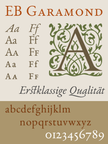
EB Garamond
The EB Garamond (»Egenolff-Berner-Garamond«), released by Georg Duffner in 2011 under the Open Font License, is a free software implementation of Garamond.[156] Duffner based the design on a specimen printed by Egenolff-Berner in 1592, with italic and Greek characters based on Robert Granjon's work, as well as the addition of Cyrillic characters and OpenType features such as swash italic capitals and schoolbook alternates.[157] It is intended to include multiple optical sizes, as of 2014 including fonts based on the 8 and 12 point forms on the 1592 specimen. It has been described as "one of the best open source fonts" by prominent typeface designer Erik Spiekermann.[158] As Georg Duffner couldn't complete the bold weights for personal reasons, the project was continued by Octavio Pardo.[159][lower-alpha 10]
Based on Jannon's design
ATF Garamond/Garamond No. 3
American Type Founders created a revival of the Imprimerie Nationale fonts from around 1917, which was designed in-house by its design department led by Morris Fuller Benton under the influence of its historian and advisor Henry Lewis Bullen.[162][163] It received a sumptuous showing, marketed especially towards advertisers, in ATF's 1923 specimen book.[164] Also involved in the design's development was book and advertising designer T.M. Cleland, who created a set of matching borders and ornaments, and according to Warde and Garnett also designed the swash characters.[142][25][lower-alpha 11]
While ATF's handset foundry type release was initially popular, the design became particularly known to later users under the name of "Garamond No. 3”, as a hot metal adaptation that was licensed to Linotype's American branch and sold from around 1936. More practical to use than ATF's handset foundry type, the number distinguished it from two versions of Stempel Garamond which Linotype also sold.[108][166] It was the Garamond revival preferred by prominent designer Massimo Vignelli.[167]
Several digitisations have been made of both ATF's original Garamond and the Linotype adaptation, most notably a 2015 digitisation by van Bronkhorst with optical sizes and the original swash characters.[168][169][170] A loose adaptation with sans-serif companion by Christian Schwartz is the corporate font of Deutsche Bahn.[171]
Gallery
Images from American Type Founders' 1923 specimen book.


Monotype Garamond
Monotype's 1922-3 design, based on Jannon's work in the Imprimerie Nationale, is bundled with many Microsoft products.[172][173] Its italic, faithful to Jannon's, is extremely calligraphic, with a variable angle of slant and flourishes on several lower-case letters.[174] Its commercial release is more extensive than the basic Microsoft release, including additional features such as swash capitals and small capitals, although like many pre-digital fonts these are only included in the regular weight. Popular in the metal type era, its digitisation has been criticised for having too light a colour on the page for body text if printed with many common printing systems, a problem with several Monotype digitisations of the period.[175][176][177][178] Monotype's 1933 guide to identifying their typefaces noted the asymmetrical T, the sharp triangular serif at top left of m, n, p and r, and a q unlike the p, with a point at top right rather than a full serif.[179]
Monotype's well-known executive Stanley Morison wrote in his memoir that the italic was based on Granjon's work, but as Carter's annotations of it note, this seems generally to be a mistake.[1][71] The swash capitals, however, at least, probably are based on the work of Granjon.[180] Some publicity art for it in the metal period was created by a young Rodney Peppé.[181]
Garamont

A revival by Frederic Goudy for the American branch of Monotype, the name chosen to differ from other revivals.[182][183] An elegant sample created by Bruce Rogers was shown in a spring 1923 issue of Monotype's magazine.[184] It, like Monotype Garamond, features a large range of swash characters, based on Imprimerie Nationale specimen sheets.
Mosley has described it as "a lively type, underappreciated I think."[103] LTC's digitisation deliberately maintained its eccentricity and irregularity true to period printing, avoiding perfect verticals.[185] In 1923, Morison at the British branch of Monotype thought it somewhat florid in comparison to the version of his branch which he considered a personal project, noting in a 1923 letter to American printer Daniel Berkeley Updike that "I entertain very decided opinions about this latest of Mr. Goudy's achievements ... a comparison leaves me with a preference for our version." He added that he "could not bring myself to believe" that Garamond himself had cut the swash capitals that "Mr. Goudy has done his best to reproduce".[186]
Simoncini Garamond
A 1950s version following Jannon by the Simoncini company of Italy, owned by Francesco Simoncini, which sold matrices for Linotype machines.[187] It is particularly popular in Italian printing.
Jannon
František Štorm's 2010 revival with optical sizes is one of the few modern revivals of Jannon's work.[188][189] Štorm also created a matching sans-serif companion design, Jannon Sans.[190]
Related fonts

As one of the most popular typefaces in history, a number of designs have been created that are influenced by Garamond's design but follow different design paths.
ITC Garamond
ITC Garamond was created by Tony Stan in 1975, and follows ITC's house style of unusually high x-height. It was initially intended to serve as a display version but has been used for text, in which its tight spacing and high x-height gives it a somewhat hectoring appearance.[3] As a result, it has proven somewhat controversial among designers; it is generally considered poorly proportioned for body text.[153][191][192] It remains the corporate font of the California State University system in printed text.[193] As seen below, it was also modified into Apple Garamond which served as Apple's corporate font from 1984 until replacement starting in 2002 with Myriad. Publishers using it included O'Reilly Media and French publisher Actes Sud.[153][194][195]
Cormorant
An open-source adaptation of Garamond intended for display sizes, designed by Christian Thalmann and co-released with Google Fonts.[196][197] It features a delicate style suitable for printing at larger sizes, and considerable contrast in stroke weight in its larger sizes. Thalmann added several unusual alternate designs such as an upright italic and unicase styles, as well as exaggerated, highly slanting accents.[198][199]
In popular culture
- In Umberto Eco's novel Foucault's Pendulum, the protagonists work for a pair of related publishing companies, Garamond and Manuzio, both owned by a Mister Garamond.[202]
- Garamond is the name of a character in the Wii game Super Paper Mario. He appears in the world of Flopside (the mirror-image of Flipside, where the game begins). He is a prolific and highly successful author, unlike his Flipside counterpart, Helvetica (a probable recognition of the relative suitability of the two fonts for use in book typesetting).
- For many years the masthead of British newspaper The Guardian used "The" in Garamond and "Guardian" in bold Helvetica.[203][204]
- A condensed variant of ITC Garamond was adopted by Apple in 1984 upon the release of the Macintosh, known as Apple Garamond. This was a proprietary font not publicly available, less condensed than the publicly released ITC Garamond Condensed.[205][206]
- One of the initial goals of the literary journal Timothy McSweeney's Quarterly Concern was to use only a single font: Garamond 3. The editor of the journal, Dave Eggers, has stated that it is his favourite font, "because it looked good in so many permutations—italics, small caps, all caps, tracked out, justified or not."[207][208][209]
- In Robin Sloan's fantasy novel Mr. Penumbra's 24-Hour Bookstore several character names derive from historical figures associated with the Garamond typeface.[210]
- In Neil Gaiman's fantasy novel Stardust (Being A Romance Within The Realms of Faerie), one of the realms of Faerie is called Garamond. It is ruled by the Squire of Garamond, whose "only heir was transformed into a Gruntling Pig-wiggin." The realm occurs in the idiom "something is so loud it can be heard from Garamond to Stormhold" and includes an unnamed island in a lake that is the only known origin of a magical herb called Limbus Grass, which compels those who eat it to answer any question truthfully.[211]
Printer ink claim
It has been claimed that Garamond uses much less ink than Times New Roman at a similar point size, so changing to Garamond could be a cost-saver for large organizations that print large numbers of documents, especially if using inkjet printers.[212][213] Garamond, along with Times New Roman and Century Gothic, has been identified by the GSA as a "toner-efficient" font.[214]
This claim has been criticised as a misinterpretation of how typefaces are actually measured and what printing methods are desirable. Monotype Garamond, the version bundled with Microsoft Windows, has a generally smaller design at the same nominal point size compared to Times New Roman and quite spindly strokes, giving it a more elegant but less readable appearance. To make letters, especially the lower-case, as high as in an equivalent setting of Times New Roman, the text size must be increased, counterbalancing any cost savings. Thomas Phinney, an expert on digital fonts, noted that the effect of simply swapping Garamond in would be compromised legibility: "any of those changes, swapping to a font that sets smaller at the same nominal point size, or actually reducing the point size, or picking a thinner typeface, will reduce the legibility of the text. That seems like a bad idea, as the percentage of Americans with poor eyesight is skyrocketing."[172] Professional type designer Jackson Cavanaugh commented "If we're actually interested in reducing waste, just printing less – using less paper – is obviously more efficient."[215]
Gallery
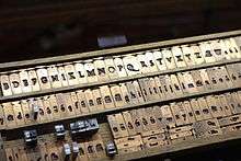
 The Plantin-Moretus Museum, which preserves original Garamond punches and matrices.
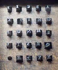 Punches for metal type founding at the Plantin-Moretus Museum, Antwerp.
 Punches at the Plantin-Moretus Museum.
 Type in a book by Jacques Dubois and printed in 1531 by Robert Estienne. Vervliet suggests that this type was not cut by Garamond himself but may have influenced him.
 The asymmetrical 'Bembo M' in a French textbook, apparently the result of French artisans such as Garamond over-faithfully copying a glitch in Manutius's type.
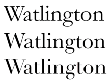 Monotype Garamond (based on Jannon) compared to the more geometric transitional serif and Didone type that replaced old-styles during the eighteenth century.
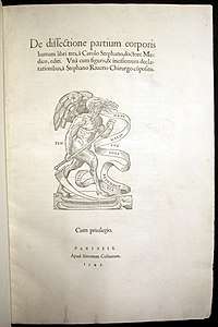
.jpg) A title page printed in Paris in 1508 showing the style preceding the 1530s: a font dark in colour, with wide capitals, tilted 'e's, large dots on the 'i' recalling calligraphy and blackletter headings.[216]
A title page printed in Paris in 1508 showing the style preceding the 1530s: a font dark in colour, with wide capitals, tilted 'e's, large dots on the 'i' recalling calligraphy and blackletter headings.[216] A very large-size font (c. 120 pt) in a 1551 book by Jean de Tournes, showing Garalde letterforms magnified to display size with sharpened contrast. Designer unidentified.
 ATF Garamond in its 1923 specimen, stating its goal to 'discourage unhealthy competition' in the printing industry.[164] (Its power collapsed considerably just six years later in the Depression.)
 Frederic Goudy's Garamont type for the American Monotype company in close-up.
 The American Monotype's Garamont specimen, showing the capitals.
 The colophon of Monotype's Garamont sample, showing the italic and ligatures.
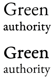 Optical sizes in EB Garamond. Top, correct: Green in a slimmer style for text printed large, authority in a thicker style for text printed small. Below, the wrong way round: Green looks too stocky and authority too fine.
 A specimen of František Štorm's revival of Jannon's type and his added bold and sans-serif derivatives.
 Plantin painted posthumously by Rubens.
Notes
- This is a slight simplification - technically the mould is an interchangeable part which is clamped around a matrix to cast type. However, the matrix is the mould for the letterform part of a sort.
- Arabic numerals in Garamond's time were engraved as what are now called text figures, styled with variable height like lower-case letters.
- Barker (1972) suggests very tentatively that the name may suggest a connection to a known family of printers from Lyon.[23]
- A famous example of this style of italic with upright capitals is the work of Arrighi in Rome, which also inspired French printers of the sixteenth century.[25]
- Gerry Leonidas, a leading expert on Greek typesetting, has commented that Vergecio's handwriting "has all the marks of a script that is unsuitable for conversion to [printing]. That it was the model for the widely-copied grecs du roi was, with hindsight, unfortunate."[56]
- The 1592 Berner specimen, now in the Stadt- und Universitatsbibliothek, Frankfurt am Main, was misfiled for some years after the Second World War, and is therefore reported as believed lost in some post-war histories.[36][61]
- The crudeness of the 'W' compared to other capitals suggests that it might not have been part of the original font.
- Linotype's British version, Granjon, was an original creation. The American branch's version, Garamond No. 3, was licensed from American Type Founders, while there and in Germany Linotype also licensed and modified that of Stempel. These versions are discussed separately below under these names.[108][109]
- The font was included in GhostScript since Stempel Garamond is included as a system font in some implementations of the PostScript standard.[137]
- As of 2018 this implementation has 5 weights (Regular, Medium, Semi-Bold, Bold and Extra-Bold), both in regular and italic style. The font files in both common flavours (OTF and TTF) can be downloaded from Pardo's repository[160] and are also available for embedding on Google Fonts, but in an, according to Duffner, ”utterly outdated” version.[161]
- Porter Garnett, in his 1927 showcase and account of running the Carnegie Institute of Technology printing course in the 1920s (which is set in ATF Garamond), provides a contemporary commentary on its genesis: "Garamond (made available to American printers in 1920) was designed by Mr. Morris F. Benton, after the caractères de l'Université attributed to the sixteenth century punch-cutter Claude Garamond (or Garamont). It has remained for Mrs. Beatrice Becker Warde ("Paul Beaujon") to prove [their origin] to Jean Jannon, of Sedan…
The forms of certain letters of the roman font, as first issued by the American Type Founders Company, were, upon the suggestion of Mr. T.M. Cleland, subsequently modified. The E, F and L were made more narrow, the J longer, the U wider, and the lower termination of the & altered. Mr. Cleland also designed a series of swash letters for the italic. The numerals originally issued with the font were of the highly objectionable "ranging" variety, but my solicitations (after two years of…using wrong-font sorts in their stead) finally extracted non-ranging numerals from the founders. I induced them also to make three ligatures Qu, Qu and Qu [with a Caslon-style calligraphic 'Q'], and a k and z [with descending flourishes similar to those on Monotype Garamond], which were used for the first time in "That Endeth Never".[165] - An accessible comparison is Warde, p. 166.[25]
References
- Dearden, James (1973). Encyclopedia of Library and Information Science: Claude Garamond. New York u.a.: Dekker. pp. 196–199. ISBN 978-0-8247-2109-1. Retrieved 11 December 2015.
- Tracy 1986, pp. 58–9.
- "Just what makes a Garamond a Garamond?". Linotype. Retrieved 11 December 2015.
- Johnson, Alfred F. (1936). "Sources Of Roman And Italic Types Used By English Printers In The Sixteenth Century". The Library. s4-XVII (1): 70–82. doi:10.1093/library/s4-XVII.1.70.
- Carter, Matthew (1985). "Galliard: A Revival of Types of Robert Granjon". Visible Language. 19 (1): 77–98. Retrieved 19 May 2017.
- Amert 2012, p. 21.
- Phil Baines; Andrew Haslam (2005). Type & Typography. Laurence King Publishing. pp. 50–1. ISBN 978-1-85669-437-7.
- Mosley, James (1960). "New Approaches to the Classification of Typefaces". The British Printer (reprinted for the United States House Committee on the Judiciary).
- Haley, Allan. "Bold type in text". Monotype. Retrieved 11 August 2015.
- Lawson, Alexander (27 June 1982). "To the Editor (letter)". New York Times. Retrieved 6 February 2016.
- Vervliet 2008, p. 223.
- Lamesle, Claude (1742). Épreuves générales des caracteres qui se trouvent chez Claude Lamesle. Rue Galande, Paris: Claude Lamesle. Retrieved 2 February 2016.
- Vervliet, Hendrik. "Conspectus of French Renaissance Printing Types (online errata)" (PDF). Bibliographical Society of London. Retrieved 14 August 2017.
- "Blackletter typefaces". French Ministry of Culture. Retrieved 30 January 2016.
- "The first Parisian workshops". French Ministry of Culture. Retrieved 30 January 2016.
- "Italian typefaces". French Ministry of Culture. Retrieved 30 January 2016.
- Mosley, James. "Garamond or Garamont". Type Foundry blog. Retrieved 3 December 2015.
- Mosley, James (2006). "Garamond, Griffo and Others: The Price of Celebrity". Bibliologia. 1 (1): 17–41. doi:10.1400/53248. Retrieved 3 December 2015.
- Amert, Kay (April 2008). "Stanley Morison's Aldine Hypothesis Revisited". Design Issues. 24 (2): 53–71. doi:10.1162/desi.2008.24.2.53.
- Nesbitt, Alexander (1998). The history and technique of lettering. Mineola, N.Y.: Dover Publications. p. 100. ISBN 978-0-486-40281-9.
It is generally acknowledged that Garamond did not cut a good italic: he does not seem to have been interested in this type form. The two italics he cut for his own venture into the publishing field were poor imitations of the Aldine letter.
- "Aldus Manutius and his innovations". French Ministry of Culture. Retrieved 3 December 2015.
- "The Italics". French Ministry of Culture. Retrieved 3 December 2015.
- Barker, Nicolas (2003). "The Aldine Roman in Paris: 1530–1534". Form and Meaning in the History of the Book : selected essays. London: British Library. pp. 186–214. ISBN 978-0-7123-4777-8.
- The Aldine Press: catalogue of the Ahmanson-Murphy collection of books by or relating to the press in the Library of the University of California, LosAngeles : incorporating works recorded elsewhere. Berkeley [u.a.]: Univ. of California Press. 2001. p. 23. ISBN 978-0-520-22993-8.
- Warde, Beatrice (1926). "The 'Garamond' Types". The Fleuron: 131–179.
- Vervliet 2008, pp. 88, 110, 156, 165, 171.
- Elizabeth Armstrong (28 April 2011). Robert Estienne, Royal Printer: An Historical Study of the Elder Stephanus. Cambridge University Press. pp. 51–2. ISBN 978-0-521-17066-6.
- Lubell, Stephen (15 May 2014). Sixteenth-century Hebrew typography: A typographical and historical analysis based on the Guillaume I Le Bé documents in the Bibliothèque nationale de France (doctoral). University of London (PhD thesis).
- Vervliet, Hendrik D.L. (2010). French Renaissance Printing Types: a Conspectus. New Castle, Del.: Oak Knoll Press. pp. 23–32, 39–40, etc. ISBN 978-1-58456-271-9.
- "The Career of a Punch-Cutter". French Ministry of Culture. Retrieved 3 December 2015.
- "The spread of Garamond". French Ministry of Culture. Retrieved 3 December 2015.
- Johnson, A. F. (1938). "Some types used by Paolo Manuzio". The Library. s4-XIX (2): 167–175. doi:10.1093/library/s4-XIX.2.167.
- "Garamont the bookseller". French Ministry of Culture. Retrieved 3 December 2015.
- "Garamont's will". French Ministry of Culture. Retrieved 3 December 2015.
- Lane, John A. (2004). Early Type Specimens in the Plantin-Moretus Museum: annotated descriptions of the specimens to ca. 1850 (mostly from the Low Countries and France) with preliminary notes on the typefoundries and printing offices (1. ed.). New Castle, Del.: Oak Knoll Press. pp. 239–243. ISBN 9781584561392.
- Carter, Harry (2002). A View of Early Typography Up to About 1600 (Reprinted ed.). London: Hyphen. pp. 85–6 etc. ISBN 978-0-907259-21-3.
- Carter, Harry; Morison, Stanley (1967). Sixteenth-century French Typefounders: The Le Bé memorandum. Private printing for A. Jammes.
- Vervliet 2008, pp. 167–171.
- "Who invented Garamond?". French Ministry of Culture. Retrieved 3 December 2015.
- "The Roman typefaces". French Ministry of Culture. Retrieved 3 December 2015.
- Vervliet 2008, pp. 164–5.
- Elizabeth Armstrong (28 April 2011). Robert Estienne, Royal Printer: An Historical Study of the Elder Stephanus. Cambridge University Press. pp. 48–9. ISBN 978-0-521-17066-6.
- Mosley, J. (23 June 2011). "The Palaeotypography of the French Renaissance: Selected Papers on Sixteenth-Century Typefaces. By HENDRIK D. L. VERVLIET. (Library of the Written Word, 6; The Handpress World, 4.) * French Renaissance Printing Types: A Conspectus. By HENDRIK D. L. VERVLIET". The Library. 12 (2): 175–178. doi:10.1093/library/12.2.175.
- Vervliet 2008, pp. 164-5.
- Amert 2012.
- Amert, Kay (June 2005). "The Phenomenon of the "Gros Canon"". The Papers of the Bibliographical Society of America. 99 (2): 231–263. doi:10.1086/pbsa.99.2.24295917.
- Vervliet 2008, pp. 178.
- Vervliet 2008, pp. 287–320.
- Valerie R. Hotchkiss, Charles C. Ryrie (1998). "Formatting the Word of God: An Exhibition at Bridwell Library". Archived from the original on 9 January 2009.
- Parent, Annie; Veyrin-Forrer, Jeanne (1974). "Claude Garamont: New Documents". The Library. s5-XXIX (1): 80–92. doi:10.1093/library/s5-XXIX.1.80.
- "Garamont's early career: the grecs du roi". French Ministry of Culture. Retrieved 3 December 2015.
- "The Greek Typefaces". French Ministry of Culture. Retrieved 3 December 2015.
- Mosley, James. "Porson's Greek type design". Type Foundry. Retrieved 30 January 2016.
- Elizabeth Armstrong (28 April 2011). Robert Estienne, Royal Printer: An Historical Study of the Elder Stephanus. Cambridge University Press. p. 52. ISBN 978-0-521-17066-6.
- Pektas, Nil Ozlem. "The First Greek Printing Press in Constantinople (1625‐1628)" (PDF). Royal Holloway (PhD thesis). Retrieved 14 May 2017.
- John D. Berry, ed. (2002). Language Culture Type: International Type Design in the Age of Unicode. ATypI. pp. 80–3. ISBN 978-1-932026-01-6.
- "Claude Garamond". linotype.com. Retrieved 3 March 2014.
- van Uchelen, Ton Croiset; Dijstelberge, P., eds. (2013). Dutch typography in the sixteenth century the collected works of Paul Valkema Blouw. Leiden: Brill. p. 426. ISBN 978-90-04-25655-2.
- Blouw, Paul Valkema (1 January 1990). "Willem Silvius's remarkable start, 1559-62". Quaerendo. 20 (3): 167–206. doi:10.1163/157006990X00175.
- Updike, Daniel Berkeley (1922). "Chapter 15: Types of the Netherlands, 1500–1800". Printing Types: Their History, Forms and Uses: Volume 2. Harvard University Press. pp. 6–7. Retrieved 18 December 2015.
- Lane, John A. (1992). "Review: Pica Roman Type in Elizabethan England". The Library. s6-14 (4): 357–365. doi:10.1093/library/s6-14.4.357.
- Lane, John A. (1995). "Arent Corsz Hogenacker (ca. 1579-1636): an account of his typefoundry and a note on his types Part two: the types". Quaerendo. 25 (3): 163. doi:10.1163/157006995X00017.
Most of these sixteenth-century types were originally cut without the letters J, U, and W, which were added in the seventeenth century.
- Mosley, James. "The materials of typefounding". Type Foundry. Retrieved 14 August 2015.
- Drucker, Margaret Re ; essays by Johanna; Mosley, James (2003). Typographically speaking : the art of Matthew Carter (2. ed.). New York: Princeton Architectural Press. p. 33. ISBN 978-1-56898-427-8.
- Vervliet 2008, p. 216.
- Vervliet 2008, pp. 321–364.
- Johson, A. F. (1940). "The Italic Types of Robert Granjon". The Library. s4-XXI (3–4): 291–308. doi:10.1093/library/s4-XXI.3-4.291.
- Vervliet 2008, pp. 321-364.
- Shaw 2017, pp. 48-69.
- Dunlap, David W. (23 December 2011). ""Printing for Kingdom, Empire & Republic: Treasures From the Archives of the Imprimerie Nationale" (exhibition review)". New York Times. Retrieved 6 February 2016.
- Morison 1973, p. 129.
- Mosley, James. "The types of Jean Jannon at the Imprimerie royale". Retrieved 3 December 2015.
- "Jannon". French Ministry of Culture.
- Williamson, Hugh (1987). "Jean Jannon of Sedan (series of articles)". Bulletin of the Printing Historical Society.
- Maag, Karin (2002). "The Huguenot academies: an uncertain future". In Mentzer, Raymond; Spicer, Andrew (eds.). Society and culture in the Huguenot world : 1559–1685. Cambridge: Cambridge University Press. pp. 139–156. ISBN 978-0-521-77324-9. Retrieved 31 January 2016.
- Shalev, Zur (2012). "Samuel Bochart's Protestant Geography". Sacred words and worlds: geography, religion, and scholarship, 1550–1700. Leiden: Brill. pp. 141, 164. ISBN 978-90-04-20935-0. Retrieved 31 January 2016.
- Haley, Allan (1992). Typographic milestones ([Nachdr.]. ed.). Hoboken, NJ: John Wiley & Sons. pp. 125–127. ISBN 978-0-471-28894-7.
- Alexander Nesbitt (1998). The History and Technique of Lettering. Courier Corporation. pp. 126–7. ISBN 978-0-486-40281-9.
- Thomas Hartwell Horne (1814). An Introduction to the Study of Bibliography ; to which is Prefixed a Memoir on the Public Libraries of the Ancients. G. Woodfall. p. 81.
- Jean Baptiste Joseph abbé#@@Boulliot (1830). Biographie ardennaise, ou Histoire des Ardennais qui se sont fait remarquer par leurs écrits, leurs actions, leurs vertus ou leurs erreurs. pp. 56–61.
- Mosley, James. "Caractères de l'Université". Type Foundry. Retrieved 3 December 2015.
- Loxley, Simon (31 March 2006). Type. pp. 41–2. ISBN 978-0-85773-017-6.
- "Type History 1". Typofonderie Gazette. Retrieved 23 December 2015.
- Johnson, A. F. (1939). "The 'Goût Hollandois'". The Library. s4-XX (2): 180–196. doi:10.1093/library/s4-XX.2.180.
- Mosley, James. "Type and its Uses, 1455-1830" (PDF). Institute of English Studies. Archived from the original (PDF) on 9 October 2016. Retrieved 7 October 2016.
- Middendorp, Jan (2004). Dutch type. Rotterdam: 010 Publishers. p. 19. ISBN 978-90-6450-460-0.
Van den Keere's romans are open and unadorned; although building on the French Renaissance style of Claude Garamond they are heavier and slightly more condensed.
- Carter, Harry, ed. (1969). The type specimen of Delacolonge. Les caractères et les vignettes de la fonderie du sieur Delacolonge, Lyons, 1773. Introduction and notes by Harry Carter. (Facsimile ... made from a copy belonging to the publishers.).
- Les Caracteres les vignettes de la fonderie du sieur Delacolonge. Lyon. 1773. Retrieved 16 August 2019.
- Johnson, A. F. (1937). "The Type-Specimen Books of Claude Lamesle and Nicolas Gando". The Library. s4-XVIII (2): 201–211. doi:10.1093/library/s4-xviii.2.201.
- "Garamond's lasting influence". French Ministry of Culture. Retrieved 31 January 2016.
- Fournier, Jean-Pierre (1756). "Lettre de M. Fournier". Mercure de France: 121–2. Retrieved 2 February 2016.
- Anonymous (1756). "Réponse à une autre Lettre inférée dans le Mercure de Mai dernier". Journal des sçavans: 21–25. Retrieved 2 February 2016.
- Updike, Daniel Berkeley (1922). "French Types, 1500–1800". Printing Types: Their History, Forms and Uses: Volume 2. Harvard University Press. Retrieved 18 December 2015.
- "The French Revolution and the Didots". French Ministry of Culture. Retrieved 31 January 2016.
- Phinney, Thomas. "Transitional & Modern Type Families". Graphic Design and Publishing Centre. Retrieved 10 August 2015.
- "Early 20th century interpretations (I)". French Ministry of Culture. Retrieved 3 December 2015.
- "Early 20th century interpretations (II)". French Ministry of Culture. Retrieved 3 December 2015.
- Morison, Stanley. "Printing the Times". Eye. Retrieved 28 July 2015.
- "Monotype matrices and moulds in the making" (PDF). Monotype Recorder. 40 (3). 1956.
- "Illuminating Letters: Garamond" (PDF). Monotype. Archived from the original (PDF) on 8 December 2015. Retrieved 14 October 2015.
- Morison 1973, pp. 129–130.
- Paillard, Jean (1914). Claude Garamont, graveur et fondeur de lettres. Paris: Ollière. Retrieved 31 January 2016.
- Mosley, James. "Comments on Typophile thread". Typophile. Archived from the original on 2 February 2015. Retrieved 11 December 2015.
- Audin, Marius (1933). "Fonderie de Lettres et les Fondeurs Français 1933". Arts et Metiers Graphiques: 45–49. Retrieved 22 October 2017.
- Haley, Allan (15 September 1992). Typographic Milestones. John Wiley. p. 126. ISBN 978-0-471-28894-7. Retrieved 8 March 2016.
- De Bondt, Sara. "Beatrice Warde: Manners and type". Eye Magazine. Retrieved 3 December 2015.
- "Stempel Garamond LT". Linotype. Retrieved 3 December 2015.
- Shaw, Paul. "The Mystery of Garamond No. 3". Blue Pencil. Retrieved 26 July 2015.
- Haley, Allan (1999). "A Flock of Garamonds". Step Inside Design. Archived from the original on 20 February 2016.
- Andrew Pettegree; Malcolm Walsby (14 October 2011). French Books III & IV: Books published in France before 1601 in Latin and Languages other than French. BRILL. pp. 11–12. ISBN 978-90-04-21500-9.
- Boardley, John (18 April 2016). "The First Roman Fonts". i love typography. Retrieved 12 September 2017.
- Malcolm, Noel (2002). Aspects of Hobbes. Oxford: Clarendon Press. pp. 267–8. ISBN 978-0-19-152998-6. Retrieved 31 January 2016.
- Shaw 2017, pp. 52–8.
- "Adobe Garamond Pro specimen book" (PDF). Adobe Systems. Archived from the original (PDF) on 23 February 2015. Retrieved 9 March 2014.
- Brady, Fred; Blumberg, Gail; Huggins, Cleo; Stauffacher, Jack; Stone, Sumner; Szujewsksa, Laurie; Wang, Min (1989). Adobe Garamond. San José: Adobe Systems.
- Vervliet 2008, p. 356.
- "SOTA Typography Award Honors Robert Slimbach". SOTA. Retrieved 8 January 2016.
- Williamson, Hugh (1991). "Adobe Garamond". Bulletin of the Printing Historical Society (30).
- Riggs, Tamye (12 June 2014). "Stone, Slimbach, and Twombly launch the first Originals". Typekit blog. Adobe. Retrieved 4 July 2015.
- Kelly, Jerry (1991). "Adobe Garamond: a new adaptation of a sixteenth-century type". Printing History. 13 (2).
- Kelly, Jerry (2001). "Adobe Garamond". In Heller, Steven (ed.). Texts on Type: Critical Writings on Typography. New York: Allworth Press. pp. 54–63. ISBN 9781581150827.
- Coles, Stephen. "Top Ten Typefaces Used by Book Design Winners". FontFeed (archived). Archived from the original on 28 February 2012. Retrieved 2 July 2015.
- "Lane, John A., and Robert Slimbach. Garamond Premier Pro: A Contemporary Adaptation (review)". 2007. Printing History.
- Lane, John A. (2005). "Claude Garamont and his Roman Types". Garamond Premier Pro: a contemporary adaptation; modelled on the roman types of Claude Garamond and the italic types of Robert Granjon. San Jose: Adobe Systems. pp. 5–13.
- Slimbach, Robert (2005). "The Making of Garamond Premier". Garamond Premier Pro: a contemporary adaptation; modelled on the roman types of Claude Garamond and the italic types of Robert Granjon. San Jose: Adobe Systems. pp. 15–21.
- Phinney; Prehn. "Adobe last news".
Garamond Premier Pro had its genesis in 1988, when Adobe senior type designer Robert Slimbach visited the Plantin-Moretus Museum in Antwerp, Belgium, to study their collection of Claude Garamond's metal punches and type designs ... While fine-tuning Adobe Garamond as a useful design suited to modern publishing, Slimbach started planning an entirely new interpretation of Garamond's designs based on the range of unique sizes he'd seen at the Plantin-Moretus, and on comparable italics cut by Garamond's contemporary, Robert Granjon.
- Riggs, Tamye (30 July 2014). "The Adobe Originals Silver Anniversary Story: How the Originals endured in an ever-changing industry". Typekit. Adobe Systems. Retrieved 19 September 2017.
- Phinney, Thomas. "Comments on Typophile thread". Archived from the original on 10 January 2015.
Robert does acknowledge a major outside influence on his new Garamond ... an optical size experiment Stephen Harvard put together in 1989 ... with a lower-case Garamond "a" interpolating from a small size to a display size. Rob thought this was very interesting. But the temporal and technical constraints Rob was working with made it impractical to do anything with this idea at the time.
- "Adobe – Fonts: Garamond Premier Pro". Adobe Systems. Retrieved 9 March 2014.
- Slimbach, Robert. "Garamond Premier Pro character set" (PDF). Adobe Systems. Archived from the original (PDF) on 9 February 2007. Retrieved 11 December 2015.
- Leonidas, Gerry. "Comments on Typophile thread". Archived from the original on 2 February 2015. Retrieved 11 December 2015.
- Phinney, Thomas. "Garamond Premier vs. Pro (comments on Typophile thread)". Typophile. Archived from the original on 2 February 2015. Retrieved 11 December 2015.
- "Stempel Garamond". MyFonts. Linotype. Retrieved 9 October 2015.
- Walters, John (2 September 2013). Fifty Typefaces That Changed the World. ISBN 978-1-84091-649-2. Retrieved 13 December 2015.
- Bergmann, Christoph; Hardwig, Florian (23 August 2016). "Zero vs. oh: Strategies of glyph differentiation". Isoglosse. Retrieved 12 September 2016.
- "Schriftdesigner Rudolf Wolf". Klingspor Museum. Retrieved 16 July 2017.
- "Font Substitutions table". Ghostscript. Archived from the original on 28 January 2016. Retrieved 2 February 2016.
- Hartke, Stephen. "A Survey of Free Math Fonts for TeX and LaTeX". The PracTeX Journal. Retrieved 2 February 2016.
- Hosny, Khaled. "URW Garamond ttf conversions". Retrieved 18 August 2015.
- "GaramondNo8 1.06 LICENSE.txt". Garamond.org. 6 June 2016. Retrieved 19 August 2016.
- "Granjon LT". MyFonts. Linotype. Retrieved 3 December 2015.
- Lawson, Alexander (June 1967). "Variations of Garamond". Printing Impressions. Archived from the original on 22 December 2015. Retrieved 11 December 2015.
- Lawson, Alexander (1990). Anatomy of a Typeface (1st ed.). Boston: Godine. pp. 147–151. ISBN 978-0-87923-333-4.
- McMurtrie, Douglas. The Book - The Story of Printing & Bookmaking. p. 580.
Personally I know of no typeface which rates higher...I once told Mr. Jones that Granjon appeared to me to be fifty per cent Garamond and fifty per cent Caslon. He replied: "Your diagnosis is just about correct." Certainly he drew on sound precedents!
- Tracy 1986, pp. 143–4 etc.
- Felici, James (3 April 2013). "Ten Great "Lost" Text Faces". Creative Pro. Retrieved 24 June 2018.
- "A Distinguished family of French printers of the sixteenth century: Henri and Robert Estienne". ABAA. Retrieved 12 March 2017.
- Williamson, Hugh (1956). Methods of Book Design. Oxford University Press. pp. 79–83.
- Dreyfus, John (1994). "Jan Tschichold's Sabon: The First Harmonised Type". Into Print: selected writings on printing history, typography and book production. London: British Library. pp. 190–4. ISBN 9780712303439.
- Berry, John D. (10 March 2003). "The Next Sabon". Creative Pro. Retrieved 9 October 2015.
- Burke, Christopher; Porchez, Jean François (2009). Sabon Next specimen. Linotype. pp. 18–21.
- Ronneberger, Volke (2002). "Die Sabon von Jan Tschichold" (PDF). Publishing Praxis. Retrieved 13 December 2015.
- Haralambous, Yannis (2007). Fonts & Encodings (1st ed.). Sebastopol, Calif.: O'Reilly Media. pp. 377–381. ISBN 978-0-596-10242-5. Retrieved 13 December 2015.
- "Berthold exklusiv 012: Garamond Old Face by Günter Gerhard Lange (uploaded by 'Jo')". Flickr. 13 April 2017. Retrieved 14 May 2018.
- "Berthold Garamond Pro". Berthold Types. Retrieved 14 May 2018.
- Duffner, Georg. "EB Garamond". Retrieved 16 October 2018.
- Duffner, Georg. "EB Garamond specimen". Retrieved 19 September 2015.
- Spiekermann, Erik. "Twitter post". Twitter. Retrieved 12 February 2015.
- Pardo, Octavio. "EBGaramond12". Retrieved 16 October 2018.
- "EBGaramond12/fonts". Retrieved 16 October 2018.
- Duffner, Georg. "EB Garamond – Development & Download". Retrieved 16 October 2018.
For the use of EB Garamond on the web Google webfonts provides an easy way to embed the font via @font-face. There you can also download a ttf version of the font. Sadly, that version is utterly outdated.
- Cost, Patricia. "The Contributions of Linn Boyd Benton and Morris Fuller Benton to the technology of typesetting and typeface design". Rochester Institute of Technology (MSc thesis). pp. 178–183. Retrieved 5 September 2016.
- Bullen, Henry Lewis (1922). "Geoffroy Tory, a great typographer, and his apprentice, Claude Garamond, the first typefounder". The Inland Printer: 635–9. Retrieved 17 September 2016.
- Benton, Morris Fuller; Cleland, Thomas (1923). 1923 American Type Founders Specimen Book & Catalogue. Elizabeth, New Jersey: American Type Founders. pp. 17–31.
- Garnett, Porter (1927). A Documentary Account of the Beginnings of the Laboratory Press, Carnegie Institute of Technology. Pittsburgh: Laboratory Press. pp. 43, 120–4 etc.
- Shaw, Paul. "More on Garamond no. 3 (and some notes on Gutenberg)". Blue Pencil. Retrieved 26 July 2015.
- Bierut, Michael. "Thirteen Ways of Looking at a Typeface". Design Observer. Retrieved 12 February 2015.
- Shaw 2017, pp. 68–9.
- "ATF Collection: Garamond". ATF Collection. Retrieved 3 December 2015.
- Simonson, Mark. "Review: ATF Garamond". Typographica. Retrieved 24 August 2016.
- Schwartz, Christian. "DB". Schwartzco. Retrieved 16 July 2015.
- Phinney, Thomas. "Save $400M printing cost from font change? Not so fast …". Phinney on Fonts. Retrieved 2 August 2015.
- "Garamond". Microsoft. Retrieved 4 July 2015.
- "Monotype Garamond". Fonts.com. Monotype. Retrieved 4 July 2015.
- Matteson, Steve. "Type Q&A: Steve Matteson from Monotype". Monotype. Retrieved 4 July 2015.
- Rafaeli, Ari (2005). Book Typography. New Castle, Del.: Oak Knoll Press. p. 55. ISBN 9781584561576.
Both the Monophoto and digital versions are scandalously too light at normal text sizes.
- Kobayashi, Akira. "Akira Kobayashi on FF Clifford". FontFeed. Retrieved 1 July 2015.
- Hendel, Richard (1998). On Book Design. New Haven [u.a.]: Yale Univ. Press. p. 79. ISBN 978-0-300-07570-0.
Some of my British colleagues who worked with the original version of [Monotype] Garamond consider the digitised version much too light. It doesn't feel so to me.
- "The choice of typefaces" (PDF). Monotype Recorder. 32 (1): 17.
- Mosley, James (2001). "Review: A Tally of Types". Journal of the Printing Historical Society. 3, new series: 63–67.
- Peppé, Rodney. The Wonderful World of Rodney Peppé. Archived from the original on 8 December 2015. Retrieved 3 December 2015.
- Goudy, Frederic (1946). A half-century of type design and typography, vol 1. New York: The Typophiles. pp. 121–124. Retrieved 3 December 2015.
I made no attempt to eliminate the mannerisms or deficiencies of his famous type, realising that they came not by intention, but rather through the punch-cutter's handling, to his lack of tools of precision and his crude materials, for he worked by eye and not by rule.
I did find it impossible to eliminate, in my own rendition of the letter, that subtle something we call 'personality' that something made up of items so intangible as practically to be imperceptible when individual types are compared, yet clearly manifest when the page they form is viewed as a whole. The subtleties ... I couldn't neglect, yet I did not consciously include them in my own drawings, and these are the touches that mark my face as belonging to the present and not to the sixteenth century. - Shaw, Paul. "An appreciation of Frederic W. Goudy as a type designer". Retrieved 12 July 2015.
- Rogers, Bruce (January 1923). "Printer's Note". Monotype: A Journal of Composing Room Efficiency: 23.
This issue of Monotype is set in a trial font of a new version of Garamond's design ... the type ornaments, modelled on 16th century ones, will also be available.
- "LTC Garamont". MyFonts. LTC. Retrieved 3 December 2015.
- McKitterick, David, ed. (1979). Stanley Morison & D.B. Updike: Selected Correspondence. Scolar Press. pp. 57–61.
- Olocco, Riccardo. "Behind Simoncini's Glasses". Medium. C-A-S-T. Retrieved 22 October 2017.
- "Jannon Pro". MyFonts. Storm Type. Retrieved 11 December 2015.
- Storm, František. "Storm Jannon specimen". Storm Type. Retrieved 11 December 2015.
- Storm, František. "Jannon Sans". Storm Type. Retrieved 11 December 2015.
- Bierut, Michael. "I Hate ITC Garamond". Design Observer. Retrieved 6 November 2014.
- Bierut, Michael (2007). Seventy-nine short essays on design (1st ed.). New York: Princeton Architectural Press. pp. 139–141. ISBN 978-1-61689-071-1.
- Grey, Marge. "Serif Type Family: ITC Garamond". California State University. Retrieved 18 August 2015.
- "Le Garamond dans l'édition contemporaine". French Ministry of Culture. Retrieved 13 December 2015.
- Walsh, Norman; Muellner, Leonard (1999). "Colophon". DocBook (1st ed.). Cambridge [u.a.]: O'Reilly. ISBN 978-1-56592-580-9. Retrieved 13 December 2015.
- "This Month in Typography: September 2015". i love typography. Retrieved 2 February 2016.
- Devroye, Luc. "The best free typefaces of 2015: Luc's selection". Luc Devroye's Type Design Information Page. Retrieved 2 February 2016.
- "Cormorant". Behance. Catharsis Fonts. Retrieved 19 August 2015.
- Thalmann, Christian. "Christian Thalmann fonts page". Archived from the original on 17 January 2015. Retrieved 19 August 2015.
- Berry, John. "The Human Side of Sans Serif". CreativePro. Retrieved 29 June 2016.
- "ITC Claude Sans". MyFonts. Letraset. Retrieved 29 June 2016.
- Capozzi, Rocco (22 February 1997). Reading Eco: An Anthology. p. 293. ISBN 978-0-253-11282-8.
- Branigan, Tania. "The most radical change in 50 years". The Guardian. Retrieved 13 December 2015.
- "From Our Archives". The Guardian. Retrieved 13 December 2015.
- '"ITC Garamond Font Family". MyFonts.com. Retrieved 19 January 2007.
- "Macintosh logo and badge". Fonts in use. Retrieved 13 December 2015.
- Eggers, Dave (2004). The Best of McSweeney's – Volume 1. ISBN 978-0-241-14234-9.
- Alexander Starre (15 August 2015). Metamedia: American Book Fictions and Literary Print Culture After Digitization. University of Iowa Press. pp. 70–1. ISBN 978-1-60938-359-6.
- Holmes, Anna. "Letters from the Past". New York Times. Retrieved 6 February 2016.
- Sloan, Robin. "Mister Penumbra's 24-hour bookstore. New York: Farrar, Straus and Giroux, 2012. Print.
- Gaiman, Neil and Charles Vess. Stardust (Being A Romance Within The Realms of Faerie). London: Headline Books, 1999. Print. pp. 19, 59, & 95.
- Stix, Madeleine (28 March 2014). Teen to gov't: change your typeface, save millions. CNN via KOCO-TV. Retrieved 28 March 2014.
- Agarwal, Amit (19 July 2012). "Which Fonts Should You Use for Saving Printer Ink". Digital Inspiration. Retrieved 29 March 2014.
- "Toner-Efficient Fonts Can Save Millions". Department of the Navy. 8 March 2013. Archived from the original on 4 December 2014.
- Popovich, Nadja. "Ask a designer: why switching fonts won't save the US government millions". The Guardian.
- Beroaldo, Filippo (1508). Orationes, prelectiones, praefationes & quaedam mithicae historiae Philippi Beroaldi. Paris: Josse Badius.
- Tibor Klaniczay; Eva Kushner; Paul Chavy (15 October 2000). L'Époque de la Renaissance: Crises et essors nouveaux. John Benjamins Publishing Company. p. 130. ISBN 978-90-272-9970-3.
- Plantin, Christophe. "Le Bonheur de ce Monde (with translation)". Poems of Leiden project. Archived from the original on 17 January 2017. Retrieved 31 January 2016.
Cited literature
- Amert, Kay (2012). Bringhurst, Robert (ed.). The Scythe and the Rabbit: Simon de Colines and the Culture of the Book in Renaissance Paris. Rochester: RIT Cary Graphic Arts Press. ISBN 978-1-933360-56-0.CS1 maint: ref=harv (link)
- Morison, Stanley (1973). Carter, Harry (ed.). A Tally of Types. Cambridge: Cambridge University Press. ISBN 978-0-521-09786-4.CS1 maint: ref=harv (link)
- Shaw, Paul (18 April 2017). Revival Type: Digital Typefaces Inspired by the Past. Yale University Press. ISBN 978-0-300-21929-6.CS1 maint: ref=harv (link)
- Tracy, Walter (1986). Letters of Credit: a view of type design. Boston: David R. Godine. ISBN 978-1-56792-240-0.CS1 maint: ref=harv (link)
- Vervliet, Hendrik (2008). The Palaeotypography of the French Renaissance: Selected Papers on Sixteenth-century Typefaces. BRILL. ISBN 978-90-04-16982-1.CS1 maint: ref=harv (link)
- Vervliet, Hendrik D.L. (2010). French Renaissance Printing Types: a Conspectus. New Castle, Del.: Oak Knoll Press. ISBN 978-1-58456-271-9.CS1 maint: ref=harv (link)
External links
On Garamond:
- Garamond at culture.fr: extensive website by the French Ministry of Culture
- Just what makes a "Garamond" a Garamond? – includes high-resolution image of the Egelhoff-Berner specimen.
- Garamond v Garamond: Physiology of a typeface (personal opinion by Peter Gabor, translated Barney Carroll)
- Illuminating Letters #1: Garamond
- Garamond discussion on Typophile
On revivals:
- ATF Garamond poster
- Garamond – Luc Devroye. A large assemblage of commentary on Garamond.
Font downloads:
- Garamond No. 8 – a modern ttf release with small caps.
- EB Garamond – specimen, specification and background.
- EB Garamond download site
- The Cormorant Typeface Project – specimen, specification and background.
| Software and libraries | |
|---|---|
| Licenses | |
| Operating system, corporate and professional |
|
| Other typefaces | |
| Groups and people | |
| |
| Authority control |
|
|---|