Q
Q or q is the 17th letter of the modern English alphabet and the ISO basic Latin alphabet. Its name in English is cue (pronounced /ˈkjuː/), plural cues.[1]
| Q | |||||
|---|---|---|---|---|---|
| Q q | |||||
| (See below) | |||||
 | |||||
| Usage | |||||
| Writing system | Latin script | ||||
| Type | Alphabetic and Logographic | ||||
| Language of origin | Greek language Latin language | ||||
| Phonetic usage | (Table) /ˈkjuː/ | ||||
| Unicode value | U+0051, U+0071 | ||||
| Alphabetical position | 17 | ||||
| History | |||||
| Development |
| ||||
| Time period | Unknown to present | ||||
| Descendants | • Ƣ • Ɋ • ℺ • Ԛ | ||||
| Sisters | Φ φ Ф ק ق ܩ ࠒ 𐎖 ቀ Փ փ Ֆ ֆ | ||||
| Variations | (See below) | ||||
| Other | |||||
| Other letters commonly used with | q(x) | ||||
|
History
| Egyptian hieroglyph wj |
Phoenician qoph |
Etruscan Q |
Greek Qoppa | ||
|---|---|---|---|---|---|
The Semitic sound value of Qôp was /q/ (voiceless uvular stop), and the form of the letter could have been based on the eye of a needle, a knot, or even a monkey with its tail hanging down.[2][3][4] /q/ is a sound common to Semitic languages, but not found in many European languages.[lower-alpha 1] Some have even suggested that the form of the letter Q is even more ancient: it could have originated from Egyptian hieroglyphics.[5][6]
In Greek, qoppa (Ϙ) probably came to represent several labialized velar stops, among them /kʷ/ and /kʷʰ/.[7] As a result of later sound shifts, these sounds in Greek changed to /p/ and /pʰ/ respectively.[8] Therefore, qoppa was transformed into two letters: qoppa, which stood for the number 90,[9] and phi (Φ), which stood for the aspirated sound /pʰ/ that came to be pronounced /f/ in Modern Greek.[10][11]
The Etruscans used Q in conjunction with V to represent /kʷ/, and this usage was copied by the Romans with the rest of their alphabet.[4] In the earliest Latin inscriptions, the letters C, K and Q were all used to represent the two sounds /k/ and /ɡ/, which were not differentiated in writing. Of these, Q was used before a rounded vowel (e.g. ⟨EQO⟩ 'ego'), K before /a/ (e.g. ⟨KALENDIS⟩ 'calendis'), and C elsewhere.[12] Later, the use of C (and its variant G) replaced most usages of K and Q: Q survived only to represent /k/ when immediately followed by a /w/ sound.[13]
Typography

.png)


Uppercase "Q"
Depending on the typeface used to typeset the letter Q, the letter's tail may either bisect its bowl as in Helvetica,[15] meet the bowl as in Univers, or lie completely outside the bowl as in PT Sans. In writing block letters, bisecting tails are fastest to write, as they require less precision. All three styles are considered equally valid, with most serif typefaces having a Q with a tail that meets the circle, while sans-serif typefaces are more equally split between those with bisecting tails and those without.[16] Typefaces with a disconnected Q tail, while uncommon, have existed since at least 1529.[17] A common method among typographers to create the shape of the Q is by simply adding a tail to the letter O.[16][18][19]
Old-style serif fonts, such as Garamond, may contain two capital Qs: one with a short tail to be used in short words, and another with a long tail to be used in long words.[17] Some early metal type fonts included up to 3 different Qs: a short-tailed Q, a long-tailed Q, and a long-tailed Q-u ligature.[14] This print tradition was alive and well until the 19th century, when long-tailed Qs fell out of favor: even recreations of classic typefaces such as Caslon began being distributed with only short Q tails.[20][14] Not a fan of long-tailed Qs, American typographer D. B. Updike celebrated their demise in his 1922 book Printing Types, claiming that Renaissance printers made their Q tails longer and longer simply to "outdo each other".[14] Latin-language words, which are much more likely than English words to contain "Q" as their first letter, have also been cited as the reason for their existence.[14] The long-tailed Q had fallen completely out of use with the advent of early digital typography, as many early digital fonts could not choose different glyphs based on the word that the glyph was in, but it has seen something of a comeback with the advent of OpenType fonts and LaTeX, both of which can automatically typeset the long-tailed Q when it is called for and the short-tailed Q when not.[21][22]
Owing to the allowable variation in the Q, the letter is a very distinctive feature of a typeface;[16][23] like the ampersand, the Q is cited as a letter that gives typographers a chance to express themselves.[4]
Identifont, an automated typeface identification service that identifies typefaces by questions about their appearance, asks about the Q tail second if the "sans-serif" option is chosen.[24] Out of Identifont's database, Q tails are divided thus:[25]
| Q tail type | Serif | Sans-serif |
|---|---|---|
| Bisecting | 1461 | 2719 |
| Meets bowl | 3363 | 4521 |
| Outside bowl | 271 | 397 |
| "2" () shape | 304 | 428 |
| Inside bowl | 129 | 220 |
| Total | 5528 | 8285 |

_pie_chart.svg.png)
_pie_chart.svg.png)
Some typographers prefer one "Q" design over another: Adrian Frutiger, famous for the airport typeface that bears his name, remarked that most of his typefaces feature a Q tail that meets the bowl and then extends horizontally.[19] Frutiger considered such Qs to make for more "harmonious" and "gentle" typefaces.[19] Some typographers, such as Sophie Elinor Brown, have listed "Q" as being among their favorite letters.[26][27]
Lowercase "q"
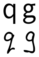
The lowercase "q" is usually seen as a lowercase "o" or "c" with a descender (i.e., downward vertical tail) extending from the right side of the bowl, with or without a swash (i.e., flourish), or even a reversed lowercase p. The "q"'s descender is usually typed without a swash due to the major style difference typically seen between the descenders of the "g" (a loop) and "q" (vertical). When handwritten, or as part of a handwriting font, the descender of the "q" sometimes finishes with a rightward swash to distinguish it from the letter "g" (or, particularly in mathematics, the digit "9").
Use in writing systems
Phonetic and phonemic transcription
The International Phonetic Alphabet uses ⟨q⟩ for the voiceless uvular stop.
English standard orthography
In English, the digraph ⟨qu⟩ most often denotes the cluster /kw/; however, in borrowings from French, it represents /k/, as in 'plaque'. See the list of English words containing Q not followed by U. Q is the second least frequently used letter in the English language (after Z), with a frequency of just 0.1% in words. Q has the third fewest English words where it is the first letter, after Z and X.
Other orthographies
In most European languages written in the Latin script, such as in Romance and Germanic languages, ⟨q⟩ appears almost exclusively in the digraph ⟨qu⟩. In French, Occitan, Catalan and Portuguese, ⟨qu⟩ represents /k/ or /kw/; in Spanish, it represents /k/. ⟨qu⟩ replaces ⟨c⟩ for /k/ before front vowels ⟨i⟩ and ⟨e⟩, since in those languages ⟨c⟩ represents a fricative or affricate before front vowels. In Italian ⟨qu⟩ represents [kw] (where [w] is the semivowel allophone of /u/).
It is not considered to be part of the Cornish (Standard Written Form), Estonian, Icelandic, Irish, Latvian, Lithuanian, Serbo-Croatian, Scottish Gaelic, Slovenian, Turkish, or Welsh alphabets.
⟨q⟩ has a wide variety of other pronunciations in some European languages and in non-European languages that have adopted the Latin alphabet.
| IPA | Name | Occurrence |
|---|---|---|
| [q] | voiceless uvular stop | IPA, Romanization of Arabic, Aymara, Berber (also pronounced as [qʷ] or [ɢ]), Chechen Latin alphabet, Crimean Tatar, Greenlandic, Hopi, Klingon, Kurdish (Latin Kurmanji, Yekgirtú), Kazakh Latin, Luiseño language, Lushootseed, Quechua, Uyghur, Uzbek, Zazaki alphabet of the Zaza language and in the interlinguistic Standard Alphabet by Lepsius; phonemic /q/ sometimes as [ɢ]: Somali, Ket Latin (normally with affrication [qχ]) |
| [qː] | geminated voiceless uvular stop | Wolof |
| [qχ] | affricated voiceless uvular stop | Ket Latin (allophone of [q]) |
| [qʰ] | aspirated voiceless uvular stop | K'iche', Nuxalk |
| [ɢ] | voiced uvular stop | Somali (allophone of [q]), Ket Latin (allophone of [q] after [ŋ]) |
| [k] | voiceless velar stop | several European languages, often only in digraph ⟨qu⟩, which often is pronounced [kw] (In some case the whole digraph is pronounced [k]); Arabic loanwords in Malay. |
| [kʷ] | labialized voiceless velar stop | Mohegan-Pequot |
| [kw] | Neo, Glosa | |
| [ɡ] | voiced velar stop | Azerbaijani alphabet |
| [c] | voiceless palatal stop | Albanian |
| [ʔ] | glottal stop | Maltese, Menominee, Võro |
| [ŋɡ] | prenasalized voiced velar stop | Fijian |
| [tɕʰ] | aspirated voiceless alveolo-palatal sibilant affricate | Chinese Hanyu Pinyin |
| [x] | voiceless velar fricative | transliteration of Classical Mongolian, Mi'kmaq |
| [ɣ] | voiced velar fricative | Raguileo Alfabet for the Mapuche language |
| [θ] | voiceless dental non-sibilant fricative | Loglan |
| [ǃ] | tenuis alveolar click | Hadza, Xhosa and Zulu |
| [ǃkʼ] | ejective click | Sesotho |
| [kʼ] | velar ejective | Kiowa |
| [qʼ] | uvular ejective | ISO 9 transliteration of the Cyrillic Abkhaz alphabet for the Abkhaz language |
| [w] | Voiced labio-velar approximant | In southern Vietnamese dialects, the digraph qu is pronounced as w |
Other uses
The capital letter Q is used as the currency sign for the Guatemalan quetzal.
The Roman numeral Q is sometimes used to represent the number 500,000.[28]
Related characters
Descendants and related characters in the Latin alphabet
Ancestors and siblings in other alphabets
Derived signs, symbols and abbreviations
- ℺ : rotated capital Q, a signature mark
- Ꝗ ꝗ, Ꝙ ꝙ : Various forms of Q were used for medieval scribal abbreviations[30]
Computing codes
| Character | Q | q | ||
|---|---|---|---|---|
| Unicode name | LATIN CAPITAL LETTER Q | LATIN SMALL LETTER Q | ||
| Encodings | decimal | hex | decimal | hex |
| Unicode | 81 | U+0051 | 113 | U+0071 |
| UTF-8 | 81 | 51 | 113 | 71 |
| Numeric character reference | Q | Q | q | q |
| EBCDIC family | 216 | D8 | 152 | 98 |
| ASCII 1 | 81 | 51 | 113 | 71 |
- 1 Also for encodings based on ASCII, including the DOS, Windows, ISO-8859 and Macintosh families of encodings.
Other representations
| NATO phonetic | Morse code |
| Quebec |
 |
|
 |
 |
| Signal flag | Flag semaphore | American manual alphabet (ASL fingerspelling) | Braille dots-12345 Unified English Braille |

References
- "Q", Oxford English Dictionary, 2nd edition (1989); Merriam-Webster's Third New International Dictionary of the English Language, Unabridged (1993); "cue," op. cit.
- Travers Wood, Henry Craven Ord Lanchester, A Hebrew Grammar, 1913, p. 7. A. B. Davidson, Hebrew Primer and Grammar, 2000, p. 4. The meaning is doubtful. "Eye of a needle" has been suggested, and also "knot" Harvard Studies in Classical Philology vol. 45.
- Isaac Taylor, History of the Alphabet: Semitic Alphabets, Part 1, 2003: "The old explanation, which has again been revived by Halévy, is that it denotes an 'ape,' the character Q being taken to represent an ape with its tail hanging down. It may also be referred to a Talmudic root which would signify an 'aperture' of some kind, as the 'eye of a needle,' ... Lenormant adopts the more usual explanation that the word means a 'knot'.
- Haley, Allan. "The Letter Q". Fonts.com. Monotype Imaging Corporation. Retrieved 2017-02-03.
- Samuel, Stehman Haldeman (1851). Elements of Latin Pronunciation: For the Use of Students in Language, Law, Medicine, Zoology, Botany, and the Sciences Generally in which Latin Words are Used. J.B. Lippincott. p. 56.
- Hamilton, Gordon James (2006). The Origins of the West Semitic Alphabet in Egyptian Scripts. Catholic Biblical Association of America.
- Woodard, Roger G. (2014-03-24). The Textualization of the Greek Alphabet. p. 303.
- Noyer, Rolf. "Principal Sound Changes from PIE to Greek" (PDF). University of Pennsylvania Department of Linguistics.
- Boeree, C. George. "The Origin of the Alphabet". Shippensburg University. Shippensburg University of Pennsylvania. Retrieved 2017-02-03.
- Arvaniti, Amalia (1999). "Standard Modern Greek" (PDF). Journal of the International Phonetic Association. 2 (29): 167–172. doi:10.1017/S0025100300006538. Archived from the original on 2016-03-03.CS1 maint: BOT: original-url status unknown (link)
- Miller, D. Gary (1994-09-06). Ancient Scripts and Phonological Knowledge. John Benjamins Publishing. pp. 54–56. ISBN 9789027276711.
- Bispham, Edward (2010-03-01). Edinburgh Companion to Ancient Greece and Rome. Edinburgh University Press. p. 482. ISBN 9780748627141.
- Sihler, Andrew L. (1995), New Comparative Grammar of Greek and Latin (illustrated ed.), New York: Oxford University Press, p. 21, ISBN 0-19-508345-8
- Updike, Daniel Berkeley (1922). Printing types, their history, forms, and use; a study in survivals. Cambridge, Massachusetts: Harvard University Press. ISBN 1584560568 – via Internet Archive.
- Ambrose, Gavin; Harris, Paul (2011-08-31). The Fundamentals of Typography: Second Edition. A & C Black. p. 24. ISBN 9782940411764.
...the bisecting tail of the Helvetica 'Q'.
- Willen, Bruce; Strals, Nolen (2009-09-23). Lettering & Type: Creating Letters and Designing Typefaces. Princeton Architectural Press. p. 110. ISBN 9781568987651.
The bowl of the Q is typically similar to the bowl of the O, although not always identical. The style and design of the Q's tail is often a distinctive feature of a typeface.
- Vervliet, Hendrik D. L. (2008-01-01). The Palaeotypography of the French Renaissance: Selected Papers on Sixteenth-century Typefaces. BRILL. pp. 58 (a) 54 (b). ISBN 9004169822.
- Rabinowitz, Tova (2015-01-01). Exploring Typography. Cengage Learning. p. 264. ISBN 9781305464810.
- Osterer, Heidrun; Stamm, Philipp (2014-05-08). Adrian Frutiger – Typefaces: The Complete Works. Walter de Gruyter. pp. 97 (a) 183 (b) 219 (c). ISBN 9783038212607.
- Loxley, Simon (2006-03-31). Type: The Secret History of Letters. I.B.Tauris. ISBN 9780857730176.
The uppercase roman Q...has a very long tail, but this has been modified and reduced on versions produced in the following centuries.
- Fischer, Ulrike (2014-11-02). "How to force a long-tailed Q in EB Garamond". TeX Stack Exchange. Retrieved 2017-02-03.
- "What are "Stylistic Sets?"". Typography.com. Hoefler & Co. Retrieved 2017-02-03.
- Bosler, Denise (2012-05-16). Mastering Type: The Essential Guide to Typography for Print and Web Design. F+W Media, Inc. p. 31. ISBN 1440313717.
Letters that contain truly individual parts [are] S, ... Q...
- "2: Q Shape". Identifont. Retrieved 2017-02-01.
- "3: $ style". Identifont. Retrieved 2017-02-02. To get the numbers in the table, click Question 1 (serif or sans-serif?) or Question 2 (Q shape) and change the value. They appear under X possible fonts.
- Heller, Stephen (2016-01-07). "We asked 15 typographers to describe their favorite letterforms. Here's what they told us". WIRED. Retrieved 2017-02-03.
- Phillips, Nicole Arnett (2016-01-27). "Wired asked 15 Typographers to introduce us to their favorite glyphs". Typograph.Her. Retrieved 2017-02-03.
- Gordon, Arthur E. (1983). Illustrated Introduction to Latin Epigraphy. University of California Press. pp. 44. ISBN 9780520038981. Retrieved 3 October 2015.
roman numerals.
- Barmeier, Severin (2015-10-10), L2/15-241: Proposal to encode Latin small capital letter Q (PDF)
- Everson, Michael; Baker, Peter; Emiliano, António; Grammel, Florian; Haugen, Odd Einar; Luft, Diana; Pedro, Susana; Schumacher, Gerd; Stötzner, Andreas (2006-01-30). "L2/06-027: Proposal to add Medievalist characters to the UCS" (PDF).
Notes
- See references at Voiceless uvular stop#Occurrence