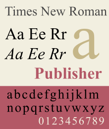
Times New Roman
 | |
| Category | Serif |
|---|---|
| Classification |
Mixed Transitional Old-style |
| Designer(s) |
Stanley Morison Victor Lardent |
| Commissioned by | The Times |
| Foundry | Monotype |
| Date released | 1932 |
| License | Proprietary |
| Design based on | Plantin |
Times New Roman is a serif typeface designed for legibility in body text. It was commissioned by the British newspaper The Times in 1931 and conceived by Stanley Morison, the artistic advisor to the British branch of the printing equipment company Monotype, in collaboration with Victor Lardent, a lettering artist in the Times' advertising department.[1][2] Although no longer used by The Times, Times New Roman is still very common in book and general printing.[3] It has become one of the most popular and influential typefaces in history and a standard typeface on most desktop computers.[4][5]
Times New Roman's creation took place through the influence of Stanley Morison of Monotype. Morison was an artistic director at Monotype, historian of printing and informal adviser to The Times. Asked to advise on a redesign, he recommended that they change their text typeface from a spindly and somewhat dated nineteenth-century face to a more robust, solid design, returning to traditions of printing from the eighteenth century and before.[6][7][lower-alpha 1][11][12][lower-alpha 2] This matched a common trend in printing tastes of the period.
The new face was drawn by Victor Lardent, an artist from the advertising department of The Times, with Morison consulting, before refinement by the Monotype drawing office.[lower-alpha 3] Morison proposed an older Monotype typeface named Plantin as a basis for the design, and Times New Roman mostly matches Plantin's dimensions. The main change was that the contrast between strokes was enhanced to give a crisper image. As a typeface designed for newspaper printing, Times New Roman has a high x-height, short descenders to allow tight linespacing and a relatively condensed appearance. The new design made its debut in The Times on 3 October 1932.[13][14] After one year, the design was released for commercial sale.[15] Although Morison may not have literally drawn the design, his influence on its concept was sufficient that he felt that he could take credit for it as "my one effort at designing a font".[16][lower-alpha 4] In Times New Roman's name, Roman is a reference to the regular style of a conventional serif font, or what is called its roman, the first part of the Times New Roman family to be designed.[17] (The style is called Antiqua in some countries.) Roman type has some roots in Italian (and other European) printing of the late 15th and early 16th centuries, but Times New Roman's design has no connection to Rome or to the Romans.
The Times stayed with Times New Roman for 40 years, but new production techniques and the format change from broadsheet to tabloid in 2004 have caused it to switch typeface five times from 1972 to 2007. However, all the new fonts have been variants of the original New Roman typeface. Once released for commercial sale, Times New Roman became extremely successful, becoming Monotype's best-selling typeface of all time in metal type.[18][19]
Design
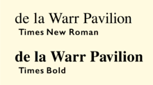
.jpg)
Times New Roman has a robust colour on the page and influences of European early modern and Baroque printing.[21] The design is slightly condensed, with short ascenders and descenders and a high x-height (tall lower-case letters), all effects that save space and increase clarity.
The ultimate origin of the 'Roman' (regular) style of Plantin and Times New Roman was a metal type created in the late sixteenth century by the French artisan Robert Granjon and preserved in the collection of the Plantin-Moretus Museum of Antwerp.[22][23][24][25] This style is sometimes categorised as part of the old-style of serif fonts. Morison admired this style for its solid structure and clarity.[26][27][lower-alpha 6]
However, due to features such as its 'a' and 'e', with larger counters and apertures than in Granjon's design, its ball terminal detailing and an increased level of contrast between thick and thin strokes, it has also been compared to fonts from the late eighteenth century, the so-called 'transitional' genre, in particular the Baskerville typeface of the 1750s.[28][29][30] Historian and sometime Monotype executive Allan Haley commented that compared to Plantin "serifs had been sharpened...contrast was increased and character curves were refined," while Lawson described Times's higher-contrast crispness as having "a sparkle [Plantin] never achieved."[31][32] (The 'a' of Plantin was already not directly sourced from Granjon's work: the sheet from the Plantin-Moretus Museum used as a specimen for Monotype to use in designing Plantin had an 'a' from the wrong font.[33]) Other changes from Plantin include a straight-sided 'M' and 'W' with three upper terminals not Plantin's four, both choices that move away from the old-style model.[34]
Morison described the companion italic as also being influenced by the typefaces created by the Didot family in the late 18th and early 19th centuries: a "rationalistic italic that owed nothing to the tradition of the sixteenth or seventeenth centuries. It has, indeed, more in common with the eighteenth century."[11][36][35] Morison had several years earlier attracted attention for promoting the radical idea that italics in book printing were too disruptive to the flow of text, and should be phased out.[37][38] He rapidly came to concede that the idea was misguided, and later wryly commented to historian Harry Carter that Times' italic "owes more to Didot than dogma."[39] Morison wrote in a personal letter of Times New Roman's mixed heritage that it "has the merit of not looking as if it had been designed by somebody in particular."[40][41][lower-alpha 7]
Rather than creating a companion boldface with letterforms similar to the roman style, Times New Roman's bold has a different character, with a more condensed and more upright effect caused by making the horizontal parts of curves consistently the thinnest lines of each letter, and making the top serifs of letters like 'd' purely horizontal.[43] This effect is not found in sixteenth-century typefaces (which did not have bold versions); it is most associated with Didone type of the early nineteenth century and with the more recent 'Ionic' styles of type influenced by it that were offered by Linotype (discussed below), which were very dominant in contemporary newspaper printing.[32][44][45][46] Some commentators have found Times' bold unsatisfactory and too condensed, such as Walter Tracy and Stephen Coles.[42][47]
Development
The development of Times New Roman was relatively involved due to the lack of a specific pre-existing model – or perhaps a surfeit of possible choices. Morison wrote in a memo that he hoped for a design that would have relatively sharp serifs, matching the general design of the Times' previous font, but on a darker and more traditional basic structure. Bulked-up versions of Monotype's pre-existing but rather dainty Baskerville and Perpetua typefaces were considered for a basis, and the Ionic designs from Linotype, such as Excelsior, that were popular in newspaper printing at the time, were also examined. (Perpetua, which Monotype had recently commissioned from sculptor Eric Gill at Morison's urging, is considered a 'transitional' design in aesthetic, although it does not revive any specific model.) Walter Tracy, who knew Lardent, suggested in the 1980s that "Morison did not begin with a clear vision of the ultimate type, but felt his way along."[42]
Morison's biographer Nicolas Barker has written that Morison's memos of the time wavered over a variety of options before it was ultimately concluded that Plantin formed the best basis for a condensed font that could nonetheless be made to fill out the full size of the letter space as far as possible.[48] (Morison ultimately conceded that Perpetua, which had been his pet project, was 'too basically circular' to be practical to condense in an attractive way.[48][lower-alpha 9])
Walter Tracy and James Moran, who discussed the design's creation with Lardent in the 1960s, found that Lardent himself had little memory of exactly what material Morison gave him as a specimen to use to design the typeface, but he told Moran that he remembered working on the design from archive photographs of vintage type, which Tracy suggests might have been the same specimen of type from the Plantin-Moretus Museum that Plantin had been based on, or a specimen of Plantin itself.[32][45][42][49] The sharpened serifs somewhat recall Perpetua, although Morison's stated reason for them was to provide continuity with the previous Didone design and the crispness associated with the Times' printing; he also later cited reproduction after stereotyping as a reason for the choice. Morison's several accounts of his reasoning in designing the concept of Times New Roman were somewhat contradictory and many historians of printing have suggested that they were mostly composed to rationalise his aesthetic preferences; Monotype's newspaper printing consultant Allen Hutt, went so far as to describe his unsigned 1936 article on the topic after his death as "rather odd...it can only be regarded as a piece of Morisonian mystification".[2]
During the project, Monotype and The Times examined research on legibility of type and carried out legibility tests on proof sheets. The design was refined extensively during the process of development by the Monotype drawing office team, and further changes were made after manufacturing began (the latter a difficult practice, since new punches and matrices had to be machined after each design change), and so obvious differences exist between Lardent's original drawings and the final release.[42] Rhatigan has said that Lardent's originals show "the spirit of the final type, but not the details."[6][lower-alpha 10]
Morison continued to develop a close connection with the Times that would last throughout his life. Morison edited the History of the Times from 1935 to 1952, and in the post-war period, at a time when Monotype effectively stopped developing new typefaces due to pressures of austerity, took a post as editor of the Times Literary Supplement which he held from 1945 to 1948.
Metal type versions
A large number of variants of Times were cut. Walter Tracy in Letters of Credit, Allen Hutt and others have discussed these extensively in their works on the family.[2][42]
Titling
Monotype also created some caps-only 'titling' designs to match Times New Roman itself, which was intended for body text.[50] While these are not sold by Monotype in digital format, Linotype's Times Eighteen in the same style (see below) remains available and could be used as a substitute.[51]
Times Hever Titling
An elegant titling caps design, quite different to Times New Roman with a Caslon-style A (with a serif at top left of the letter, suggesting a stroke written with a quill) and old-style C and W; Tracy suggests Monotype's previous Poliphilus design as an influence. Named after Hever Castle, the home of the Times' owner Lord Astor. Designed early on, it was used by the Times for section headings.[50][52] It has not been digitised.
Times Wide (1938, series 427)
A variant intended for book printing, avoiding the slight condensation of the original Times New Roman.[53] Although it was popular in the metal type period for book printing, it was apparently never digitised.
Series 727 and 827
Monotype also produced Series 727, in which the heavier strokes of upper-case letters were made slightly thinner. This was done to produce a lighter effect in which capital letters do not stand out so much, and was particularly intended for German use, since in the German language capitals are far more common since they appear at the start of each noun. Series 827 modified some letters (notably the R) to correspond to their appearance in other typefaces popular in French printing. This production of what are now called stylistic alternates to suit national tastes was common at the time, and many alternates were also offered for Gill Sans for use in Europe.[54]
Claritas
A modified 4¾ point size of Times Roman was produced by Monotype for use in printing matter requiring a very small size of type. Listed as Times Newspaper Smalls, available as either Series 333 or 335, it was also referred to by the name Claritas.[11]
Times 4-line Mathematics Series 569
This is a variant designed for printing mathematical formulae, using the 4‑line system for mathematics developed by Monotype in 1957.[55][56] This modified version of Times Roman was designed for use as part of Monotype's 4-line Mathematics system. The major changes to the Times Roman typeface itself were a reduction in the slope of italic characters to 12 degrees from 16 degrees, so as to reduce the need for kerning, and a change in the form of italic v and w so that italic v could be more easily distinguished from a Greek nu.
The 4-line system involved casting characters for 10-point Times Roman on 6-point bodies. The top of the character would overhang the slug, forming a kern which was less fragile than the normal kerns of foundry type, as it was on a slab of cast metal. This technique had been in previous use on Monotype machines, usually involving double-height matrices, to allow the automatic setting of "advertising figures" (numbers that occupy two or more lines, usually to clearly indicate a price in an advertisement set in small type). This meant that the same matrix could be used for both superscript and subscript numbers. More importantly, it allowed a variable or other item to have both a superscript and a subscript at the same time, one above the other, without inordinate difficulty.
Previously, while the Monotype system, due to its flexibility, was widely used for setting mathematical formulas, the typeface Modern Series 7 was usually used for this purpose.[57] Because of the popularity of Times Roman at the time, Monotype chose to design a variant of Times Roman suited to mathematical composition, and recut many additional characters needed for mathematics, including special symbols as well as Greek and Fraktur alphabets, to accompany the system instead of designing it around the typeface that was being used, for which characters were already available. Matrices for some 700 characters were available as part of Times Roman Series 569 when it was released in 1958, with new characters constantly being added for over a decade afterwards (thus, in 1971, 8,000 characters were included, and new ones were being added at a rate of about 5 per week).
Usage
Times New Roman's popularity rapidly expanded beyond its original niche, becoming popular in book printing and general publishing. Monotype took advantage of this popularity by commissioning a widened version, Series 427, for book publishing, although many books ultimately used the original version.
An early use of Times New Roman outside its origin was by Daniel Berkeley Updike, an influential historian of printing with whom Morison carried an extensive correspondence. Impressed by the design, he used it to set his book Some Aspects of Printing, Old and New.[59][60][61] It then was chosen by the Crowell-Collier magazines Woman's Home Companion and then its sister publications such as Collier's.[62][63] A brochure was published to mark the change along with a letter from Morison hoping that the redesign would be a success.[58]
Walter Tracy, who worked on a redesign, however noted that the design's compression and fine detail extending to the edge of the matrices was actually problematic in the aggressive conditions of most newspaper printing, in which the Times was unusual for its particularly high standard of printing suiting its luxury market. Users found that in the hot metal period it was common for the molten metal to rapidly eat through the matrices, and so it did not become popular among other newspapers: "Times Roman achieved its popularity chiefly in general printing, not in newspaper work."[42] He described it as particularly used in "book work, especially non-fiction" such as the Encyclopaedia Britannica.[42]
Linotype releases
Despite Monotype's key role in creating Times New Roman, its rival Linotype rapidly began to offer the design; The Times used Linotype equipment for much of its production. Linotype referred to the design as Times or Times Roman. Monotype and Linotype have since merged, but slight differences have split the lineage of Times into two subtly different designs.
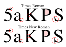
Although Times New Roman and Times are very similar, various differences developed between the versions marketed by Linotype and Monotype when the master fonts were transferred from metal to photo and digital media. For example, Linotype has slanted serifs on the capital S, while Monotype's are vertical, and Linotype has an extra serif on the number 5.[65] Most of these differences are invisible in body text at normal reading distances, or 10pts at 300 dpi. Subtle competition grew between the two foundries, as the proportions and details as well as the width metrics for their version of Times grew apart.[66] Vivid differences between the two versions do occur in the lowercase z in the italic weight (Times Linotype has a curl also followed in the STIX revival, Times New Roman is straight) and in the percent sign in all weights. (Linotype and STIX have a stroke connecting up the left-hand zero with a slash, Times New Roman does not.)
Linotype licensed its version to Xerox and then Adobe and Apple, guaranteeing its importance in digital printing by making it one of the core fonts of the PostScript page description language.[67] Microsoft's version of Times New Roman is licensed from Monotype, hence the original name. For compatibility, Monotype had to subtly redraw their design to match the widths from the Adobe/Linotype version.[68] It has been reported to have lighter capitals that were originally developed for printing German (where all nouns begin with a capital letter). Versions of Times New Roman from Monotype exist which vary from the Linotype metrics (i.e. not the same as the version for Microsoft).
Linotype applied for registration of the trademark name Times Roman and received registration status in 1945. In the 1980s, there was an attempt by a group of entrepreneurs to seek from Rupert Murdoch, who owned The Times, the right to use the Times Roman name; separately, a legal action was also initiated to clarify the right of Monotype to use the name in the US despite Linotype's registration. As a result of legal action, Linotype and its licensees continued to use the name Times Roman, while Monotype and its licensees used the name Times New Roman.[66]
Modern releases
As Times New Roman
Monotype sells a wider range of styles and optical sizes for Times New Roman than are offered with Windows, in order to meet the needs of newspapers and books which print at a range of text sizes.[11] Its current release includes Regular, Medium, Semi Bold and Bold weights with matching italics, Extra Bold, Condensed (in regular, italic and bold), Seven (for smaller text, in regular, italic, bold and bold italic) and Small Text (for very small text, in regular, italic and bold).[69]
As of 2017, the version of Times New Roman included with Windows 10, version 6.96, includes small capitals, text figures, and italic swash capitals.[70] The Microsoft/Monotype digitisation of Times New Roman omits automatic ligature insertion (although as of v. 6.96 it is selectable)[70], which the version of Times installed with macOS has. (This can result in unsightly character collisions if the characters 'fi' are needed.)
Times New Roman World
This is a version based on fonts released with Windows Vista.[71] It includes fonts in WGL character sets, Hebrew and Arabic characters. Similar to Helvetica World, Arabic in italic fonts are in roman positions.
Linotype variants
Like Monotype, Linotype released additional versions of Times for different text sizes. These include:
- Times Ten is a version specially designed for smaller text (12 point and below). It features wider characters and stronger hairlines.[72][73]
- Times Eighteen, a headline version for point sizes of 18 and larger. The characters are subtly condensed and the hairlines are finer. The current version has no italics, but does have a lower case (whereas some Times titling fonts were capitals only).[51]
- Times Europa Office, a 2006 adaptation of the Times newspaper's 1972 design Times Europa (see below). This is a complete family of designs intended for use on poor-quality paper. The updating, created by Akira Kobayashi, contains tabular numbers, mathematical signs, and currency symbols. Each character has the same advance width in all the fonts in the family so that changing from regular to bold or italic does not affect word wrap.[74]
Other typefaces used by The Times
From 1908 to 1932, The Times used a Didone serif font cut by Monotype, the same as or similar to Monotype Modern.[12][lower-alpha 11] The Times newspaper has commissioned various successors to Times New Roman:
- Times Europa was designed by Walter Tracy in 1972 for The Times, as a sturdier alternative to the Times font family, designed for the demands of faster printing presses and cheaper paper. The typeface features more open counter spaces and a more strongly contrasting, calligraphic italic. It has been released commercially by Adobe, among others, recently in an updating by Linotype.[75]
- Times Roman replaced Times Europa on 30 August 1982.[76]
- Times Millennium was made in 1991, drawn by Gunnlaugur Briem on the instructions of Aurobind Patel, composing manager of News International.[76][lower-alpha 12]
- Times Classic first appeared in 2001.[78] Designed as an economical face by the British type team of Dave Farey and Richard Dawson, it took advantage of the new PC-based publishing system at the newspaper, while obviating the production shortcomings of its predecessor Times Millennium. The new typeface included 120 letters per font. Initially the family comprised ten fonts, but a condensed version was added in 2004.
- Times Modern was unveiled on 20 November 2006, as the successor of Times Classic.[76] Designed for improving legibility in smaller font sizes, it uses 45-degree angled bracket serifs. It was designed by Research Studios, led by designer Neville Brody with input from Ben Preston, deputy editor of The Times.[79] (Other designs have been released called Times Modern; see below.)
During the Times New Roman period The Times also sometimes used Perpetua Titling, also from Monotype, and one of Morison's favourite type designs from his work at Monotype.[50]
Uses
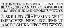
.jpg)
Times New Roman has been used for a wide range of newspapers around the world. In addition:
- Microsoft has distributed Times New Roman with every copy of Microsoft Windows since version 3.1,[80] and the typeface is used as the default in many applications for MS Windows, especially word processors and Web browsers. (Calibri became the default font for Microsoft Word beginning with Microsoft Office 2007).
- Linotype's Times Roman is the default Apple Mac OS X font for the serif/roman generic font family and has long been installed by default in Mac OS X. Monotype's Times New Roman is also installed by default in recent versions of Mac OS X (10.5+).[81]
- The United States Department of State announced that, as of 1 February 2004, all US diplomatic documents would use 14 pitch [sic] Times New Roman instead of the previous 12 point (equivalent to 10 pitch) Courier New.[82][83]
- Researchers in 2008 found that satirical readings of text printed in Times New Roman were perceived as more funny and angry than those printed in Arial.[84]
William Starling Burgess
In 1994 the printing historian Mike Parker published claims that the design of Times New Roman’s roman or regular style was based on a 1904 design of William Starling Burgess.[85] This theory remains controversial.[86][87] Parker and his friend Gerald Giampa, a Canadian printer, claimed that in 1904 Burgess created a type design for company documents at his shipyard in Marblehead, Massachusetts, and hired Lanston Monotype to issue it.[87] However, Burgess abandoned the idea and Monotype shelved the sketches, ultimately reusing them as a basis for Times New Roman. Giampa claimed that he stumbled upon original material in 1987, after he had purchased Lanston Monotype. Giampa claimed that some of the papers that had been his evidence had been lost in a flood at his house, while Parker claimed that an additional source was material in a section of the Smithsonian now closed due to asbestos contamination.[87][88] Giampa asked Parker to complete the type from the limited number of surviving letters, which was issued in June 2009 by Font Bureau under the name of 'Starling'.[87][88]
Reception to the claims was sceptical with dismissal from Morison's biographer Nicolas Barker and Luc Devroye among others; Barker suggested that the material had been fabricated in order to aid Giampa in embarrassing Monotype's British branch, while Devroye suggested that the claim had begun as a prank.[88][89][90] Monotype executive Dan Rhatigan described the theory as implausible in 2011: "I'll admit that I tend to side with the more fully documented (both in general, and in agreement with what little I can find within Monotype to support it) notion that Times New Roman was based on Plantin...I won't rule out the possibility that Starling Burgess drew up the concept first, but Occam's razor makes me doubt it."[9]
The Times Online web site credits the design to "Stanley Morrison, Victor Lardent and perhaps Starling Burgess".[91]
Designs inspired by Times New Roman
Because of its popularity, the typeface has been influential in the subsequent development of a number of serif typefaces both before and after the start of the digital-font era.
- Times Modern was a condensed and bold display variant published by, among others, Elsner+Flake. It was withdrawn from sale due to trademark disputes with the Times newspaper, which owns its own unrelated design named 'Times Modern' (see above).[92]
- CG Times is a variant of Times family made by Compugraphic Corporation foundry.
- Pelham is a version of Times Roman by DTP Types of Britain, which also cut an infant version with single-story versions of the letters a and g.
- In the mid-1960s, a derivative of Times New Roman known as 'Press Roman' was used as a font for the IBM Composer. This was an ultra-premium electric 'golfball' typewriter system, intended to be used for producing high-quality office documents or copy to be photographically enlarged for small-scale printing projects.[93] Unlike most typewriters, the Composer produced proportional type, rather than monospaced letters. Ultimately the system proved a niche product, as it competed with increasingly cheap phototypesetting, and then in the 1980s was largely displaced by word processors and general-purpose computers.[94][lower-alpha 13]
Free alternatives
Times Roman and Times New Roman are proprietary fonts.[97] There are some free software metric-compatible fonts used as free Times Roman and Times New Roman alternatives or used for font substitution:
- URW++ produced a version of Times New Roman called Nimbus Roman in 1982. Nimbus Roman No9 L, URW's PostScript variant, was released under the GNU General Public License in 1996,[98][99] and available in major free and open source operating systems. This was later adapted as FreeSerif[97][100], TeX Gyre Termes[101] and TeX Gyre Termes Math[102]. Like Times New Roman, many additional styles of Nimbus Roman exist that are only sold commercially, including condensed and extra-bold styles. URW also developed Nimbus Roman No. 4, which is metrically compatible with the slightly different CG Times.
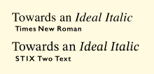
- The STIX Fonts project is a four-style set of open-source fonts. They were created for scientific publishing by the Scientific and Technical Information Exchange consortium of publishers, but are also very suitable for general use, including Greek and Cyrillic support.[103] The original version is installed by default on Mac OS X, and adapted as XITS. In 2016, a completely redesigned version was released by Ross Mills and John Hudson of Tiro Typeworks. Unlike the previous version, it is an original design loosely inspired by a smaller 10 point size of Times New Roman, with a higher x-height than Monotype's Times digitisation.[104][105]
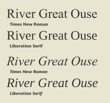
- Liberation Serif is metrically equivalent to Times New Roman. It was developed by Ascender Corp. and published by Red Hat in 2007 under the GPL license with some exceptions.[106] It is used in some GNU/Linux distributions as a default font replacement for Times New Roman.[107] Widths aside, it does not particularly resemble Times New Roman, being much squarer in shape with less fine detail and blunt ends rather than ball terminals.
- Google's Tinos in the Croscore fonts package is a derivation and expansion of Liberation Serif, also designed by Steve Matteson.
- Bitstream Cyberbit is a roman-only font released by Bitstream for non-commercial use, with European alphabets based on Times New Roman.[108][109] It has an expanded character range intended to cover a large proportion of Unicode for scholarly use. Bitstream no longer offers the font, but it remains downloadable from the University of Frankfurt.[110]
Metric-incompatible alternatives
- Linux Libertine is a proportional serif typeface inspired by 19th century book type and is intended as a replacement for the Times font family. The typeface has six styles.
- Times Newer Roman is a variant of Times New Roman with slightly wider characters and spacing. By taking up more space, it allows college students to make shorter essays with a given page count using a font that looks like Times New Roman.[111][112][113]
See also
Notes
- ↑ The Times's previous font was a Didone or Modern design; James Mosley reports that it is the face Monotype sold as Series 7 or "Modern Extended", based on typefaces by Miller and Richard.[8][9] Fonts of its kind were standard in nineteenth- and early-twentieth century newspaper printing.[10] Now little-known, the success of its replacement has led to it sometimes being called Times Old Roman in reference to its successor and a famous cover of Monotype's trade journal Monotype Recorder which presented it under this name. Computer Modern is somewhat similar.
- ↑ "The Changing Newspaper" articles in the Monotype Recorder are unsigned, but Allen Hutt, who also co-authored the issue, attributed them to Morison.[2]
- ↑ Exactly what direction Morison gave Lardent is uncertain: Morison said that he had given Lardent basic drawings which Lardent worked up; Lardent that Morison had only given him basic directions and some photographs as a model; see below.
- ↑ Spelling modernised. Morison wrote "fount", the usual spelling in British English at the time.
- ↑ "Modern" in typography is a generic term referring to designs in the modern or Didone style of the nineteenth century.
- ↑ Times New Roman was called "Times Old Style" in an early stage of its development.[3]
- ↑ Morison continued: "– Mr. Goudy for instance."[16] This refers to Frederic Goudy, one of the leading American type designers of the period. Morison considered his very organic tastes in letter design somewhat florid and self-indulgent.
- ↑ It will be noted in the roman style that the high serifs of the 'v' do not sit well with the lower shape of the 'i'. In his commentary on Times, Walter Tracy commented that the designers should have tested the font using words like 'divide' and 'jump' to avoid this.[42]
- ↑ Dreyfus shows proofs of the experimental recut of Perpetua with shortened descenders to allow tighter linespacing.[3] Morison later commented that "it stared at the reader", presumably meaning it was too wide and circular.[42]
- ↑ Lardent's original drawings are according to Rhatigan lost, but were photographed. Tracy provides a reproduction.[42]
- ↑ Monotype's article on the creation of the new type provides a side-by-side comparison of text in both typefaces.[22]
- ↑ Briem has written that a complicated three-way lawsuit followed in which Patel unsuccessfully claimed to have co-designed Times Millennium himself.[77]
- ↑ The system returned to public attention in 2004, during the Killian documents controversy, when some documents apparently from the 1970s and presenting the future U.S. president George W. Bush's somewhat chequered military service in an unfavourable light were presented by the American news network CBS. The documents were typeset in a form of Times New Roman. As the documents looked unlike most typewritten documents, having proportional spacing rather than the monospacing of almost all typewritten documents, some defenders of the documents suggested that they might have been typed using this method. It is now accepted that they were forged on a modern computer, according to digital font expert Thomas Phinney in the Linotype version of Times New Roman.[95][96]
References
- ↑ Loxley, Simon (2006). Type: the secret history of letters. I. B. Tauris & Co. Ltd. pp. 130–131. ISBN 1-84511-028-5.
- 1 2 3 4 Hutt, Allen (1970). "Times Roman: a re-assessment". Journal of Typographic Research. 4 (3): 259–270. Retrieved 5 March 2017.
- 1 2 3 Dreyfus, John (1973). "The Evolution of Times New Roman". The Penrose Annual. 66: 165–174.
- ↑ Farey, Dave (2014). "A Life and Times, Part 1". Ultrabold (16): 16–25.
- ↑ Farey, Dave (2014). "A Life and Times, Part 2". Ultrabold (15): 3–13.
- 1 2 Rhatigan, Dan. "Time and Times again". Monotype. Retrieved 28 July 2015.
- ↑ Carter, H. G. (2004). ‘Morison, Stanley Arthur (1889–1967)’. Oxford Dictionary of National Biography,. rev. David McKitterick. Oxford University Press,.
- ↑ Mosley, James. "Comments on Typophile thread". Typophile. Archived from the original on 12 June 2012. Retrieved 27 July 2015.
- 1 2 Rhatigan, Dan. "It was never called Times Old Roman". Ultrasparky. Retrieved 27 July 2015.
- ↑ Frere-Jones, Tobias. "Decompiled & Remixed History: The Making of Exchange". Frere-Jones Type. Retrieved 1 August 2017.
- 1 2 3 4 Morison, Stanley. "Changing the Times". Eye. Retrieved 28 July 2015.
- 1 2 Morison, Stanley. "Monotype Recorder: The Changing Newspaper" (PDF). Monotype Recorder. 35 (1).
- ↑ "TYPOlis: Times New Roman". Typolis.de. Retrieved 21 September 2013.
- ↑ Clarke, C.F.O. "The Times: A Revolution in Newspaper Printing". Graphis. pp. 362–375.
- ↑ Morison, Stanley (1973). A tally of types (New ed. with additions by several hands ed.). Cambridge: Cambridge University Press. p. 106. ISBN 9780521097864.
- 1 2 Morison, Stanley; Updike, Daniel Berkeley. Stanley Morison & D. B. Updike: Selected Correspondence. pp. 184–6.
- ↑ William E. Ryan; Theodore E. Conover (2004). Graphic Communications Today. Cengage Learning. pp. 72–81. ISBN 0-7668-2075-0.
- ↑ Badaracco, Claire (1991). "Innovative Industrial Design and Modern Public Culture: The Monotype Corporation, 1922–1932" (PDF). Business & Economic History. Business History Conference. 20 (second series): 226–233. Retrieved 19 December 2015.
- ↑ Whittington Press [@whittingtonpres] (14 April 2016). "Sales chart of Monotype die cases" (Tweet) – via Twitter.
- ↑ Gaultney, Victor. "Balancing typeface legibility and economy Practical techniques for the type designer". University of Reading (MA thesis). Retrieved 13 October 2017.
- ↑ Haslam, Andrew; Baines, Phil (2005). Type & typography (2nd ed.). London: Laurence King. p. 65. ISBN 978-1-85669-437-7.
- 1 2 Mann, Meredith. "Where Did Times New Roman Come From?". New York Public Library. Retrieved 2 February 2016.
- ↑ Hendrik D. L. Vervliet (2008). The Palaeotypography of the French Renaissance: Selected Papers on Sixteenth-century Typefaces. BRILL. pp. 226–7. ISBN 90-04-16982-2.
- ↑ Morison, Stanley (7 June 1973). A Tally of Types. CUP Archive. pp. 22–24. ISBN 978-0-521-09786-4.
- ↑ Mosley, James. "Comments on Typophile thread". Typophile. Retrieved 16 December 2016.
The consensus appears to be that not only the wrong-fount a in the cases at Antwerp but also the italic that Monotype adapted for their Plantin (which can be seen on that first page of the 1905 specimen) may be the work of Johann Michael Schmidt (died 1750), also known as J. M. Smit or Smid.
- ↑ Haley, Allan (1992). "Stanley Morison". Typographic milestones. Hoboken, NJ: John Wiley & Sons. pp. 99–107. ISBN 9780471288947. Retrieved 26 January 2016.
- ↑ Morison, Stanley (2009). "Chapter 8: Leipzig as a Centre of Type-Founding". In McKitterick, David. Selected essays on the history of letterforms in manuscript and print (Paperback reissue, digitally printed version ed.). Cambridge: Cambridge University Press. pp. 149–170. ISBN 978-0-521-18316-1.
- ↑ Busic-Snyder, Kate Clair, Cynthia (2005). A typographic workbook a primer to history, techniques, and artistry (2nd ed.). Hoboken, N.J.: Wiley. p. 171. ISBN 9781118399880. Retrieved 16 January 2016.
- ↑ Landa, Robin. Graphic Design Solutions. Cengage. ISBN 9781285657615.
- ↑ Horne, Yannis Haralambous ; translated by P. Scott (2007). Fonts & Encodings (1st ed.). Sebastopol, Calif.: O'Reilly Media. p. 417. ISBN 9780596102425. Retrieved 26 January 2016.
- ↑ Allan Haley (15 September 1992). Typographic Milestones. John Wiley & Sons. p. 106. ISBN 978-0-471-28894-7.
- 1 2 3 Lawson, Alexander (1990). Anatomy of a Typeface. New York: David R. Godine. pp. 270–294. ISBN 9780879233334. Retrieved 6 March 2016.
- ↑ Mosley, James (2003). "Reviving the Classics: Matthew Carter and the Interpretation of Historical Models". In Mosley, James; Re, Margaret; Drucker, Johanna; Carter, Matthew. Typographically Speaking: The Art of Matthew Carter. Princeton Architectural Press. pp. 31–34. ISBN 9781568984278.
Plantin was a recreation of one of the old types held at the Plantin-Moretus Museum in Antwerp, of which a specimen, printed in 1905, had been acquired by Pierpont on a visit. The type from which the specimen was printed was not only centuries old and worn almost beyond use, but it was contaminated with wrong-font letters (notably the letter ‘a’) and the italic did not even belong to the roman. The revival, derived by Monotype from an indirect and confused original, is [nonetheless] as sound a piece of type-making as was ever created in the 20th century…behind the foggy image of the roman type lies the...'Gros Cicero' Roman of Robert Granjon, acquired by the Plantin printing office after the death of its founder.
- ↑ Tracy, Walter (January 2003). Letters of Credit: A View of Type Design. D.R. Godine. pp. 56–59. ISBN 978-1-56792-240-0.
- 1 2 Mosley, James. "Comments on Typophile thread". Retrieved 27 March 2017.
One of the distinctive things about French calligraphy of [the 1680s] is that the lead-in stroke of letters like i, m, n and so on have flat, rather ‘roman’, serifs, making them look a bit like a ‘sloped roman’…Fournier used it fifty years later in his ‘new style’ italics, and later so did Firmin Didot. And that French flat serif also turns up in…the italic to Times New Roman.
- ↑ Barr, John (1971). Stanley Morison: A Portrait. British Museum. p. 33.
- ↑ Wardle, Tiffany (2000). The story of Perpetua (PDF). University of Reading. p. 5. Archived from the original (PDF) on 10 November 2006. Retrieved 26 March 2009.
- ↑ Mosley, James. "Eric Gill's Perpetua Type". Fine Print.
- ↑ Morison, Stanley (7 June 1973). A Tally of Types. CUP Archive. pp. 124–5. ISBN 978-0-521-09786-4.
- ↑ Simon Loxley (12 June 2006). Type: The Secret History of Letters. I.B.Tauris. pp. 134–. ISBN 978-1-84511-028-4.
- ↑ Alas, Joel. "The history of the Times New Roman typeface". Financial Times. Retrieved 16 January 2016.
- 1 2 3 4 5 6 7 8 9 10 Walter Tracy (January 2003). Letters of Credit: A View of Type Design. D.R. Godine. pp. 80–82, 183–5, 194–209. ISBN 978-1-56792-240-0.
- ↑ Hare, Steve. "By printers, for printers". Eye Magazine. Retrieved 2 February 2016.
[Shown are] overlays from the article 'The Evolution of Times New Roman’ by John Dreyfus. He writes: ‘These drawings demonstrate how severely the bowl of “p” has been reduced in the bold version, because mainstrokes have been thickened without drawing the bold version any wider.'
- ↑ Middendorp, Jan (2004). Dutch type. Rotterdam: 010 Publishers. p. 94. ISBN 9789064504600. Retrieved 26 January 2016.
- 1 2 Miklavčič, Mitja (2006). "Three chapters in the development of Clarendon/Ionic typefaces" (PDF). MA Thesis (University of Reading). Archived from the original (PDF) on 25 November 2011. Retrieved 14 August 2015.
- ↑ Coles, Stephen. "Times Bold Modified". Flickr. Retrieved 26 January 2016.
[Writing on cold type rereleases of Times New Roman by Berthold]: To me, the sources for both Monotype and Linotype digital versions…really suffer from the condensed bold…in fact, many Bold letters are actually narrower, resulting in counters reduced to mere slits in some cases. Times 421 [an alternative release in the 1970s by Berthold] is not compromised in this way and the result is much more clear and confident. Yes, it takes up more space; but this style needs to — especially for text. [It] also maintains the angled stress of the regular (327), while Times New Roman Bold is forced into an unrelated vertical stress…I don’t know if this design originated at Monotype or if it’s a Berthold invention. It isn’t a match, but it does seem similar to the variant used by Stanley Morison in his essay on Times for A Tally of Types(1953), which he describes as “a wide version, more suited for longer lines.” Jaspert, Berry and Johnson show that in Encyclopaedia of Typefaces as “Times Wide” (Series 427). Another possible link to this Berthold design is mentioned by Tracy in Letters of Credit: “This disparity in style between the roman and bold was evidently something the German Linotype company thought should be eliminated. In the version of Times Roman they issued in 1935, first called Neue Romanisch but then named Toscana, the bold lowercase was redesigned in the ‘old style’ mode. The idea of harmonising the bold with the roman was logical; the actual execution, especially the character spacing, was not well done. The type soon disappeared."
- ↑ Coles, Stephen; Shinn, Nick; Phinney, Thomas. "Why does the digital Times New Roman seem to consist of two different typefaces? (discussion)". Quora. Retrieved 6 September 2017.
- 1 2 Barker, Nicolas (1972). Stanley Morison. pp. 271–302.
|access-date=requires|url=(help) - ↑ Cees de Jong; Alston W. Purvis; Friedrich Friedl (2005). Creative Type: A Sourcebook of Classic and Contemporary Letterforms. Inmerc. p. 355. ISBN 978-90-6611-250-6.
- 1 2 "Linotype Times Eighteen". MyFonts. Retrieved 14 July 2015.
- ↑ Savoie & Hudson. "Comments on Typophile thread". Typophile. Archived from the original on 17 July 2014. Retrieved 16 September 2015.
- ↑ "Typographic Problems of the Illustrated Book" (PDF). Monotype Recorder. 37 (2): 31. 1938.
Some types look larger, size for size, than others, because they have unusually short descenders and ascenders. This allows more room for the 'x' or the middle part of the lower-case [but] a 'large x' is bound to waste space horizontally...the imperceptible condensation of Monotype Times New Roman puts it in a class by itself as a news face. In the wider book measure, however, condensation is no asset.
- ↑ "Modifications and extensions of a single series" (PDF). Monotype Recorder. 40 (3): 14. 1956. Retrieved 27 July 2015.
- ↑ Rhatigan, Daniel. "The Monotype 4-Line System for Setting Mathematics". Type Culture. Retrieved 17 August 2018.
- ↑ Rhatigan, Daniel. "Three typefaces for mathematics" (PDF). University of Reading (MA thesis). Retrieved 2 February 2016.
- ↑ T. W. Chaundy, P. R. Barett, Charles Batey, The Printing of Mathematics, Oxford University Press (1954, 1957)
- 1 2 Heller, Steven. "Happiness is Times New Roman". Print magazine. Retrieved 15 December 2016.
- ↑ Lewis Blackwell (2004). 20th-century Type. Laurence King Publishing. pp. 76–9. ISBN 978-1-85669-351-6.
- ↑ Lawson, Alexander S. "D.B. Updike Set Standard of Great Craftsmanship". The Alexander S. Lawson Archive. Retrieved 15 December 2016.
- ↑ Lawson, Alexander S. "Stanley Morison: Significant Historian (obituary)". The Alexander S. Lawson Archive. Archived from the original on 27 May 2016. Retrieved 14 May 2016.
- ↑ Alexander S. Lawson (January 1990). Anatomy of a Typeface. David R. Godine Publisher. pp. 270–294. ISBN 978-0-87923-333-4.
- ↑ "Crowell-Collier adopts a Type Developed by London Times". Inland Printer and American Lithographer. 111.
- ↑ "TypeTalk: Times Roman vs Times New Roman". 14 October 2009. Archived from the original on 5 August 2012. Retrieved 1 July 2011.
- ↑ "TypeTalk: Times Roman vs Times New Roman". CreativePro.com.
- 1 2 Charles Bigelow (1994). "Times (New) Roman and its part in the Development of Scalable Font Technology". Retrieved 4 July 2011.
- ↑ Shaw, Paul. "Some history about Arial". Paul Shaw Letter Design. Retrieved 22 May 2015.
- ↑ Simonson, Mark. "Monotype's Other Arials". Mark Simonson Studio. Retrieved 14 July 2015.
- ↑ "Monotype Library: Times New Roman". Monotype. Retrieved 14 July 2015.
- 1 2 Times New Roman, v. 6.96 (Font digitisation). Monotype.
- ↑ "Times New Roman OS". Linotype. Monotype. Retrieved 14 July 2015.
- ↑ "Linotype Times Ten". MyFonts. Retrieved 14 July 2015.
- ↑ "Adobe Times Ten". MyFonts. Retrieved 14 July 2015.
- ↑ "Times Europa Office Font Family". Linotype.com. Retrieved 21 September 2013.
- ↑ "Adobe Times Europa". MyFonts. Retrieved 14 July 2015.
- 1 2 3 "After 221 years, the world's leading newspaper shows off a fresh face". Thetimes.co.uk. 20 November 2006. Retrieved 21 September 2013.
- ↑ Briem, Gunnlaugur. "BriemTimes:". Gunnlaugur SE Briem. Retrieved 27 July 2015.
- ↑ "Typography of News Bigger, faster, better". Fontshop.com. Retrieved 21 September 2013.
- ↑ "Neville Brody's Research Studios Creates New Font and Design Changes for The Times as Compact Format Continues to Attract Loyal Readership". LONDON: Prnewswire.co.uk. 2006-11-15. Retrieved 21 September 2013.
- ↑ "Times New Roman - Microsoft Typography". Retrieved 6 January 2012.
- ↑ "Mac OS X 10.5: Fonts list". 15 May 2008. Retrieved 5 December 2010.
- ↑ "5 FAH-1 H-620 Preparing Diplomatic Notes" (PDF). U.S. Department of State Foreign Affairs Handbook. U.S. Department of State. 1 August 2007. Retrieved 12 January 2016.
- ↑ "5 FAH-1 Change Transmittal CH-10" (PDF). U.S. Department of State Foreign Affairs Handbook. U.S. Department of State. 19 January 2005. Archived from the original (PDF) on 1 October 2006. Retrieved 18 April 2008.
- ↑ Juni S; Gross JS (February 2008). "Emotional and persuasive perception of fonts". Perceptual and motor skills. 106 (1): 35–42. doi:10.2466/pms.106.1.35-42. PMID 18459353.
- ↑ Parker, Mike (1994). "W. Starling Burgess, Type Designer?". Printing History. 31/32: 52–108.
- ↑ Alas, Joel (1 August 2009). "The history of the Times New Roman typeface". Financial Times. Retrieved 26 August 2009.
- 1 2 3 4 Katherine Eastland. The History Page: Exactly your type, TheDaily.com, 15 August 2011
- 1 2 3 Loxley, SImon. "Stanley Morison and Times New Roman". Ultrabold. Retrieved 8 March 2016.
- ↑ Barker, Nicolas (2003). "Starling Burgess: No Type Designer". Form and Meaning in the History of the Book : selected essays. London: British Library. pp. 371–390. ISBN 0-7123-4777-1.
- ↑ Devroye, Luc. "William Starling Burgess". Type Design Information. Retrieved 8 March 2016.
- ↑ "FAQ: infrequently asked questions". Times Online. 25 January 2007. Retrieved 26 August 2009.
- ↑ Coles, Stephen. "Times Modern". Fonts in Use. Retrieved 14 July 2015.
- ↑ Stamm, Swiss Foundation Type and Typography ; edited by Heidrun Osterer and Philipp (2009). Adrian Frutiger typefaces : the complete works (English ed.). Basel: Birkhäuser. p. 192. ISBN 978-3764385811.
- ↑ McEldowney, Dennis (1 October 2013). A Press Achieved: the Emergence of Auckland University Press, 1927-1972. Auckland University Press. pp. 102–5. ISBN 978-1-86940-671-4.
- ↑ Phinney, Thomas (3 August 2006). "Bush Guard memos used Times Roman, not Times New Roman". The Typekit Blog. Retrieved 20 April 2015.
- ↑ Dobbs, Michael; Kurtz, Howard (14 September 2004). "Expert Cited by CBS Says He Didn't Authenticate Papers". The Washington Post. Retrieved 20 February 2007.
- 1 2 "GNU FreeFont - Why do we need free outline UCS fonts?". 4 October 2009. Retrieved 2 July 2010.
- ↑ "Finally! Good-quality free (GPL) basic-35 PostScript Type 1 fonts" (TXT). Retrieved 6 May 2010.
- ↑ "ghostscript-fonts-std-4.0.tar.gz - GhostScript 4.0 standard fonts - AFPL license". 28 June 1996. Archived from the original (TAR.GZ) on 24 April 2011. Retrieved 6 May 2010.
- ↑ "GNU FreeFont - Design notes". 4 October 2009. Retrieved 2 July 2010.
- ↑ "TeX Gyre Termes — GUST Web Presence". Retrieved 20 May 2018.
- ↑ "README-TeX-Gyre-Termes-Math.txt — GUST Web Presence". Retrieved 6 October 2018.
- ↑ "STIX Project". Scientific and Technical Information Exchange. Retrieved 16 September 2015.
- ↑ "Tweet". Twitter. Tiro Typeworks. Retrieved 10 December 2016.
The original STIX fonts were based on a Times New Roman clone. The new #STIX2 faces are redesigned, inspired by 10pt metal Times fonts.
- ↑ Twardoch, Adam. "New "STIX Two" opensource fonts by Tiro: stixfonts.org". Facebook. Retrieved 10 December 2016.
The new design is fantastic — it can be described as “the better Times New Roman”. It’s somewhat similar to Times, but with a touch of Fleischmann. Its lower contrast, enlarged x-height and less inclined italic all contribute to superb(!) readability, in both web and print. STIX Text is a neutral, non-invasive text face for continuous reading.
- ↑ "Overview - liberation-fonts - Pagure". Red Hat pagure. Retrieved 12 February 2018.
- ↑ "Mandriva Linux 2008 Release Tour". Retrieved 12 February 2018.
integrated into Mandriva Linux 2008
- ↑ "Titus Unicode". Department of Empirical Linguistics. University of Frankfurt. Retrieved 22 February 2016.
- ↑ "pub/communicator/extras/fonts/windows". Netscape. Archived from the original on 7 September 2008. Retrieved 22 February 2016.
- ↑ "Titus Unicode". University of Frankfurt. Retrieved 22 February 2016.
- ↑ "Times Newer Roman". This is the Times Newer Roman home page with a download link
- ↑ "Times Newer Roman is a sneaky font designed to make your essays look longer". The Verge.
- ↑ "Times Newer Roman: cheat your teachers with this slightly wider font clone". Boing Boing.
- Macmillan, Neil. An A–Z of Type Designers. Yale University Press: 2006. ISBN 0-300-11151-7.
External links
| Wikimedia Commons has media related to Times New Roman. |
- Type trading card: Times New Roman/Albertus (Monotype)
- Times New Roman (Linotype purchase page)
- Goodbye to the Courier font? – Tom Vanderbilt, Slate.com, 20 February 2004.
- A conversation with Times Modern designer Luke Prowse
- Times Modern, by Dan Rhatigan Part 1
- Times Modern, by Dan Rhatigan Part 2
- Times New Roman family (different sizes, in hot metal type)
| Editors of The Times |
|
|---|---|
| Editors of The Sunday Times |
|
| Works originally published in The Times | |
| Related publications | |
| Other | |
| |
Monotype typefaces | |
|---|---|
| 1900s |
|
| 1910s |
|
| 1920s |
|
| 1930s |
|
| 1940s |
|
| 1950s |
|
| 1960s |
|
| 1970s |
|
| 1980s | |
| 1990s |
|
| 2000s |
|
| 2010s |
|