Jan van Krimpen
Jan van Krimpen (12 January 1892, in Gouda – 20 October 1958, in Haarlem) was a Dutch typographer, book designer and type designer. He worked for the printing house Koninklijke Joh. Enschedé.[1][2] He also worked with Monotype in England, who issued or reissued many of his designs outside the Netherlands.[3]
Van Krimpen was a leading figure of international reputation in book printing during his lifetime.[4][5] He designed books both in the Netherlands and for the Limited Editions Club of New York, amongst others.[6][7] His work has been described as traditional and classical in style, focusing on simplicity and high quality of book printing.[8][9]
Type designs

Van Krimpen's type designs are elegant book typefaces, originally made for manual printing and the Monotype machine. Although a good few have been digitised (Romulus, Haarlemmer, Spectrum), the typefaces are only rarely used in publications. Van Krimpen was opposed to the idea of directly reviving type designs of the past, and his work is influenced by the structure of classical Roman square capitals in the upper case and chancery calligraphy of the Renaissance in italic. His approach of pursuing a personal path in type design was continued by Sem Hartz, his successor at Enschedé, and has been of interest to more recent Dutch designers such as Martin Majoor.[10][11]
An extensive review of van Krimpen's work is type designer Walter Tracy's Letters of Credit, a chapter of which assesses Van Krimpen's entire output. From his perspective as a designer who had worked on types for difficult uses such as newspapers and small-size printing, Tracy felt that van Krimpen's love of classical letterforms made his work sometimes interesting but often impractical for general use: "a person of knowledge, ability, and taste...the empirical attitude and the practical method were not, it seems, Van Krimpen's way...he worked from an inner vision, not from a broad view of practical realities and requirements." Tracy considered Spectrum "crisp and positive" and "the most practical" of Van Krimpen's types.[7] Van Krimpen had reservations about the quality of machine engraving of type punches and most of his designs were cut into metal by Enschedé's house punchcutter P.H. Rädisch, at least in the pilot sizes.[12][13]
Of special note is the Romulus 'superfamily', consisting of a seriffed font, a sloped roman, a chancery italic (Cancelleresca Bastarda), a sans-serif, and a Greek in a range of weights.[7][6] Such an extensive family would have been a first, comparable to today's Scala family by Majoor. The outbreak of the Second World War disrupted the project before completion. After the war, Van Krimpen was not interested in resuming it. The decision to use a sloped roman rather than a true italic was influenced by the theories of his friend Stanley Morison, who for a time suggested that italics were too disruptive to the flow of text and should be phased out except for decorative printing. Both Van Krimpen and Morison later moved away from the idea.
Foundry Type
These foundry types were designed by Jan van Krimpen:[14]
- Lutetia (1925 Enschedé Foundry, 1928 Monotype)[15]
- Romanée (1928-1949, Enschedé)
- Open Roman Capitals (1929, Enschedé)
- Romulus type family[16]
- Romulus (1931, Enschedé, also 1936 Monotype, sloped form is an oblique rather than a true italic)[6]
- Cancelleresca Bastarda (1934, Enschedé)[17]
- Romulus Sans (never released)
- Romulus Greek
- Van Dijck Roman (1935, Monotype); Van Krimpen's level of involvement in this project was apparently mostly that of a consultant.[18][19]
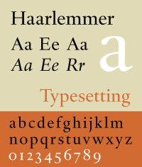
- Haarlemmer (1938, Monotype); release cancelled due to the war[20][21]
- Sheldon (1947), designed for a Bible made by Oxford University Press and named for Archbishop Gilbert Sheldon.[22]
- Spectrum (1952 Enschedé, also 1955 Monotype)[23][6]
Some initials designed by van Krimpen for the Curwen Press have also been digitised by ARTypes of Chicago.[24] ARTypes also digitised some sets of van Krimpen initial designs that are no longer on sale.[25][26][27][28]
Van Krimpen was renowned for his perfectionism and temper. Monotype's archives preserve a letter to Stanley Morison which says "I do not want to be taken for the man who designed something so ridiculously poor as the sloped Romulus bold" that Monotype had produced without his involvement while he was trapped in the Netherlands during the war.[29] Some of his papers are held by the University of Amsterdam.[30]
See also
- A. A. M. Stols, a Dutch publisher for whom van Krimpen did a lot of work
References
- ↑ Kuipers, Reinold (1 January 1995). "J. van Krimpen, the typographer Part One". Quaerendo. 25 (2): 115–135. doi:10.1163/157006995X00062.
- ↑ Kuipers, Reinold (1 January 1995). "J. van Krimpen, the typographer". Quaerendo. 25 (3): 192–213. doi:10.1163/157006995X00026.
- ↑ Dreyfus, John (1996). The Work of Jan van Krimpen. Washington, D.C.: Hartley and Marks / Lund Humphries. ISBN 9780881791129.
- ↑ Van Velden, Dora (1 January 1974). "Notes to early work by Jan van Krimpen". Quaerendo. 4 (4): 317–329. doi:10.1163/157006974X00245.
- ↑ Lommen, Mathieu (1 January 1994). "Jan van Krimpen and Bruce Rogers: two approaches to traditional typography in a modern perspective1". Quaerendo. 24 (3): 206–218. doi:10.1163/157006994X00171.
- 1 2 3 4 Williamson, Hugh (1956). Methods of Book Design. Oxford: Oxford University Press. pp. 99–105 etc.
- 1 2 3 Tracy, Walter. Letters of Credit. pp. 101–120.
- ↑ Martijn F. Le Coultre; Ellen Lupton; Alston W. Purvis (October 2001). Wendingen - A Journal for the Arts, 1918-1932. Princeton Architectural Press. pp. 19–20. ISBN 978-1-56898-276-2.
- ↑ Philip B. Meggs; Alston W. Purvis (14 April 2016). Meggs' History of Graphic Design. John Wiley & Sons. pp. 199–202. ISBN 978-1-119-13620-0.
- ↑ Majoor, Martin. "My type design philosophy". Retrieved 12 September 2014.
- ↑ "Juliana". Font Bureau. Retrieved 17 September 2015.
- ↑ Ovink, G. Willem (1973). "Review: Jan van Krimpen, A Letter to Philip Hofer". Quaerendo: 239–242. doi:10.1163/157006973X00237.
- ↑ Ovink, G. Willem (1 January 1980). "Grandeurs and Miseries of the Punch-Cutter's Craft: a review of A to Z. Een autobiografie van P.H. Rädisch, staal-stempelsnijder". Quaerendo. 10 (2): 158–172. doi:10.1163/157006980X00149.
- ↑ Jaspert, W. Pincus, W. Turner Berry and A.F. Johnson. The Encyclopedia of Type Faces. Blandford Press Lts.: 1953, 1983, ISBN 0-7137-1347-X, p. 2408-249
- ↑ Unger, Ralph. "RMU Lutetia". MyFonts. RMU Fonts. Retrieved 17 September 2015.
- ↑ "DTL Romulus Text". Dutch Type Library. Retrieved 17 September 2015.
- ↑ Impallari, Pablo. "Cancelleresca Bastarda Impallari (open-source revival, in beta)". ArchLinux repository. Impallari Type. Retrieved 17 September 2015.
- ↑ Macmillan, Neil (2006). An A-Z of type designers. New Haven: Yale University Press. p. 74. ISBN 9780300111514.
- ↑ Hoeflake, Netty (1973). A tally of types (postscript on Van Dijck by Hoeflake) (New ed. with additions by several hands ed.). Cambridge: Cambridge University Press. p. 114. ISBN 9780521097864.
- ↑ "DTL Haarlemmer". DTL. Retrieved 17 September 2015.
- ↑ "Haarlemmer MT". MyFonts. Monotype. Retrieved 17 September 2015.
- ↑ Middendorp, Jan (2004). Dutch type. Rotterdam: 010 Publishers. p. 62. ISBN 9789064504600.
- ↑ "Spectrum MT". MyFonts. Retrieved 17 September 2015.
- ↑ "Curwen Initials". MyFonts. ARTypes. Retrieved 17 September 2015.
- ↑ "Open Roman Capitals (dead link)". MyFonts. ARTypes. Retrieved 17 September 2015.
- ↑ "Lutetia Open (dead link)". MyFonts. ARTypes. Retrieved 17 September 2015.
- ↑ "Romulus Open (dead link)". MyFonts. ARTypes. Retrieved 17 September 2015.
- ↑ "Romulus Capitals". MyFonts. ARTypes. Retrieved 17 September 2015.
- ↑ van Krimpen, Jan. "Letter from van Krimpen to Morison". Monotype Archive. Retrieved 17 September 2015.
- ↑ "Beschrijving van het archief Jan van Krimpen ca. 1915-1958". Universiteit van Amsterdam. Retrieved 17 September 2015.
External links
| Wikimedia Commons has media related to Jan van Krimpen. |
- J. van Krimpen, On designing and devising type (New York: The Typophiles 1957).
- R. Bringhurst, The Elements of Typographic Style 3rd ed. (Vancouver Hartley & Marks: 2004).
- Klingspor Museum, notes on van Krimpen's career with samples of several designs not digitally available
- Dutch Type Library, a company which has digitised several van Krimpen designs
- Jan Middendorp, "Dutch Type" (010 Publishers, 2004) (pages 54–64)
- Michael Russem, "A Checklist of the 100-Cent Postage Stamps Designed by Jan van Krimpen" (Kat Ran Press, 2015)
- Cancelleresca Bastarda digitisation by Pablo Impallari (archived download link of open-source font in beta version)
Monotype typefaces | |
|---|---|
| 1900s |
|
| 1910s |
|
| 1920s |
|
| 1930s |
|
| 1940s |
|
| 1950s |
|
| 1960s |
|
| 1970s |
|
| 1980s | |
| 1990s |
|
| 2000s |
|
| 2010s |
|