Joan Michaël Fleischman
Joan Michaël Fleischman (1707 – 1768),[2] was an 18th-century German-Dutch typographer and punchcutter.
Fleischman worked in the Baroque period of design and his roman typefaces have been described as "transitional" in style, more stylised and sharply cut than was common before.[3][4][5] Perhaps his most notable design was his complex music font, that was later used to decorate the edges of documents, including the first bank note of the Netherlands called the "roodborstje" or robin.
Biography
He was born in Wöhrd, Nuremberg,[1] but moved to Amsterdam, where he worked for Izaak van der Putte and Hermanus Uytwerff before opening his own type foundry in 1735. According to the RKD he was also an engraver and had travelled to France in 1727-1728.[6] Fleischman was unable to continue the type foundry on his own, and Rudolf Wetstein ran the business for him, while he continued to work for him as a punchcutter. After Rudolf died in 1742, his son Hendrik Joris Wetstein sold the company in 1743 to Izaak Enschedé of Haarlem. Fleischman continued to live in Amsterdam and made fonts for Enschedé as well as other Amsterdam businesses. Fleischman died in Amsterdam.[6]
Fleischman's typefaces were received with great popularity in his lifetime and Enschedé's lavish type specimen of 1768 was apparently partly intended as a memorial to him.[5][7] John A. Lane, who has prepared an edition of it, notes that "Enschedé scrupulously saved Fleischman's own account book and other documents, including even his passports, so that his career can be reconstructed in remarkable detail."[1] Fournier also thought that his work had brought "considerable accessions" to the reputation of the Enschedé foundry.[7] However, his typefaces, with a high x-height (large lower-case letters, following the "Dutch taste" style of the preceding century) and strong appearance on the page, did not appeal to printers and type designers in the twentieth century, for instance receiving criticism from Daniel Berkeley Updike's influential Printing Types, and have been less commonly been revived than the work of other Renaissance and early modern punchcutters.[3] Lane comments that "his romans lack the staid majesty and subtle curves" of John Baskerville's delicate typefaces of the same period, and James Mosley wrote that "Fleischman was undoubtedly a virtuoso punchcutter, even though there is something rather arid about his hard, angular types."[1][8]
Interest in Fleischman's work has been greater in the digital type period, and numerous digital type designs have been influenced by Fleischman's work. His "Courant-Letter" face used by the Haerlemse Courant was one of the first marketed specifically for the use of newspapers,[1] and several contemporary designs influenced by Fleischman such as Hoefler & Co.'s Mercury and Matthew Carter's Fenway have been intended for this use.[3][9][10][11] Kris Sowersby comments that "for all their extroverted detailing, Fleischman’s text typefaces work extraordinarily well. Even colour and efficient forms make them interesting and readable."[12] Carter comments "I’ve always liked Fleischmann’s faces for small sizes...I think Fleischmann was wonderful at doing those tiny faces that were very legible."[13] DTL Fleischmann is a particularly faithful digital revival of his work with optical sizes.[3][14]
Music font
When Johann Gottlob Immanuel Breitkopf developed the first typeface for music in 1755, Enschedé wanted to improve on the idea, and hired Fleischman to create a more flexible and accurate system. Soon after, the first Haarlem songbook Haerlemsche Zangen was published with this font. Previous songbooks had had their music engraved on copper plates by musicians. The new font was designed to be used by publishers in the same way that typeface could be used to print words, but this idea was not successful, as the musicians who wrote the music needed training in order to use the font. An innovative musician who used the Enschedé-Fleischman font was Leopold Mozart for his Dutch edition of his Instructions to play the violin in 1766.[15][16] His son the wunderkind played the organ in the St. Bavochurch across the street from Enschedé's publishing company in the same year.
Gallery
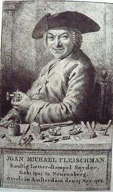
 Handheld moulds like the ones he is holding in Cornelis van Noorde's engraved portrait of him
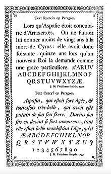
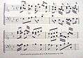 Parel Muziek font
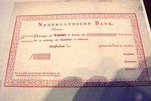 First Dutch banknote in 1814, called Roodborstje, with Fleishman's music font recycled for the decorative edging.
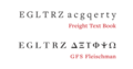 Two modern digital fonts influenced by Fleischman: Joshua Darden's Freight Text Book and GFS Fleischman by George D. Matthiopoulos.[17]
References
- 1 2 3 4 5 Enschedé, Johannes; Lane, John A. (1993). The Enschedé type specimens of 1768 and 1773: a facsimile ([Nachdr. d. Ausg.] 1768. ed.). Stichting Museum Enschedé, the Enschedé Font Foundry, Uitgeverij De Buitenkant. pp. 29–30 etc. ISBN 9070386585.
- ↑ Lommen, Mathieu (1 January 1996). "A history of Lettergieterij 'Amsterdam' voorheen N. Tetterode (Typefoundry Amsterdam) 1851-19881". Quaerendo. 26 (2): 111–143. doi:10.1163/157006996X00089.
- 1 2 3 4 Jan Middendorp (2004). Dutch Type. 010 Publishers. pp. 27–30. ISBN 978-90-6450-460-0.
- ↑ Paul Shaw (April 2017). Revival Type: Digital Typefaces Inspired by the Past. Yale University Press. pp. 89–91. ISBN 978-0-300-21929-6.
- 1 2 Lane, John A.; Lommen, Matthieu (1998). Dutch typefounders’ specimens. 's-Gravenhage: Nijhoff. pp. 61–64. ISBN 9789070386948. Retrieved 1 August 2017.
- 1 2 Joan Michaël Fleischman in the RKD
- 1 2 Updike, Daniel Berkeley (1922). Printing Types, Their History, Forms, and Use: A Study in Survivals, Volume 2. Cambridge, MA: Harvard University Press. pp. 31–43.
- ↑ Mosley, James (1995). "Book Reviews: The Enschede Type Specimen of 1768 and 1773 & Fleischman on Punchcutting". Bulletin of the Printing Historical Society: 13–17.
- ↑ Berry, John. "Sparkle, Sparkle, Little Type". Creative Pro. Retrieved 28 September 2017.
- ↑ "Big Fleischmann Bake-Off Imminent". Typophile. Retrieved 28 September 2017.
- ↑ Peters, Yves. "Fleischman". Bald Condensed. Retrieved 28 September 2017.
- ↑ Sowersby, Kris. "Playing Favourites, Part One". Klim Type Foundry. Retrieved 27 June 2018.
- ↑ Twardoch, Adam; Carter, Matthew (2005). "Typo Interview: Matthew Carter". Typo (18): 18–37.
- ↑ Kaiser, Erhard. "Schriftmuster der DTL Fleischmann" (PDF). Dutch Type Library. Retrieved 28 September 2017.
- ↑ Grondig onderwijs in het behandelen der viool, reprint of 1766 publication by Leopold Mozart, A. Oosthoek's uitgeversmaatschappij, 1965
- ↑ Steyart, Kris; Edge, Dexter. "The first Dutch edition of Leopold Mozart's Versuch einer gründlichen Violinschule". Mozart: New Documents. Retrieved 28 September 2017.
- ↑ Berry, John. "Hauling Freight". Creative Pro. Retrieved 10 October 2018.
- Enschede aan het Klokhuisplein, by Just Enschedé, Joh. Enschedé, 1991, ISBN 90-6076-341-6
- Joh. Enschedé anniversary publication, produced on the occasion of their 150th anniversary in 1893
- Notes
- ↑ Note that according to Lane and Lommen the date on this image is incorrect. Several dates of birth have been reported for Fleischman. 15 June 1707 is the date recorded for what is presumed to be his baptism record in Nuremberg, although he reported himself to be a year older at the time of his marriage.[1]
External links
| Wikimedia Commons has media related to Joan Michael Fleischman. |
- Proef van letteren, Enschedé type specimen of 1768. Apparently partly intended as a memorial to Fleischman: his typefaces are specifically identified as his work and dated. An annotated edition with commentary has also been published authored by John A. Lane.
- Joan Michaël Fleischman on bibliopolis.nl
| Authority control |
|---|