Light-on-dark color scheme
Light-on-dark color scheme is a color scheme that uses light-colored text on a dark background and is often discussed in terms of computer user interface design.
Originally, computer user interface images were formed on CRTs. The phosphor was normally a very dark color, and lit up brightly when the electron beam hit it, appearing to be green or amber on black, depending on phosphors applied on a monochrome screen. RGB screens continued along a similar vein, using all the beams set to "on" to form white.
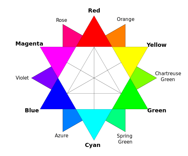
With the advent of teletext, research was done into which primary and secondary light colors and combinations worked best for this new medium. Cyan or yellow on black was typically found to be optimal from a palette of black, red, green, yellow, blue, magenta, cyan and white.
The opposite color scheme, dark-on-light color scheme, was originally introduced in WYSIWYG word processors, to simulate ink on paper.
Whether it is easier or healthier to read text on a dark background is disputed by vision and perception researchers; there is similar dispute between users.
Energy usage
Light on dark color schemes require less energy to display on some display technologies, such as OLED, CRT and LCD displays.[1] This can impact battery life and overall energy conservation.
Special on OLED display panels, while an OLED will consume around 40% of the power of an LCD displaying an image that is primarily black, for the majority of images it will consume 60–80% of the power of an LCD. However, an OLED can use more than three times as much power to display an image with a white background, such as a document or web site.[2] This can lead to reduced battery life in mobile devices, when white backgrounds are used.
Issues with the web
Some[3][4][5] argue that a color scheme with light text on a dark background is easier to read on the screen, because the lower brightness causes less eyestrain. The caveat is that most pages on the web are designed for white backgrounds; GIF and PNG images with a transparency bit instead of alpha channels tend to show up with choppy outlines, as well as causing problems with other graphical elements.
It is not necessary that a web design work well with only one color scheme. There are many mechanisms of web architecture that allow designs to work well with any color scheme a user might prefer. This technical flexibility is a product of the web architect's concern for accessibility and user preference empowerment, though designers rarely utilize this technical flexibility. Users who prefer certain color schemes frequently apply their preference to web pages using tools such as Stylish or its privacy-preserving brother, Stylus.
"Blazing white"
Blazing white is black text on a bright background found in some software packages, often without the option to set colors (e.g. Skype, or Wikipedia). Another common problem is, when using spatial anti-aliasing, the software assumes the background color is white.
Unlike paper, which reflects ambient light, both CRT and LCD displays emit light of sufficient brightness to overcome ambient light. As ambient light varies, the relative brightness of the display can vary widely.
See also
References
- ↑ Blackle vs. Google Monitor Power Consumption Tested
- ↑ Stokes, Jon. (2009-08-11) This September, OLED no longer "three to five years away" Archived 2012-01-25 at the Wayback Machine.. Arstechnica.com. Retrieved 2011-10-04.
- ↑ SUN, Tong (29 March 2008). "Dark Background Is Good For You". Unix/Linux (*niX) Collection. Retrieved 26 March 2016.
- ↑ Supuhstar (17 Jan 2013). "Which is easier on the eyes: dark-on-light or light-on-dark?". Stack Exchange. Retrieved 26 March 2016.
- ↑ Rector, Gary (22 May 2015). "Which is easier on the eyes: dark-on-light or light-on-dark?". Stack Exchange. Retrieved 26 March 2016.
External links
- Anthony (28 April 2011). "When to Use White Text on a Dark Background". ux movement. Retrieved 26 March 2016.
- "Which color scheme to choose for applications that require long work hours?". User Experience Stack Exchange. February 2014. Retrieved 26 March 2016.
- "Dark or white color theme is better for the eyes?". User Experience Stack Exchange. March 2014. Retrieved 26 March 2016.
