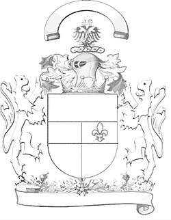
Tincture (heraldry)
| Part of a series on |
| Heraldic achievement |
|---|
| Conventional elements of coats of arms |
|
|
Tinctures constitute the limited palette of colours and patterns used in heraldry. The need to define, depict, and correctly blazon the various tinctures is one of the most important aspects of heraldic art and design.
Development and history
The use of these tinctures dates back to the formative period of European heraldry, in the twelfth and thirteenth centuries, but the range of tinctures and the manner of depicting and describing them has evolved over time, as new variations and practices have developed.
The basic scheme and rules of applying the heraldic tinctures dates to the formative period of heraldry, during the twelfth and thirteenth centuries. By the time of the earliest coloured heraldic illustrations, in the mid-thirteenth century, the use of two metals, five colours, and two furs had become standardized, and ever since that time, the great majority of heraldic art has employed these nine tinctures.[1][2]
Over time, variations on these basic tinctures were developed, particularly with respect to the furs, although the authorities differ as to whether these should be considered separate tinctures, or merely varieties of existing ones. Two additional colours appeared, and were generally accepted by heraldic writers, although they remained scarce, and were eventually termed stains, from the belief that they were used to signify some dishonour on the part of the bearer.[3] The practice of depicting certain charges as they appear in nature, termed proper, was established by the seventeenth century. Other colours have appeared occasionally since the eighteenth century, especially in continental heraldry, but their use is infrequent, and they have never been regarded as particularly heraldic, or numbered among the tinctures that form the basis of heraldic design.[4][5]
Frequency and national variants
The frequency with which different tinctures have been used over time has been much observed, but little studied. There are, however, some general trends of note, both with respect to the passage of time, and noted preferences from one region to another.
In medieval heraldry, gules was by far the most common tincture, followed by the metals argent and or, at least one of which necessarily appeared on the majority of arms (see below). Among the colours, sable was the second most common, followed by azure; vert, although present from the formative period of heraldic design, was relatively scarce.[1][6] Over time, the popularity of azure increased above that of sable, while gules, still the most common, became less dominant. A survey of French arms granted during the seventeenth century reveals a distinct split between the trends for the arms granted to nobles and commoners. Among nobles, gules remained the most common tincture, closely followed by or, then by argent and azure at nearly equal levels; sable was a very distant fifth choice, while vert remained scarce. Among commoners, azure was easily the most common tincture, followed by or, and only then by gules, argent, and sable, which was used more by commoners than among the nobility; vert, however, was even scarcer in common arms.[6] Purpure is so scarce in French heraldry that some authorities do not regard it as a "real heraldic tincture".[7]
On the whole, French heraldry is known for its use of azure and or, while English heraldry is characterized by heavy use of gules and argent, and unlike French heraldry, it has always made regular use of vert, and occasional, if not extensive, use of purpure. German heraldry is known for its extensive use of or and sable.[1] German and Nordic heraldry rarely make use of purpure or ermine, except in mantling, pavilions, and the lining of crowns and caps.[8] In fact, furs occur infrequently in German and Nordic heraldry.[9]
List
| Class | Metals | Colours | Stains | ||||||||
|---|---|---|---|---|---|---|---|---|---|---|---|
| Name | Argent | Or | Gules | Sable | Azure | Vert | Purpure | Murrey | Sanguine | Tenné | |
| Non-heraldic equivalent | Silver/White | Gold/Yellow | Red | Black | Blue | Green | Purple | Mulberry | Blood red | Tawny | |
| Monochromatic designations | Hatching | ||||||||||
| Tricking abbr. | ar. | o. | gu. | s., sa. | as., bl., b. | vt., v. | purp., pu., p. | m. | |||
| Poetic designations | Heavenly body | Moon, ☾ | Sun, ☉ | Mars, ♂ | Saturn, ♄ | Jupiter, ♃ | Venus, ♀ | Mercury, ☿ | Dragon's Tail | Dragon's Tail | Dragon's Head |
| Jewel | Pearl | Topaz | Ruby | Diamond | Sapphire | Emerald | Amethyst | Sardonyx | Sardonyx | Jacinth | |
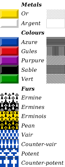
The colours and patterns of the heraldic palette are divided into three groups, usually known as metals, colours, and furs.
Metals
The metals are or and argent, representing gold and silver, respectively, although in practice they are often depicted as yellow and white.[10][11]
Or (Ger. Gelb, Gold, or golden)[1][12] derives its name from the Latin aurum, "gold". It may be depicted using either yellow or metallic gold, at the artist's discretion; "yellow" has no separate existence in heraldry, and is never used to represent any tincture other than or.[10]
Argent (Ger. Weiß, Weiss, Silber, or silbern)[1][12] is similarly derived from the Latin argentum, "silver". Although sometimes depicted as metallic silver or faint grey, it is more often represented by white, in part because of the tendency for silver paint to oxidize and darken over time,[lower-roman 1] and in part because of the pleasing effect of white against a contrasting colour.[10] Notwithstanding the widespread use of white for argent, some heraldic authorities have suggested the existence of white as a distinct heraldic colour.[13]
Colours
Five colours have been recognized since the earliest days of heraldry. These are: gules, or red; sable, or black; azure, or blue; vert, or green; and purpure, or purple.
Gules (Fr. gueules, Ger. Rot)[11][1] is of uncertain derivation; outside of the heraldic context, the modern French word refers to the mouth of an animal.[14]
Sable (Ger. Schwarz)[1] is named for a type of marten, known for its dark, luxuriant fur.[lower-roman 2]
Azure (Fr. azur or bleu, Ger. Blau)[11][1] comes through the Arabic lāzaward, from the Persian lāžavard both referring to the blue mineral lapis lazuli, used to produce blue pigments.
Vert (Fr. vert or sinople, Ger. Grün)[11][1] is from Latin viridis, "green". The alternative name in French, sinople, is derived from the ancient city of Sinope in Asia Minor, which was famous for its pigments.
Purpure (Fr. purpure or pourpre, Ger. Purpur)[11][1] is from Latin purpura, in turn from Greek porphyra, the dye known as Tyrian purple. This expensive dye, known from antiquity, produced a much redder purple than the modern heraldic colour; and in fact earlier depictions of purpure are far redder than recent ones. As a heraldic colour, purpure may have originated as a variation of gules.
Stains
Two more were eventually acknowledged by most heraldic authorities: sanguine or murrey, a dark red or mulberry colour, and tenné, an orange or dark yellow to brownish colour. These were termed "stains" by some of the more influential heraldic writers, and supposed to represent some sort of dishonour on the part of the bearer; but in fact there is no evidence that they were ever so employed, and they probably originated as mere variations of existing colours.[3][15] Nevertheless, the belief that they represented stains upon the honour of an armiger served to prevent them receiving widespread use, and it is only in recent times that they have begun to appear on a regular basis.[16]
Sanguine or Murrey, from Latin sanguineus, "blood red", and Greek morum, "mulberry", one of the two so-called "stains" in British armory, is a dark red or mulberry colour, between gules and purpure in hue.[11] It probably originated as a mere variation of one of those two colours, and may in fact represent the original hue of purpure, which is now treated as a much bluer colour than when it first appeared in heraldry. Although long shunned in the belief that it represented some dishonour on the part of the bearer,[lower-roman 3] it has found some use in the twentieth and twenty-first centuries.[lower-roman 4][16]
Tenné or tenny, from Latin tannare, "to tan", is the second of the so-called "stains". It is most often depicted as orange, but sometimes as tawny yellow or brown. In earlier times it was occasionally used in continental heraldry, but in England largely confined to livery.[3][17]
Furs
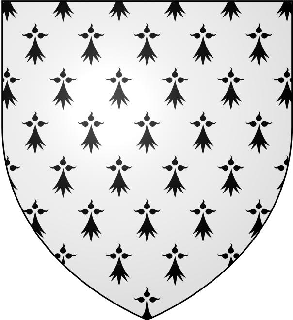
The use of heraldic furs alongside the metals and colours dates to the beginning of the art. In this earliest period, there were only two furs, ermine and vair.[lower-roman 5] Ermine represents the fur of the stoat, a type of weasel, in its white winter coat, when it is called an ermine. Vair represents the winter coat of the red squirrel, which is blue-grey above and white below. These furs were commonly used to line the cloaks and robes of the nobility. Both ermine and vair give the appearance of being a combination of metal and colour, but in heraldic convention they are considered a separate class of tincture that is neither metal nor colour. Over time, several variations of ermine and vair have appeared, together with three additional furs typically encountered in continental heraldry, known as plumeté, papelonné, and kürsch, the origins of which are more mysterious, but which probably began as variations of vair.[18][19]
Ermine (Fr. hermine, Ger. hermelin) is normally depicted as a white field powdered with black spots, known as "ermine spots", representing the ermine's black tail. The use of white instead of silver is normal, even when silver is available, since this is how the fur naturally appears; but occasionally silver is used to depict ermine.[20] Traditionally, ermine has been used to line the cloaks and robes of various nobles, as well as the chapeaux and caps of maintenance worn by peers, and used to line crowns; these appear beneath many crests in place of a torse.[21]
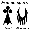
There is considerable variation in the shape of ermine spots; in the oldest depictions, they were drawn realistically, as long, tapering points; in modern times they are typically drawn as arrowheads, usually topped by three small dots;[lower-roman 6] but as with other details, the form used is left to the heraldic artist. Ermine spots are considered part of the tincture known as ermine, rather than charges; but the same shape can also be used as a charge upon other tinctures.[20] In English heraldry, a single ermine spot has been used as a mark of difference when, by royal licence, one person assumes the names and arms of another, in the absence of any blood relationship.[22] Ermine spots are normally depicted upright, except on a bend, when they are depicted bendwise.[23]
British armory recognizes three variations of ermine. A black field powdered with white ermine spots is termed ermines (Fr. contre-hermine, Ger. gegen-hermelin); a gold field with black ermine spots is erminois, and a black field with gold ermine spots is pean.[lower-roman 7][20][22] These are not regarded as separate furs, but merely variations of ermine. Neither erminois nor pean are known by distinctive names outside of British armory; instead they are regarded as a field semé of ermine spots. In French heraldry, erminois would be blazoned d'Or, semé d'hermines de sable, while pean would be de Sable, semé d'hermines d'or.[lower-roman 8] Especially in continental heraldry, a field of any tincture may be semé of ermine spots, producing a pattern indistinguishable from ermine, except by virtue of the tinctures used; but these should be treated as other fields semé, rather than heraldic furs.[20]
 Ermine
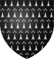 Ermines
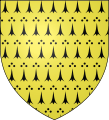 Erminois
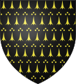 Pean
Pean
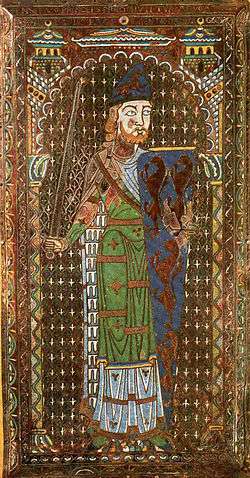
Vair(Ger. Feh) derives its name from Latin varius, "variegated". It is usually depicted as a series of alternating shapes, conventionally known as panes or "vair bells", of argent and azure, arranged in horizontal rows, so that the panes of one tincture form the upper part of the row, while those of the opposite tincture are on the bottom.[lower-roman 9] Succeeding rows are staggered, so that the bases of the panes making up each row are opposite those of the other tincture in the rows above and below. As with ermine, the argent panes may be depicted as either white or silver; silver is used more often with vair than with ermine, but the natural fur is white. In the earliest period of heraldry, vair was depicted by alternating straight and wavy or nebuly lines; today this form is known as vair ondé or vair ancien (Ger. Wolkenfeh, "cloud vair").[lower-roman 10] Through a series of intermediate forms, the panes evolved their modern shape, consisting entirely of straight lines and sharp angles; but the heraldic artist is normally at liberty to use any of these forms.[24][25]
Traditionally vair was produced in three sizes, and each size came to be depicted in armory. A field consisting of only three rows, representing the largest size, was termed gros vair or beffroi (from the same root as the English word belfry); vair of four rows was simply vair, while if there were six rows, representing the smallest size, it was menu-vair (whence the English word miniver). This distinction is not generally observed in English heraldry, and is not strictly observed in continental heraldry, although in French heraldry it is customary to specify the number of rows if there are more than four.[24][25]
There are several varieties of vair consisting entirely of alternate arrangements of the rows. The most familiar is counter-vair (Fr. contre vair), in which succeeding rows are reversed instead of staggered, so that the bases of the panes of each tincture are opposite those of the same tincture in adjoining rows. Less common is vair in pale (Fr. vair en pal or vair appointé, Ger. Pfahlfeh), in which the panes of each tincture are arranged in vertical columns. In German heraldry one finds Stürzpfahlfeh, or reversed vair in pale. Vair in bend (Fr. vair en bande) and vair in bend sinister (Fr. vair en barre), in which the panes are arranged in diagonal rows, is found in continental heraldry. Vair in point (Fr. vair en pointe, Ger. Wogenfeh, "wave vair") is formed by reversing alternate rows, as in counter-vair, and then displacing them by half the width of a pane, forming an undulating pattern across adjoining rows. German heraldry also uses a form called Wechselfeh, or "alternate vair", in which each pane is divided in half along a vertical line, one side being argent and the other azure.[24][25]
When the pattern of vair is used with other colours, the field is termed vairé or vairy[lower-roman 11] of the tinctures used. Normally vairé consists of one metal and one colour, although ermine or one of its variants is sometimes used, with an ermine spot appearing in each pane of that tincture. Vairé of four colours (Ger. Buntfeh, "gay-coloured" or "checked vair") is also known, usually consisting of two metals and two colours.[24][25]
Another type of variation is known as potent[lower-roman 12] (Ger. Sturzkrückenfeh, "upside-down crutch vair"). In this form, the familiar "vair bell" is replaced by a T-shaped figure, known as a "potent" due to its resemblance to a crutch. The appearance of this shape is thought by some authorities to have originated from crude draftsmanship, although others regard it as an old and perfectly acceptable variation. A regularly encountered variation of potent is counter-potent or potent-counter-potent (Ger. Gegensturzkrückenfeh), which is produced in the same fashion as counter-vair; potent in point (Ger. Verschobenes Gegensturzkrückenfeh, "displaced counter-potent") is also found. There is no reason why one could not have potent in pale, potent in bend, alternate potent, or potent of four colours. The same pattern using other tinctures than argent and azure is termed potenté or potenty of those colours.[24][25]
Three other furs sometimes encountered in continental heraldry are thought to be derived from vair: in plumeté or plumetty, the panes are depicted as feathers; and in papelonné or papellony they are depicted as scales, resembling those of a butterfly's wings, whence the name is derived. In German heraldry there is a fur known as Kürsch, or "vair bellies", consisting of panes depicted hairy and brown.[24][25] Here the phrase "vair bellies" may be a misnomer, as the belly of the red squirrel is always white, although its summer coat is indeed reddish brown.
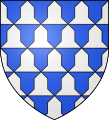 Vair (as usually depicted in British armory)
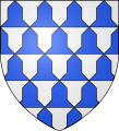 Vair (as usually depicted in French armory)
.svg.png) Menu-vair
Menu-vair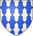 Counter-vair
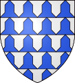 Vair in pale
 Vair in point
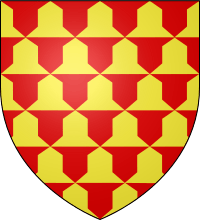 Vairé or and gules
 Potent
 Per fess potenté argent and gules
 Azure, a fess argent double cotised potent-counter-potent or
_Nord-France.svg.png) Plumeté or and sable
Plumeté or and sable.svg.png) Gules, papelonné or
Gules, papelonné or Kürsch
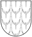 Kürsch
Other tinctures
Several other tinctures are occasionally met with, usually in continental heraldry:
- Cendrée, or "ash-colour";[lower-roman 13]
- Brunâtre (Ger. Braun), or brown, occasionally used in German heraldry, in place of purpure;[lower-roman 14]
- Bleu-céleste or bleu de ciel, a sky blue colour intended to be lighter than azure;[lower-roman 15]
- Amaranth or columbine, a strong violet-red, found in at least one grant of arms to a Bohemian knight in 1701;
- Eisen-farbe, or iron-colour, found in German heraldry; and
- Carnation, often used in French heraldry as the colour of flesh.
The heraldic scholar A. C. Fox-Davies proposed that, in some circumstances, white should be considered a heraldic colour, distinct from argent. In a number of instances, a label or collar blazoned as "white" rather than "argent" appears on a supporter blazoned argent or or. The use of "white" in place of "argent" would be consistent with the practice of heraldic blazon that discourages repeating the name of a tincture in describing a coat of arms, but if it were merely intended as a synonym of "argent", this placement would clearly violate the rule against placing metal on metal or colour on colour (see below). This difficulty is avoided if "white" is considered a colour in this particular instance, rather than a synonym of "argent".[26] This interpretation has neither been accepted nor refuted by any heraldic authority, but a counter-argument is that the labels are not intended to represent a heraldic tincture, but are in fact white labels proper.
Other exceptional colours have occasionally appeared during the twentieth and twenty-first centuries:
The arms of the Jewish Autonomous Region in Russia have a field of aquamarine, which is emblazoned more as a kind of dark green than a true aquamarine colour.
The Canadian Heraldic Authority granted arms containing rose as a colour in 1997.[lower-roman 16] In 2002, the Authority granted arms including copper, treated as a metal, to the municipality of Whitehorse, Yukon.
Ochre, both red and yellow, appears in South African heraldry; the national coat of arms, adopted in 2000, includes red ochre, while (yellow) ochre appears in the arms of the University of Transkei.[27][28]
In the United States, heraldry is not governed by any official authority; but the United States Army, which makes extensive use of heraldry, does have its own authority, the United States Army Institute of Heraldry. The armorial designs of the Institute of Heraldry include a number of novel tinctures, including buff (employed variously as either a metal or a colour),[29] and horizon blue.[30] Silver gray has appeared in the heraldry of both the Army and the Air Force.[31][32] Bronze appears as a colour in the arms of the Special Troops Battalion of the 2nd Brigade, 1st Cavalry Division.[33] There seems to be some confusion about the colour crimson, as in some cases it is treated as a separate tincture, while in others it is used to specify the shade of gules to be employed by the artist.[34] Differing from most heraldic practice, the Institute of Heraldry often specifies the exact shades to be used in depicting various arms.
Proper
A charge that is coloured as it naturally appears is blazoned proper (Fr. propre), or "the colour of nature".[35][36] Strictly speaking, proper is not a tincture in itself, and if, as is sometimes the case, a charge is meant to be depicted in particular colours that are not apparent from the word "proper" alone, they may be specified in whatever detail is necessary.[lower-roman 17][35][36] Certain charges are considered "proper" when portrayed with particular colours, even though a range of different colours is found in nature; for instance, a popinjay proper is green, even though wild parrots occur in a variety of colours. In some cases, a charge depicted in a particular set of colours may be referred to as "proper", even though it consists entirely of heraldic tinctures; a rose proper, whether red or white, is barbed vert and seeded or.[37]
The most extensive use of non-heraldic colours is probably associated with "landscape heraldry", a common feature of British and German armory during the latter part of the eighteenth century, and the early part of the nineteenth. Although rarely used for the field itself, landscapes were often granted as augmentations, typically depicting a fortress successfully captured or defended, or a particular ship, or a battle in which the armiger to whom the augmentation was granted was involved. Such landscapes, usually appearing on a chief, might be blazoned with great particularity as to the things portrayed and the colours used to portray them. Officially, these landscapes appeared on a field of argent, but it was common, and perhaps expected, for the artist to add further details, such as the sky and clouds, by which the field might be wholly obscured. The use of landscapes in heraldry fell out of fashion during the Victorian era, when heraldic scholars and artists began looking to earlier and simpler periods of armorial design for inspiration.[38]
Terminology
In the English-speaking world, heraldic terminology is based largely on that of British armory, which in turn is based on Norman French. With respect to the heraldic tinctures, French heraldry, which is often cited by heraldic authors, uses similar terminology; while German heraldry, also highly influential, uses a different vocabulary; it calls the colours by their everyday names.[lower-roman 18]
In its original sense, tincture refers only to the group conventionally referred to as "colours".[10] But as the word "colour" seems inapplicable to the heraldic furs, and no other term clearly encompasses all three classes, the word "tincture" has come to be used in this broader sense, while "colour" has acquired the more restricted sense originally given to "tincture".[11] Thus, when consulting various heraldic authorities, care must be taken to determine which meaning each term is given.
Designations
Artistic liberties
In most heraldic tradition, the various metals and colours have no fixed appearance, hue, or shade. The heraldic artist is free to choose a lighter or darker blue or green, a deeper or brighter red; to choose between depicting or with yellow or any of various gold paints, to depict argent as white or silver.[39] Recently the College of Arms explained, "there are no fixed shades for heraldic colours. If the official description of a coat of arms gives its tinctures as Gules (red), Azure (blue) and Argent (white or silver) then, as long as the blue is not too light and the red not too orange, purple or pink, it is up to the artist to decide which particular shades they think are appropriate."[16]
In blazoning
Most heraldic authors do not capitalize the names of the various tinctures, although a few do (sometimes inconsistently), and some who do not capitalize the other tinctures recommend capitalizing "or" in order to avoid confusion with the conjunction. However, there are relatively few occasions in which the conjunction "or" would appear in the blazon of a coat of arms; and if properly worded, which meaning is intended should be readily apparent from the context.[1][40][41][42][43][44][45] Another convention has been to capitalize only the first word or the first tincture appearing in the blazon, but no other words.[46] In the elaborate calligraphy appearing on most grants of arms, all of the tinctures are capitalized, as indeed are the names of the charges; but this is purely a matter of decorative style, and in no way does the manner of capitalization used in the original grant affect how the arms may be described on other occasions.
A long-standing heraldic tradition has been to avoid repeating the names of tinctures multiple times in any given blazon. If it is possible to mention multiple charges of the same tincture at once, followed by the name of the tincture, then this problem is avoided; but when it is impossible to combine elements of the same tincture in this manner, more creative descriptions may be used. For example, instead of "gules, on a fess or between three chess-rooks argent, a lion passant gules, armed and langued argent", one might say, "gules, on a fess or between three chess-rooks argent, a lion passant of the field, armed and langued of the third." Similar phrases include "of the last" and "of the like". Alternately, descriptions such as "gold" and "silver" might be substituted for "or" and "argent" on a subsequent occurrence. Another rule of blazon relating to tinctures suggests the placing of a comma after each occurrence of a tincture.[47]
In recent years, the College of Arms has regularly dispensed with many of these practices, believing them to cause confusion; and in new grants of arms, the names of tinctures are repeated on each instance that they occur. The names of all tinctures and charges are capitalized, although the word "proper", indicating the colour of nature, is not; and internal commas are entirely omitted.
Rule of tincture
The first so-called "rule" of heraldry is the rule of tincture: metal should not be placed upon metal, nor colour upon colour, for the sake of contrast.
The main duty of a heraldic device is to be recognized, and the dark colours or light metals are supposed to be too difficult to distinguish if they are placed on top of other dark or light colours, particularly in poor light. Though this is the practical genesis of the rule, the rule is technical and appearance is not used in determining whether arms conform to the rule. Another reason sometimes given to justify this rule is that it was difficult to paint with enamel (colour) over enamel, or with metal over metal.
This "rule" has at times been followed so pedantically that arms that violate it were called armes fausses (false arms) or armes à enquérir (arms of enquiry); any violation was presumed to be intentional, to the point that one was supposed to enquire how it came to pass. One of the most famous armes à enquérir (often said to be the only example) was the shield of the Kingdom of Jerusalem, which had gold crosses on silver. This use of metal on metal, that is to say white and gold together, is seen on the arms of the King of Jerusalem, the flag and arms of the Vatican, and the bishop's mitre in the arms of Andorra. It indicates the exceptional holy and special status of the Coat of Arms. An example of "colour on colour" is the arms of Albania, with its sable two-headed eagle on a gules field.
The "rule of tincture" has had an influence reaching far beyond heraldry. It has been applied to the design of flags, so that the flag of Saxe-Weimar-Eisenach was modified to conform to the rule.[48]
Counterchanging
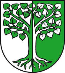
When a charge or group of charges is placed across a division line, variation, or ordinary, it may be counterchanged (Fr. contre-changé, but modern de l'un en l'autre, Ger. verwechselte Farben or verschränkte Farben), meaning that the charges are divided the same way as the field upon which they rest, with the colours reversed.[49][50]
In the municipal arms of Behnsdorf, Saxony-Anhalt, seen at right, the field is divided with the left half white (argent) and the right half green (vert), and the counterchanged tree is green where it lies on the white part of the field, and white where it lies on the green part.
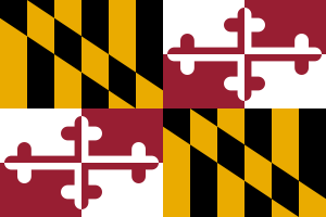
The flag of Maryland is another example of counterchanging. The only U.S. state flag to be directly based on English heraldry, it is the arms of George Calvert, 1st Baron Baltimore, who founded the colony of Maryland in 1632. In the 1st and 4th quarters, the field is divided into six vertical bands of gold (or) and black (sable) with a diagonal band (a bend) in which the colours are reversed (i.e., the bend is counterchanged). The 2nd and 3rd quarters are themselves quartered between white (argent) and red (gules) with a counterchanged cross bottony that is red where it lies on the white part of the field and white where it lies on the red part of the field.
Counterchanging is rare in early heraldry; early examples from German heraldry are found in the late fifteenth-century Wernigerode Armorial;[51] it becomes more frequently applied from the seventeenth century onward, especially with the substantial number of newly-created coats of arms, of which some notable examples include Baron Baltimore (1624), Nightingale baronets (1628), Barrett-Lennard baronets (1801), Verney baronets (1818), and Baron Alvingham (1929).
In Scottish heraldry, charges are sometimes blazoned as counterchanged of different colours from the field; for instance, per fess gules and azure, a sun in splendour counterchanged or and of the first. A more typical blazon for this would be per fess gules and azure, a sun in splendour per fess or and of the first.
The term countercoloured is sometimes used in place of counterchanged. The arms of the Fenwick baronets were originally blazoned as silver, a chief gules with six martlets countercoloured. In this case, three martlets argent rest on a chief gules, while three martlets gules rest on the argent field. Some heraldic authorities regard the use of this term as erroneous.[52]
Monochromatic presentation
Hatching
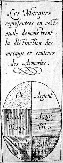
During the first half of the seventeenth century, the proliferation of the printing press coupled with the persistence of difficulties in and expense of colour printing prompted the development of a number of systems of hatching for the purpose of depicting heraldic designs without the use of colour. Intended chiefly for printing and engraving, the system which eventually gained widespread acceptance was that of Silvestro de Petra Sancta, a Jesuit priest and heraldic scholar, originally published in 1638.[53]
In Petra Sancta's method, illustrated in the table above, a separate hatching represents each metal and colour, while the furs are treated as combinations of metal and colour. Argent is represented by a plain field, while or is represented by a field strewn with dots. Gules is represented by vertical lines, azure by horizontal lines, and sable by a combination of horizontal and vertical lines. Diagonal lines running from dexter chief to sinister base represent vert, while purpure is the reverse, represented by diagonal lines running from sinister chief to dexter base. Sanguine is represented by diagonal lines running in each direction, while tenné is represented by a combination of horizontal lines and diagonal lines running from sinister chief to dexter base.[54]
Nine additional hatchings, published by Marcus Vulson de la Colombière in 1639, were intended to represent other colours, although none of them correspond with regular heraldic tinctures, and they have never been used in British armory. A combination of vertical lines with diagonal lines running from dexter chief to sinister base represents brown; blood red is represented by vertical lines combined with diagonal lines running from sinister chief to dexter base; earth-colour by horizontal and vertical lines combined with diagonal lines running from dexter chief to sinister base; iron-grey by diagonal lines running in each direction (the same as sanguine in Petra Sancta's system); water-colour by broken horizontal lines; flesh-colour by broken vertical lines; ashen-grey by a combination of broken horizontal and broken diagonal lines; orange by broken vertical lines interspersed with dots; and the colour of nature by zig-zag lines running from dexter chief to sinister base.[54]
Tricking
Before the use of hatching to depict individual heraldic tinctures, it was common to "trick" heraldic designs when colours were unavailable. The arms would be drawn in outline, and the tinctures written in abbreviated form: O or or for or; A, ar, or arg for argent, G or gu for gules; S or sa for sable; Az or B for azure (B for "blue" being used in older trickings to avoid confusion between ar and az); Vt for vert, Purp for purpure, and Pr for proper. Although most records of the College of Arms are in colour, the practice of tricking is used in all other cases, even after the widespread adoption of hatching for printing and engraving arms.[1][55]
French heraldry also uses tricking to depict heraldic tinctures, using O for or; A for argent; G for gules; S for sable; B for bleu (to avoid confusing azur with argent); V for vert (to avoid confusing sinople with sable); P for purpure or pourpre; and Pr for propre.[1]
In German heraldry, G is used for gelb (gold); W for weiss (white); R for rot (red); S for schwarz (black); B for blau (blue); and Gr, or a shape like an upright leaf, for grün (green); German heraldry makes little use of purpure, but in its place allows Br for braun (brown). These abbreviations may be either capitalized or lowercase.[1]
Poetic representation
That was a time when heraldry was ruled by allegorical and astrological views. All this was in connection with the ancient lore of sympathies, which examined sympathies and antipathies among the stars, minerals, animals, plants, and people. Some additional tinctures were also designed by astrological symbols.
The Babylonians, according to the lore of sympathies, had great esteem for gems, semi-precious stones and scarce minerals. They saw them as the concentrates of cosmic powers. Pliny the Elder stressed several times that he wrote his work to reveal this universal law (i. e. the lore of sympathies). This doctrine was taken over by the Medieval medicine, pharmacy, alchemy, heraldry etc. During the 1350s, the work of Bartolo de Sassoferrato (1313/1314-1357) linked Or to the sun, Azure to the element air, and Gules to the element fire. Between 1382 and 1387 he was followed by Honoré Bonet (c. 1340-c. 1410), a heraldist from Provence. In his work Arbre des Batailles (1387) Bonet declares that the metal gold is the noblest in the world because, due to its very nature, is bright and shining and full of virtues.
During the late medieval period and Renaissance, there was an occasional practice of blazoning tinctures by gemstones, or by references to the seven classical "planets" (including Sun and Moon).[56]
The work of Bonet was thoroughly studied by the 15th century Burgundian heraldists and Jean Courtois (†1436) called Sicily Herald. In his work Le Blason des Couleurs (1414), Courtois developed a heraldic system consisting of the tinctures, planets and carbuncles (furthermore, the virtues, metals, months, the zodiac, and weekdays among others). He was familiar with the Etymologies of Isidore of Seville, and also he gave the names of the tinctures in Greek. However, his main contribution was the development of gemstone-planetary blazon. The system that Bonet developed was as a mix of the colour-gemstone-planet: or topaz the sun, argent pearl the moon, gules ruby the Mars, sable diamond the Saturn, azure sapphire the Jupiter, vert emerald the Venus, purpure amethyst the Mercury, tenné jacinth the dragon's head, sanguine/murrey sardonyx the dragon's tail.
Tenné and Sanguine were the stains used in the abatements of arms which were dishonorable charges placed upon the coats of arms of malefactors. Dragon's head and dragon's tail were in use from the late ancient times. While the dragon's head (called also Anabibazon in astronomy and astrology) symbolizes a light colour (tenné), dragon‘s tail (called also Catabibazon) symbolizes a dark colour (sanguine) which in miniature corresponds to transmutation, provided by alchemists. The purpose of this process is to produce the philosopher's stone. During the process, as a result of the successive reactions, the materia prima will get transformed to a darker and more reddish one from the light coloured material. In the astrology dragon‘s head is connected to good luck, while dragon‘s tail is linked to unlucky events. All these indicate that the then contemporary heraldry was strongly under the influences of magical views and alchemistic ideas, which in turn were connected to the lore of the sympathies between the colours, planets, gemstones, metals, virtues etc. (The odd terminology of colours used by Heraldus Britannus, as mentioned by Spener, can partly reflect the view of alchemy: aurum–cytrine, argentum–aspre, rubeus–coccine, caeruleus– veneto, Niger–mauro, viridis–prasino, and purpureus–oiscy.)
The work of Jean Courtois was diffused in manuscripts and later became one of the first books printed in French. Shortly it was published in England as well, but without much impact. However, during the Tudor and Stuart dynasties (1485–1702), it appeared in the then heraldry manuals. In his book Traité du blason (1465), Clément Prinsault deals with the relation of colours to the virtues, the seven planets, the 12 celestial signs, gemstones, weekdays, the three elements etc. This book is one of the earliest writings on heraldry that is available today.
The English historian and heraldist Sir Henry Spelman (1564–1641) applied in his 1654 book titled Aspilogia the symbols of the planets to designate tinctures (presented in the table). Sir John Ferne (†1609) enumerates as many as 14 different methods of blazon: 1. by colours, 2. by planets, 3. by precious stones, 4. by virtues, 5. by celestial signs, 6. by the months of the year, 7. by the days of the week, 8. by the ages of man, 9. by flowers, 10. by the elements, 11. by the seasons of the year, 12. by the complexions of man, 13. by numbers, 14. by metals. Though today its practice is considered absurd, it was an organic part of the then heraldic view.
Apart from the main tinctures, there also existed English and other language tricking abbreviations for some other tinctures (such as Proper – ppr, pp, Ermine – er etc.). To designate carnation (carnea tinctura), the then contemporary heraldry applied the zodiac sign of Leo in reverse (![]()
![]()
![]()
![]()
![]()
![]()
![]()
So, besides these seven principal tinctures, there soon emerged some additional colours, which were also symbolized by the planetary symbols, gemstones, weekdays etc. Thus, a system of nine tinctures was developed. In general, it was said that the great magnates – the dukes, the earls, and the barons – were to have their arms blazoned by gemstones, and that the princes, the kings and the emperors were to have their arms blazoned by the planets. However, the Austrian troubadour and herald Peter Suchenwirt (c. 1320-1395) used gemstones to designate the tinctures even earlier (c. 1355) to describe the coat of arms of the Hungarian king Louis the Great (1342–1382).[58] In his poem titled Turnier von Nantheiz (c. 1258) Konrad von Würzburg (c. 1230 -1287) also mentioned some coat of arms made of gemstones. In his blazon on the arms of the king of England (lines 310-320) we can learn that his escutheion was covered with Arabian gold and his leopards were made of rubies; finally, to the end of his work (1040) we can also read about further precious stones applied on coat of arms.[59]
Footnotes
- ↑ At one point, aluminum paint was used for argent, as it was more resistant to oxidation; but its effect also faded with age.
- ↑ Despite the origin of the name, sable is always regarded as a colour, rather than a fur.
- ↑ A rare exception of sanguine in older heraldry, cited by Woodward and Burnett, were the arms of the Clayhills of Invergowrie: per bend sanguine and vert, two greyhounds courant bendways argent.
- ↑ For instance, the arms of Lewes Old Grammar School, granted October 25, 2012: "Murrey within an Orle of eight Crosses crosslet Argent a Lion rampant Or holding in the forepaws a Book bound Azure the spine and the edges of the pages Gold" and those of Woolf, granted October 2, 2015: "Murrey a Snow Wolf's Head erased proper on a Chief Argent a Boar's Head coped at the neck between two Fleurs de Lys Azure."
- ↑ Although sable is also named after the dark pelt of a type of marten, it has always been regarded as a colour, rather than a fur.
- ↑ An interpretation of this shape is that the base of the ermine spot represents three tufts of fur, converging in a point at the top, which is attached to the white surface by three studs.
- ↑ An additional variation, known as erminites, is said to be the same as ermine, but with a red hair on each side of the ermine spots; but no examples are known in either British or continental heraldry, so it appears to be nothing more than the fanciful invention of heraldic writers.
- ↑ The terms herminais and péan may be recent inventions.
- ↑ Usage varies as to whether the panes in the upper part of each row should be argent or azure. There is no rule, but following the reasoning that metals are more "honourable" than colours, the leading authorities suggest that argent should come first. This is the usual practice in French heraldry, but in British armory the top row is usually azure.
- ↑ As with many heraldic terms, the Norman French spelling is commonly used, even in English heraldry; but the Anglicized form, vair ancient, is also found.
- ↑ Sometimes, in older authorities, varry or verry.
- ↑ Occasionally, varry cuppy.
- ↑ Aschau of Bavaria: Cendrée, a mount of three coupeaux in base, or. Gwilt of South Wales: Argent, a lion rampant sable, the head, paws, and half of the tail ash colour.
- ↑ Mieroszewsky of Silesia: de Brunâtre, a cross patée argent supporting a raven rising sable, and holding in its beak a horse-shoe proper, its points towards the chief.
- ↑ Cinti (now Cini) of Florence: Per pale azure and bleu-celeste an estoile counter changed.
- ↑ Arms of Kim Campbell, 19th Prime Minister of Canada: Or the universal symbol for a woman pendant from its crosspiece a pair of scales Rose and in base three bars wavy Azure on a canton the mark of the Prime Ministership of Canada.
- ↑ For example, "a dapple-grey horse proper, the mane and tail sable, and both hind feet white".
- ↑ Spanish and Dutch heraldry, in common with English, also use terminology derived from Norman French; while Italian heraldry, like German, uses everyday names for the colours.
References
- 1 2 3 4 5 6 7 8 9 10 11 12 13 14 Ottfried Neubecker, Heraldry: Sources, Symbols and Meaning, Macdonald and James Publishers (1977), pp. 86–87.
- ↑ Stephen Slater, The Complete Book of Heraldry, Hermes House, New York (2003), p. 72.
- 1 2 3 Woodward and Burnett, A Treatise on Heraldry, vol. 1, pp. 60–61.
- ↑ Woodward and Burnett, A Treatise on Heraldry, vol. 1, pp. 61–62.
- ↑ Fox-Davies, A Complete Guide to Heraldry, p. 74.
- 1 2 Pastoureau, "Heraldry", p. 83.
- ↑ Pastoureau, Heraldry, p. 45.
- ↑ Carl-Alexander von Volborth, Heraldry: Customs, Rules, and Styles, Blandford Press, Dorset (1981), p. 10.
- ↑ Chrisopher von Warnstedt, "The Heraldic Provinces of Europe", in The Coat of Arms, vol. XI, no. 84 (October 1970), pp. 128-130.
- 1 2 3 4 Arthur Charles Fox-Davies, A Complete Guide to Heraldry, Dodge Publishing Company, New York (1909), reprinted by Bonanza Books, New York (1978), p. 70.
- 1 2 3 4 5 6 7 John Woodward and George Burnett, A Treatise on Heraldry: British and Foreign, W. & A. K. Johnson, Edinburgh and London (1892), vol. 1, p. 60.
- 1 2 Walter Leonhard, Das große Buch der Wappenkunst, Callway-Verlag, Munich (1976), pp. 128, 129.
- ↑ Fox-Davies, A Complete Guide to Heraldry, pp. 70–71.
- ↑ The New Cassell's French Dictionary, Denis Gerard et al., (editors), Funk & Wagnalls Company, Inc., New York (1962).
- ↑ Fox-Davies, A Complete Guide to Heraldry, pp. 70–74.
- 1 2 3 College of Arms official website, accessed 3 March 2016.
- ↑ Fox-Davies, A Complete Guide to Heraldry, p. 73.
- ↑ Woodward and Burnett, A Treatise on Heraldry, pp. 63, 68–74.
- ↑ Fox-Davies, A Complete Guide to Heraldry, pp. 77–85.
- 1 2 3 4 Woodward and Burnett, A Treatise on Heraldry, pp. 63, 68.
- ↑ Fox-Davies, A Complete Guide to Heraldry, pp. 378–382.
- 1 2 Fox-Davies, A Complete Guide to Heraldry, p. 78.
- ↑ Fox-Davies, A Complete Guide to Heraldry, p. 79.
- 1 2 3 4 5 6 Woodward and Burnett, A Treatise on Heraldry, pp. 68–71.
- 1 2 3 4 5 6 Fox-Davies, A Complete Guide to Heraldry, pp. 79–83.
- ↑ Fox-Davies, A Complete Guide to Heraldry, pp. 70–72.
- ↑ "South Africa – Coat of Arms". Crwflags.com. Retrieved 2009-04-16.
- ↑
- ↑ "11th Transportation Battalion Insignia Page, The Institute of Heraldry". Archived from the original on December 30, 2006. Retrieved 2007-08-14.
- ↑ "190th Quartermaster Battalion Insignia Page". Tioh.hqda.pentagon.mil. Archived from the original on May 17, 2008. Retrieved 2009-04-16.
- ↑ "1st Space Battalion". Tioh.hqda.pentagon.mil. Archived from the original on July 24, 2008. Retrieved 2009-04-16.
- ↑ "88th ABW Emblem". Ascho.wpafb.af.mil. Archived from the original on 2010-06-09. Retrieved 2009-04-16.
- ↑ "American Heraldry Society forum". Archived from the original on February 8, 2006.
- ↑ "15th Ordnance Battalion". Tioh.hqda.pentagon.mil. Archived from the original on June 22, 2008. Retrieved 2009-04-16.
- 1 2 Woodward and Burnett, A Treatise on Heraldry, p. 62.
- 1 2 Fox-Davies, A Complete Guide to Heraldry, pp. 74–76.
- ↑ Julian Franklyn, Heraldry, A. S. Barnes and Company, Inc., Cranbury, New Jersey (1968), p. 68.
- ↑ Fox-Davies, A Complete Guide to Heraldry, pp. 87–88.
- ↑ Pastoureau, Heraldry, p. 46.
- ↑ S. T. Aveling, Heraldry: Ancient and Modern, including Boutell's Heraldry, Frederick Warne and Company, London and New York (1890), pp. 11–16.
- ↑ Woodward and Burnett, A Treatise on Heraldry, vol. 1, pp. 60–64.
- ↑ Fox-Davies, A Complete Guide to Heraldry, pp. 70–87.
- ↑ Franklyn, Heraldry, p. 21.
- ↑ Slater, The Complete Book of Heraldry, pp. 72–73.
- ↑ Michel Pastoureau, Heraldry: An Introduction to a Noble Tradition, Thames and Hudson Ltd. (1997), pp. 45–49.
- ↑ Fox-Davies, A Complete Guide to Heraldry, p. 104.
- ↑ Fox-Davies, A Complete Guide to Heraldry, pp. 101–102, 104.
- ↑ "Grand Duchy of Saxe-Weimar-Eisenach 1813–1918 (Germany)". Flagspot.net. Retrieved 2009-04-16.
- ↑ Elvin, A dictionary of heraldry (1889), p. 35.
- ↑ Panckoucke, Le grand vocabulaire françois (1768), p. 556.
- ↑ Wernigeroder Wappenbuch, pp. 202, 238, 239, 318.
- ↑ Gough and Parker, A Glossary of Terms Used in Heraldry, p. 139.
- ↑ Woodward and Burnett, A Treatise on Heraldry, vol. 1, pp. 63–64.
- 1 2 Fox-Davies, A Complete Guide to Heraldry, pp. 75–76.
- ↑ Fox-Davies, A Complete Guide to Heraldry, p. 77.
- ↑ Fox-Davies (1909), p. 77.
- Entry "Tincture" in A Glossary of Terms Used in Heraldry by James Parker (1894). (text online)
- Entry "Tincture" in Pimbley's Dictionary of Heraldry: An Authoritative Guide to the Terminology of Heraldry by Arthur Francis Pimbley (1908) (text online)
- Precious Peers and Planetary Princes Archived 2012-03-14 at the Wayback Machine.
- ↑ J. A. Rudolphi: Heraldica Curiosa. Nürnberg, 1698. 96. l.
- ↑ ”I wish I was so ingenious and sage to praise the brilliance of his arms, held by him in honour, according to my volition! His escutcheon is not disfigured by any flaws; it beams a silvery colour, and is divided in two equal parts. One field gleams in the light colour of pearls and rubies, and is polished for radiant, and there lie in the horizontal direction eight picked fesses; another field of blue celeste is redundantly graced by domed golden fleurs-de-lis that stood by the arms many times with their plentiful rays, which are very pleasant to see. The helmet’s top decorates a richly decked golden crown with a lot of shining gemstones, smoothed to lustrous; from the crown standing off two ostrich feathers and between them to be seen the ermine neck of the ostrich; his eyes sparkling from the rubies towards the enemy, his bill is golden, in which he beautifully holds a handsomely curved horseshoe-shaped charge made of gold. His head is being richly crowned by gold.” (Jakab Bleyer, Századok 1899. pp. 808-809) This poem is an evidence that in the past there really existed some coat of arms made of gemstones.
- ↑ ”smaragden und karvunkel [Karfunkelsteine],/ jachande [Hyazinthsteine] und crisolîten [Krisolithen],/ die wurden bi den zîten/ getengelt ûz den schilten.”
Bibliography
- Fox-Davies, A. C. (1904). The Art of Heraldry: An Encyclopædia of Armory. (1968 edition) New York: Benjamin Blom, Inc. LCCN 68-56481
- Fox-Davies, A. C. (1909). A Complete Guide to Heraldry. (2004 edition) Whitefish, MT: Kessenger Publishing. ISBN 1-4179-0630-8 LCCN 09-23803
External links
| For a list of words relating to with definitions, see the Heraldic tincture category of words in Wiktionary, the free dictionary. |

| Officials | Conventional elements of coats of arms | ||||||||||||||||
|---|---|---|---|---|---|---|---|---|---|---|---|---|---|---|---|---|---|
| Subjects | |||||||||||||||||
| Charges of heraldic achieve- ments (List) |
| ||||||||||||||||
| Tinctures Rules Tricking Hatching |
| ||||||||||||||||
| External | |||||||||||||||||
| Applications | |||||||||||||||||
| See also | |||||||||||||||||
| |||||||||||||||||
| Metals |  | ||||
|---|---|---|---|---|---|
| Colours | |||||
| Furs | |||||
| Stains | |||||
| Non-traditional1 |
| ||||
| |||||
Color topics | ||||||||
|---|---|---|---|---|---|---|---|---|
| Color science |
|  | ||||||
| Color philosophy |
| |||||||
| Color terms |
| |||||||
| Color organizations | ||||||||
| Lists | ||||||||
| Related | ||||||||
| ||||||||