Map symbol
A map symbol is a graphical device used to visually represent a real-world phenomenon or a characteristic thereof on a map, working in the same fashion as other forms of symbols. Map symbols may include point markers, lines, regions, continuous fields, or text; these can be modified visually in their shape, size, color, pattern, and other graphic variables.
Representing spatial phenomena
Symbols are used to represent geographic phenomena, which exist in, and are represented by, a variety of spatial forms. Different kinds of symbols are used to portray different spatial forms.[1] Phenomena can be categorized a number of ways, but two are most relevant to symbology: ontological form and dimensionality.
Ontological form
Geographic phenomena can be categorized into objects, which are recognizable as a unified whole with a relevant boundary and shape; and masses, in which the notion of boundary and wholeness are not relevant to their identity. Features such as buildings, cities, roads, lakes, and countries are geographic objects that are often portrayed on maps using symbols. Mass phenomena include air, water, vegetation, and rock. These are rarely represented directly on maps; instead, map symbols portray their properties, which usually take the form of geographic fields, such as temperature, moisture content, density, and composition.
Dimensionality
There are basically five types of spatial dimensions that are used to classify phenomena for map symbolization. Point phenomena are assumed to have no spatial extent and are said to be zero-dimensional. These use point symbols on a map to indicate their location. An example of these would be fire hydrants or trees in a park. Linear phenomena are one-dimensional and have a length. This would include any line feature on a map like roads or sidewalks. Areal phenomena are 2-D that has both a length and a width. The best example of this would be a lake or other body of water. When volume comes into consideration, it is broken down into two types, 2 ½ dimensions and 3-D. A good example of 2 ½ D would be the elevation of a place above sea level, while 3-D being any three-dimensional objects.
The dimensionality of a map symbol representing a feature may or may not be the same as the dimensionality of the feature in the real world; discrepancies are the result of cartographic generalization to simplify features based on purpose and scale. For example, a three-dimensional road is often represented as a one-dimensional line symbol, while two-dimensional cities are frequently represented by zero-dimensional points.
Cognition and semiotics
In cartography, the principles of cognition are important since they explain why certain map symbols work.[2] In the past, mapmakers did not care why they worked. This behaviorist view treats the human brain like a black box. Modern cartographers are curious why certain symbols are the most effective. This should help develop a theoretical basis for how brains recognize symbols and, in turn, provide a platform for creating new symbols.
According to semiotics, map symbols are "read" by map users when they make a connection between the graphic mark on the map (the sign), a general concept (the interpretant), and a particular feature of the real world (the referent). Map symbols can thus be categorized by how they suggest this connection:[3][4]
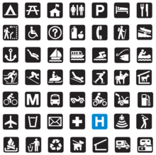
- Pictorial symbols (also "image", "iconic", or "replicative") appear as the real-world feature, although it is often in a generalized manner; e.g. a tree icon to represent a forest, or green denoting vegetation.
- Functional symbols (also "representational") directly represent the activity that takes place at the represented feature; e.g. a picture of a skier to represent a ski resort or a tent to represent a campground.
- Conceptual symbols directly represent a concept related to the represented feature; e.g. a dollar sign to represent an ATM, or a Star of David to represent a Jewish synagogue.
- Conventional symbols (also "associative") do not have any intuitive relationship but are so commonly used that map readers eventually learn to recognize them; e.g. a red line to represent a highway or a cross to represent a hospital.
- Abstract/geometric symbols (also "ad hoc") are arbitrary shapes chosen by the cartographer to represent a certain feature.
Visual variables
A map symbol is created by altering the visual appearance of a feature, whether a point, line, or region; this appearance can be controlled using one or more visual variables. Jacques Bertin, a French cartographer, developed the concept of visual variables in his 1967 book, "Sémiologie Graphique."[5] Bertin identified seven main categories of visual variables: position, size, shape, value, color, orientation, and texture.[6] Since then, cartographers have modified and expanded this set.[7]
Each of these variables may be employed to convey information, to provide contrast between different features and layers, to establish a clear visual hierarchy, or add to the aesthetic appeal of the map.
Position
While the absolute location of a feature on a map is usually unalterable, the position of labels and other information can be controlled.
Size
The size of a label or symbol is how much space it occupies on a map.[8] Size differences are relatively easy to recognize, making it a useful variable to convey information, such as a quantitative amount of something, or relative importance. Such value estimations are the most accurate from bars and squares. From circles, especially larger ones, value estimations are underestimated, on average - there is a large variation between people in abilities to estimate values from circles.[9]
Because geographical features have an actual size on the Earth, this cannot always be controlled, and sometimes works against the wishes of a cartographer; for example, it can be difficult to make a world map in which Russia does not stand out. In a cartogram the size of features is purposefully distorted to represent a variable other than area.
Shape
A shape is a simple design that is used to symbolize an attribute on a map.[10] Shape is most useful for representing nominal categories of features, especially for point features.[11] Some shapes are simple in nature and thus are more abstract, while other shapes are more pictorial and are easy for the reader to comprehend what is trying to be conveyed.[12]
Some aspects of shape are inherent to the phenomenon and may not be easily manipulable, especially in line and region symbols, such as the shape of a road or a country. However, shape can still play a role in line and region symbols, such as a region filled with tree symbols or an arrowhead on a line. Also, the shape of a feature may be purposefully distorted by Cartographic generalization, especially when creating schematic representations such as many transit maps, although this distortion is rarely used to convey information, only to reduce emphasis on shape and location.
Color hue
Hue is the visual perceptual property corresponding in humans to the categories called red, green, blue, and others. Maps often use hue to differentiate categories of nominal variables, such as land cover types or geologic layers.[13] Hue is also often used for its psychological connotations, such as red implying heat or danger and blue implying cold or water.
Color value
As an aspect of color, value refers to how light or dark an object appears. Value effectively connotes "more" and "less," an ordinal measure; this makes it a very useful form of symbology in thematic maps, especially choropleth maps. Value contributes strongly to Visual hierarchy; elements that contrast most with the value of the background tend to stand out most (e.g., black on a white sheet of paper, white on a black computer screen).
Color saturation/intensity
The saturation of a color is its purity or intensity, created by the variety of light composing it; a single wavelength of light is of the highest saturation, while white, black, or gray has no saturation (being an even mixture of all visible wavelengths). Of the three psychological aspects of color, this is the least effective at conveying specific information, but it is effective at establishing visual hierarchy, with bright colors generally standing out more than muted tones or shades of gray.
Orientation
Orientation refers to the direction labels and symbols are facing on a map. Although it is not used as often as many of the other visual variables, it can be useful for communicating information about the real-world orientation of features. Common examples include wind direction and the direction in which a spring flows.
Texture
Texture refers to the aggregate pattern made up of many individual symbols. For example, a dense network of street lines could collectively convey the concept urban area. An evenly spaced lattice of green dots could mean Orchard, while a random distribution of the same green dots could mean Forest.
Transparency/opacity
A fairly recent addition, the control of opacity has become common in digital cartography. While it is rarely used to convey specific information, it is common to make features translucent to reduce contrast or to retain underlying information.
Guidelines for effective symbol design
While there are many different ways in which to effectively design symbols, There are a few basic principles to follow to make them more powerful and intuitive. The primary way in which symbols are changed is through their size, shape, texture, and pattern. A simple example of this concept would be in how cities are represented on maps. Cities are often represented by points, with their sizes or shape altered to help differentiate populations or to help determine a city's significance. Often, capital cities are represented with a star, for example. These basic changes ensure that the reader can easily separate different features into categories without significant effort. Another important guideline to keep in mind while designing symbols is to keep them simple, and logical. Symbols should make sense in the context that they are being used in, in order to make the map more intuitive and easier to read. For example, parks should be represented with a symbol that is commonly associated with that feature, such as a tree, or a bench, while an airport could be represented by a plane. These symbols are logical and simple and again create a map that is easier to interpret for readers.
Visual hierarchy
An important factor in map symbols is the order in which they are ranked according to their relative importance. This is known as intellectual hierarchy. The most important hierarchy is the thematic symbols and type labels that are directly related to the theme. Next comes the title, subtitle, and legend.[1] The map must also contain base information, such as boundaries, roads, and place names. Data source and notes should be on all maps. Lastly, the scale, neat lines, and north arrow are the least important of the hierarchy of the map. From this we see that the symbols are the single most important thing to build a good visual hierarchy that shows proper graphical representation. When producing a map with good visual hierarchy, thematic symbols should be graphically emphasized. A map with a visual hierarchy that is effective attracts the map user's eyes to the symbols with the most important aspects of the map first and to the symbols with the lesser importance later.
Map legend
The legend of the map also contains important information and all of the thematic symbols of the map. Symbol that need no explanation, or do not coincide with the theme of the map, are normally omitted from the map legend. Thematic symbols directly represent the maps theme and should stand out.[18]
See also
- Symbolization & the Visual Variables, Topic CV-08 in the 2017 Geographic Information Science and Technology Body of Knowledge
References

- Krygier, J. & Wood, D. (2005). Making Maps: A Visual Guide to Map Design for GIS. New York: Guilford Press.
- Olson, J. M. (1979). "Cognitive Cartographic Experimentation". The Canadian Cartographer. 16 (1): 34–44. doi:10.3138/R342-258H-5K6N-4351.
- MacEachren, Alan (1995) How Maps Work: Representation, visualization, and design, New York: Guilford Press
- Dent, Borden D. (1999). Cartography : thematic map design (5th ed.). New York: McGraw-Hill Higher Education. ISBN 0697384950.
- Jacque Bertin, Sémiologie Graphique. Les diagrammes, les réseaux, les cartes. With Marc Barbut [et al.]. Paris : Gauthier-Villars. (Translation 1983. Semiology of Graphics by William J. Berg.)
- http://www.infovis-wiki.net/index.php?title=Visual_Variables
- Tyner, J. A. (2010). Principles of map design. New York: The Guilford Press.
- "Department of Geography" (PDF).
- "Graduated and Proportional Symbol Maps". GEOG 486: Cartography and Visualization. The Pennsylvania State University. Archived from the original on July 2017.
- "Shape", GIS Dictionary
- "Visual Variables", Westfaelische Wilhelms Universitaet
- Symbol Basics, "Cartographic Symbols",
- https://www.e-education.psu.edu/geog486/node/1864
- DiBiase, D., MacEachren, A. M., Krygier, J. B., & Reeves, C. (1992). Animation and the role of map design in scientific visualization. Cartography and geographic information systems, 19(4), 201–214.
- MacEachren, A. M. (1994). Some truth with maps: A primer on symbolization and design. Association of American Geographers.
- Griffin, A. L. (2001). Feeling it out: the use of haptic visualization for exploratory geographic analysis. Cartographic Perspectives, (39), 12–29. DOI: 10.14714/CP39.636
- Krygier, J. B. (1994). Sound and geographic visualization. In Visualization in Modern Cartography. A. M. MacEachren and D. R. F. Taylor (Eds.). Oxford: Pergamon, pp. 149–166
- "Map Symbols". Compass Dude. n.d. Retrieved May 4, 2011.