Thematic map
A thematic map is a type of map specifically designed to show a particular theme connected with a specific geographic area, such as temperature variation, rainfall distribution or population density.
Overview
A thematic map is a map that focuses on a specific theme or subject area. This is in contrast to general reference maps, which show the variety of features—geological, geographical, political—together.[1][2] Thematic maps use the base data, such as coastlines, boundaries and places, only as points of reference for the feature being mapped. General maps portray the base data, such as landforms, lines of transportation, settlements, and political boundaries, for their own sake.[1]
Thematic maps emphasize spatial variation of one or a small number of geographic distributions. These distributions may be physical phenomena such as climate or human data such as population density and health issues. Barbara Petchenik[3] described the difference as "in place, about space". While general reference maps show where something is in space, thematic maps tell a story about that place.[4]
Thematic maps are sometimes referred to as graphic essays that portray spatial variations and interrelationships of geographical distributions. Location, of course, is important to provide a reference base of the location of the featured information.
History
An important cartographic development preceding thematic mapping was the production of accurate general base maps. Their accuracy improved slowly, and even in the mid-17th century, they were usually of poor quality; but they were good enough to display basic information, allowing the production of the first thematic maps.
One of the earliest thematic maps was one entitled Designatio orbis christiani (1607) by Jodocus Hondius, showing the dispersion of major religions using map symbols, in the French edition of his Atlas Minor (1607).[5] This was soon followed by a thematic globe (in the form of a six-gore map) showing the same subject, using Hondius' symbols, by Franciscus Haraeus, entitled Novus typus orbis ipsus globus, ex Analemmate Ptolomaei diductus (1614)[6]
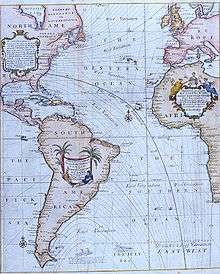
An early contributor to thematic mapping in England was the English astronomer Edmond Halley (1656–1742).[1] His first significant cartographic contribution was a star chart of the constellation of the Southern Hemisphere, made during his stay on St. Helena and published in 1686. In that same year he also published his first terrestrial map in an article about trade winds, and this map is called the first meteorological chart.[7] In 1701 he published the "New and Correct Chart Shewing the Variations of the Compass", see first image, the first chart to show lines of equal magnetic variation.
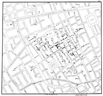
Another example of early thematic mapping comes from London physician John Snow. Though disease had been mapped thematically, Snow's cholera map in 1854 is the best-known example of using thematic maps for analysis. Essentially, his technique and methodology anticipated the principles of a geographic information system (GIS). Starting with an accurate base map of a London neighborhood which included streets and water pump locations, Snow mapped out the incidence of cholera deaths. The emerging pattern centred around one particular pump in Broad Street. At Snow’s request, the handle of the pump was removed, and new cholera cases ceased almost at once. Further investigation of the area revealed that the Broad Street pump was near a cesspit under the home of the outbreak's first cholera victim.
Another 19th-century example of a thematic map, according to Friendly (2008), was the earliest known choropleth map in 1826 created by Charles Dupin. Based on this work Louis-Léger Vauthier (1815–1901) developed the population contour map, a map that shows the population density of Paris in 1874 by contours or isolines.[8]
Uses
Thematic maps serve three primary purposes.
- They provide specific information about particular locations.
- They provide general information about spatial patterns.
- They can be used to compare patterns on two or more maps.
Common examples are maps of demographic data such as population density. When designing a thematic map, cartographers must balance a number of factors in order to effectively represent the data. Besides spatial accuracy, and aesthetics, quirks of human visual perception and the presentation format must be taken into account.
Data terminology
A thematic map is univariate if the non-location data is all of the same kind. Population density, cancer rates, and annual rainfall are three examples of univariate data.
Bivariate mapping shows the geographical distribution of two distinct sets of data. For example, a map showing both rainfall and cancer rates may be used to explore a possible correlation between the two phenomena.
More than two sets of data leads to multivariate mapping. For example, a single map might show population density in addition to annual rainfall and cancer rates.
Mapping methods
Cartographers use many methods to create thematic maps, but five techniques are especially noted.
Choropleth
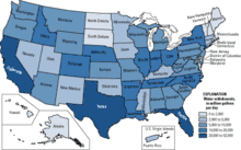
Choropleth mapping shows statistical data aggregated over predefined regions, such as countries or states, by coloring or shading these regions. For example, countries with higher rates of infant mortality might appear darker on a choropleth map. This technique assumes a relatively even distribution of the measured phenomenon within each region. Generally speaking, differences in hue are used to indicate qualitative differences, such as land use, while differences in saturation or lightness are used to indicate quantitative differences, such as population.
Proportional symbol
The proportional symbol technique uses symbols of different heights, lengths, areas, or volumes to represent data associated with different areas or locations within the map. For example, a disc may be shown at the location of each city in a map, with the area of the disc being proportional to the population of the city. [9]. This type of map is useful for visualization when raw data cannot be dealt with as a ratio or proportion. Although circles are the most typical symbol because they are more compact due to their low perimeter to area ratio, studies show that it is easier for the reader to estimate the size of the symbol if it is a square or a bar.[10] Proportional symbol maps are effective because they allow the reader to understand large quantities of data in a fast and simple way.
Cartogram
A cartogram map is a map that purposely distorts geographic space based on values of a theme. A good example to this would be to make the size of countries proportional to their population. Most commonly used in everyday life are distance cartograms. Distance cartograms show real-world distances that are distorted to reflect some sort of attribute, such as the time between subway stops. Another type of cartogram is an area cartogram. These are created by scaling (or sizing) enumeration units as a function of the values of an attribute associated with the enumeration units. There are two different forms of an area cartogram: contiguous and noncontiguous. A contiguous cartogram tries to retain the contiguity of enumeration units. With noncontiguous cartograms, the shapes of enumeration units are retained, but gaps appear between units. [11]
Isarithmic or isoline
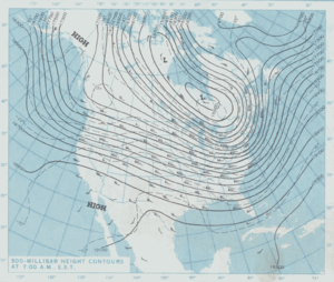
Isarithmic maps, also known as contour maps or isoline maps depict smooth continuous phenomena such as precipitation or elevation. Each line-bounded area on this type of map represents a region with the same value. For example, on an elevation map, each elevation line indicates an area at the listed elevation. An isarithmic map is a planimetric graphic representation of a 3-D surface. Isarithmic mapping requires 3-D thinking for surfaces that vary spatially.
Chorochromatic or Area-class
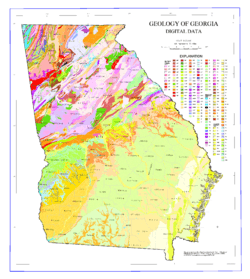
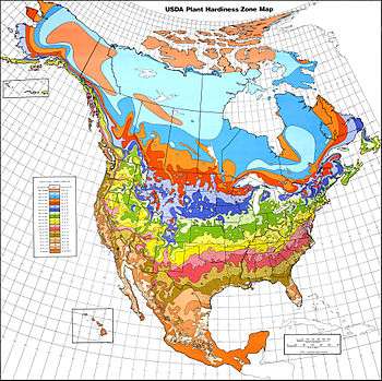
A Chorochromatic or Area-class map represents a categorical or nominal variable distributed over space (also known as a discrete field), by using different area symbols (usually color hue) to represent regions of homogeneous value. Common examples include maps of surface geology, soil, vegetation, land use, city zoning, and climate type.[12]
Dot
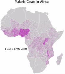
A dot distribution map might be used to locate each occurrence of a phenomenon, as in the map made by Dr. Snow during the 1854 Broad Street cholera outbreak, where each dot represented one death due to cholera. Where appropriate, the dot distribution technique may also be used in combination the proportional symbol technique
Flow
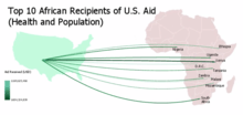
Flow maps are maps that use lines or arrows to portray movement between two or more destinations. These arrows or lines can represent movements of people, migration of animals, monetary aid, or any imports and exports between countries. These lines or arrows can also represent quantities of things being transferred between locations. This can be done via use of proportional symbols.
Dasymetric
A dasymetric map is an alternative to a choropleth map. As with a choropleth map, data are collected by enumeration units. But instead of mapping the data so that the region appears uniform, ancillary information is used to model internal distribution of the phenomenon. For example, population density will be much lower in forested area than urbanized area, so in a common operation, land cover data (forest, water, grassland, urbanization) may be used to model the distribution of population reported by census enumeration unit such as a tract or county.[13]
References
- Thrower 2008, p. 95
- "Fundamentals of Mapping". www.icsm.gov.au. Retrieved 2015-05-03.
- Bartz Petchenik, Barbara (April 1979). "From Place to Space: The Psychological Achievement of Thematic Mapping". Cartography and Geographic Information Science. 6 (1): 5–12. doi:10.1559/152304079784022763.
- Maps and GS Archived 2009-03-12 at the Wayback Machine. Accessed 28 Feb 2009.
- Van der Dussen, Jan and Kevin Wilson (1995). The History of the Idea of Europe. Routledge. p. 28.
- "Novus typus orbis ipsus globus, ex Analemmate Ptolomaei diductus 1614". Retrieved 25 February 2013.
- Thrower 2008, p. 97
- Michael Friendly (2008). "Milestones in the history of thematic cartography, statistical graphics, and data visualization".
- Using Proportional Symbols ESRI ArcGIS Resources. Accessed 19 Dec 2018
- "3.2 Thematic Maps | GEOG 160: Mapping our Changing World". E-education.psu.edu. Retrieved 2019-02-25.
- Slocum, Terry A.; McMaster, Robert B.; Kessler, Fritz C.; Howard, Hugh H. (2009). Thematic cartography and geovisualization (3rd ed.). Pearson Prentice Hall. ISBN 978-0-13-229834-6. Ch. 19
- Kraak, Menno Jan; Ormeling, Ferjan (2003). Cartography: Visualization of spatial data (2nd ed.). Prentice Hall. ISBN 978-0-13-088890-7. p.129
- Slocum, Terry A.; McMaster, Robert B.; Kessler, Fritz C.; Howard, Hugh H. (2009). Thematic Cartography and Geovisualization (3rd ed.). Pearson Prentice Hall. ISBN 978-0-13-229834-6. Ch. 15
Further reading
| Wikimedia Commons has media related to Maps by theme. |
- Delaney, John (2012). First X, Then Y, Now Z: An Introduction to Landmark Thematic Maps. Princeton University Library.
- Muehrcke, Phillip; Muehrcke, Juliana O.; Kimerling, A. Jon (2001). Map Use: Reading, Analysis, and Interpretation. JP Publications. ISBN 978-0-9602978-5-6.
- Robinson, Arthur H. (1982). Early Thematic Mapping in the History of Cartography. University of Chicago Press. ISBN 978-0-226-72285-6.
- Robinson, Arthur H. (1995). Elements of cartography (6e ed.). Wiley. ISBN 978-0-471-55579-7.
- Slocum, Terry A.; McMaster, Robert B.; Kessler, Fritz C.; Howard, Hugh H. (2009). Thematic cartography and geovisualization (3rd ed.). Pearson Prentice Hall. ISBN 978-0-13-229834-6.
- Thrower, Norman J.W. (2008). Maps & Civilization: Cartography in Culture and Society (3rd ed.). University of Chicago Press. ISBN 978-0-226-79974-2.CS1 maint: ref=harv (link)
|
| Authority control |
|
|---|