Long s
The long s (ſ) is an archaic form of the lower case letter s. It replaced the single s, or one or both[note 1] of the letters s in a double s (e.g. "ſinfulneſs" for "sinfulness" and "poſſeſs" for "possess").[1] The long s is the basis of the first half of the grapheme of the German alphabet ligature letter ß, which is known as the Eszett.[2] The modern letterform is known as the short, terminal, or round s.
Rules for long s
This list of rules for the long s is not exhaustive, and it applies only to books printed during the 17th and 18th centuries in England, Wales, Scotland, Ireland, and other English-speaking countries. (In handwriting these rules do not apply–the long s is usually confined to preceding a short s either in the middle or at the end of a word—for example aſsure, Bleſsings, which makes it look like the German ß.)[1]
- At the end of a word and before an apostrophe a round s is used: is
- However, long s is maintained in abbreviations such as ſ. for ſubſtantive, and Geneſ. for Geneſis
- Before and after an f a round s is used: offset, ſatisfaction.
- Before a hyphen at the end of the line a long s must be used: Shaftſ- bury.
- In the 17th century the round s was used before k and b: ask, husband; in the 18th century: aſk and huſband.
- Otherwise long s is used: ſong, ſubſtitute.
History


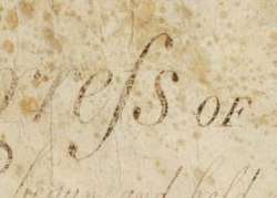
.jpg)
.jpg)
The long s was derived from the old Roman cursive medial s. When the distinction between majuscule (uppercase) and minuscule (lowercase) letter forms became established, toward the end of the eighth century, it developed a more vertical form.[3] During this period, it was occasionally used at the end of a word, a practice that quickly died but that was occasionally revived in Italian printing between about 1465 and 1480. Thus, the general rule that the long s never occurred at the end of a word is not strictly correct, although the exceptions are rare and archaic. The double s in the middle of a word was also written with a long s and a short s, as in: "Miſsiſsippi".[4] In German typography, the rules are more complicated: short s also appears at the end of each component within a compound word, and there are more detailed rules and practices for special cases.
The long s is often confused with the minuscule f, sometimes even having an f-like nub at its middle, but on the left side only in various Roman typefaces and in black-letter. There was no nub in its italic type form, which gave the stroke a descender that curled to the left and which is not possible without kerning in the other type forms mentioned. For this reason, the short s was also normally used in combination with f: for example, in "ſatisfaction".
The nub acquired its form in the blackletter style of writing. What looks like one stroke was actually a wedge pointing downward. The wedge's widest part was at that height (x-height), and capped by a second stroke that formed an ascender that curled to the right. Those styles of writing, and their derivatives, in type design had a cross-bar at the height of the nub for letters f and t, as well as for k. In Roman type, except for the crossbar on medial s, all other cross bars disappeared.
The long s was used in ligatures in various languages. Three examples were for si, ss, and st, besides the German letter Eszett (ß). The long s survives in Fraktur typefaces.
The present-day German letter ß (Eszett or scharfes S in German; also used in Low German and historical Upper Sorbian orthographies) is considered to have originated in a ligature of ſz (which is supported by the fact that the second part of the ß glyph usually resembles a Fraktur z), or ſs (see ß for more), or some Tironian notes.[5]
Some old orthographic systems of Slavonic and Baltic languages used ſ and s as two separate letters with different phonetic values. For example, the Bohorič alphabet of the Slovene language included ſ /s/, s /z/, ſh /ʃ/, sh /ʒ/. In the original version of the alphabet, majuscule S was shared by both letters; later a modified character Š became the counterpart of ſ.
Also, some Latin alphabets devised in the 1920s for some Caucasian languages used the ſ for some specific sounds.[6] These orthographies were in actual use until 1938.[7] Some of these had developed a capital form which roughly resembles a smoothed variant of the letter "ʕ".

Decline in use
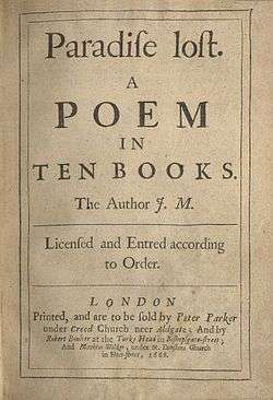
In general, the long s fell out of use in Roman and italic typefaces in professional printing well before the middle of the 19th century. It rarely appears in good quality London printing after 1800, though it lingers provincially until 1824, and is found in handwriting into the second half of the nineteenth century,[8] being sometimes seen later on in archaic or traditionalist printing such as printed collections of sermons. Woodhouse's The Principles of Analytical Calculation, published by the Cambridge University Press in 1803, uses the long s throughout its Roman text.[9]
Abandonment by printers and type founders
The long s disappeared from new typefaces rapidly in the mid-1790s, and most printers who could afford to do so had discarded older typefaces by the early years of the 19th century. Pioneer of type design John Bell (1746–1831), who started the British Letter Foundry in 1788, commissioned the William Caslon Company to produce a new modern typeface for him and is often "credited with the demise of the long s."[10]
The 1808 Printer's Grammar describes the transition away from the use of the long s among type founders and printers in its list of available sorts:
The introduction of the round s, instead of the long, is an improvement in the art of printing equal, if not superior, to any which has taken place in recent years, and for which we are indebted to the ingenious Mr. Bell, who introduced them in his edition of the British Classics [published in the 1780s and 1790s]. They are now generally adopted, and the [type founders] scarcely ever cast a long s to their fonts, unless particularly ordered. Indeed, they omit it altogether in their specimens ... They are placed in our list of sorts, not to recommend them, but because we may not be subject to blame from those of the old school, who are tenacious of deviating from custom, however antiquated, for giving a list which they might term imperfect.[11]
An individual instance of an important work using s instead of the long s occurred in 1749, with Joseph Ames' Typographical Antiquities, about printing in England 1471–1600, but "the general abolition of long s began with John Bell's British Theatre (1791)."[12]
In Spain, the change was mainly accomplished between the years 1760 and 1766; for example, the multi-volume España Sagrada made the switch with volume 16 (1762). In France, the change occurred between 1782 and 1793. Printers in the United States stopped using the long s between 1795 and 1810: for example, acts of Congress were published with the long s throughout 1803, switching to the short s in 1804. In the U.S., a late use of the long s was in Low's Encyclopaedia, which was published between 1805 and 1811. Its reprint in 1816 was one of the last such uses in America. The latest use of the long s typeset among English printed Bibles can be found in the Lunenburg Mass., 1826 printing (12mo) by W. Greenough and Son. Although this writer is not certain of any still extant, there is at least one in holding of an 1823 (12mo) printed by W. Greenough, Lunenburg Mass. The same typeset was used for the 1826 printed later by W. Greenough and Son, and the statutes of the United Kingdom's colony Nova Scotia also used the long s as late as 1816. Some examples of the use of the long and short s among specific well-known typefaces and publications in the UK include the following:
- The Caslon typeface 1732 has the long s.[13]
- The Caslon typeface 1796 has the short s only.[13]
- In the UK, The Times of London made the switch from the long to the short s with its issue of 10 September 1803.
- The Catherwood typeface 1810 has the short s only.[13]
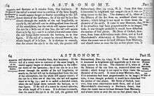
- Encyclopædia Britannica's 5th edition, completed in 1817, was the last edition to use the long s.[14] The 1823 6th edition uses the short s.
- The Caslon typeface 1841 has the short s only.[13]
- Two typefaces from Stephenson Blake, both 1838–1841, have the short s only.[13]
When the War of 1812 began, the contrast between the non-use of the long S by the United States, and its continued use by the United Kingdom, is illustrated by the Twelfth U.S. Congress's use of the "short-S" of today in the U.S. declaration of war against the United Kingdom, and in contrast, the continued use of "long-s" within the text of Isaac Brock's counterpart document responding to the declaration of war by the United States.
Early editions of Scottish poet Robert Burns that have lost their title page can be dated by their use of the long s; that is, Dr. James Currie's edition of the Works of Robert Burns (Liverpool, 1800 and many re-printings) does not use the long s, while editions from the 1780s and early 1790s do.
In printing, instances of the long s continue in rare and sometimes notable cases in the U.K. until the end of the 19th century, possibly as part of a consciously antiquarian revival of old-fashioned type. For example,
- The Chiswick Press reprinted the Wyclyffite New Testament in 1848 in the Caslon typeface[15] using the long s; Chiswick Press, run by Charles Whittingham II (nephew of Charles Whittingham) from c. 1832–1870s, reprinted classics like Geoffrey Chaucer's The Canterbury Tales in a font of Caslon that included the long s.
- The "antiqued" first edition of Thackeray's The History of Henry Esmond (1852), a historical novel set in the eighteenth century, prints long s, and not just when doubled as in mistreſs's.[16][17][18]
- Mary Elizabeth Coleridge's first volume of poetry, Fancy's Following, published in 1896, was printed with the long s.[19]
- Collections of sermons were published using the long s until the end of the 19th century.
Eventual abandonment of the long s in handwriting
After its decline and disappearance in printing in the early years of the 19th century, the long s persisted into the second half of the century in manuscript. In handwriting used for correspondence and diaries, its use for a single s seems to have disappeared first: most manuscript examples from the 19th century use it for the first in a double s. For example,
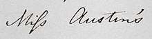
- Charlotte Brontë used the long s, as the first in a double s, in some of her letters, e.g., Miſs Austen in a letter to G. H. Lewes, 12 January 1848; in other letters, however, she uses the short s, for example in an 1849 letter to Patrick Brontë, her father.[20] Her husband Arthur Bell Nicholls used the long s in writing to Ellen Nussey of Brontë's death.[21]
- Edward Lear regularly used the long s in his diaries in the second half of the 19th century; for example, his 1884 diary has an instance in which the first s in a double s is long: Addreſsed.[22]
- Wilkie Collins routinely used the long s for the first in a double s in his manuscript correspondence; for example, he used the long s in the words mſs (for manuscripts) and needleſs in a 1 June 1886 letter to Daniel S. Ford.[23]
For these as well as others, the handwritten long s may have suggested type and a certain formality as well as the traditional. Margaret Mathewson "published" her Sketch of 8 Months a Patient in the Royal Infirmary of Edinburgh, A.D. 1877 of her experiences as a patient of Joseph Lister in the Royal Infirmary of Edinburgh by writing copies out in manuscript.[24] In place of the first s in a double s Mathewson recreated the long s in these copies, a practice widely used for both personal and business correspondence by her family, who lived on the remote island of Yell, Shetland. The practice of using the long s in handwriting on Yell, as elsewhere, may have been a carryover from 18th-century printing conventions, but it was not unfamiliar as a convention in handwriting.
Modern usage

The long s survives in elongated form, with an italic-styled curled descender, as the integral symbol ∫ used in calculus. Gottfried Leibniz based the character on the Latin summa "sum", which he wrote ∫umma. This use first appeared publicly in his paper De Geometria, published in Acta Eruditorum of June 1686,[25] but he had been using it in private manuscripts at least since 29 October 1675.[26] The integral of a function f over the interval [a,b] is typeset as

In linguistics, a similar character (ʃ, called "esh"), is used in the International Phonetic Alphabet, in which it represents the voiceless postalveolar fricative, the first sound in the English word ship.
In Nordic and German-speaking countries, relics of the long s continue to be seen in signs and logos that use various forms of fraktur typefaces. Examples include the logos of the Norwegian newspapers Aftenpoſten and Adresſeaviſen; the packaging logo for Finnish Siſu pastilles; and the Jägermeiſter logo.
The long s exists in some current OpenType digital fonts that are historic revivals, like Caslon, Garamond, and Bodoni.[27]
In the 1993 Turkmen orthography, ſ represented /ʒ/; however, it was replaced in 1995 by the letter ž. The capital form was £, which was replaced by Ž.
The long s form with the bar (ẜ) is encoded at:
- U+1E9C ẜ LATIN SMALL LETTER LONG S WITH DIAGONAL STROKE
In Unicode:
| Character | ſ | |
|---|---|---|
| Unicode name | LATIN SMALL LETTER LONG S | |
| Encodings | decimal | hex |
| Unicode | 383 | U+017F |
| UTF-8 | 197 191 | C5 BF |
| Numeric character reference | ſ | ſ |
Shilling mark
Another survival of the long s was the abbreviation used in British English for shilling, as in 7/6 "seven shillings and sixpence," where the shilling mark "/" stands in for the long s, an abbreviation for the Latin solidus.[28] In the same way, the "d" in "7s. 6d." abbreviates the Latin denarius.
See also
- ß (Eszett)
- Insular S (Ꞅ)
- Esh (letter)
- Integral symbol
- R rotunda
Notes
- Depending on whether they appear in the end or middle of a word, respectively. Some texts starting from the late 18th century had it exclusively replace the first s, however.
References
- West, Andrew (June 2006), "The Rules for Long S", Babelstone (blog)
- Cheng, Karen. Designing Type. Laurence King Publishing, 2006. Page 212. ISBN 9781856694452
- Davies, Lyn (2006), A is for Ox, London: Folio Society.
- Look at this map from 1800. https://commons.wikimedia.org/wiki/File:LowsUSAmap_1.jpeg
- Bollwage, Max (1999), "Ist das Eszett ein lateinischer Gastarbeiter?", Gutenberg-Jahrbuch [Gutenberg yearbook] (in German), Mainz, DE, pp. 35–41, ISBN 978-3-7755-1999-1. Cited and discussed in Stötzner, Uta (2006), "Die Geschichte des versalen Eszetts", Signa (in German), DE: Grimma, 9: 21–22, ISBN 978-3-933629-17-3.
- Proposal to encode Latin letters used in the Former Soviet Union (in Unicode) (PDF), DK: DK UUG.
- Frings, Andreas (2007), Sowjetische Schriftpolitik zwischen 1917 und 1941 – eine handlungstheoretische Analyse [Soviet scripts politics between 1917 and 1941 – an action-theoretical analysis] (in German), Stuttgart, DE, ISBN 978-3-515-08887-9.
- Attar, Karen. "S and Long S." Oxford Companion to the Book (2010), ads., Michael Felix Suarez and H. R. Woudhuysen, II: 1116.
- Woodhouse, Robert (1 January 1803). The principles of analytical calculation. Printed at the University press.
- "Bell, John." Oxford Companion to the Book (2010), eds., Michael Felix Suarez and H. R. Woudhuysen I:516.
- Caleb Stower, The Printer's Grammar (1808), p. 53.
- Attar, Karen. "S and Long S." Oxford Companion to the Book (2010), eds., Michael Felix Suarez and H. R. Woudhuysen, II: 1116. For fuller information, Attar cites Paul W. Nash, "The Abandonment of the Long s in Britain in 1800," Journal of the Printing Historical Society, ns 3 (2001): 3–19.
- Philip Gaskell, New Introduction to Bibliography, Clarendon, 1972, p. 210, Figs 74, 75.
- Encyclopædia Britannica (5th ed.), 1817.
- Wells, John Edwin (1970), A Manual of the Writings in Middle English 1050–1500, Modern Language Association of America, p. 548.
- Daniel Hack, The Material Interests of the Victorian Novel. Victorian Literature and Culture series. University of Virginia Press, 2005. 12. Figure 1 prints a facsimile of a sample page.
- J. A. Sutherland. "Henry Esmond: The Virtues of Carelessness." In Thackeray at Work. Bloomsbury Academic Collections: English Literary Criticism: 18th–19th Centuries. London and New York: Bloomsbury Academic, 2013: 56–73. Rpt.
- Mosley, James. "Recasting Caslon Old Face". Type Foundry. Retrieved 1 August 2015.
- Coleridge, Mary. Fancy's Following. Oxford: Daniel Press, 1896.
- Smith, Margaret, ed. (2000), The Letters of Charlotte Brontë: With a Selection of Letters by Family and Friends, Two (1848–1851), Oxford: Clarendon Press, p. between 406 and 407.
- Smith, Margaret, ed. (2004), The Letters of Charlotte Brontë: With a Selection of Letters by Family and Friends, Three (1852–1855), Oxford: Clarendon Press, p. opposite 217.
- Edward Lear, Edward Lear Diaries, 1858–1888. MS Eng 797.3 (27). Houghton Library, Harvard. http://oasis.lib.harvard.edu//oasis/deliver/deepLink?_collection=oasis&uniqueId=hou01884 Archived 22 February 2014 at the Wayback Machine.
- Collins, Wilkie. "To Daniel S. Ford." The Wilkie Collins Pages: Wilkie's Letters. Paul Lewis, ed. http://www.paullewis.co.uk/wilkie/Letters/18860601Ford.htm.
- The still-unpublished MS of this Sketch is held by the Shetland Museum and Archives.
- Swetz, Frank J., Mathematical Treasure: Leibniz's Papers on Calculus – Integral Calculus, Convergence, Mathematical Association of America, retrieved 11 February 2017
- Leibniz, G. W., Sämtliche Schriften und Briefe, Reihe VII: Mathematische Schriften, vol. 5: Infinitesimalmathematik 1674–1676, Berlin: Akademie Verlag, 2008, pp. 288–295 ("Analyseos tetragonisticae pars secunda", 29 October 1675).
- Strizver, Ilene (2014). Type Rules!: The Designer's Guide to Professional Typography (4th ed.). Hoboken, New Jersey: Wiley. p. 34. ISBN 978-1-118-45405-3.
- Fowler, Francis George (1917). The concise Oxford dictionary of current English, entry "solidus". p. 829 – via Google Books.
External links
| Look up long s or ſ in Wiktionary, the free dictionary. |
| Wikimedia Commons has media related to Long s. |
- A Simple Explanation of the Correct Usage of Long and Short S, Alice Moore.
- Mosley, James (January 2008), "Long s", Type foundry (Blogspot) (blog).
- "Long s", Classics, The Straight Dope, 6 November 1981.
- West, Andrew (June 2006), "The Long and the Short of the Letter S", Babelstone (blog).
- The American Declaration of Independence with long s, NU: Unknown.