Lato (typeface)
Lato is a humanist sans-serif typeface designed by Łukasz Dziedzic. It was released in 2015. The name "Lato" is Polish for "summer".[3]
 | |
| Category | Sans-serif |
|---|---|
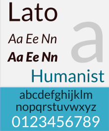
| Classification | Humanist |
| Designer(s) | Łukasz Dziedzic |
| Date released | December 2010[1] |
| License | SIL Open Font License[2] |
| Website | www |
| Latest release version | 2.015 |
As of August 2018, Lato is used on more than 9.6 million websites, and is the third most served font on Google Fonts, with over one billion views per day.[2]
Use
Lato has been used in various physical publications, including information signs and election campaign billboards.[4]
Development
Lato was created in 2010 for a Polish bank by Łukasz Dziedzic.[1] When the bank changed its stylistic vision, he shelved the typeface,[1] and released it later that year under the libre SIL Open Font License.[2][3]
After Lato was added to Google Fonts it quickly gained popularity,[5] becoming the third most used web font after Google's own Roboto and Open Sans, with over one billion views per day as of August 2018.[6]
Carlito is a forked typeface which is very similar to Lato, it is released by Google with metrics compatible with Microsoft's Calibri typeface
Language support
It supports all Latin alphabets, along with Cyrillic, Greek, and IPA.[7]
Derivatives


The Lato typeface is available in nine weights from hairline to black, each of which has a distinct italic variant.[8] Each of these 18 variants is additionally available in a LatoLatin version, containing just the subset of glyphs required for European languages based on the Latin alphabet; this allows for smaller file sizes.[8]
References
- Martyna Trykozko, Lato podbija świat, czyli jak nieudane zlecenie doprowadziło do spektakularnego sukcesu Polaka, Gazeta.pl, 18 September 2015
- Google Fonts, Lato
- Jeremiah Shoaf, Taking A Second Look At Free Fonts, published in Typography: Practical Considerations And Design Patterns, Smashing Magazine GmbH, 2014, p. 39
- Łukasz Majchrzyk, Font „Lato” światowym sukcesem Łukasza Dziedzica, mobiRANK, 21 September 2015
- Print & Publishing issue 211, October 2015, p. 18
- Google Fonts, Analytics
- Antoni Bohdanowicz, "Z czcionką jest jak z krzesłem, najpierw musi być wygodne, a dopiero potem artystyczne" – mówi typograf Łukasz Dziedzic, na:Temat, 6 April 2014
- latofonts.com, The Fonts
External links
| Wikimedia Commons has media related to Lato. |
| Software and libraries | |
|---|---|
| Licenses | |
| Operating system, corporate and professional |
|
| Other typefaces | |
| Groups and people | |
| |