Calibri
Calibri (/kəˈliːbri/) is a sans-serif typeface family designed by Luc(as) de Groot in 2002–2004 and released to the general public in 2007, with Microsoft Office 2007 and Windows Vista.[2][3] In Office 2007, it replaced Times New Roman as the default typeface in Word[4] and replaced Arial as the default in PowerPoint, Excel, Outlook, and WordPad. De Groot described its subtly rounded design as having "a warm and soft character".[3]
 | |
| Category | Sans-serif |
|---|---|
| Classification | Modern[1] |
| Designer(s) | Luc(as) de Groot |
| Foundry | Microsoft |
| Date created | 2002–2006 |
| Date released | 2007 |
| License | Proprietary |
| Metrically compatible with | Carlito |
Calibri is part of the ClearType Font Collection, a suite of fonts from various designers released with Windows Vista.[5] All start with the letter C to reflect that they were designed to work well with Microsoft's ClearType text rendering system, a text rendering engine designed to make text clearer to read on liquid-crystal display monitors.[6] The other fonts in the same group are Cambria, Candara, Consolas, Constantia and Corbel.[3][7]
Characteristics
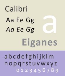
Calibri features subtly rounded stems and corners that are visible at larger sizes.[7] Its sloped form is a "true italic" with handwriting influences,[8] which are not unusual in modern sans-serif typefaces.
The typeface includes characters from Latin, Latin extended, Greek and Cyrillic scripts. Calibri makes extensive use of sophisticated OpenType formatting; it features a range of ligatures as well as lining and text figures, indices (numbers enclosed by circles) up to 20, and an alternate f and g accessible by enabling the fourth and fifth stylistic sets.[9] Some features in Calibri remain unsupported by Office, including true small caps, all-caps spacing, superscript and subscript glyphs and the ability to create arbitrary fractions; these may be accessed using programs such as Adobe InDesign.
One potential source of confusion in Calibri is a visible homoglyph, a pair of easily confused characters: the lowercase letter L and the uppercase letter i (l and I) of the Latin script are effectively indistinguishable; this is true of many other common fonts, however.
The design has clear similarities to de Groot's famous and much more extensive commercial family TheSans, although this has straight ends rather than rounding.[10]
As of 2017 a Hebrew alphabet version is in development.[11] De Groot has also said in 2016 that he would like if possible to add Bulgarian alphabet variant letterforms at a later date.[12]
Availability

Calibri is the default typeface of Microsoft Office and much other Microsoft software. Joe Friend, a program manager on Word for Office 2007's release, explained that the decision to switch to Calibri was caused by a desire to make the default font one optimised towards onscreen display: "We believed that more and more documents would never be printed but would solely be consumed on a digital device", and to achieve a "modern look".[13]
Because of the long development of Windows Vista, Calibri's development – from 2002 to 2005 – occurred several years before the release of that OS.[1][3] It was first presented in a 2005 beta of Windows Vista, then codenamed Longhorn,[2] and first became available for use with the Beta 2 version of Office 2007, released on May 23, 2006.[14] Calibri and the rest of the ClearType Font Collection were finally released to the general public on January 30, 2007, since when it has been released with most Microsoft software environments.[2]
Calibri is also distributed with Microsoft Excel Viewer, Microsoft PowerPoint Viewer,[15][16] the Microsoft Office Compatibility Pack[17] for Microsoft Windows and the Open XML File Format Converter for Mac.[18] For use in other operating systems, such as cross-platform web use, Calibri is licensed by Ascender Corporation and its parent company Monotype Imaging.[19]
The font Calibri Light was introduced in Microsoft Windows 8 and added to Windows 7 and Server 2008 as part of a software update.[20] From Microsoft Word 2013 onwards, Calibri and Calibri Light are the default fonts for body text and headings respectively.[20] Calibri Light is also a default font for headings in Powerpoint.[20]
In 2013, due to Calibri's widespread use in Microsoft Office documents, Google released a freely-licensed font called Carlito, which is metric-compatible to Calibri, as part of ChromeOS.[21] Because Carlito has the same font metrics as Calibri, ChromeOS users can correctly display and print a document designed in Calibri without disrupting layout. Carlito’s glyph shapes are based on the prior open-source typeface Lato, without de Groot's involvement.[22]
Awards
Calibri won the TDC2 2005 award from the Type Directors Club under the Type System category.[23]
In crime and politics
Because of Calibri's position as the default font in Office, many cases have been reported in which documents were shown to be forged thanks to a purported creation date before Calibri was available to the general public.[2][24][25][26]
FontGate
In 2017, the font came to public attention as evidence in the Pakistani government-related "Panama Papers" case (also known as Fontgate),[27] in which a document supposedly signed in February 2006 was found to be typed up in Calibri.[28][29][30][31] De Groot said that there was "really zero chance" that the document was genuine.[11]
References
- Berry, John D. (2004). Now Read This: the Microsoft ClearType Collection. Redmond, WA: Microsoft Corp.
- Phinney, Thomas. "Calibri reached the general public on January 30, 2007, with the release of Microsoft Office 2007 and Windows Vista on that date". Quora. Retrieved 11 July 2017.
- Berry, John D.; De Groot, Lucas. "Case Study: Microsoft ClearType". Lucasfonts. Retrieved 11 July 2017.
- "Microsoft typography: Calibri". Microsoft. Retrieved 10 Dec 2011.
- "The Microsoft ClearType Font Collection". Microsoft Typography. Microsoft. Retrieved 31 August 2017.
- Hudson, John. "Comments on Typophile thread". Typophile. Retrieved 28 September 2014.
- Van Wagener, Anne. "The Next Big Thing in Online Type". Poynter Online. Archived from the original on 4 June 2006. Retrieved 31 August 2017.CS1 maint: BOT: original-url status unknown (link)
- Levien, Raph. "Microsoft's ClearType Font Collection: A Fair and Balanced Review". Typographica. Retrieved 24 November 2014.
- Batchelor, Lee. "Opentype Features in Microsoft Word". Leeviathan. Retrieved 7 July 2015.
- Middendorp, Jan (2004). "The Two Sides of Luc(as) de Groot". Dutch Type. Rotterdam: 010. pp. 219–227.
- van de Klundert, Mitchell (13 July 2017). "Het Nederlandse Calibri brengt mogelijk de Pakistaanse premier ten val". Nederlandse Omroep Stichting. Retrieved 14 July 2017.
- Knecht, Sonja. "European Cyrillics". TXET. Retrieved 31 August 2017.
- Friend, Joe. "Why did Microsoft change the default font to Calibri?". Quora. Retrieved 25 April 2019.
- Mondok, Matt (23 May 2006). "Office 2007 Beta 2 released for the masses". Ars Technica. Retrieved 18 July 2017.
- "Download Excel Viewer from Official Microsoft Download Center". Microsoft.
- "Download PowerPoint Viewer from Official Microsoft Download Center". Microsoft.
- "Download Microsoft Office Compatibility Pack for Word, Excel, and PowerPoint File Formats from Official Microsoft Download Center". Microsoft.
- "Download Open XML File Format Converter for Mac 1.2.1 from Official Microsoft Download Center". Microsoft. Archived from the original on 2013-05-05. Retrieved 2013-02-19.
- "Calibri". MyFonts. Monotype Imaging/Ascender Corporation. Retrieved 30 August 2017.
- "An update is available to add the Calibri Light and Calibri Light Italic fonts to Windows 7 and Windows Server 2008 R2". Microsoft Support. Microsoft. Retrieved 31 August 2017.
- "A thank you to Google from Desktop Linux". GNOME blog.
- "carlito – Support for Carlito sans-serif fonts". CTAN. Retrieved 22 October 2018.
- TDC2 2005: Winning Entries
- Arbes, Ross (24 July 2017). "Calibri's Scandalous History". The New Yorker. Condé Nast. Retrieved 1 August 2017.
- Peters, Diane (15 May 2019). "The Font Detectives". JSTOR. Retrieved 24 May 2019.
- Bright, Peter (15 January 2019). "Microsoft's fonts catch out another fraudster—this time in Canada". Ars Technica. Condé Nast. Retrieved 21 January 2019.
- Rasmussen, Sune Engel; Collins, Pádraig (13 July 2017). "'Fontgate': Microsoft, Wikipedia and the scandal threatening the Pakistani PM". The Guardian. Retrieved 31 May 2019.
- McKurdy, Euan; Saifi, Sophia (13 July 2017). "At the center of a corruption case involving the Pakistani Prime Minister is a font". CNN. Retrieved 14 July 2017.
- Clark, Bryan (11 July 2017). "Microsoft's default font is at the center of a government corruption case". The Next Web. Retrieved 11 July 2017.
- Siddiqui, Zarin (12 July 2017). "We asked the creator of Calibri to weigh in on the JIT debate". Dawn. Retrieved 13 July 2017.
- Jafar, Ovais (13 July 2017). "'Extremely unlikely' Calibri used in Feb 2006 to draft legal document, says font creator". geo.tv. Retrieved 4 August 2017.
External links

Microsoft Windows typefaces | |||||
|---|---|---|---|---|---|
| Latin, Greek, Cyrillic |
| ||||
| Hebrew |
| ||||
| Arabic |
| ||||
| Thai |
| ||||
| Chinese |
| ||||
| Korean |
| ||||
| Japanese |
| ||||
| Indic scripts | |||||
| Other | |||||