Toronto Subway (typeface)
 | |
| Category | Sans-serif |
|---|---|
| Classification | Geometric |
| Designer(s) | original unknown; current release David Vereschagin |
| Commissioned by | Toronto Transit Commission |
| Date created |
circa 1954 recreated 2004 |
| Design based on | Futura |
Toronto Subway[1][2] is a geometric sans-serif typeface designed for the original section of the Toronto Transit Commission’s Yonge subway. It is today used at station entrances, fare booths and track level signage throughout the system.[3]
History
The typeface and TTC logo were developed during the construction of Line 1 Yonge–University in the 1940s, perhaps by draughtsman Philip Butt, but the original designer has not been determined. The original logo used during the subway's development was designed by mid-century architect John C. Parkin and chief architect Arthur Keith. Against the wishes of Walter Paterson, the chief engineer, TTC chairman William McBrien and general manager H.C. Patten rejected the design in favour of one that was more similar to the one previously used on TTC vehicles.[4]
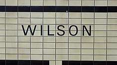
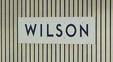
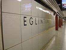
The font is a distinctive rectangular font composed of capital letters etched into the tiles of Toronto subway stations opened between 1954 and 1974, as well as on signs. Over time, it was replaced by both Helvetica and Univers 55 on the original Line 1 Yonge–University (from Union to Eglinton stations) as a result of renovations to all stations along that line, except for Eglinton, trim lettering at Queen, and various directional signs. A bold version (the later standard) of this font can be seen at every station along the Line 2 Bloor–Danforth from Islington to Warden, which were the termini from 1968 to 1980, when Kipling and Kennedy stations were built (these two stations do not use the Toronto Subway font). It can also be seen at most stations north of Bloor–Yonge station on the eastern branch of Line 1, at stations on the western branch of Line 1 from Union to St. George, and was incorporated into the renovated Bloor, Wellesley, and Union stations. The other fonts, used at stations on system extensions built from the late 1970s to the 1990s, have also been replaced with the recreated font at a few stations: The original Univers 55 at Wilson station has been partially replaced with it, and a full replacement of Helvetica was done at Sheppard West after it was renamed from "Downsview" in 2017. The font is used at all stations built from 2002 onwards; such as Line 4 Sheppard, the Toronto–York Spadina Subway Extension, as well as on all stops and stations along the rebuilt 512 St. Clair streetcar line, with the exception of the terminal at St. Clair West station.
The font was recreated by David Vereschagin in 2004. Because the original designer of the font is unknown, and no documentation of the font had been kept, Vereschagin digitized the font by visiting stations and making rubbings of the letters on the original Vitrolite glass tiles as well as taking photographs.[2] This is now used by the TTC as their font for station names.[2] Vereschagin designed a matching lowercase, inspired by Futura and other similar designs. As one of the few typeface designs to have originated in Canada, it was used in a number of zines as a mark of local pride.[5]
In 2011, Dominion Modern ran an exhibit on Toronto Subway at George Brown's School of Design.[2]
On October 23, 2013, the TTC announced new wayfinding standards, including using Toronto Subway "on more signage – at station entrances, fares booths and track level signage".[3] This decision was made in conjunction with adding route numbers to the subway and RT lines. The wayfinding team also created an overhauled version of the Subway typeface called Bloor–Yonge, which includes missing numbers and punctuation, as well as correcting some design issues with the existing glyphs.[6]
Features
Notable features:[7]
- near-perfect circles for C, G, O, and Q;
- middle horizontal strokes along a horizontal mid-line for B, E, F and H;
- a Futura-like S composed of two semicircles;
- strokes that tend toward straight lines (even the stem of the distinctive low-waist R) and terminate at right angles;
- sharp corners on M, N, V, and W that descend below the baseline or project above the cap height.
Similar fonts
Often misidentified as Gill Sans, the Toronto Subway Font is based on Futura. Somewhat similar typefaces include Johnston (used by Transport for London), Verlag, Bernhard Gothic, Metro, Brandon Grotesque, Neutraface, and Eagle.
See also
References
- ↑ Graphic Content: A field guide to wayfinding, Dylan Robertson, The Grid, December 11, 2013
- 1 2 3 4 The story of the "Toronto Subway" font, BlogTO, Derek Flack, April 5, 2011
- 1 2 New Wayfinding Standards, TTC, October 23, 2013
- ↑ Bateman, Chris (13 April 2018). "TTC's subway station typeface a font of intrigue". The Globe and Mail. Retrieved 14 April 2018.
- ↑ Wasserman, Sherri. "Kern Your Enthusiasm". Hilobrow. Retrieved August 1, 2015.
- ↑ Chris Bateman (November 25, 2015). "How the TTC lost and found its subway style". Spacing Toronto. Retrieved March 10, 2017.
Called Bloor-Yonge, the updated version of the font is now used on the official company letterhead, in the Ride Guide, and on the monthly Metropass.
- ↑ Clark, Joe 2007 Inscribed in the living tile: Type in the Toronto subway Presented at the ATypI 2007 conference, Brighton, U.K.
External links
| Bus |  _(14918534190).jpg) | |
|---|---|---|
| Subway | ||
| Streetcars | ||
| History | ||
| Predecessors |
| |
| Facilities | ||
| Proposed | ||
| Miscellaneous | ||
Italics indicate a project under construction | ||