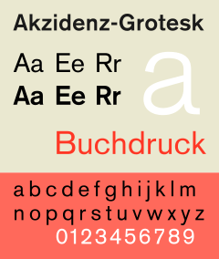
Akzidenz-Grotesk
 | |
| Category | Sans-serif |
|---|---|
| Classification | Grotesque |
| Foundry | H. Berthold AG |
| Date released | 1898 (?) |
Akzidenz-Grotesk is a sans-serif typeface family originally released by the Berthold Type Foundry of Berlin.[1] Akzidenz means 'commercial' and indicates its intended use as a typeface for trade printing such as publicity, tickets and forms, as opposed to book or fine printing.[2][3][4]
Originating during the late nineteenth century, Akzidenz-Grotesk belongs to a tradition of general-purpose, unadorned sans serif types known as "grotesques" that had become dominant in German printing during the nineteenth century, and became one of the most popular examples of this style.[5][6] Its simple, neutral design has influenced many later faces and became commonly used and influential as an element of the popular 'International' or 'Swiss' design style of the 1950s and 1960s.[7] It has sometimes been sold as Standard or Basic Commercial in English-speaking countries.[8][9]
Design characteristics
.jpg)
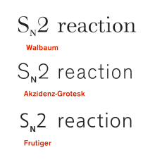
Like most sans-serifs, Akzidenz-Grotesk is 'monoline' in structure, with all strokes of the letter of similar width. This gives a sense of simplicity and an absence of the adornment and flourishes seen in many more decorative sans-serifs of the late nineteenth century influenced by the Art Nouveau style.[10] Modern type designer Martin Majoor has described the general design of Akzidenz-Grotesk and its ancestors as similar in letterforms to the Didone serif fonts that were standard printing types in the nineteenth century, such as Didot, Walbaum and their followers.[11] This is most visible in the quite folded-up apertures of letters such as ‘a’ and ‘c’.[10][11] The capitals of Akzidenz-Grotesk are wide and relatively uniform in width.[5]
The 'g' of Akzidenz-Grotesk is a 'single-storey' design, like in many other German sans-serifs, but unlike the double-storey 'g' found in most serif faces and in many of the earliest sans-serifs that had a lower-case; sans-serif types first appeared in London, but became popular in Germany from the mid-nineteenth century onwards.[12][13][14] Walter Tracy describes this style of 'g' as a common feature in German sans-serifs of the period and apparently influenced by the tradition of blackletter, which uses a single-story 'g' in upright composition.[10] Blackletter was still very popular for printing extended body text in Germany in the nineteenth century.
As is normal in typefaces cut during the metal type period, Akzidenz-Grotesk shows variation between sizes of metal type, with adaptation of letter-spacing and proportions to different sizes.[15][16] In addition, there is variation between weights: Karl Gerstner notes that even comparing one size (20pt), the medium and bold weights have different x-height, cap height and descender length to the light and regular weights.[15][16][lower-alpha 1] This is common with nineteenth-century sans-serifs, which were often not designed with the intention of forming an extended family that would match together.[18] The differences in proportions between different sizes and weights of Akzidenz-Grotesk has led to a range of contemporary adaptations, reviving or modifying different aspects of the original design.
History
The influences, sources and engravers of Akzidenz-Grotesk are not fully known, although it descends from a school of general-purpose sans-serifs cut in the nineteenth century. Research is complicated by the very large number of small type foundries active in Germany during this period, which often did not publish extensive specimens.[22] Sans-serifs had become very popular in Germany by the late nineteenth century, with many type foundries offering different versions.[12] Berthold literature from the 1920s dated the design to 1898.[23][12]
It was claimed by Berthold's post-war artistic director Günter Gerhard Lange that a key source of Akzidenz-Grotesk was types from the Ferdinand Theinhardt type foundry.[24] This was owned by businessman and punchcutter Ferdinand Theinhardt, who was otherwise particularly famous for his scholarly endeavours in the field of hieroglyph and Syriac typefaces.[25] Professor Indra Kupferschmid, who has researched the early use of sans-serifs in Germany, however reports that this cannot be a full explanation of the family's history: "there must have been an Accidenz-Grotesk at Berthold before the acquisition of Theinhardt’s foundry in 1908."[26][4][27][28] (Early references to Akzidenz-Grotesk at Berthold often use the alternative spelling 'Accidenz-Grotesk'.[4]) According to Eckehart Schumacher-Gebler and Kupferschmid, a likely source for some styles of Akzidenz-Grotesk is Berthold's 1897 purchase of the Bauer Foundry of Stuttgart (not to be confused with the much better-known Bauer Type Foundry of Frankfurt) and confusion may have occurred with fonts held by Berthold that the Theinhardt foundry licensed.[26][29][30][31] Kupferschmid concludes that the design appears to be related to a shadowed sans-serif ('Schattierte Grotesk') sold by the Bauer Foundry and reviewed in a printing journal in 1896.[31][19][32][lower-alpha 3] Some early adverts that present Akzidenz-Grotesk are co-signed by both foundries.[34][32][35] Dan Reynolds additionally suggests that the name Akzidenz-Grotesk may have been intended as a brand extension following on from an "Accidenz-Gothisch" blackletter face sold by the Bauer & Co. foundry.[36]
The light weight of Akzidenz-Grotesk was for many years branded separately as 'Royal-Grotesk'; it was reported in the post-war period that it this referred to it being commissioned by the Prussian Academy of Sciences, but Kupferschmid again reports being unable to find it used in its publications.[31] It apparently was cut by Berthold around 1902-3, when it was announced in a trade periodical as “a new, quite usable typeface” and advertised as having matching dimensions allowing it to be combined with the regular weight of Akzidenz-Grotesk.[31][37][17][23]
Many other grotesques in a similar style to Akzidenz-Grotesk were sold in Germany during this period. Around the beginning of the twentieth century, these increasingly began to be branded as larger families of multiple matched styles. Its competitors included the very popular Venus-Grotesk of the Bauer foundry of Frankfurt, very similar to Akzidenz-Grotesk but with high-waisted capitals, and Koralle by Schelter & Giesecke, which has a single-storey 'a'.[38][39][40][lower-alpha 4] (Monotype Grotesque also is based on German typefaces of this period.[10]) Seeman's Handbuch der Schriftarten illustrates the wide range of sans-serif typefaces on sale in Germany by the time of its publication in 1926.[23] By around 1911, Berthold had begun to market Akzidenz-Grotesk as a complete family.[42][31][32]
While apparently not unpopular, Akzidenz-Grotesk was not among the most intensively-marketed typefaces of the period, and was not even particularly aggressively marketed by Berthold.[15] A 1921 Berthold specimen and company history almost apologetically described it in this way: "In 1898 Accidenz-Grotesk was created, which has earned a laurel wreath of fame for itself. This old typeface, which these days one would perhaps make in a more modern style, has a peculiar life in its own way which would probably be lost if it were to be altered. All the many imitations of Accidenz-Grotesk have not matched its character."[4] An unusual user of Berthold's Akzidenz-Grotesk in the period soon after its release, however, was the poet Stefan George.[43] He commissioned a custom version with some uncial-style alternate characters to print his poetry.[44][45][46]
Mid-twentieth-century use
The use of Akzidenz-Grotesk and similar "grotesque" typefaces dipped from the late 1920s due to the arrival of fashionable new "geometric" sans-serifs such as Erbar, Futura and Kabel, based on the proportions of the circle and square. Berthold released its own family in this style, Berthold-Grotesk.[lower-alpha 5]
However, during this period there was increasing interest in using sans-serifs as capturing the spirit of the time, most famously, Jan Tschichold's influential book Die Neue Typographie, which praised the aesthetic qualities of the "anonymous" sans-serifs of the nineteenth century and was printed in a sans-serif similar to Berthold's Akzidenz-Grotesk.[50][10][lower-alpha 6] Its comments would prove influential in later graphic design:
Among all the types that are available, the so-called “Grotesque"…is the only one in spiritual accordance with our time. To proclaim sans-serif as the typeface of our time is not a question of being fashionable, it really does express the same tendencies to be seen in our architecture…there is no doubt that the sans-serif types available today are not yet wholly satisfactory as all-purpose faces. The essential characteristics of this type have not been fully worked out: the lower-case letters especially are still too like their “humanistic” counterparts. Most of them, in particular the newest designs such as Erbar and Kabel, are inferior to the old anonymous sans-serifs, and have modifications which place them basically in line with the rest of the “art” faces. As bread-and-butter faces they are less good than the old sans faces…I find the best face in use today is the so-called ordinary jobbing sanserif, which is quiet and easy to read.[51]
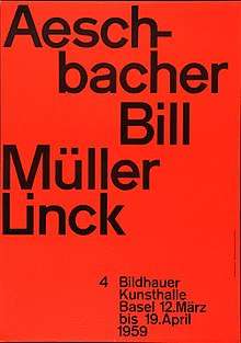
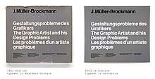
In the post-war period and particularly in Switzerland a revival in Akzidenz-Grotesk's popularity took hold, in what became known as the "Swiss International Style" of graphic design. This style often contrasted Akzidenz-Grotesk with photographic art, and did not use all caps as much as many older posters.[52] Graphic designers of this style such as Karl Gerstner found the sans-serifs of the nineteenth-century more "neutral" and even than the more "personal" recent sans-serifs of the previous decades.[15][16] Eskilson's Graphic Design: A New History comments that they "conveyed the functionalist ethos without appearing too stylised...in the manner of the more geometrically pure types."[52]
.jpg)
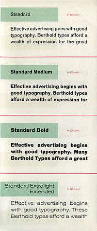
Akzidenz-Grotesk was popular in this period although other typefaces such as Monotype Grotesque were used also: a problem with use of Akzidenz-Grotesk up to the late 1950s was that it was only available in foundry type for handsetting. While this was acceptable for posters, by the 1950s hot metal typesetting machines had become the main system for printing general-purpose body text, and for this system Akzidenz-Grotesk was unavailable until around 1958,[lower-alpha 7] when it was first sold on Linotype and then in 1960 on Intertype systems.[53][55] Much printing around this time of body text accordingly used Monotype Grotesque as a lookalike.[56][57][58][41] In the United States, Akzidenz-Grotesk was imported by Amsterdam Continental Types under the name 'Standard'.[59][60][61]
In 1957, three notable competitors of Akzidenz-Grotesk appeared intended to compete with its growing popularity: Helvetica from the Haas foundry, with a very high x-height and a strong image with tight letterspacing, Univers from Deberny & Peignot, with a large range of weights and widths, and Folio from Bauer.[55] Paul Shaw suggests that Helvetica "began to muscle out" Akzidenz-Grotesk in New York from around summer 1965, when Amsterdam Continental's marketing stopped pushing Standard strongly and began to focus on Helvetica instead.[8]
By the 1960s, Berthold could claim in its type specimens that Akzidenz-Grotesk was:
a type series which has proved itself in practice for more than 70 years and has held its ground to the present day against all comers...wherever one sees graphics and advertising of an international standard...starting a revival in Switzerland in recent years, Akzidenz-Grotesk has progressed all over the world and impressed its image in the typography of our time.[9][62]
Post-metal releases
With the end of mass use of metal type, Akzidenz-Grotesk has been rereleased and adapted in versions for the new phototypesetting and digital technologies.
Contemporary versions of Akzidenz-Grotesk descend from a late-1950s project, directed by Günter Gerhard Lange at Berthold, to enlarge the typeface family. This added new styles including AG Extra (1958),[63] AG Extra Bold (1966) and AG Super (1968), AG Super Italic (2001) and Extra Bold italic (2001).[64]
Separately, Karl Gerstner and other designers at his company GGK Basel launched a project in the 1960s to build Akzidenz-Grotesk into a coherent series, to match the new families appearing in the same style; it was used by Berthold for its Diatype system in the late 60s under the name of "Gerstner-Programm" but according to Lange it was never fully released.[15][16][65][24] A digitisation has been released by the digital type foundry Forgotten Shapes.[66]
The current holder of the Berthold rights is Berthold Types of Chicago, following the bankruptcy of H. Berthold AG of Germany in 1993.[67][68] Berthold released Akzidenz-Grotesk in OpenType format in 2006, under the name Akzidenz-Grotesk Pro, and added matching Cyrillic and Greek characters the next year.[69][70] Unofficial digitisations have been made by other companies under alternative names.
Distinctive characteristics
Characteristics of this typeface are:
lower case: A 'folded-up' structure with narrow apertures and strokes curled up towards the vertical, most obvious on letters such as c, e, s and a. Stroke endings are though less consistently horizontal or vertical than in Helvetica. A square dot over the letter i. Double-storey a, single-storey g.
upper case: G with a vertical spur. A dropped horizontal stroke on A. The capitals are wide and have relatively little variation in width, with letters like 'E' and 'F' quite wide.[5] The 'M' is straight-sided with the diagonals meeting in the bottom centre of the letter. Capitals in several weights have very noticeably thicker strokes than the lower-case.[71] On many but not all styles a straight leg on the 'R' and a 'Q' where the outstroke does not cut through the letter.
number: A top serif on the 1 and in some styles a downward-pointing serif on the top left of the 7.
Like most grotesque sans-serifs, Akzidenz-Grotesk's slanted form is an oblique rather than a true italic. This means that the letters are slanted without using handwriting forms.[11] It is important to note, however, that many weights of Akzidenz-Grotesk in the metal type period did not have sloped forms, and as the weights and sizes of Akzidenz-Grotesk were cut separately not all these features will appear on all styles.[9]
Versions
Metal type versions
_Specimen_(4083757282).jpg)
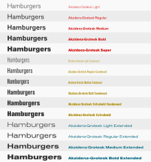
Berthold's Akzidenz-Grotesk family by the late metal type period included, with German names:
- Akzidenz-Grotesk (Regular weight, available on Linotype in modified form as series 57 with oblique)[9][7][lower-alpha 9]
- Halbfett (Medium, available on Linotype in modified form as series 58 and as poster type)[9][7][lower-alpha 10]
- Mager (Light, sometimes sold as Royal-Grotesk)[9][53]
- Fett (Bold, available as poster type)[9][53]
- Schmalmager (Light Condensed)[9][53]
- Eng (Regular Condensed)[9][53]
- Schmalhalbfett (Medium Condensed, sometimes called "Steinschrift eng",[4] 'R' has curled leg[9])[53]
.jpg)
- Schmalfett (Condensed Bold, sometimes called "Bücher-Grotesk halbfett",[4] available as poster type, 'R' with a curled leg)[9][53]
- Extra (Condensed Bold, tighter-spaced than the Schmalfett weight)[9]
- Extrafett (Condensed Extra Bold)[9][lower-alpha 11]
_Specimen_(4083751496).jpg)
- Skelett (Extralight Extended)[9][53]
- Breitmager (Light Extended)[9][53]
- Breit (Extended)[9]
- Breithalbfett (Extended Medium)[9][lower-alpha 12][53]
- Breitfett (Extended Bold)[9][lower-alpha 13][53]
Other weights were added by the time of the phototypesetting and digital versions, such as the ultra-bold 'Akzidenz-Grotesk Super'.
Akzidenz-Grotesk Book
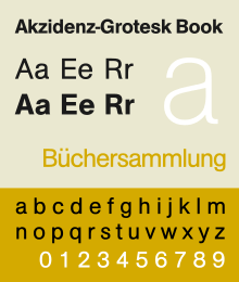
Akzidenz-Grotesk Book is a variant designed by Günter Gerhard Lange between 1969 and 1973. Designed after Helvetica had become popular, it incorporates some of its features, such as strike-through tail in 'Q', a curved tail for the 'R', horizontal and vertical cut stroke terminators.[72] As in some Helvetica versions, the cedilla is replaced with a comma.[73] Erik Spiekermann has described it as Berthold's "answer to Helvetica."[74]
Digital versions included Greek and Cyrillic characters, and the family includes a condensed, extended, rounded and stencil series.[75][76]
Akzidenz-Grotesk Schulbuch

Akzidenz-Grotesk Schulbuch (Schoolbook) is a variant of Akzidenz-Grotesk Buch designed by Günter Gerhard Lange in 1983. It uses schoolbook characters, characters intended to be more distinct and closer to handwritten forms to be easier for children to recognise.
Generally based on Akzidenz-Grotesk Book, it includes a single-storey 'a', curled 'l', lower- and upper-case 'k' that are symmetrical, and 't', 'u' and 'y' without curls on the base. The 'J' has a top bar, the 'M' centre does not descend to the baseline and the 'G' and 'R' are simplified in the manner of Futura. A particularly striking feature is a blackletter-style default upper-case 'i' with a curl at the bottom: this is not standard in the English-speaking world, but much more common in Germany.[77][78]
Each weight is available in two fonts featuring alternative designs. In 2008, OpenType Pro versions of the fonts were released. FontFont's FF Schulbuch family is in a similar style.[78]
Akzidenz-Grotesk Old Face
Akzidenz-Grotesk Old Face is a variant designed by Günter Gerhard Lange in 1984, intended to be more true to the metal type than previous phototypesetting versions and incorporate more of the original type's inconsistencies of dimensions such as x-height.[79] It also incorporates a comma-style cedilla in the medium and bold weights, inward hook in regular-weighted ß, and a shortened horizontal serif on the regular-weighted 1.[80]
Regular, medium, bold, outline, bold outline and shaded styles were made for the family, but no obliques.[80][79]
Akzidenz-Grotesk Next
In December 2006, Berthold announced the release of Akzidenz-Grotesk Next.[81] Designed by Bernd Möllenstädt and Dieter Hofrichter, this typeface family features readjusted x-heights and weights throughout the family, giving a more consistent design. The family consists of 14 variants with 7 weights in roman and italic, in a single width.
Similarities to other typefaces
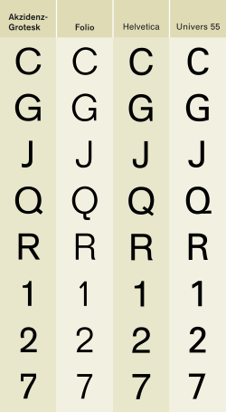
Several other type designers modelled typefaces from this popular typeface. Max Miedinger at the Haas Foundry used it as a model for the typeface Neue Haas-Grotesk, released in 1957 and renamed Helvetica in 1961. Miedinger sought to refine the typeface making it more even and unified, with a higher x-height and tighter spacing.[55] Two other releases from 1957, Adrian Frutiger's Univers and Bauer and Baum's Folio, take inspiration from Akzidenz-Grotesk.
Akzidenz-Grotesk is sometimes at first glance mistaken for the Helvetica or Univers typefaces. The similarities of Helvetica and Akzidenz-Grotesk are apparent, but the subtle differences include the uppercase and lowercase C and the uppercase G, J, R and Q. Aside from the subtle differences in these individual letters, Miedinger's primary change to Akzidenz-Grotesk is Helvetica's higher x-height, the distance from the baseline to the height of the lowercase letter x, and the consistently horizontal terminals. The general effect is that Helvetica appears more oblong while Akzidenz-Grotesk maintains circular counters and bowls. Both Helvetica and Univers are more regular and have a greater consistency of stroke weight and details, for instance unifying all or most strokes to terminate on horizontals or verticals.
The Swiss digital type foundry Optimo has released an alternative interpretation of Akzidenz-Grotesk named "Theinhardt".[82] Erik Spiekermann has praised this as "the best" Akzidenz-Grotesk digitisation.[83] Spiekermann has also released with Ralph du Carrois a very loose digitisation of Akzidenz Grotesk, FF Real, in two optical sizes, with variant features like a two-storey 'g' and ligatures.[84][85]
In the US, Akzidenz-Grotesk was available under the name ‘Standard’.[9] Linotype, which started to sell Akzidenz-Grotesk on its hot metal typesetting system in the 1950s, continues to sell a limited digital version under the other common alternative name, 'Basic Commercial', and Bitstream offer a two-weight version named 'Gothic 725'.[86][87]
Much more loosely, Transport, the typeface used on British road signs, was designed by Jock Kinneir and Margaret Calvert influenced by Akzidenz-Grotesk.[88] However, many adaptations and letters influenced by other typefaces were incorporated to increase legibility and make characters more distinct.[89][90]
"Akzidenz-Grotesk" (Haas)
A completely different "Akzidenz-Grotesk" was made by the Haas Type Foundry of Switzerland. Also named "Accidenz-Grotesk" and "Normal-Grotesk", it had a more condensed, "boxy" design.[52][55] Indra Kupferschmid, an expert on German and Swiss printing history, describes it as a “reworking of “Neue Moderne Grotesk”, originally ca. 1909 by Wagner & Schmidt, Leipzig. Initially issued by Haas under the name “Accidenz-Grotesk”, later spelled “Akzidenz-Grotesk” but 1943 revised and renamed “Normal-Grotesk” to prevent confusion with Berthold's Akzidenz-Grotesk.”[91][92] The Haas Foundry created Helvetica (then called “Neue Haas Grotesk”) due to its decline in popularity in competition with Berthold's design.[52]
Notable users
Akzidenz-Grotesk and Georgia are the official fonts of the American Red Cross. Akzidenz-Grotesk is used on the national logo and national guidelines require the font to be used on all chapter logos. All American Red Cross publications must be printed in Akzidenz-Grotesk or Georgia fonts.[94]
Akzidenz-Grotesk is also the font used in Arizona State University brand logo;[95] in extra bold italic form, used in the NASCAR Sprint Cup Series for the driver's surname placed on the windshield of the race cars; and in light condensed form, used in the Brooklyn Nets' logo. In the late 1990s and early 2000s, Akzidenz-Grotesk was used heavily on The Weather Channel's on-screen graphics.
Berthold sued Target Corporation for copyright infringement and breach of contract in 2017, alleging that Target had asked a design firm to use the font in a promotional video without a license.[96]
See also
Notes
- ↑ Berthold literature from the 1900s marketed these two weights (light at the time under the name of 'Royal-Grotesk' as being compatible.[17]
- ↑ The display face appears to be Berthold's Herold.[21]
- ↑ Dan Reynolds proposes that Schattierte Grotesk precedes the "unschattiert" Akzidenz-Grotesk given the latter's claimed release date of 1898,[33] although Kupferschmid suggests that it is more likely that the un-shadowed version was designed first.[31]
- ↑ According to Kupferschmid, Ideal-Grotesk, a separate sans-serif face Berthold sold in the first half of the twentieth century, is a Venus knockoff, possibly made by electrotype copying.[41]
- ↑ Berthold-Grotesk is somewhat less well-known than other German geometrics of the period. A licensed adaptation (changing some characters) by the Amsterdam Type Foundry under the name of Nobel, however, became a popular standard typeface in Dutch printing.[47][48] Note also that some twentieth-century sources used different terminology to distinguish between the traditional "grotesques/gothics" and the new faces of the 1920s, such as restricting the term "sans-serifs" to the latter group.[49] The term "industrial" has also been used for the early grotesque sans-serifs like Akzidenz-Grotesk.[10]
- ↑ Although similar, according to Kupferschmid the type used in Die Neue Typographie is not Berthold's Akzidenz-Grotesk.[50]
- ↑ Date according to Helvetica Forever and Ulrich Stiehl shows Linotype sales material saying that it was "taken over to the Linotype machine" in 1958, although Eskilson reports 1959 for its release.[7][54]
- ↑ This image shows a later revival of Walbaum's work; during the early nineteenth century figures in roman type were customarily of variable height.
- ↑ An alternative 'R' with curled leg was available by request.[9]
- ↑ An alternative 'R' with curled leg was available by request.[9]
- ↑ Ulrich Stiehl suggests that this may have been one of the last additions to the metal type family: it does not appear in a 1959 advert[53] or Berthold's Hauptprobe Nr. 470, but it does in the slightly later Schriftprobe Nr. 473, which he suggests dates from c. 1966.[9]
- ↑ A less folded-up 'a' and 'g' and a narrower 'r' were available by request.[9]
- ↑ A less folded-up 'a' and 'g' and a narrower 'r' were available by request.[9]
References
- ↑ Reynolds, Dan. "The 1869–1978 headquarters of Berthold today". Typeoff. Retrieved 27 June 2018.
- ↑ "Akzidenz-Grotesk". Identifont. Retrieved 20 June 2015.
- ↑ Majoor, Martin. "Inclined to be dull". Eye magazine. Retrieved 20 June 2015.
- 1 2 3 4 5 6 Spiekermann, Erik. "Akzidenz-Grotesk (Re-)Release Dates (comments on Typophile thread)". Typophile. Retrieved 20 June 2015.
- 1 2 3 Berry, John. "A Neo-Grotesque Heritage". Adobe Systems. Retrieved 15 October 2015.
With its horizontal and vertical strokes of almost the same thickness and its regularized capital letters with few variations of width, Akzidenz Grotesk stood out starkly on the page — especially when that page also included the highly-decorated types that were popular in the same era.
- ↑ Shinn, Nick. "Uniformity" (PDF). Nick Shinn. Graphic Exchange. Retrieved 1 July 2015.
- 1 2 3 4 Müller, Lars; Malsy, Victor; Kupferschmid, Indra (2009). Helvetica Forever: Story of a Typeface. Lars Müller. ISBN 978-3037781210.
- 1 2 Shaw, Paul. "From the Archives no. 15—Helvetica and Standard". Paul Shaw Letter Design (blog). Retrieved 27 December 2017.
- 1 2 3 4 5 6 7 8 9 10 11 12 13 14 15 16 17 18 19 20 21 22 23 24 Schriftprobe Nr. 473. Berlin/Stuttgart: H. Berthold/Zweigwerk Stuttgart. c. 1966.
- 1 2 3 4 5 6 Tracy, Walter (2003). Letters of Credit: A View of Type Design. D. R. Godine. pp. 58, 86–97. ISBN 978-1-56792-240-0.
- 1 2 3 Majoor, Martin. "My Type Design Philosophy". Typotheque. Retrieved 12 November 2015.
- 1 2 3 Handover, Phyllis Margaret (1958). "Grotesque Letters". Monotype Newsletter, also printed in Motif as "Letters without Serifs".
- ↑ Mosley, James. "Comments on Typophile thread - "Unborn: sans serif lower case in the 19th century"". Typophile (archived). Archived from the original on 28 June 2014. Retrieved 15 October 2016.
- ↑ Homola, Wolfgang. "Type design in the age of the machine. The 'Breite Grotesk' by J. G. Schelter & Giesecke" (PDF). University of Reading (archived). Archived from the original on 12 January 2011. Retrieved 17 January 2018.
- 1 2 3 4 5 6 Gerstner, Karl (1963). "A new basis for the old Akzidenz-Grotesk (English translation)" (PDF). Der Druckspiegel. Archived from the original (PDF) on 2017-10-15. Retrieved 15 October 2017.
- 1 2 3 4 5 Gerstner, Karl (1963). "Die alte Akzidenz-Grotesk auf neuer Basis" (PDF). Der Druckspiegel. Archived from the original (PDF) on 2017-10-15. Retrieved 15 October 2017.
- 1 2 "Schriftprobe". Archiv für Buchgewerbe. 41: 149. 1904. Retrieved 22 December 2017.
Die Firma H. Berthold, Akt-Ges. in Berlin zeigt in einem hübsch angeordneten handlichen Heftchen zwei Garnituren Royal- und Akzidenz-Grotesk, beide sich ergänzende Schriften von vornehmer Wirkung, die um so mehr als zeitgemäß bezeichnet werden können, weil anscheinend nun endlich auch in der Druckausstattung der Akzidenzen Wege eingeschlagen werden, die zu einer wesentlichen Vereinfachung des Satzbildes führen dürften.
- ↑ Hoefler, Jonathan; Frere-Jones, Tobias. "Knockout". Hoefler & Co. Retrieved 21 October 2017.
The notion of the “type family” is so central to typography that it’s easy to forget how recent an invention it is. Throughout most of its history, typography simply evolved the forms that were the most useful and the most interesting, generally with indifference toward how they related to one another. Italic faces existed for decades before they were considered as companions for romans, just as poster types shouted in a range of emphatic tones before they were reimagined as “bold” or “condensed” cousins. The notion that a type family should be planned from the outset is a Modernist concoction, and it’s one that type designers have lived with for less than a century…For more than a century before Helvetica, the sans serif landscape was dominated by unrelated designs.
- 1 2 "Schriftprobenschau". Archiv für Buchdruckerkunst und verwandte Geschäftszweige: 404, 407. 1896.
Die Schriftgießerei Bauer & Co., Stuttgart und Düsseldorf, veröffentlicht unter den heutigen Schriftproben eine schattierte Grotesk und bietet unseren Lesern mit dieser Schrift ein beliebtes, sehr verwendbares Material, das sich in ähnlicher, älterer Ausführung seit jener einen Platz auf allen guten Akzidenzien erhoben hat.
- ↑ "Berthold advertisement". Almänna Svenska Boktryckareföreningens Meddelanden: 106, 336, 368. 1905.
- ↑ "Reklameschrift Herold". Fonts In Use. Retrieved 23 July 2018.
- ↑ Reynolds, Dan. "Distribution of sans serif typefaces across German-speaking foundries in the 19th century". Typeoff. Retrieved 27 June 2018.
- 1 2 3 Handbuch der Schriftarten. Leipzig: Seemann. 1926. pp. 181–218. Retrieved 30 June 2017.
- 1 2 "Sonderheft Günter Gerhard Lange". Typografische Monatsblätter. 2003.
- ↑ Liste der Hieroglyphischen Typen aus der Schriftgießerei des Herrn F. Theinhardt in Berlin. Buchdruckerei der Königl. Akademie der Wissenschaften (G. Vogt). 1875. Retrieved 21 October 2017.
- 1 2 Kupferschmid, Indra. "Some notes on the history of Akzidenz-Grotesk". kupferschrift*. Archived from the original on 30 March 2013. Retrieved 19 January 2017.
- ↑ Akzidenz Grotesk roots
- ↑ page 21, Sans Serif: The ultimate sourcebook of classic and contemporary sans-serif typography, Thames & Hudson, Cees W. de Jong, 2006
- ↑ Jan-Pool, Albert. "Stefan George Schrift". Flickr. Retrieved 30 June 2017.
- ↑ "Ferdinand Theinhardt" (PDF). Klingspor Museum. Retrieved 30 June 2017.
- 1 2 3 4 5 6 Kupferschmid, Indra. "Some notes on the history of Akzidenz-Grotesk Part 2". kupferschrift. Retrieved 15 October 2017.
- 1 2 3 Kupferschmid, Indra. "Notes on the history of Akzidenz-Grotesk Part 2a – Timeline". Kupferschrift. Retrieved 27 December 2017.
- ↑ Reynolds, Dan. "Origin of Akzidenz-Grotesk's weight now sorted. @kupfers was right. Berthold derived it from an earlier Bauer & Co. display typeface". Twitter. Retrieved 7 October 2018.
Origin of Akzidenz-Grotesk’s weight now sorted. @kupfers was right. Berthold derived it from an earlier Bauer & Co. display typeface called Schattierte Grotesk. Berthold bought Bauer & Co. The new Berlin + Stuttgart company made an »unschattierte« version, which Berthold began selling in 1898 as Accidenz-Grotesk.
- ↑ Cees W. de Jong; Alston W. Purvis; Friedrich Friedl (2005). Creative Type: A Sourcebook of Classic and Contemporary Letterforms. Inmerc. p. 331. ISBN 978-90-6611-250-6.
- ↑ Wanetzky, Harald (1995). Typotektur: Architektur und Typografie im 20. Jahrhundert : der Modellfall einer Zusammenführung.
Berthold und Bauer werben im Jahre 1899 mit einem aus heutiger Sicht seltsam anmutenden Jugendstilayout für die 'Accidenz-Grotesk'.
- ↑ Reynolds, Dan. "Also, the name Accidenz-Grotesk likely came from Bauer & Co., too. That foundry's founder F.W. Bauer had earlier cut a typeface called Accidenz-Gothisch". Twitter. Retrieved 20 October 2017.
- ↑ "Schriftprobe". Archiv für Buchgewerbe. 40: 19. 1903. Retrieved 22 December 2017.
Eine neue recht verwendbare Schrift hat die Firma H. Berthold Akt.-Ges in Berlin geschaffen, eine in acht Graden geschnittene Royal-Grotesk, die sich zu allen besseren Accidenzen verwenden lassen und infolge ihres scharfen und sauberen Schnitts zur besten Wirkung gelangen wird. Auf eine kleine, vielleicht unbeabsichtigte Unschönheit möchten wir doch hinweisen. Diese betrifft das Versal-R, dessen Querstrich zu tief steht, was auffällt und störend wirkt, wenn der Buchstabe zwischen B und E steht. Vielleicht ist hier eine Verbesserung noch angängig. Chronos.
- ↑ Paul Shaw (April 2017). Revival Type: Digital Typefaces Inspired by the Past. Yale University Press. pp. 190–205. ISBN 978-0-300-21929-6.
- ↑ Kupferschmid. "Koralle". Alphabettes. Retrieved 13 July 2016.
- ↑ "Venus - MyFonts". MyFonts. Retrieved 13 July 2016.
- 1 2 Shaw, Paul; Kupferschmid, Indra. "Blue Pencil no. 18—Arial addendum no. 3". Paul Shaw Letter Design (blog). Retrieved 27 December 2017.
- ↑ 'N1KE'. "Type Specimen book H. Berthold AG, ca 1913". Flickr. Retrieved 23 December 2017.
- ↑ Cartwright, Justin. "Prophet of doom". The Guardian. Retrieved 29 June 2018.
- ↑ Burke, Christopher (December 1998). Paul Renner: The Art of Typography. Princeton Architectural Press. pp. 115–8. ISBN 978-1-56898-158-1.
- ↑ Achim Aurnhammer; Wolfgang Braungart; Stefan Breuer; Ute Oelmann (1 January 2016). Stefan George und sein Kreis: Ein Handbuch. Walter de Gruyter GmbH & Co KG. pp. 480–481. ISBN 978-3-11-045688-2.
- ↑ Gewerblicher Rechtsschutz und Urheberrecht Zeitschrift. 1943. p. 45.
Gedruckt wurde seit 1904 in der sogenannten Stefan-George-Schrift, einer Letternschrift, die der Graphiker Melchior Lechter im Jahre 1903 in Anlehnung an die Handschrift Georges aus einer freien Akzidenz-Grotesk-Schrift der Schriftgießerei Berthold, Berlin, geschaffen hatte. Stefan George ist 1933, Melchior Lechtor 1938 gestorben.
- ↑ Lane, John A.; Lommen, Mathieu; de Zoete, Johan (1998). Dutch Typefounders' Specimens. De Graaf. pp. 29–31. Retrieved 4 August 2017.
- ↑ Jan Middendorp (2004). Dutch Type. 010 Publishers. p. 45. ISBN 978-90-6450-460-0.
- ↑ Day, Kenneth (1956). The Typography of Press Advertisement. pp. 86–8, etc.
- 1 2 Kupferschmid, Indra. "Live Type Research in Barcelona". Kupferschrift. Retrieved 29 June 2018.
- ↑ Tschichold, Jan. McLean, Ruari; Kinross, Robin, eds. The New Typography: a handbook for modern designers. University of California Press. ISBN 0520071476.
- 1 2 3 4 Stephen Eskilson (28 February 2012). Graphic Design: A New History, Second Edition. Yale University Press. pp. 290–1. ISBN 978-0-300-17260-7.
- 1 2 3 4 5 6 7 8 9 10 11 12 13 "Akzidenz-Grotesk für Hand- und Maschinensatz (advert)". Gebrauchsgrafik. Berthold/Linotype (advert): 56. 1959.
Die Akzidenz-Grotesk is sechzig Jahre alt, und doch scheint sie nicht zu veraltern, sondern in ihrer Frische und Lebendigkeit für immer zu verharren. Sie erfreut sich solcher Beliebheit, daß sie nun auf die Setzmaschine kam. Zusammen mit den Handsatz-Garnituren bilden die Linotype-Werkschiftgrade eine sehr stattliche Familie, die der Gestalter und Drucker oft und gern bei seiner Arbeit in Anspruch nehmen wird.
- ↑ Stiehl, Ulrich. "Akzidenz-Grotesk auf der Linotype-Zeilengußmaschine (German)" (PDF). Sanskritweb (blog). Retrieved 20 October 2017.
- 1 2 3 4 Kupferschmid, Indra. "The Birth of a Giant". Font Bureau. Retrieved 18 January 2017.
- ↑ Richard Hollis (2006). Swiss Graphic Design: The Origins and Growth of an International Style, 1920-1965. Laurence King Publishing. p. 201. ISBN 978-1-85669-487-2.
- ↑ Grace Lees-Maffei (8 January 2015). Iconic Designs: 50 Stories about 50 Things. Bloomsbury Publishing. pp. 81–3. ISBN 978-0-85785-353-0.
- ↑ Lucienne Roberts (1 November 2005). Drip-dry Shirts: The Evolution of the Graphic Designer. AVA Publishing. pp. 27–29. ISBN 978-2-940373-08-6.
- ↑ Shaw, Paul. "The (Mostly) True Story of Helvetica and the New York City Subway". AIGA. Retrieved 27 December 2017.
Exactly when Amsterdam Continental began importing Standard is unclear but it appears on several record album covers as early as 1957.
- ↑ Devroye, Luc. "Amsterdam Continental: A Handbook of Types" (PDF). Type Design Information. Retrieved 27 December 2017.
- ↑ Budrick, Callie. "Vintage Fonts: 35 Adverts From the Past". Print. Retrieved 27 December 2017.
- ↑ Akzidenz-Grotesk von Berthold, Probe 429A (digitisation: Stephen Coles/Thomas Maier). Stuttgart: H. Berthold. c. 1960. Retrieved 24 December 2017.
- ↑ de Jong, Cees W. (2006). Sans Serif: The Ultimate Sourcebook of Classic and Contemporary Sans Serif Typography. London: Thames & Hudson. p. 23. ISBN 9780500513118.
- ↑ "Akzidenz-Grotesk". Berthold Types blog. H. Berthold. Retrieved 27 December 2017.
- ↑ "Gerstner-Programm". Fonts in Use. Retrieved 15 October 2017.
- ↑ Raabe, Marcel. "Gerstner-Programm". Forgotten Shapes. Retrieved 26 June 2018.
- ↑ "Berthold Goes Bankrupt". Telecompaper. Retrieved 20 October 2017.
- ↑ Hunt, Harvey (2004). "Erik Spiekermann's Statements re Berthold". Typophile. Berthold Types. Retrieved 20 October 2017.
- ↑ Berthold Announces the Release of Akzidenz-Grotesk in OpenType Format Archived 2006-05-18 at the Wayback Machine.
- ↑ AG goes Greek and Cyrillic
- ↑ Frutiger, Adrian (2009). Osterer, Heiden; Stamm, Philipp, eds. Typefaces: The Complete Works (English ed.). Basel: Birkhäuser. pp. 88, 96–7, 355 etc. ISBN 978-3764385811.
(On the grotesque revival, written in 1961): Some of these old sans-serifs have had a real renaissance within the last twenty years...a purely geometrical form of type is unsustainable over a larger period of time. (On Frutiger's typeface Univers, inspired by Akzidenz-Grotesk) Univers doesn't form patches in print, like Akzidenz-Grotesk for example, because the uppercase letters are only drawn slightly bolder than the lowercase.
- ↑ Peter Karow (6 December 2012). Font Technology: Methods and Tools. Springer Science & Business Media. pp. 225–8, 235–40. ISBN 978-3-642-78505-4.
- ↑ Schwartz, Christian. "Neue Haas Grotesk". Retrieved 28 November 2014.
- ↑ Spiekermann, Eric. "Twitter post". Twitter. Retrieved 21 July 2016.
AG Buch war GGL’s Antwort auf Helvetica, für die Berthold keine Lizenz kriegte von Linotype.
- ↑ "AG Book Pro". Berthold. Retrieved 1 October 2017.
- ↑ "AG Book Rounded Pro". Berthold. Retrieved 1 October 2017.
- ↑ Coles, Stephen. "Wikipedia Redefined". Fonts In Use. Retrieved 13 July 2016.
- 1 2 Coles, Stephen. "Design Museum". Fonts In Use. Retrieved 13 July 2016.
- 1 2 "AG Old Face Pro". Berthold. Retrieved 1 October 2017.
- 1 2 Berthold exklusiv Probe 013: Akzidenz-Grotesk. Berlin: Berthold Fototype. 1984. Retrieved 1 October 2017.
- ↑ Berthold Releases Akzidenz-Grotesk Next
- ↑ "Theinhardt". Optimo. Retrieved 21 July 2016.
- ↑ Spiekermann, Erik. "Twitter post". Twitter. Retrieved 21 July 2016.
ist ja auch die beste AG
- ↑ "FF Real". Linotype. Retrieved 21 July 2016.
- ↑ "Interview with Erik Spiekermann and Ralph du Carrois". FontShop. Retrieved 21 July 2016.
- ↑ "Basic Commercial LT". MyFonts. Linotype. Retrieved 20 October 2017.
- ↑ "Gothic 725". MyFonts. Bitstream Inc. Retrieved 23 December 2017.
- ↑ Calvert, Margaret. "New Transport". A2-Type. Retrieved 1 March 2016.
- ↑ Sudjic, Deyan. "From Akzidenz to Transport Solution". Port. Retrieved 21 July 2016.
- ↑ Jackson, Tanya (31 January 2013). British Railways: The Nation's Railway. History Press. p. 130. ISBN 978-0-7524-9742-6.
- ↑ Kupferschmid, Indra. "Haas Normal-Grotesk". Flickr. Retrieved 18 January 2017.
- ↑ Kupferschmid, Indra. "Wagner & Schmidt, etc". kupferschrift. Retrieved 18 January 2017.
- ↑ Schwemer-Scheddin, Yvonne. "Reputations: Josef Müller-Brockmann". Eye. Retrieved 7 October 2018.
- ↑ American Red Cross Brand Standards Archived 2010-08-12 at the Wayback Machine.
- ↑ Arizona State University Communication Guide | Font Standard
- ↑ "Chicago Font Co. Takes Aim At Target's Use Of Typeface - Law360". www.law360.com. Retrieved 2017-10-06.
External links
- Berthold pages: AG Book Pro+, AG Book Rounded, AG Book Stencil et al, AG Old Face, AG Schoolbook, Akzidenz-Grotesk Pro+, Akzidenz-Grotesk Next
- Akzidenz Grotesk sample books digitised by Ulrich Stiehl
- Berthold specimens from c. 1913, showing Schattierte-Grotesk and co-branding mentioning Berthold and Bauer
- Fonts in Use coverage: Akzidenz-Grotesk, AG Condensed, AG Book, Standard (for American uses)
- Probe 429A (c. 1960 specimen, photographed by Stephen Coles/Thomas Maier)
- Berthold exklusiv 013: Akzidenz-Grotesk (1980s Berthold specimen, for phototypesetting)
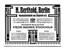
- Berthold advertisement from 1937 not showing Akzidenz-Grotesk. The advert showcases "modern and successful" faces, illustrating the eclipse of Akzidenz-Grotesk in this period.
- 1959 advert announcing the arrival of Akzidenz-Grotesk on the Linotype hot metal system