Kabel (typeface)
 | |
| Category | Sans-serif |
|---|---|
| Classification | Geometric |
| Designer(s) | Rudolf Koch |
| Foundry | Gebr. Klingspor |
| Variations | ITC Kabel |
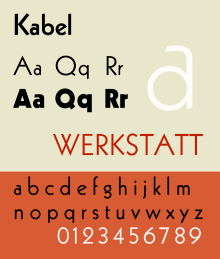
Kabel is a sans-serif typeface designed by German designer Rudolf Koch, and released by the Klingspor foundry from 1927 onwards.[1]
Kabel belongs to the "geometric" style of sans-serifs, which was becoming popular in Germany at the time of Kabel's creation. Based loosely on the structure of the circle and straight lines, it nonetheless applies a number of unusual design decisions, such as a delicately low x-height (although larger in the bold weight), a tilted 'e' and irregularly angled terminals, to add delicacy and an irregularity suggesting stylish calligraphy, of which Koch was an expert. A variety of rereleases and digitisations have been created.
Design
Kabel shows influence from Expressionism as much as from Modernism, and may be considered as a monoline sans-serif version of Koch's Koch-Antiqua, sharing many of its character shapes and proportions. This is visible in its low x-height and its two-storey 'g' with a large, partly open lower loop, similar to William Morris's Troy Type, and its 'e' with a tilted centre-stroke, similar to early Renaissance typefaces and also seen in Morris's type designs. The termini of vertical and horizontal strokes are cut an angle, often at right angles to stroke direction, suggesting writing with a pen. This gives Kabel the effect of not quite sitting on the baseline and makes for a more animated, less static feeling than Futura. The capitals vary considerably in width and show influence of Roman square capitals, for instance in the wide 'M' and narrow 'E'. The capital 'W' has a four-terminal form.
Koch marketed Kabel with a specimen showing the capitals supposedly derived from a construction grid of perfect rectangles and circles, but Walter Tracy and others have noted that this graphic does not really resemble the letters of the printed type, which were clearly drawn freely rather than by uncorrected geometry: "Koch probably drew [his] letters without constraint, and then 'rationalised' them afterwards…Koch was evidently not a man to be bound by arbitrary rules. In Kabel Light the arms of E are actually three different lengths, the bowl of R is deeper than that of B, and in P it is deeper still…and Y does not have the vertical stem shown in the diagram. In short, Koch's sense of style is in command, rather than any geometric formula. The result is an alphabet of capitals that relate perfectly without need [of] 'mathematical harmony'…they are, for my taste, the most attractive of all sans-serif capitals."[2]
Of the name, Adobe's release notes for their version of Kabel comment: "Kabel was not named after any specific cable, although the Zugspitze cable car car been completed in 1926, and a Berlin-Vienna facsimile telegraphy line opened in 1927. The name had techie cachet in its day (Piet Zwart's NKF kabel catalogue of 1927 is well-known) and is primarily metaphorical and allusive, a pun referring to both the monolinear construction of the face, and the role of type as a means of communication."[3]
Release
The original release of Kabel was in four weights: Light (released first), Medium, Bold and Heavy. The latter has a redesigned structure to fit the thicker strokes, with an enlarged x-height and more regularity, without the angled terminals of the lighter weights.[2] Also released was an inline design, “Prisma”, a headline weight “Zeppelin”, and condensed weights.[4]
Some metal type releases offered stylistic alternates, alternate characters with a different design. Many reduced the eccentricities of Kabel and in particular made it more resemble Futura, which was very dominant in printing of the period.[2][1] (This offering of Futura-like alternates such as a single-storey ‘a’, which historian Paul Shaw has called a "Futura-ectomy", was common among other sans-serifs of the time, including Monotype’s Gill Sans, Linotype's Metro and Erbar.[5])
Originally released by Koch’s employer the Klingspor Foundry, to widen sales the design was also made available by the Stempel Foundry (which bought Klingspor in 1956, having already owned some shares) and on Linotype’s “machine composition” hot metal typesetting and phototypesetting systems.[1] Linotype continues to sell Kabel in digital format.[6] Owing to Kabel’s popularity, many adaptations and simple knock-offs were sold by other companies, such as Phil Martin’s Alphabet Innovations.[1][7][8][9][10] This particularly occurred in the phototypesetting and digital type periods, taking advantage of the lack of international copyright protection for typefaces.[1]
ITC Kabel
Victor Caruso's 1975 adaptation for phototypesetting was created for the International Typeface Corporation, licensing the design rights from Stempel. It follows the standard ITC approach of a dramatically increased x-height accompanied by a unified set of weights from Book to Ultra, for instance retaining the angled-terminal motif into the bold weights.[1]
ITC also sold ITC Grizzly, an adaptation of the bold weight.[11]
Neue Kabel
A 2016 release by Marc Schütz with an x-height between the original and the ITC digitisation in 9 weights with italic styles to complement them. Another distinction that Neue Kabel has are stylistic alternates such as lower-case letters "a", "g", "e" and "l", circular and 45° square tittles.[1][12][13]
Other
Bhikkhu Pesala created the open-source revival Kabala, named after a Pāli word meaning 'a morsel of food' due to its intended use in Buddhist religious publications.[14] This release is inspired by the ITC weight set and structure, but adds a number of features including italics, small caps and combined characters.
Prominent usage

- Kabel is used in the popular board game Monopoly.[15]
- ITC Kabel Demi is used in the game Sonic Boom: Rise of Lyric[16]
- The typeface was used in the opening credits for the movie, Yellow Submarine.[17]
- Kabel Black in lower-case is used as the typeface in the logo for supermarket chain Piggly Wiggly.[18]
- Kabel was famously used as a typeface for music video credit tags on MTV from 1981 to 2006.
Google's corporate typeface, Product Sans, has some similarities to Kabel, in particular the angled 'e', but other features such as the 'M' and 'g' are very different, resembling Helvetica or Futura.[19] Product Sans is a proprietary design not available for licensing.
Notes
- 1 2 3 4 5 6 7 Ulrich, Ferdinand. "Why we need a new Kabel". FontShop. Retrieved 19 December 2016.
- 1 2 3 Tracy, Walter. Letters of Credit. pp. 168–173. Retrieved 19 December 2016.
- ↑ "Adobe Kabel". MyFonts. Adobe. Retrieved 21 May 2017.
- ↑ Unger, Ralph M. "Prisma Pro". MyFonts. RMU. Retrieved 19 December 2016.
- ↑ Shaw, Paul. "From the Archives: Typographic Sanity". Paul Shaw Letter Design. Retrieved 26 December 2015.
- ↑ "Kabel LT". MyFonts. Linotype. Retrieved 19 December 2016.
- ↑ Bean, Russel. "Virginia Neo". MyFonts. Type Associates. Retrieved 19 December 2016.
- ↑ "Geometric 231". MyFonts. Bitstream Inc. Retrieved 19 December 2016.
- ↑ "Koblenz Serial". MyFonts. SoftMaker. Retrieved 19 December 2016.
- ↑ "Koch Original". MyFonts. LetterPerfect. Retrieved 19 December 2016.
- ↑ "ITC Grizzly". MyFonts. International Typeface Corporation. Retrieved 19 December 2016.
- ↑ "Neue Kabel". MyFonts. Linotype. Retrieved 19 December 2016.
- ↑ Ferdinand Ulrich and Emma Tucker. "Neue Kabel: reshaping a lost classic". Monotype. Retrieved 2 August 2018.
- ↑ Pesala, Bhikku. "Kabala". Retrieved 4 September 2015.
- ↑ DeLeone, Brad. "DeLeone Designs - Typographic Poster (Kabel)". DeLeone Designs. Retrieved 11 October 2014.
- ↑ "Sonic Boom: Rise of Lyric". Wikipedia. 2017-11-16.
- ↑ Hudson, Rob (5 September 2013). "Yellow Submarine (1968) Opening Credits". Fonts In Use. Retrieved 12 October 2014.
- ↑ "Piggly Wiggly Font". Font Meme. Retrieved 12 October 2014.
- ↑ "Product Sans specimen" (PDF). Google. Retrieved 4 September 2015.
References
- Blackwell, Lewis. 20th Century Type. Yale University Press: 2004. ISBN 0-300-10073-6.
- Fiedl, Frederich, Nicholas Ott and Bernard Stein. Typography: An Encyclopedic Survey of Type Design and Techniques Through History. Black Dog & Leventhal: 1998. ISBN 1-57912-023-7.
- Jaspert, W. Pincus, W. Turner Berry and A.F. Johnson. The Encyclopædia of Type Faces. Blandford Press Lts.: 1953, 1983. ISBN 0-7137-1347-X.
- Macmillan, Neil. An A–Z of Type Designers. Yale University Press: 2006. ISBN 0-300-11151-7.
External links
| Wikimedia Commons has media related to Kabel (typeface). |