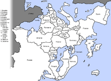
South-up map orientation

South-up map orientation is the orientation of a map with south up, or at the top of the map, amounting to a 180-degree rotation of the map from the standard convention of north-up. Maps in this orientation are sometimes called upside down maps or reversed maps.
Other maps with non-standard orientation include T and O maps, polar maps, and Dymaxion maps.
Psychological significance
Research suggests that north-south positions on maps have psychological consequences. In general, north is associated with richer people, more expensive real estate, and higher altitude, while south is associated with poorer people, cheaper prices, and lower altitude (the "north-south bias"). When participants were presented with south-up oriented maps, this north-south bias disappeared.[1]
Researchers posit the observed association between map-position and goodness/badness (north=good; south=bad) is caused by the combination of (i) the convention of consistently placing north at the top of maps, and (ii) a much more general association between vertical position and goodness/badness (up=good, down=bad), which has been documented in numerous contexts (e.g., power/status, profits/prices, affect/emotion, and even the divine).[2]
For example, Pope Francis used the term "true North" as a metaphor for authentic values: "If we want a future of prosperity for all, we need to keep our compass pointing toward 'true North', in the direction of authentic values."[3]
Common English idioms support the notion that many English speakers conflate or associate north-with-up and south-with-down (e.g., "heading up north", "down south", Down Under), a conflation that can only be understood as learned by repeated exposure to a particular map-orientation convention (i.e., north put at the top of maps). Related idioms used in popular song lyrics provide further evidence for the pervasiveness of "north-south bias" among English speakers, in particular with regard to wealth. Examples include, using "Uptown" to mean "high class or rich" (as in Uptown Girl by Billy Joel), or using "Downtown" to convey lower socioeconomic status (as in Bad, Bad Leroy Brown by Jim Croce)[4]
Cultural diversity education
Cultural diversity and media literacy educators use south-up oriented world maps to help students viscerally experience the frequently disorienting effect of seeing something familiar from a different perspective. Having students consider the privileged position given to the Northern hemisphere (especially Europe and North America) on most world maps can help students confront their more general potential for culturally biased perceptions.[5]
History of south-up oriented maps as political statements
Throughout history, maps have been made with varied orientations, and reversing the orientation of maps is technically very easy to do. As such, some cartographers maintain that the issue of south-up map orientation is itself trivial. More noteworthy than the technical matter of orientation, per se, is the history of explicitly using south-up map orientation as a political statement, that is, creating south-up oriented maps with the express rationale of reacting to the north-up oriented world maps that have dominated map publication during the modern age.
The history of south-up map orientation as political statement can be traced back to the early 1900s. Joaquín Torres García, a Uruguayan modernist painter, created one of the first maps to make a political statement related to north-south map positions entitled "América Invertida." "Torres-García placed the South Pole at the top of the earth, thereby suggesting a visual affirmation of the importance of the (South American) continent."[6][7]
A popular example of a south-up oriented map designed as a political statement is "McArthur's Universal Corrective Map of the World" (1979). An insert on this map explains that the Australian, Stuart McArthur, sought to confront "the perpetual onslaught of 'downunder' jokes -- implications from Northern nations that the height of a country's prestige is determined by its equivalent spatial location on a conventional map of the world".[8] McArthur's Universal Corrective Map of the World (1979) has sold over 350,000 copies to date.
In popular culture
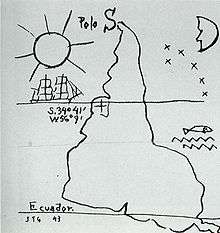
South-up maps are commonly available as novelties or sociopolitical statements in southern hemisphere locales, particularly Australia.[9] A south-up oriented world map appears in The West Wing season 2 episode 16, and issues of cultural bias are discussed in relation to it. Mafalda, by Argentinian cartoonist Quino, is a popular daily cartoon strip in Latin America and Spain. It is very political, yet about Mafalda, a 5-year-old girl. One of the most famous episodes is based on the question: “why are we down?” She finally concludes that the southern hemisphere is so undeveloped because the ideas fall off. Then she puts her globe upside-down and, for a few days, everything is upside-down. American cartoonist Leo Cullum published a cartoon in The New Yorker titled, "Happy penguin looking at upside-down globe; Antarctica is on top" (April 20, 1992).
See also
Notes
- ↑ Meier et al. 2011; Nelson & Simmonds 2009.
- ↑ Meier & Robinson 2004; Montoro et al. 2015; Kacinik 2014.
- ↑ https://twitter.com/pontifex/status/968100835866521600?lang=en
- ↑ Meier et al. 2011; Kacinik 2014.
- ↑ Wood 2010; Kaiser 2013.
- ↑ "Upside Down Maps". Retrieved 2016-01-24.
- ↑ De Armendi 2009.
- ↑ Wood, Kaiser & Abramms 2006, pp. 50–51.
- ↑ Monmonier 2004, p. 169.
Sources
- What's Up? South!, retrieved 2016-01-18 .
- De Armendi, Nicole (2009), "The Map as Political Agent: Destabilising the North-South Model and Redefining Identity in Twentieth-Century Latin American Art" (PDF), St Andrews Journal of Art History and Museum Studies: 5–17 .
- Kacinik, Natalie A. (24 September 2014), "Sticking your neck out and burying the hatchet: what idioms reveal about embodied simulation", Frontiers in Human Neuroscience, 8 (689), doi:10.3389/fnhum.2014.00689 .
- Kaiser, Ward (2013), How Maps Change Things, Wood Lake Publications, ISBN 9781770645660 .
- Levine, Jesse (1982), A New World of Understanding [map]
- Meier, Brian P.; Moller, Arlen C.; Chen, Julie J.; Riemer-Peltz, Miles (2011), "Spatial Metaphor and Real Estate: North-South Location Biases Housing Preference", Social Psychological and Personality Science, 2 (5): 547–553, doi:10.1177/1948550611401042 .
- Meier, Brian P.; Robinson, Michael D. (2004), "Why the sunny side is up associations between affect and vertical position", Psychological Science, 15 (4): 243–247, doi:10.1111/j.0956-7976.2004.00659.x .
- Monmonier, Mark (2004), Rhumb Lines and Map Wars: A Social History of the Mercator Projection, University of Chicago Press. .
- Montoro, Pedro R.; Contreras, María José; Elosúa, María Rosa; Marmolejo-Ramos, Fernando (2015), "Cross-modal metaphorical mapping of spoken emotion words onto vertical space", Frontiers in Psychology, 6: 1205, doi:10.3389/fpsyg.2015.01205 .
- Nelson, L.D.; Simmonds, J.P. (2009), "On southbound ease and northbound fees: Literal consequences of the metaphoric link between vertical space and cardinal direction.", Journal of Marketing Research, 46: 715–726, doi:10.1509/jmkr.46.6.715 .
- Wood, D.; Kaiser, W. L.; Abramms, B. (2006), Seeing Through Maps: Many Ways to See the World, ODT, Inc., ISBN 978-1-931057-20-2 .
- Wood, Denis (2010), Rethinking the Power of Maps .
- Haviland, William A.; Prins, Harald. E. L.; McBride, Bunny.; Walrath, Dana. (2010), Cultural Anthropology: The Human Challenge, Wadsworth .
External links
![]()
- The Upsidedown Map Page A collection of world maps with south-up orientation.
- Jesse Levine's A New World Of Understanding Map.
- Alverto Rios' Upside-down Map of the World (Van der Grinten projection).
- Boston Public Library educational resources