Misleading graph
| Part of a series on Statistics |
| Data visualization |
|---|
|
Important figures |
|
Information graphic types |
|
Related topics |
In statistics, a misleading graph, also known as a distorted graph, is a graph that misrepresents data, constituting a misuse of statistics and with the result that an incorrect conclusion may be derived from it.
Graphs may be misleading through being excessively complex or poorly constructed. Even when constructed to accurately display the characteristics of their data, graphs can be subject to different interpretation.[1]
Misleading graphs may be created intentionally to hinder the proper interpretation of data or accidentally due to unfamiliarity with graphing software, misinterpretation of data, or because data cannot be accurately conveyed. Misleading graphs are often used in false advertising. One of the first authors to write about misleading graphs was Darrell Huff, publisher of the 1954 book How to Lie with Statistics.
The field of data visualization describes ways to present information that avoids creating misleading graphs.
Misleading graph methods
--How to Lie with Statistics (1954)[2]
There are numerous ways in which a misleading graph may be constructed.[3]
Excessive usage
The use of graphs where they are not needed can lead to unnecessary confusion/interpretation.[4] Generally, the more explanation a graph needs, the less the graph itself is needed.[4] Graphs do not always convey information better than tables.[5]
Biased labeling
The use of biased or loaded words in the graph's title, axis labels, or caption may inappropriately prime the reader.[4][6]
Fabricated trends
Similarly, attempting to draw trend lines through uncorrelated data may mislead the reader into believing a trend exists where there is none. This can be both the result of intentionally attempting to mislead the reader, or due to the phenomenon of illusory correlation.
Pie chart
- Comparing pie charts of different sizes could be misleading as people cannot accurately read the comparative area of circles.[7]
- The usage of thin slices, which are hard to discern, may be difficult to interpret.[7]
- The usage of percentages as labels on a pie chart can be misleading when the sample size is small.[8]
- Making a pie chart 3D or adding a slant will make interpretation difficult due to distorted effect of perspective.[9] Bar-charted pie graphs in which the height of the slices is varied may confuse the reader.[9]
3D Pie chart slice perspective
A perspective (3D) pie chart is used to give the chart a 3D look. Often used for aesthetic reasons, the third dimension does not improve the reading of the data; on the contrary, these plots are difficult to interpret because of the distorted effect of perspective associated with the third dimension. The use of superfluous dimensions not used to display the data of interest is discouraged for charts in general, not only for pie charts.[10] In a 3D pie chart, the slices that are closer to the reader appear to be larger than those in the back due to the angle at which they're presented.[11]
Comparison of pie charts Misleading pie chart Regular pie chart 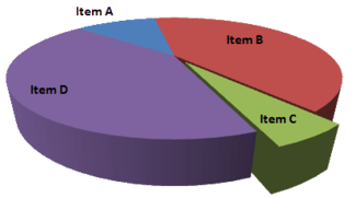
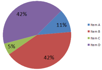
In the misleading pie chart, Item C appears to be at least as large as Item A, whereas in actuality, it is less than half as large.
Edward Tufte, a prominent American statistician, noted why tables may be preferred to pie charts in The Visual Display of Quantitative Information:[5]
Tables are preferable to graphics for many small data sets. A table is nearly always better than a dumb pie chart; the only thing worse than a pie chart is several of them, for then the viewer is asked to compare quantities located in spatial disarray both within and between pies – Given their low data-density and failure to order numbers along a visual dimension, pie charts should never be used.
Improper scaling
When using pictograms in bar graphs, they should not be scaled uniformly, as this creates a perceptually misleading comparison.[12] The area of the pictogram is interpreted instead of only its height or width.[13] This causes the scaling to make the difference appear to be squared.[13]
Improper scaling of 2D pictogram in bar graph Improper scaling Regular Comparison 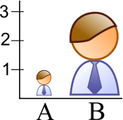
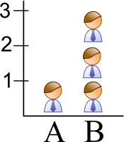
In the improperly scaled pictogram bar graph, the image for B is actually 9 times as large as A.
2D shape scaling comparison Square Circle Triangle 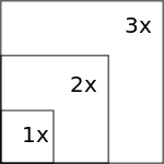

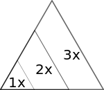
The perceived size increases when scaling.
The effect of improper scaling of pictograms is further exemplified when the pictogram has 3 dimensions, in which case the effect is cubed.[14]

The graph of house sales (left) is misleading. It appears that home sales have grown eightfold in 2001 over the previous year, wheareas they have actually grown twofold. Besides, the number of sales is not specified.
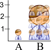
An improperly scaled pictogram may also suggest that the item itself has changed in size.[15]
Misleading Regular 

Assuming the pictures represent equivalent quantities, the misleading graph makes it appear that there are more bananas
because the bananas occupy the most area and are furthest to the right.
Logarithmic scaling
Logarithmic (or log) scales are a valid means of representing data. But when used without being clearly labelled as log scales, or when displayed to a reader unfamiliar with them, they can be misleading. Log scales put the data values in terms of a chosen number (the base of the log) to a particular power. The base is often e (2.71828...) or 10. For example, log scales may give a height of 1 for a value of 10 in the data and a height of 6 for a value of 1,000,000 (106) in the data. Log scales and variants are commonly used, for instance, for the volcanic explosivity index, the Richter scale for earthquakes, the magnitude of stars, and the pH of acidic and alkaline solutions. Even in these cases, the log scale can make the data less apparent to the eye. Often the reason for the use of log scales is that the graph's author wishes to display effects of vastly different scales on the same axis. Without log scales, comparing quantities such as 103 versus 109 becomes visually impractical. A graph with a log scale which was not clearly labelled as such, or a graph with a log scale presented to a viewer who did not have knowledge of logarithmic scales, would generally result in a representation which made data values look of similar size whilst in fact being of widely differing magnitudes. Misuse of a log scale can make vastly different values (such as 10 and 10,000) appear close together (on a base-10 log scale they would be only 1 and 4). Or it can make small values appear to be negative due to the way in which logarithmic scales represent numbers smaller than the base.
Misuse of log scales may also cause relationships between quantities to appear to be linear whilst those relationships are in fact exponentials or power laws which rise very rapidly towards higher values. It has been stated, although mainly in a humorous way, that "anything looks linear on a log-log plot with thick marker pen" .
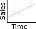
Comparison of linear and logarithmic scales for identical data Linear scale Logarithmic scale 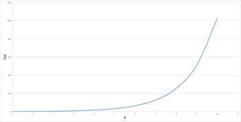
.png)
Both graphs show an identical exponential function of f(x) = 2x. The graph on the left uses a linear scale, showing clearly an exponential trend. The graph on the right however uses a logarithmic scale, which generates a straight line. If the viewer of the graph was not aware of this, the graph would appear to show a linear trend.
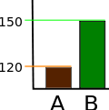
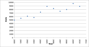
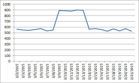
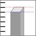
Truncated graph
A truncated graph (also known as a torn graph) has a y axis that does not start at 0. These graphs can create the impression of important change where there is relatively little change.
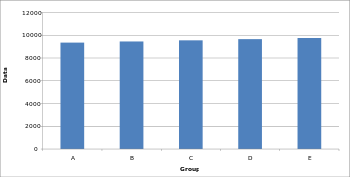
Truncated graphs are useful in illustrating small differences.[16] Graphs may also be truncated to save space.[16] Commercial software such as MS Excel will tend to truncate graphs by default if the values are all within a narrow range, as in this example.
Truncated bar graph Truncated bar graph Regular bar graph 
Both of these graphs display identical data; however, in the truncated bar graph on the left, the data appear to show significant differences, whereas in the regular bar graph on the right, these differences are hardly visible.
There are several ways to indicate a y-axis break:
Indicating a y-axis break 

Axis changes
Changing y-axis maximum Original graph Smaller maximum Larger maximum 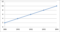

Changing the y-axis maximum affects how the graph appears. A higher maximum will cause the graph to appear to have less volatility, less growth and a less steep line than a lower maximum.
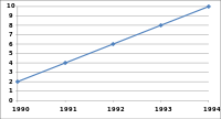
Changing ratio of graph dimensions Original graph Half width, twice height Twice width, half height 
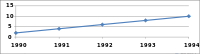
Changing the ratio of a graph's dimensions will affect how the graph appears.
No scale
The scales of a graph are often used to exaggerate or minimize differences.[17][18]
Misleading bar graph with no scale Less difference More difference 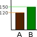
The lack of a starting value for the y axis makes it unclear whether the graph is truncated. Additionally, the lack of tick marks prevents the reader from determining whether the graph bars are properly scaled. Without a scale, the visual difference between the bars can be easily manipulated.
Misleading line graph with no scale Volatility Steady, fast growth Slow growth 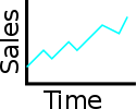

Though all three graphs share the same data, and hence the actual slope of the (x, y) data is the same, the way that the data is plotted can change the visual appearance of the angle made by the line on the graph. This is because each plot has different scale on its vertical axis. Because the scale is not shown, these graphs can be misleading.
Improper intervals or units
The intervals and units used in a graph may be manipulated to create or mitigate the expression of change.[11]
Omitting data
Graphs created with omitted data remove information from which to base a conclusion.
Scatter plot with missing categories Scatter plot with missing categories Regular scatter plot 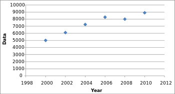
In the scatter plot with missing categories on the left, the growth appears to be more linear with less variation.
In financial reports, negative returns or data that do not correlate a positive outlook may be excluded to create a more favorable visual impression.[19]
Improper extraction
Graphs based on other graphs should be representative in their presentation.
Extraction has valid uses when searching for anomalies.
Extraction Misleading extracted graph Representative extracted graph 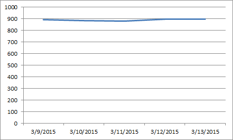
The misleading graph gives the impression of consistently high values, but in context these values are anomalous.
3D
The use of a superfluous third dimension, which does not contain information, is strongly discouraged, as it may confuse the reader.[9]
 The third dimension may confuse readers[9]
 The blue bar in the front appears larger than the green bar in the back due to perspective, despite having the same value
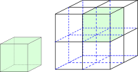 When scaling in three dimensions, the effect of the change is cubed
Complexity
Graphs are designed to allow easier interpretation of statistical data. However, graphs with excessive complexity can obfuscate the data and make interpretation difficult.
Poor construction
Poorly constructed graphs can make data difficult to discern and thus interpret.
Extrapolation
Misleading graphs may be used in turn to extrapolate misleading trends.[20]
Measuring distortion
Several methods have been developed to determine whether graphs are distorted and to quantify this distortion.[21][22]
Lie factor

where

A graph with a high lie factor (>1) would exaggerate change in the data it represents, while one with a small lie factor (>0, <1) would obscure change in the data.[23] A perfectly accurate graph would exhibit a lie factor of 1.
Graph discrepancy index

where


The graph discrepancy index, also known as the graph distortion index (GDI), was originally proposed by Paul John Steinbart in 1998. GDI is calculated as a percentage ranging from −100% to positive infinity, with zero percent indicating that the graph has been properly constructed and anything outside the ±5% margin is considered to be distorted.[21] Research into the usage of GDI as a measure of graphics distortion has found it to be inconsistent and discontinuous, making the usage of GDI as a measurement for comparisons difficult.[21]
Data-ink ratio

The data-ink ratio should be relatively high, otherwise the chart may have unnecessary graphics.[23]
Data density

The data density should be relatively high, otherwise a table may be better suited for displaying the data.[23]
Usage in finance and corporate reports
Graphs are useful in the summary and interpretation of financial data.[24] Graphs allow trends in large data sets to be seen while also allowing the data to be interpreted by non-specialists.[24][25]
Graphs are often used in corporate annual reports as a form of impression management.[26] In the United States, graphs do not have to be audited, as they fall under AU Section 550 Other Information in Documents Containing Audited Financial Statements.[26]
Several published studies have looked at the usage of graphs in corporate reports for different corporations in different countries and have found frequent usage of improper design, selectivity, and measurement distortion within these reports.[26][27][28][29][30][31][32] The presence of misleading graphs in annual reports have led to requests for standards to be set.[19][33][34][35]
Research has found that while readers with poor levels of financial understanding have a greater chance of being misinformed by misleading graphs,[36] even those with financial understanding, such as loan officers, may be misled.[33]
Academia
The perception of graphs is studied in psychophysics, cognitive psychology, and computational visions.[37]
See also
References
- ↑ Kirk, p. 52
- ↑ Huff, p. 63
- ↑ Nolan, pp. 49–52
- 1 2 3 "Methodology Manual: Data Analysis: Displaying Data - Deception with Graphs" (PDF). Texas State Auditor's Office. Jan 4, 1996. Archived from the original on 2003-04-02.
- 1 2 Tufte, Edward R. (2006). The visual display of quantitative information (4th print, 2nd ed.). Cheshire, Conn.: Graphics Press. p. 178. ISBN 9780961392147.
- ↑ Keller, p. 84
- 1 2 Whitbread, p. 150
- ↑ Soderstrom, Irina R. (2008), Introductory Criminal Justice Statistics, Waveland Press, p. 17, ISBN 9781478610342 .
- 1 2 3 4 Whitbread, p. 151
- ↑ Few, Stephen (August 2007). "Save the Pies for Dessert" (PDF). Visual Business Intelligence Newsletter. Perceptual Edge. Retrieved 28 June 2012.
- 1 2 Rumsey, p. 156.
- ↑ Weiss, p. 60.
- 1 2 Utts, pp. 146–147.
- ↑ Hurley, pp. 565–566.
- ↑ Huff, p. 72.
- 1 2 Rensberger, Boyce (May 10, 1995). "Slanting The Slope of Graphs". The Washington Post. Retrieved 9 July 2012. (subscription required)
- ↑ Smith, Karl J. (1 January 2012). Mathematics: Its Power and Utility. Cengage Learning. p. 472. ISBN 978-1-111-57742-1. Retrieved 24 July 2012.
- ↑ Moore, David S.; Notz, William (9 November 2005). Statistics: Concepts And Controversies. Macmillan. pp. 189–190. ISBN 978-0-7167-8636-8. Retrieved 24 July 2012.
- 1 2 Burgess, Deanna Oxender; William N. Dilla; Paul John Steinbart; Todd M. Shank (May 2008). "Does Graph Design Matter To CPAs And Financial Statement Readers?". Journal of Business & Economics Research. 6 (5).
- ↑ Smith, Charles Hugh (29 Mar 2011). "Extrapolating Trends Is Exciting But Misleading". Business Insider. Retrieved 23 September 2018.
- 1 2 3 Mather, Dineli R.; Mather, Paul R.; Ramsay, Alan L. (July 2003). "Is the Graph Discrepancy Index (GDI) a Robust Measure?". doi:10.2139/ssrn.556833.
- ↑ Mather, Dineli; Mather, Paul; Ramsay, Alan (1 June 2005). "An investigation into the measurement of graph distortion in financial reports". Accounting and Business Research. 35 (2): 147–160. doi:10.1080/00014788.2005.9729670.
- 1 2 3 Craven, Tim (November 6, 2000). "LIS 504 - Graphic displays of data". Faculty of Information and Media Studies. London, Ontario: University of Western Ontario. Retrieved 9 July 2012.
- 1 2 Fulkerson, Cheryl Linthicum; Marshall K. Pitman; Cynthia Frownfelter-Lohrke (June 1999). "PREPARING FINANCIAL GRAPHICS". The CPA Journal.
- ↑ McNelis, L. Kevin (June 1, 2000). "Graphs, An Underused Information Presentation Technique". The National Public Accountant. (subscription required)
- 1 2 3 Beattie, Vivien; Jones, Michael John (June 1, 1999). "Financial graphs: True and Fair?". Australian CPA. 69 (5): 42–44.
- ↑ Beattie, Vivien; Jones, Michael John (1 September 1992). "The Use and Abuse of Graphs in Annual Reports: Theoretical Framework and Empirical Study" (PDF). Accounting and Business Research. 22 (88): 291–303. doi:10.1080/00014788.1992.9729446.
- ↑ Penrose, J. M. (1 April 2008). "Annual Report Graphic Use: A Review of the Literature". Journal of Business Communication. 45 (2): 158–180. doi:10.1177/0021943607313990.
- ↑ Frownfelter-Lohrke, Cynthia; Fulkerson, C. L. (1 July 2001). "The Incidence and Quality of Graphics in Annual Reports: An International Comparison". Journal of Business Communication. 38 (3): 337–357. doi:10.1177/002194360103800308.
- ↑ Mohd Isa, Rosiatimah (2006). "The incidence and faithful representation of graphical information in corporate annual report: a study of Malaysian companies". Technical Report. Institute of Research, Development and Commercialization, Universiti Teknologi MARA. Archived from the original on 2016-08-15. Also published as: Mohd Isa, Rosiatimah (2006). "Graphical Information in Corporate Annual Report: A Survey of Users and Preparers Perceptions". Journal of Financial Reporting and Accounting. 4 (1): 39–59. doi:10.1108/19852510680001583.
- ↑ Beattie, Vivien; Jones, Michael John (1 March 1997). "A Comparative Study of the Use of Financial Graphs in the Corporate Annual Reports of Major U.S. and U.K. Companies". Journal of International Financial Management and Accounting. 8 (1): 33–68. doi:10.1111/1467-646X.00016.
- ↑ Beattie, Vivien; Jones, Michael John (2008). "Corporate reporting using graphs: a review and synthesis". Journal of Accounting Literature. 27: 71–110. ISSN 0737-4607.
- 1 2 Christensen, David S.; Albert Larkin (Spring 1992). "Criteria For High Integrity Graphics". Journal of Managerial Issues. Pittsburg State University. 4 (1): 130–153. JSTOR 40603924.
- ↑ Eakin, Cynthia Firey; Timothy Louwers; Stephen Wheeler (2009). "The Role of the Auditor in Managing Public Disclosures: Potentially Misleading Information in Documents Containing Audited Financial Statements" (PDF). Journal of Forensic & Investigative Accounting. 1 (2). ISSN 2165-3755.
- ↑ Steinbart, P. (September 1989). "The Auditor's Responsibility for the Accuracy of Graphs in Annual Reports: Some Evidence for the Need for Additional Guidance". Accounting Horizons: 60–70.
- ↑ Beattie, Vivien; Jones, Michael John (2002). "Measurement distortion of graphs in corporate reports: an experimental study". Accounting, Auditing & Accountability Journal. 15 (4): 546–564. doi:10.1108/09513570210440595.
- ↑ Frees, Edward W; Robert B Miller (Jan 1998). "Designing Effective Graphs" (PDF). North American Actuarial Journal. 2 (2): 53–76. doi:10.1080/10920277.1998.10595699. Archived from the original on 2012-02-16.
Books
- Huff, Darrell (1954). How to lie with statistics. pictures by Irving Geis (1st ed.). New York: Norton. ISBN 0393052648.
- Hurley, Patrick J. (2000). A Concise Introduction to Logic. Wadsworth Publishing. ISBN 9780534520069.
- Keller, Gerald (2011). Statistics for Management and Economics (abbreviated, 9th ed.). Mason, OH: South-Western. ISBN 978-1111527327.
- Kirk, Roger E. (2007). Statistics: An Introduction. Cengage Learning. ISBN 978-0-534-56478-0. Retrieved 28 June 2012.
- Nolan, Susan; Heinzen, Thomas (2011). Statistics for the Behavioral Sciences. Macmillan. ISBN 978-1-4292-3265-4. Retrieved 28 June 2012.
- Rumsey, Deborah (2010). Statistics Essentials For Dummies. John Wiley & Sons. ISBN 978-0-470-61839-4. Retrieved 28 June 2012.
- Weiss, Neil A. (1993). Elementary statistics. Addison-Wesley. ISBN 978-0-201-56640-6. Retrieved 28 June 2012.
- Tufte, Edward (1997). Visual Explanations: Images and Quantities, Evidence and Narrative. Cheshire, CT: Graphics Press. ISBN 978-0961392123.
- Utts, Jessica M. (2005). Seeing through statistics (3rd ed.). Belmont: Thomson, Brooks/Cole. ISBN 9780534394028.
- Wainer, Howard (2000). Visual Revelations: Graphical Tales of Fate and Deception From Napoleon Bonaparte To Ross Perot. Psychology Press. ISBN 978-0-8058-3878-7. Retrieved 19 July 2012.
- Whitbread, David (2001). The design manual (2nd ed.). Sydney: University of New South Wales Press. ISBN 0868406589.
Further reading
- A discussion of misleading graphs, Mark Harbison, Sacramento City College
- Robbins, Naomi B. (2005). Creating more effective graphs. Hoboken, N.J.: Wiley-Interscience. ISBN 9780471698180.
- Durbin CG, Jr (October 2004). "Effective use of tables and figures in abstracts, presentations, and papers". Respiratory care. 49 (10): 1233–7. PMID 15447809.
- Goundar, Nadesa (2009). "Impression Management in Financial Reports Surrounding CEO Turnover". Masters Dissertation. Unitec Institute of Technology. Retrieved 9 July 2012.
- Huff, Darrell; Geis, Irving (17 October 1993). How to Lie With Statistics. W. W. Norton & Company. ISBN 978-0-393-31072-6. Retrieved 28 June 2012.
- Bracey, Gerald (2003). "Seeing Through Graphs". Understanding and using education statistics: it's easier than you think. Educational Research Service. ISBN 9781931762267.
- Harvey, J. Motulsky (June 2009). "The Use and Abuse of Logarithmic Axes" (PDF). GraphPad Software Inc. Archived from the original on 2010-11-23.
- Chandar, N.; Collier, D.; Miranti, P. (15 February 2012). "Graph standardization and management accounting at AT&T during the 1920s". Accounting History. 17 (1): 35–62. doi:10.1177/1032373211424889.
- Mather, Paul; Ramsay, Alan; Steen, Adam (1 January 2000). "The use and representational faithfulness of graphs in Australian IPO prospectuses". Accounting, Auditing & Accountability Journal. 13 (1): 65–83. doi:10.1108/09513570010316144.
- Beattie, Vivien; Jones, Michael John (1996). Financial graphs in corporate annual reports: a review of practice in six countries. London: Institute of Chartered Accounants in England and Wales. ISBN 9781853557071.
- Galliat, Tobias (Summer 2005). "Visualisierung von Informationsräumen" (PDF). Fachhochschule Köln, University of Applied Sciences Cologne. Archived from the original (PDF) on 2006-01-04. Retrieved 9 July 2012.
- Carvalho, Clark R.; McMillan, Michael D. (September 1992). "Graphic Representation in Managerial Decision Making: The Effect of Scale Break on the Dependent Axis" (PDF). AIR FORCE INST OF TECH WRIGHT-PATTERSON AFB OH.
- Johnson, R. Rice; Roemmich, R. (October 1980). "Pictures that Lie: The Abuse of Graphs in Annual Reports". Management Accounting: 50–56.
- Davis, Alan J. (1 August 1999). "Bad graphs, good lessons". ACM SIGGRAPH Computer Graphics. 33 (3): 35–38. doi:10.1145/330572.330586.
- Louwers, T.; Radtke, R; Pitman, M. (May–June 1999). "Please Pass the Salt: A Look at Creative Reporting in Annual Reports". Today's CPA: 20–23.
- Beattie, Vivien; Jones, Michael John (May 2001). "A six-country comparison of the use of graphs in annual reports". The International Journal of Accounting. 36 (2): 195–222. doi:10.1016/S0020-7063(01)00094-2.
- Wainer, Howard (1984). "How to Display Data Badly". The American Statistician. 38 (2): 137–147. doi:10.1080/00031305.1984.10483186.
- Lane, David M.; Sándor, Anikó (1 January 2009). "Designing better graphs by including distributional information and integrating words, numbers, and images" (PDF). Psychological Methods. 14 (3): 239–257. doi:10.1037/a0016620.
- Campbell, Mary Pat (Feb 2010). "Spreadsheet Issues: Pitfalls, Best Practices, and Practical Tips". Actuarial Practice Forum.
- Arocha, Carlos (May 2011). "Words or Graphs?". The Stepping Stone.
- Raschke, Robyn L.; Steinbart, Paul John (1 September 2008). "Mitigating the Effects of Misleading Graphs on Decisions by Educating Users about the Principles of Graph Design". Journal of Information Systems. 22 (2): 23–52. doi:10.2308/jis.2008.22.2.23.