Sankey diagram

Sankey diagrams are a specific type of flow diagram, in which the width of the arrows is shown proportionally to the flow quantity.
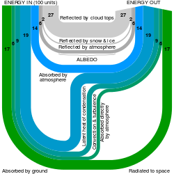
The illustration shows a Sankey diagram which represents all the primary energy flows into a factory. The widths of the bands are directly proportional to energy production, utilization and losses. The primary energy sources are gas, electricity and coal/oil and represent energy inputs at the left hand side of the Sankey diagram. They can also visualize the energy accounts, material flow accounts on a regional or national level, and also the breakdown of cost of item or services.
Sankey diagrams put a visual emphasis on the major transfers or flows within a system. They are helpful in locating dominant contributions to an overall flow. Often, Sankey diagrams show conserved quantities within defined system boundaries.
History
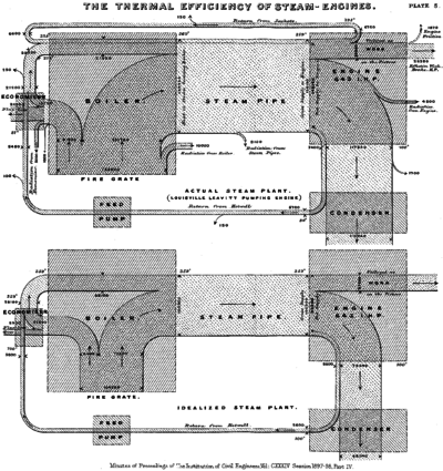
Sankey diagrams are named after Irish Captain Matthew Henry Phineas Riall Sankey, who used this type of diagram in 1898 in a classic figure (see panel on the right) showing the energy efficiency of a steam engine. While the first charts in black and white were merely used to display one type of flow (e.g. steam), using colors for different types of flows has added more degrees of freedom to Sankey diagrams.
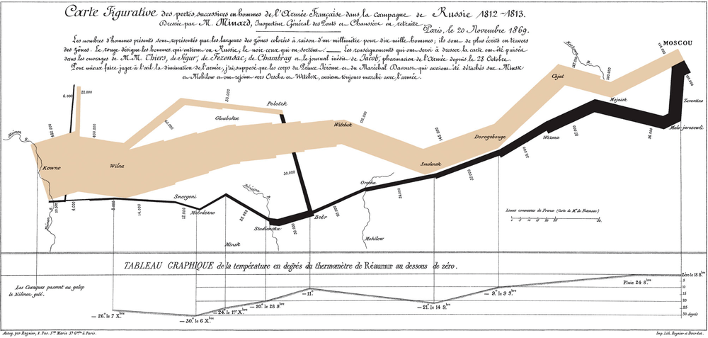
One of the most famous Sankey diagrams is Charles Minard's Map of Napoleon's Russian Campaign of 1812. It is a flow map, overlaying a Sankey diagram onto a geographical map. It was created in 1869, so it actually predates Sankey's 'first' Sankey diagram of 1898.
Science
Sankey diagrams are often used in fields of science, especially physics. They are used to represent energy inputs, useful output, and wasted output.
Active examples
The United States Energy Information Administration (EIA) produces numerous Sankey diagrams annually in its Annual Energy Review[1] which illustrate the production and consumption of various forms of energy.
Eurostat, the Statistical Office of the European Union, has developed an interactive Sankey web tool to visualise energy data by means of flow diagrams.[2] The tool allows the building and customisation of diagrams by playing with different options (country, year, fuel, level of detail).
The International Energy Agency (IEA) created an interactive Sankey web application] that details the flow of energy for the entire planet.[3] Users can select specific countries, points of time back to 1973, and modify the arrangement of various flows within the Sankey diagram.
The US Department of Energy's Lawrence Livermore Laboratory maintains a site of Sankey diagrams, including US energy flow and carbon flow.[4]
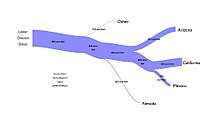
Ben Schmidt, an assistant professor of history at Northeastern University, created a Sankey diagram relating majors in college to eventual careers.[5]
Sankey Diagram Drawing Tools
Software tools to draw Sankey diagrams are available on the web and for a variety of computing platforms.
| Name | Description | Platform | Requires Programming? |
|---|---|---|---|
| amCharts | JavaScript charting library | Any OS that supports JavaScript | Yes |
| AnyChart | JavaScript charting library for data visualization | Any OS that supports JavaScript | Yes |
| D3.js | JavaScript library for visualization and diagramming | Any OS that supports JavaScript | Yes |
| DisplayR | Subscription website visualization tool based on R | Web site | Supported, but not required |
| e!Sankey | Visually place nodes and flows | Microsoft Windows | No |
| Google Charts | HTML-based chart-generator (does not work under Internet Explorer) | Web site | Yes |
| Power BI | Data Visualization Tool, enter data in spreadsheet or other compatible database | Microsoft Windows | No |
| Sankey by tamc | JavaScript library for drawing Sankey / flow diagrams | Any OS that supports JavaScript | Yes |
| Sankey Diagram | Visually place nodes and flows | iOS | No |
| Sankey Diagram Generator | Enter flow data through node and link fields, generates a diagram on the fly as you add the nodes. | Web site | No |
| Sankey for Android | Manually enter data, visualize flow | Android | No |
| SankeyMATIC | Enter flow data manually into a text-based form, generates a diagram. | Web site | No |
| SDraw | Visually place nodes and flows | Microsoft Windows | No |
| The Sankey Diagram Generator | Provides pre-configured diagrams, or enter your own data in JSON format. | Web site | Yes |
Notably Microsoft Visio - a common business infographics application - does not have "Sankey Diagrams templates that ship with Visio" [6]
See also
- Alluvial diagram a type of Sankey diagram that uses the same kind of representation to depict how items re-group.[7]
- Thermodynamics
- Material flow management
- Grassmann diagram (exergy flow and loss)
References
- ↑ "Annual Energy Review". Energy Information Administration. Retrieved 15 December 2017.
- ↑ "Energy balance flow for European Union (28 countries) 2015". Eurostat. Retrieved 15 December 2017.
- ↑ "World Balance (2015)". International Energy Agency (IEA). Retrieved 15 December 2017.
- ↑ "LLNL Flow Charts". Lawrence Livermore National Laboratory. Retrieved 15 December 2017.
- ↑ Schmidt, Ben. "What are you going to do with that degree?". Ben Schmidt. Retrieved 15 December 2017.
- ↑ http://www.visguy.com/2008/01/02/sankey-diagram-shapes-for-visio/
- ↑ "How to make an alluvial diagram". RAWGraphs Documentation. Retrieved 1 March 2018.
External links
| Wikimedia Commons has media related to Sankey diagrams. |
- Scottish Executive - Energy in Scotland: Supply and Demand
- Irish Environmental Protection Agency - Material Flow Accounts (MFAs) – Demonstration for Ireland - 2001
- sankey-diagrams.com – Blog discussing the usage of Sankey diagrams
- IEA Energy Balance Flows – Containing International Energy Agency's data on over 150 countries and regions
- Eurostat energy flow diagrams – Interactive visualisation tool for the annual energy balance data of 42 countries reporting to Eurostat