Heat map
A heat map (or heatmap) is a data visualization technique that shows magnitude of a phenomenon as color in two dimensions. The variation in color may be by hue or intensity, giving obvious visual cues to the reader about how the phenomenon is clustered or varies over space. There are two fundamentally different categories of heat maps: the cluster heat map and the spatial heat map. In a cluster heat map, magnitudes are laid out into a matrix of fixed cell size whose rows and columns are discrete phenomena and categories, and the sorting of rows and columns is intentional and somewhat arbitrary, with the goal of suggesting clusters or portraying them as discovered via statistical analysis. The size of the cell is arbitrary but large enough to be clearly visible. By contrast, the position of a magnitude in a spatial heat map is forced by the location of the magnitude in that space, and there is no notion of cells; the phenomenon is considered to vary continuously.
"Heat map" is a relatively new term, but the practice of shading matrices has existed for over a century.[1]
History
Heat maps originated in 2D displays of the values in a data matrix. Larger values were represented by small dark gray or black squares (pixels) and smaller values by lighter squares. Loua (1873) used a shading matrix to visualize social statistics across the districts of Paris.[1] Sneath (1957) displayed the results of a cluster analysis by permuting the rows and the columns of a matrix to place similar values near each other according to the clustering. Jacques Bertin used a similar representation to display data that conformed to a Guttman scale. The idea for joining cluster trees to the rows and columns of the data matrix originated with Robert Ling in 1973. Ling used overstruck printer characters to represent different shades of gray, one character-width per pixel. Leland Wilkinson developed the first computer program in 1994 (SYSTAT) to produce cluster heat maps with high-resolution color graphics. The Eisen et al. display shown in the figure is a replication of the earlier SYSTAT design.
Software designer Cormac Kinney trademarked the term 'heat map' in 1991 to describe a 2D display depicting financial market information.[2] The company that acquired Kinney's invention in 2003 unintentionally allowed the trademark to lapse.[3]
Types
There are different kinds of heat maps:
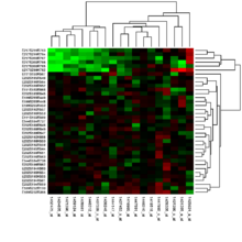
- Biology heat maps are typically used in molecular biology to represent the level of expression of many genes across a number of comparable samples (e.g. cells in different states, samples from different patients) as they are obtained from DNA microarrays.
- The tree map is a 2D hierarchical partitioning of data that visually resembles a heat map.
- A mosaic plot is a tiled heat map for representing a two-way or higher-way table of data. As with treemaps, the rectangular regions in a mosaic plot are hierarchically organized. The means that the regions are rectangles instead of squares. Friendly (1994) surveys the history and usage of this graph.
- A density function visualization is a heat map for representing the density of dots in a map. It enables one to perceive density of points independently of the zoom factor. Perrot et al (2015) proposed a way to use density function to visualize billions and billions of dots using big data infrastructure with Spark and Hadoop.[5]
Color schemes
Many different color schemes can be used to illustrate the heat map, with perceptual advantages and disadvantages for each. Rainbow color maps are often used, as humans can perceive more shades of color than they can of gray, and this would purportedly increase the amount of detail perceivable in the image. However, this is discouraged by many in the scientific community, for the following reasons:[6][7][8][9][10]
- The colors lack the natural perceptual ordering found in grayscale or blackbody spectrum colormaps.[6]
- Common colormaps (like the "jet" colormap used as the default in many visualization software packages) have uncontrolled changes in luminance that prevent meaningful conversion to grayscale for display or printing. This also distracts from the actual data, arbitrarily making yellow and cyan regions appear more prominent than the regions of the data that are actually most important.[6]
- The changes between colors also lead to perception of gradients that aren't actually present, making actual gradients less prominent, meaning that rainbow colormaps can actually obscure detail in many cases rather than enhancing it.[6][10]
Choropleth maps vis-à-vis heat maps
Choropleth maps are sometimes incorrectly referred to as heat maps. A choropleth map features different shading or patterns within geographic boundaries to show the proportion of a variable of interest, whereas the coloration a heat map (in a map context) does not correspond to geographic boundaries.[11]
Software implementations
Several heat map software implementations are freely available:
- R, a free software environment for statistical computing and graphics, contains several functions to trace heat maps[12][13], including interactive cluster heat maps [14] (via the heatmaply R package).
- Gnuplot, a universal and free command-line plotting program, can trace 2D and 3D heat maps[15]
- Google Fusion Tables can generate a heat map from a Google Sheets spreadsheet limited to 1000 points of geographic data.[16]
- Dave Green's 'cubehelix' colour scheme provides resources for a colour scheme that prints as a monotonically increasing greyscale on black and white postscript devices[17]
- Openlayers3 can render a heat map layer of a selected property of all geographic features in a vector layer.[18]
- Highcharts, a JavaScript charting library, provides the ability create heat maps as a part of its solution.[19][20]
Examples
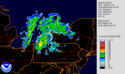 Lake effect snow – weather radar information is usually shown using a heat map.
 Human voice visualized with a spectrogram; a heat map representing the magnitude of the STFT. An alternative visualization is the waterfall plot.
 Example showing the relationships between a heat map, surface plot, and contour lines of the same data
 Combination of surface plot and heat map, where the surface height represents the amplitude of the function, and the color represents the phase angle.
 Score of each contiguous region of a dartboard (not to scale)
See also
References
Footnotes
- Wilkinson, Leland; Friendly, Michael (May 2009). "The History of the Cluster Heat Map". The American Statistician. 63 (2): 179–184. CiteSeerX 10.1.1.165.7924. doi:10.1198/tas.2009.0033.
- "United States Patent and Trademark Office, registration #75263259". 1993-09-01.
- Silhavy, Radek; Senkerik, Roman; Oplatkova, Zuzana Kominkova; Silhavy, Petr; Prokopova, Zdenka (2016-04-26). Software Engineering Perspectives and Application in Intelligent Systems. ISBN 978-3-319-33622-0.
- MH370 – Definition of Underwater Search Areas (PDF) (Report). Australian Transport Safety Bureau. 3 December 2015.
- Perrot, A.; Bourqui, R.; Hanusse, N.; Lalanne, F.; Auber, D (2015). Large interactive visualization of density functions on big data infrastructure. IEEE 5th Symposium on Large Data Analysis and Visualization (LDAV), 2015. pp. 99–106. doi:10.1109/LDAV.2015.7348077. ISBN 978-1-4673-8517-6.
- Borland, David; Taylor, Russell (2007). "Rainbow Color Map (Still) Considered Harmful". IEEE Computer Graphics and Applications. 27 (2): 14–7. doi:10.1109/MCG.2007.323435. PMID 17388198.
- How NOT to Lie with Visualization – Bernice E. Rogowitz and Lloyd A. Treinish – IBM Thomas J. Watson Research Center, Yorktown Heights, NY
- Harrower, Mark; Brewer, Cynthia A. (2003). "ColorBrewer.org: An Online Tool for Selecting Colour Schemes for Maps". In Dodge, Martin; Kitchin, Rob; Perkins, Chris (eds.). The Cartographic Journal. pp. 27–37. doi:10.1179/000870403235002042. ISBN 978-0-470-98007-1.
- Green, D. A. (2011). "A colour scheme for the display of astronomical intensity images". Bulletin of the Astronomical Society of India. 39: 289–95. arXiv:1108.5083. Bibcode:2011BASI...39..289G.
- Borkin, M.; Gajos, K.; Peters, A.; Mitsouras, D.; Melchionna, S.; Rybicki, F.; Feldman, C.; Pfister, H. (2011). "Evaluation of Artery Visualizations for Heart Disease Diagnosis". IEEE Transactions on Visualization and Computer Graphics. 17 (12): 2479–88. CiteSeerX 10.1.1.309.590. doi:10.1109/TVCG.2011.192. PMID 22034369.
- "Choropleth vs. Heat Map –". www.gretchenpeterson.com.
- "Using R to draw a heat map from Microarray Data". Molecular Organisation and Assembly in Cells. 26 Nov 2009.
- "Draw a Heat Map". R Manual.
- Galili, Tal; O'Callaghan, Alan; Sidi, Jonathan; Sievert, Carson (2017). "heatmaply: an R package for creating interactive cluster heat maps for online publishing". Bioinformatics. ? (?): 1600–1602. doi:10.1093/bioinformatics/btx657. PMC 5925766. PMID 29069305.
- "Gnuplot demo script: Heatmaps.dem".
- "Fusion Tables Help - Create a heat map". Jan 2018. support.google.com
- "Dave Green's 'cubehelix' colour scheme".
- "ol/layer/Heatmap~Heatmap". OpenLayers. Retrieved 2019-01-01.
- "Heatmap - Highcharts docs". Highcharts. Retrieved 9 December 2019.
- "Heat and tree maps - Highcharts demos". Highcharts. Retrieved 9 December 2019.
Bibliography
- Bertin, J. (1967). Sémiologie Graphique. Les diagrammes, les réseaux, les cartes [Graphic semiotics. Diagrams, networks, maps] (in French). Gauthier-Villars. OCLC 2656278.
- Eisen, M. B.; Spellman, P. T.; Brown, P. O.; Botstein, D (1998). "Cluster analysis and display of genome-wide expression patterns". Proceedings of the National Academy of Sciences of the United States of America. 95 (25): 14863–14868. Bibcode:1998PNAS...9514863E. doi:10.1073/pnas.95.25.14863. PMC 24541. PMID 9843981.
- Friendly, Michael (March 1994). "Mosaic Displays for Multi-Way Contingency Tables". Journal of the American Statistical Association. 89 (425): 190–200. doi:10.1080/01621459.1994.10476460. JSTOR 2291215.
- Ling, Robert L. (1973). "A computer generated aid for cluster analysis". Communications of the ACM. 16 (6): 355–361. doi:10.1145/362248.362263.
- Sneath, P. H. A. (1957). "The Application of Computers to Taxonomy". Journal of General Microbiology. 17 (1): 201–26. doi:10.1099/00221287-17-1-201. PMID 13475686.
- Wilkinson, L. (1994). Advanced Applications: Systat for DOS Version 6. SYSTAT. ISBN 978-0-13-447285-0.
- Perrot, A.; Bourqui, R.; Hanusse, N.; Lalanne, F.; Auber, D. (2015). Large interactive visualization of density functions on big data infrastructure. IEEE 5th Symposium on Large Data Analysis and Visualization (LDAV), 2015. pp. 99–106. doi:10.1109/LDAV.2015.7348077. ISBN 978-1-4673-8517-6.
- Barter, R. L.; Yu, B. (2018). "Superheat: An R Package for Creating Beautiful and Extendable Heatmaps for Visualizing Complex Data". Journal of Computational and Graphical Statistics. 27 (4): 910–922. arXiv:1512.01524. doi:10.1080/10618600.2018.1473780. PMC 6430237. PMID 30911216.
External links
- The History of the Cluster Heat Map. Leland Wilkinson and Michael Friendly.
- Albergotti, Reed (May 7, 2014). "Strava, Popular With Cyclists and Runners, Wants to Sell Its Data to Urban Planners". The Wall Street Journal.