Candlestick chart
A candlestick chart (also called Japanese candlestick chart) is a style of financial chart used to describe price movements of a security, derivative, or currency. Each "candlestick" typically shows one day, thus a one-month chart may show the 20 trading days as 20 candlesticks.[1] Candlestick charts can also be built using intervals shorter or longer than one day.

It is similar to a bar chart in that each candlestick represents all four important pieces of information for that day: open and close in the thick body; high and low in the “candle wick”. Being densely packed with information, it tends to represent trading patterns over short periods of time, often a few days or a few trading sessions.[2]
Candlestick charts are most often used in technical analysis of equity and currency price patterns. They are visually similar to box plots, though box plots show different information.
History
Candlestick charts are thought to have been developed in the 18th century by Munehisa Homma, a Japanese rice trader.[3] They were introduced to the Western world by Steve Nison in his book, Japanese Candlestick Charting Techniques. They are often used today in stock analysis along with other analytical tools such as Fibonacci analysis.[4]
In Beyond Candlesticks,[5] Nison says:
However, based on my research, it is unlikely that Homma used candle charts. As will be seen later, when I discuss the evolution of the candle charts, it was more likely that candle charts were developed in the early part of the Meiji period in Japan (in the late 1800s).
Description
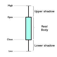
The area between the open and the close is called the real body, price excursions above and below the real body are shadows (also called wicks). Wicks illustrate the highest and lowest traded prices of an asset during the time interval represented. The body illustrates the opening and closing trades.
If the asset closed higher than it opened, the body is hollow or unfilled, with the opening price at the bottom of the body and the closing price at the top. If the asset closed lower than it opened, the body is solid or filled, with the opening price at the top and the closing price at the bottom. Thus, the color of the candle represents the price movement relative to the prior period's close and the "fill" (solid or hollow) of the candle represents the price direction of the period in isolation (solid for a higher open and lower close; hollow for a lower open and a higher close). A black (or red) candle represents a price action with a lower closing price than the prior candle's close. A white (or green) candle represents a higher closing price than the prior candle's close. In practice, any color can be assigned to rising or falling price candles. A candlestick need not have either a body or a wick. Generally, the longer the body of the candle, the more intense the trading. A hollow body signifies that the stock closed higher than its opening value. A filled body signifies the opposite.[4]

Rather than using the open, high, low, and close values for a given time interval, candlesticks can also be constructed using the open, high, low, and close of a specified volume range (for example, 1,000; 100,000; 1 million shares per candlestick). In modern charting software, volume can be incorporated into candlestick charts by increasing or decreasing candlesticks width according to the relative volume for a given time period.[6]
Usage
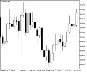
Candlestick charts are a visual aid for decision making in stock, foreign exchange, commodity, and option trading. Looking at a candlestick, one can identify an asset’s opening and closing prices, highs and lows, and overall range for a specific time frame.[7] Candlestick charts serve as a cornerstone of technical analysis. For example, when the bar is white and high relative to other time periods, it means buyers are very bullish. The opposite is true for a black bar.
A candlestick pattern is a particular sequence of candlesticks on a candlestick chart, which is mainly used to identify trends.
Heikin-Ashi candlesticks
Heikin-Ashi (平均足, Japanese for 'average bar') candlesticks are a weighted version of candlesticks calculated with the following formula:[8]
- Close = (real open + real high + real low + real close) / 4
- High = maximum of the real high, the Heiken-Ashi Open, or the real Close (whichever is highest)
- Low = minimum of real low, the Heiken-Ashi Open, or the real Close (whichever is lowest)
- Open = (Open of previous Heiken-Ashi + Close of previous Heiken-Ashi) / 2
The body of a Heiken-Ashi candle does not always represent the actual open/close. Unlike with regular candlesticks, a long wick shows more strength, whereas the same period on a standard chart might show a long body with little or no wick.
Relationship to box plots
Candlestick chart are similar to box plots. Both show maximum and minimum values. The difference between them is in the information conveyed by the box in between the max and min values. The top and bottom edges of the box in the box plot show the 75th and 25th percentile values respectively. The bar inside the box in the box plot shows the 50th percentile. The top and bottom edges of the box in the candlestick chart show the initial value and the final value, with the color of the box showing whether the initial value is higher or lower than the final value.
References
| Wikimedia Commons has media related to Candlestick charts. |
- "Stock Analysis - an introduction to candlesticks". Stockcharts. Retrieved 22 October 2019.
- Grant, Mitchell. "Understanding Japanese Candlestick Charts". Investopedia. Retrieved 22 October 2019.
- Gregory M., Morris (2006). Candlestick Charting Explained: Timeless Techniques for Trading Stocks and Futures. McGraw-Hill. ISBN 9780071461542.
- Nison, Steve (2001). Japanese Candlestick Charting Techniques (2nd ed.). Prentice Hall Press. ISBN 9780735201811.
- Nison, Steve (1994). Beyond Candlesticks: New Japanese Charting Techniques Revealed. John Wiley & Sons. ISBN 9780471007203.
- "CandleVolume [ChartSchool]". Stockcharts. Retrieved 22 October 2019.
- Lu, Tsung-Hsun; Shiu, Yung-Ming; Liu, Tsung-Chi (2012-04-01). "Profitable candlestick trading strategies—The evidence from a new perspective". Review of Financial Economics. 21 (2): 63–68. doi:10.1016/j.rfe.2012.02.001.
- Kuepper, Justin. "Heikin-Ashi: A Better Candlestick". Investopedia. Retrieved 22 October 2019.