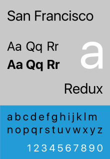
San Francisco (sans-serif typeface)
 | |
| Category | Neo-grotesque |
|---|---|
| Foundry | Apple Inc. |
| Date released | 2015 |
| Variations | SF, SF Compact, SF Mono, SF Pro, SF Serif |
| Website | https://developer.apple.com/fonts/ |
San Francisco is a neo-grotesque sans-serif typeface made by Apple Inc. It was first released to developers on November 18, 2014.[1][2] It is the first new typeface designed at Apple in nearly 20 years and has been inspired by Helvetica and FF DIN.[1]
Variants
The San Francisco typeface has four variants: "SF" (or "SF UI") for macOS, iOS, and tvOS; "SF Compact" for watchOS; "SF Mono" (based on SF Compact) for the Xcode application; and "SF Serif" for Apple Books.[3][4] The main difference is that the sides of letters with round shapes, such as o, e, and s, are round in SF, whereas they are flat in SF Compact. The flat sides allow the letters to have more space between them, thereby making the text more legible at small sizes, which is particularly important for the Apple Watch.[5]
Both SF and SF Compact each have two optical sizes: "display" for large and "text" for small text. Compared to display, the letters in text have larger apertures and more generous letter-spacing. The operating system automatically chooses the display optical size for sizes of at least 20 points, and the text optical size otherwise.[5] Additionally, included in macOS Sierra and iOS 10 is a new variant named "SF Compact Rounded". It is used in the new contact placeholder icons introduced in the OSes.
The "SF Serif" variant was showcased during the keynote at WWDC 2018 on June 4, 2018 when the all-new Apple Books app was introduced.[6] This variant is exclusive to Apple Books in iOS 12 and macOS Mojave, is not mentioned in Apple's Typography design guidelines, and is not publicly downloadable like other variants of the San Francisco typeface.
Usage
Since its introduction, San Francisco has gradually replaced most of Apple's other typefaces on their software and hardware products and for overall branding. It was the original system typeface of watchOS and tvOS[7] and has replaced Helvetica Neue and Lucida Grande as the system typeface of macOS and iOS since OS X El Capitan and iOS 9.[8][3][9] Apple uses it on its website and for its product wordmarks, where it replaced Myriad Pro. It is also used on the keyboard of the 2015 MacBook and on the 2016 MacBook Pro, replacing VAG Rounded.[10] It is also used as Apple's corporate typeface.[11]
Apple restricts the usage of the typeface by others. It is licensed to registered third-party developers only for the design and development of applications for Apple's platforms.[3]
References
- 1 2 Brownlee, John (November 19, 2014). "Apple Releases Its Most Important Typeface in 20 Years". Fast Company. Retrieved 2015-06-13.
- ↑ Williams, Owen (November 18, 2014). "Meet Apple's new font, designed for its smartwatch". The Next Web. Retrieved June 13, 2015.
- 1 2 3 "Fonts". Apple Developer. Apple Inc. Retrieved 2015-06-13.
- ↑ Nowell, Peter. "Apple Reveals San Francisco Monospaced Font".
- 1 2 Cavedoni, Antonio (June 12, 2015). "Introducing the New System Fonts". WWDC 2015. Apple Inc.
- ↑ "Apple Books: What's new in iOS 12". iMore. Retrieved 2018-07-10.
- ↑ Apple (2015). "Visual Design - Apple TV Human Interface Guidelines - Apple Developer". Retrieved on 2015-10-04 from https://developer.apple.com/tvos/human-interface-guidelines/visual-design/.
- ↑ "Typography". Apple Watch Human Interface Guidelines. Apple Inc. Archived from the original on 2015-06-15. Retrieved 2015-06-13.
- ↑ Stinson, Liz (June 9, 2015). "Why Apple Abandoned the World's Most Beloved Typeface". Wired. Retrieved 2015-06-13.
- ↑ Wright, Mic (March 9, 2015). "The new MacBook shows San Francisco is more than just the Apple Watch font". The Next Web. Retrieved 2015-05-29.
- ↑ "Apple Adopts San Francisco Typeface for Apple.com Website". Retrieved 2018-04-21.
External links
- San Francisco on Apple's developer website
macOS typefaces | |
|---|---|
| Latin, Greek, Cyrillic |
|
| Non-alphabetic | |
Monospaced programming and typewriter fonts | |||||||||||
|---|---|---|---|---|---|---|---|---|---|---|---|
| Sans serif |
| ||||||||||
| Serif | |||||||||||