Large-print
Large-print (also large-type or large-font) refers to the formatting of a book or other text document in which the typeface (or font), and sometimes the medium, are considerably larger than usual, to accommodate people who have poor vision. Often public special-needs libraries will stock large-print versions of books, along with versions written in Braille.
The standard font size for large print is at least 18 points in size, but different sizes are made to suit different visual needs.[1]

History
Large Print book publishing in English began in 1964 in Leicester, England when Frederick Thorpe, a retired book and magazine distributor, decided to meet the needs of elderly poor-sighted readers by reprinting older classic books in editions about twice the physical size of the original book.[2] The type inside was enlarged to about twice the size of the original printing. The books were given plain dustjackets with type only, color-coded to indicate categories like mysteries (black), general fiction (red), romances (blue), Westerns (orange) and so forth. These editions met the need but were difficult for frail elderly readers to handle because they were oversize.
In 1969 Thorpe's company, Ulverscroft, began to retypeset the books in 16 point type and print them in normal-sized bindings, again with color-coded plain jackets. This change greatly increased the acceptance of Large Print in public libraries. Thorpe himself became a Large Print ambassador, travelling around the English-speaking world promoting the acquisition of Large Print books for seniors.[3]
Today Large Print editions of some current books are published simultaneously with regular print editions by their publishers and usually feature the same full-colour jackets and jacket design. Many, if not most public libraries in the English-speaking world have Large Print sections and most bookstores do carry some Large Print editions.
Publishing standards
The American National Association for Visually Handicapped (NAVH) provides the NAVH Seal of Approval to commercial publishers in the US, for books that meet their large print standards.[4] (Lighthouse International acquired NAVH in 2010).[5]
The standards[6] call for:
- Maximum limits on size, thickness, and weight
- Minimum limits on margins
- Type size at least 14 point, preferably 18 point[7]
- Sans serif or modified serif font recommended
- Adequate letter and word spacing
- Flexible binding recommended to allow open book to lie flat
Readable fonts
For many people with visual impairment enlarging the type is not enough. Fonts designed for readability make it easier to distinguish one character from another. Some characteristics of such fonts are:[8]
- Sans serif
- Consistent tracking, so that groups like "ill" don't blend together
- Clear descenders
- Optically circular counters
- Larger punctuation marks
Examples of more-easily read fonts are APHont, Antique Olive, Helvetica, Tahoma, Tiresias and Verdana. APHont was developed for the non-profit AmericanPrinting House for the Blind. They also make it available as a free download for individual use by those with vision problems.[9]
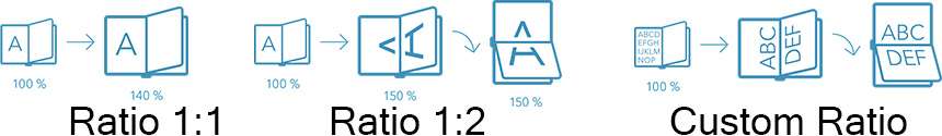
Ratios
Companies offering the large-print formatting uses diverse formats (also called ratios) to support the larger font size.[10] Among these ratios, we find:
- Ratio 1:1, the content is enlarged on a single (1) portrait page and the common typological size is 18 points.
- Ratio 1:2, the content is enlarged on two (2) landscape page and the common typological size is 18 points.
- Custom ratios, the content is enlarged on multiple landscape pages and the common typological size is 28 points.
Recent developments
Since 2005 some companies, notably ReadHowYouWant, have begun offering a variety of font sizes for Large Print books. This allows readers to choose the font that best suits them when purchasing a book. The font size usually varies from more regular sizes (11 and 13 point fonts) through to large (16 to 20 point fonts) and Super Large (up to 48 point fonts).[11] These books can also be purchased in Bold.
See also
References
- ↑ Duffy, Maureen A. "Large Print - VisionAware". www.visionaware.org. American Foundation for the Blind. Retrieved 18 June 2018.
- ↑ The Ulverscroft Foundation, "How the Ulverscroft Foundation began", accessed 24 July 2007
- ↑ Matthews, David (15 June 1999). "Frederick Thorpe. His big idea helped the visually impaired to read". The Guardian.
- ↑ "National Association for Visually Handicapped - NAVH". U.S. Department of Health & Human Services. Archived from the original on 11 March 2012.
- ↑ "Lighthouse International Acquires National Association for Visually Handicapped (NAVH)". Vision Monday. Retrieved 29 April 2017.
- ↑ "NAVH Standards & Criteria for Large Print Publications" (PDF). National Association for Visually Handicapped. Retrieved 20 February 2012.
- ↑ "NLS Reference Guide". Library of Congress. Retrieved 29 April 2017.
- ↑ Kitchel, J. Elaine. "APH Guidelines for Print Document Design". American Publishing House for the Blind. Retrieved 26 January 2012.
- ↑ "APHont: A Font for Low Vision". American Publishing House for the Blind. Retrieved 26 January 2012.
- ↑ "Large Print Strategies". Jymico. Retrieved 29 April 2017.
- ↑ http://www.readhowyouwant.com/formats/print-format.aspx