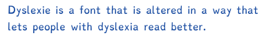
Dyslexie
 | |
| Category | Sans-serif |
|---|---|
| Designer(s) | Christian Boer |
| Foundry | Dyslexie font |
| Date created | 2008[1] |
| License | proprietary[2] |
| Variations | Dyslexie regular, bold, italic, italic bold |
| Website |
www |
Dyslexie is a typeface/font designed to mitigate some of the issues that dyslexics experience when reading. It was developed by Dutch graphic designer Christian Boer while in college to help combat his own dyslexia.[3] Dyslexie is not a cure for dyslexia. In Christian Boer's words, it was designed simply "like a wheelchair" to help dyslexics function, and it makes each letter significantly unique.[4] However, there is no evidence that it aids reading.
The typeface of Dyslexie was created with the notion that many of the letters in the twenty-six lettered ISO basic Latin alphabet are visually very similar, thus more confusing for people with dyslexia. Dyslexie puts more emphasis on the parts of the letter that are different from each other.[5]
Creation
Christian Boer created Dyslexie in 2008 while he was majoring in graphic design at the University of Twente. After struggling with dyslexia for much of his life, he decided to design a typeface that would make it easier for people with dyslexia to read.[1]
In an interview, Boer stated that he came up with the typeface after a difficult final he was studying for. Its creation was an attempt to keep the characters from appearing to spin around, a symptom often reported in dyslexics. Boer related this to the way most people think in words: dyslexics cannot stop seeing letters differently just as non-dyslexic people cannot stop thinking in words.[6]
Font
Dyslexie uses a heavier line thickness to emphasize the bottom of most characters. This is to try to 'anchor' the letters since some people with dyslexia may see letters either moving or in three dimensions.[7] Since dyslexics tend to get b, d, p, and q mixed up, it also emphasizes a slight slant downwards on the curvature of the letters. Letters such as c or e may gape slightly more, or slump slightly in one direction. Also, in letters such as n or h, the font slightly elongates or diminishes the stem on the letters. So the letter h would have a longer line, and n would have a lower line. In addition, the font also thickens or bolds capital letters and punctuations, so that it is easier to identify when a sentence starts or ends.[8]
Research
A student thesis by Renske de Leeuw of the University of Twente found Dyslexie had no statistically significant effect on reading speed or error rates. What differences there were fell short of statistical significance and were both slightly positive and slightly negative. Tests compared text set in Dyslexie with text set in Arial. Sample size was 43 (21 dyslexic readers, 22 'normal' readers) – low in statistical terms. The study's conclusion states that further research needs to be done.[9]
There are other fonts designed to help dyslexics, including but not limited to Write to Read,[10] Read Regular,[11] Lexie Readable,[12] Sylexiad,[13] and OpenDyslexic.[14][15] Only a handful of these fonts, like OpenDyslexic,[14] Dyslexie and Sylexiad,[13] have had studies conducted into their efficiency, and only with statistically small sample sizes.
No research to date has found a statistically significant beneficial effect on reading for dyslexics from any font specifically designed for dyslexia.[14][16]
Using a specialist font is just one of many possible dyslexia interventions.
References
- 1 2 Nalewicki, Jennifer (October 26, 2011). "Bold Stroke: New Font Helps Dyslexics Read". Scientific American.
- ↑ "Order Dyslexie". Studiostudio.nl. Retrieved December 15, 2012.
- ↑ https://www.dyslexiefont.com/en/our-story/
- ↑ Gann, Carrie. "Special Font Helps Dyslexics Mind Their Ps and Qs". Abcnews.go.com. Retrieved April 9, 2012.
- ↑ Sawers, Paul. "Dyslexie: A typeface for dyslexics". Thenextweb.com. Retrieved April 9, 2012.
- ↑ Allen, Rebekah. "Christian Boer". Dailybrink.com. Retrieved April 9, 2012.
- ↑ Gonzalez, Robert. "Check out "Dyslexie," a new font that helps dyslexics read with ease". Io9.com. Retrieved April 9, 2012.
- ↑ O'Connor, Mary. "Dyslexie font designed to help dyslexics read, write". Smartplanet.com. Retrieved April 9, 2012.
- ↑ Leeuw de, Renske. "Special font for dyslexia?". Essay.utwente.nl. Retrieved April 9, 2013.
- ↑
- ↑ "Read Regular / Read Regular". Readregular.com. Retrieved 2017-02-27.
- ↑ "Lexie Readable". k-type.com.
- 1 2
- 1 2 3 "Which Font is Best For Dyslexic Users? The Science Reviewed". S-E-O.org. Retrieved 2018-09-20.
- ↑ "OpenDyslexic, free open-source typeface". OpenDyslexic. Retrieved 2018-09-20.
- ↑ "TYPOGRAPHY & DYSLEXIA (Bigelow & Holmes)". Bigelowandholmes.typepad.com. Retrieved 2017-02-27.