Dashboard (business)
Dashboards often provide at-a-glance views of KPIs (key performance indicators) relevant to a particular objective or business process. In the other, "dashboard" has another name for "progress report" or "report."
The "dashboard" is often displayed on a web page which is linked to a database that allows the report to be constantly updated. For example, a manufacturing dashboard may show numbers related to productivity such as number of parts manufactured, or number of failed quality inspections per hour. Similarly, a human resources dashboard may show numbers related to staff recruitment, retention and composition, for example number of open positions, or average days or cost per recruitment.[1]
The term dashboard originates from the automobile dashboard where drivers monitor the major functions at a glance via the instrument cluster.
Benefits
Digital dashboards allow managers to monitor the contribution of the various departments in their organization. To gauge exactly how well an organization is performing overall, digital dashboards allow you to capture and report specific data points from each department within the organization, thus providing a "snapshot" of performance.
Benefits of using digital dashboards include:[1]
- Visual presentation of performance measures
- Ability to identify and correct negative trends
- Measure efficiencies/inefficiencies
- Ability to generate detailed reports showing new trends
- Ability to make more informed decisions based on collected business intelligence
- Align strategies and organizational goals
- Saves time compared to running multiple reports
- Gain total visibility of all systems instantly
- Quick identification of data outliers and correlations
Classification
Dashboards can be broken down according to role and are either strategic, analytical, operational, or informational.[2] Strategic dashboards support managers at any level in an organization, and provide the quick overview that decision makers need to monitor the health and opportunities of the business. Dashboards of this type focus on high level measures of performance, and forecasts. Strategic dashboards benefit from static snapshots of data (daily, weekly, monthly, and quarterly) that are not constantly changing from one moment to the next. Dashboards for analytical purposes often include more context, comparisons, and history, along with subtler performance evaluators. Analytical dashboards typically support interactions with the data, such as drilling down into the underlying details. Dashboards for monitoring operations are often designed differently from those that support strategic decision making or data analysis and often require monitoring of activities and events that are constantly changing and might require attention and response at a moment's notice.
Types of dashboards
Digital dashboards may be laid out to track the flows inherent in the business processes that they monitor. Graphically, users may see the high-level processes and then drill down into low level data. This level of detail is often buried deep within the corporate enterprise and otherwise unavailable to the senior executives.
Three main types of digital dashboard dominate the market today: stand alone software applications, web-browser based applications, and desktop applications also known as desktop widgets. The last are driven by a widget engine.
Specialized dashboards may track all corporate functions. Examples include human resources, recruiting, sales, operations, security, information technology, project management, customer relationship management and many more departmental dashboards. For a smaller organization like a startup a compact startup scorecard dashboard tracks important activities across lot of domains ranging from social media to sales.
Digital dashboard projects involve business units as the driver and the information technology department as the enabler. The success of digital dashboard projects often depends on the metrics that were chosen for monitoring. Key performance indicators, balanced scorecards, and sales performance figures are some of the content appropriate on business dashboards.
Dashboards and scoreboards
Balanced Scoreboards and Dashboards have been linked together as if they were interchangeable. However, although both visually display critical information, the difference is in the format: Scoreboards can open the quality of an operation while dashboards provide calculated direction. A balanced scoreboard has what they called a "prescriptive" format. It should always contain these components (Active Strategy)...
- Perspectives – group
- Objectives – verb-noun phrases pulled from a strategy plan
- Measures – also called Metric or Key Performance Indicators (KPIs)
- Spotlight Indicators – red, yellow, or green symbols that provide an at-a-glance view of a measure’s performance.
Each of these sections ensures that a Balanced Scorecard is essentially connected to the businesses critical strategic needs.
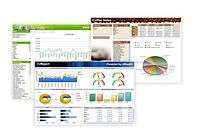
The design of a dashboard is more loosely defined. Dashboards are usually a series of graphics, charts, gauges and other visual indicators that can be monitored and interpreted. Even when there is a strategic link, on a dashboard, it may not be noticed as such since objectives are not normally present on dashboards. However, dashboards can be customized to link their graphs and charts to strategic objectives.[3]
Design
Digital dashboard technology is available "out-of-the-box" from many software providers. Some companies however continue to do in-house development and maintenance of dashboard applications. For example, GE Aviation has developed a proprietary software/portal called "Digital Cockpit" to monitor the trends in aircraft spare parts business.
Good dashboard design practices take into account and address the following:
- the medium it is designed for (desktop, laptop, mobile, tablet)
- use of visuals over tabluar presentation of data
- bar charts: to visualize one or more series of data
- line charts: to track changes in a number of dependent data sets over a period of time
- sparklines: to show the trend in a single data set
- use of legends anytime more than one color or shape is present on a graph
- spatial arrangement: place your most important view on the top left (if the language is written left to right) then arrange the following views in a Z pattern with the most important information following the top-to-bottom, left-to-right pattern[4]
- color palettes to be colorblind friendly
A good information design will clearly communicate key information to users and makes supporting information easily accessible.[5]
Assessing the quality of dashboards
There are a few key elements to a good dashboard:.[6]
- Simple, communicates easily
- Minimum distractions...it could cause confusion
- Supports organized business with meaning and useful data
- Applies human visual perception to visual presentation of information
- It can be accessed easily by its intended audience[7]
History
The idea of digital dashboards followed the study of decision support systems in the 1970s. Early predecessors of the modern business dashboard were first developed in the 1980s in the form of Executive Information Systems (EISs). Due to problems primarily with data refreshing and handling, it was soon realized that the approach wasn’t practical as information was often incomplete, unreliable, and spread across too many disparate sources.[8] Thus, EISs hibernated until the 1990s when the information age quickened pace and data warehousing, and online analytical processing (OLAP) allowed dashboards to function adequately. Despite the availability of enabling technologies, the dashboard use didn't become popular until later in that decade, with the rise of key performance indicators (KPIs), and the introduction of Robert S. Kaplan and David P. Norton's Balanced Scorecard.[9] In the late 1990s, Microsoft promoted a concept known as the Digital Nervous System and "digital dashboards" were described as being one leg of that concept.[10] Today, the use of dashboards forms an important part of Business Performance Management (BPM).
See also
References
- 1 2 Briggs, Jonathan. "Management Reports & Dashboard Best Practice". Target Dashboard. Retrieved 18 February 2013.
- ↑ Stephen Few, Information Dashboard Design: The Effective Visual Communication of Data (O'Reilly, 2006)
- ↑ ZSL Inc., Dashboards Vs Scorecards – An Insight ZSL Inc. (2006)
- ↑ Firican, George (May 22, 2017). "Best Practices for Powerful Dashboards". Business Intelligence Journal. 22.
- ↑ Stacey Barr, 7 Small Business Dashboard Design Dos and Don'ts (Barr, 2010)
- ↑ Victoria Hetherington, Dashboard Demystified: What is a Dashboard? (Hetherington, 2009)
- ↑ "White Paper: Best practices for powerful dashboards". May 29, 2018.
- ↑ Stephen Few, Information Dashboard Design: The Effective Visual Communication of Data (O'Reilly, 2006)
- ↑ Wayne W. Eckerson, Performance Dashboards: Measuring, Monitoring, and Managing Your Business (Wiley , 2010)
- ↑ "Microsoft refines Digital Dashboard concept". Retrieved 2009-06-09.
Further reading
- Few, Stephen (2006). Information Dashboard Design. O'Reilly. ISBN 978-0-596-10016-2.
- Eckerson, Wayne W (2006). Performance Dashboards: Measuring, Monitoring, and Managing Your Business. John Wiley & Sons. ISBN 978-0-471-77863-9.