Chord diagram
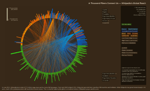
A chord diagram is a graphical method of displaying the inter-relationships between data in a matrix. The data are arranged radially around a circle with the relationships between the data points typically drawn as arcs connecting the data.
The format can be aesthetically pleasing, making it a popular choice in the world of data visualization.
Name
Chord diagrams get their name from terminology used in geometry. A chord of a circle is a geometric line segment whose endpoints both lie on the circle. Chord diagrams are also known as radial network diagrams and may sometimes be referred to as a type of circular layout.
Hierarchical edge bundling
While a small amount of data could be represented in a circular diagram using straight lines to show the interconnections, a diagram featuring numerous lines would quickly become illegible. To reduce the visual complexity, chord diagrams employ a technique called hierarchical edge bundling.[1]
History
This type of diagram was used in 2007 by the New York Times infographic Close-Ups of the Genome[2]
References
- ↑ Holten, Danny (September–October 2006). "Hierarchical Edge Bundles: Visualization of Adjacency Relations in Hierarchical Data" (PDF). IEEE Transactions on Visualization and Computer Graphics. IEEE Computer Society. 12 (5). ISSN 1077-2626.
- ↑ http://circos.ca/ Circos
External links
- Hierarchical Edge Bundling is the technique by which the lines connect nodes together are grouped to reduce visual clutter.