This section will guide you through text-formatting techniques. Formatting refers to most things to do with appearance including text style and spacing. Formatting may also refer to paragraph and page layout, here we will focus on the customization of words and sentences.
Writers use formatting techniques to differentiate textual elements from the rest of the text. The many ways in which writers wish to differentiate textual elements give rise to many formatting techniques. Italicization is often used to add emphasis to key words or phrases. Footnotes are useful for providing extra information or clarification without interrupting the main flow of the text. For these reasons, formatting is very important. However, it is also very easy to abuse, and a document that has been over-done can look and read worse than one with none at all.
LaTeX is so flexible that we will actually only skim the surface, as you can have much more control over the presentation of your document if you wish. Having said that, one of the purposes of LaTeX is to take away the stress of having to deal with the physical presentation yourself, so you need not get too carried away!
Spacing
Line Spacing
If you want to use larger inter-line spacing in a document, you can change its value by putting the
\linespread{factor}
|
command into the preamble of your document. Use \linespread{1.3} for "one and a half" line spacing, and \linespread{1.6} for "double" line spacing. Normally the lines are not spread, so the default line spread factor is 1. This may not be ideal in all situations: see http://tex.stackexchange.com/questions/30073/why-is-the-linespread-factor-as-it-is .
The setspace package allows more fine-grained control over line spacing. To set "one and a half" line spacing document-wide, but not where it is usually unnecessary (e.g. footnotes, captions):
\usepackage{setspace}
%\singlespacing
\onehalfspacing
%\doublespacing
%\setstretch{1.1}
|
To change line spacing within the document, the setspace package provides the environments singlespace, onehalfspace, doublespace and spacing:
This paragraph has \\ default \\ line spacing.

\begin{doublespace}
  This paragraph has \\ double \\ line spacing.
\end{doublespace}

\begin{spacing}{2.5}
  This paragraph has \\ huge gaps \\ between lines.
\end{spacing}
|
Non-breaking spaces
This essential feature is a bit unknown to newcomers, although it is available on most WYSIWYG document processors. A non-breaking space between two tokens (e.g. words, punctuation marks) prevents the processors from inserting a line break between them. Additionally, a non-breaking space cannot be enlarged. It is very important for a consistent reading.
LaTeX uses the '~' symbol as a non-breaking space. You would usually use non-breaking spaces for punctuation marks in some languages, for units and currencies, for initials, etc. In French typography, you would put a non-breaking space before all two-parts punctuation marks.
Examples:
D.~Knuth
EUR~50
|
Space between words and sentences
To get a straight right margin in the output, LaTeX inserts varying amounts of space between the words. By default, it also inserts slightly more space at the end of a sentence. However, the extra space added at the end of sentences is generally considered typographically old-fashioned in English language printing. (The practice is found in nineteenth century design and in twentieth century typewriter styles.) Most modern typesetters treat the end of sentence space the same as the interword space. (See for example, Bringhurst's Elements of Typographic Style.) The additional space after periods can be disabled with the command
\frenchspacing
|
which tells LaTeX not to insert more space after a period than after ordinary character. Frenchspacing can be turned off later in your document via the \nonfrenchspacing command.
If an author wishes to use the wider end-of-sentence spacing, care must be exercised so that punctuation marks are not misinterpreted as ends of sentences. TeX assumes that sentences end with periods, question marks or exclamation marks. Although if a period follows an uppercase letter, this is not taken as a sentence ending, since periods after uppercase letters normally occur in abbreviations. Any exception from these assumptions has to be specified by the author. A backslash before a space generates a space that will not be enlarged. A tilde ‘~’ character generates a non-breaking space. The command \@ before a period specifies that this period terminates a sentence even when it follows an uppercase letter. (If you are using \frenchspacing, then none of these exceptions need be specified.)
Stretched spaces
You can insert a horizontal stretched space with \hfill in a line so that the rest gets "pushed" toward the right margin.
For instance this may be useful in the header.
Author Name \hfill \today
|
Similarly you can insert vertical stretched space with \vfill. It may be useful for special pages.
\maketitle
\vfill
\tableofcontents
\clearpage

\section{My first section}
% ...
|
See Lengths for more details.
Manual spacing
The spaces between words and sentences, between paragraphs, sections, subsections, etc. is determined automatically by LaTeX. It is against LaTeX philosophy to insert spaces manually and will usually lead to bad formatting. Manual spacing is a matter of macro writing and package creation.
See Lengths for more details.
Hyphenation
LaTeX hyphenates words whenever necessary. Hyphenation rules will vary for different languages. LaTeX only supports English by default, so if you want to have correct hyphenation rules for your desired language, see Internationalization.
If the hyphenation algorithm does not find the correct hyphenation points, you can remedy the situation by using the following commands to tell TeX about the exception. The command
\hyphenation{word list}
|
causes the words listed in the argument (separated by blanks) to be hyphenated only at the points marked by “-”. The argument of the command should only contain words built from normal letters, or rather characters that are considered to be normal letters by LaTeX. It is known that the hyphenation algorithm does not find all correct American English hyphenation points for several words. A log of known exceptions is published periodically in the TUGboat journal. (2012 list: https://www.tug.org/TUGboat/tb33-1/tb103hyf.pdf).
The hyphenation hints are stored for the language that is active when the hyphenation command occurs. This means that if you place a hyphenation command into the preamble of your document it will influence the English language hyphenation. If you place the command after the \begin{document} and you are using some package for national language support like babel, then the hyphenation hints will be active in the language activated through babel. The example below will allow “hyphenation” to be hyphenated as well as “Hyphenation”, and it prevents “FORTRAN”, “Fortran” and “fortran” from being hyphenated at all. No special characters or symbols are allowed in the argument. Example:
\hyphenation{FORTRAN Hy-phen-a-tion}
|
With babel, the recommended command to set hyphenation exceptions is \babelhyphenation. When LuaTeX is used, babel also allows to add new patterns and modify existing ones (with \babelpatterns), as well as to define non-standard rules (like ‘ff’ to ‘ff-f’ in some languages, or ranked hyphenation) to be applied without explicit mark-up (with \babelposthyphenation).
The command \- inserts a discretionary hyphen into a word. This also becomes the only point where hyphenation is allowed in this word. This command is especially useful for words containing special characters (e.g., accented characters), because LaTeX does not automatically hyphenate words containing special characters.
\begin{minipage}{2in}
I think this is: su\-per\-cal\-%
i\-frag\-i\-lis\-tic\-ex\-pi\-%
al\-i\-do\-cious
\end{minipage}
|
|

LaTeX does not hyphenate compound words that contain a dash[1]. There are two packages that can add back flexibility. The hyphenat package supplies the \hyp command. This command typesets the dash and then subjects the constituent words to automatic hyphenation. After loading the package:
\usepackage{hyphenat}
|
one should write, instead of electromagnetic-endioscopy:
electromagnetic\hyp{}endioscopy
|
The extdash package also offers features for controlling the hyphenation of compound words containing dashes — as opposed to the words themselves which it leaves to LaTeX. The shortcuts option enables a more compressed syntax:
\usepackage[shortcuts]{extdash}
|
Typical usage is as follows, assuming the compressed syntax. In both cases, LaTeX can break and hyphenate the constituent words, but in the latter case, it will not break after the L:
electromagnetic\-/endioscopy
L\=/approximation
|
One or more words can be kept together on the one line with the standard LaTeX command:
\mbox{text}
|
This prevents hyphenation and causes its argument to be kept together under all circumstances. For example:
My phone number will change soon. It will be \mbox{0116 291 2319}.
|
\fbox is similar to \mbox, but in addition there will be a visible box drawn around the content.
To avoid hyphenation altogether, the penalty for hyphenation can be set to an extreme value:
\hyphenpenalty=100000
|
You can change the degree to which LaTeX will hyphenate by changing the value of \tolerance=1000 and \hyphenpenalty=1000.
You'll have to experiment with the values to achieve the desired effect. A document which has a low tolerance value will cause LaTeX not to tolerate uneven spacing between words, hyphenating words more frequently than in documents with higher tolerances.
Also note that using a higher text width will decrease the probability of encountering badly hyphenated word. For example adding
\usepackage{geometry}
|
will widen the text width and reduce the amount of margin overruns.
Quote-marks
LaTeX treats left and right quotes as different entities. For single quotes, a grave accent, ` (on American keyboards, this symbol is found on the tilde key; adjacent to the number 1 key on most keyboards) gives a left quote mark, and an apostrophe, ' gives a right. For double quotes, simply double the symbols, and LaTeX will interpret them accordingly. (Don't use the " for right double quotes: when the babel package is used for some languages (e.g. German), the " is redefined to produce an umlaut accent; using " for right double quotes will either lead to bad spacing or it being used to produce an umlaut). On British keyboards, ' ` ' is left of the ' 1 ' key and shares the key with ' ¬ ', and sometimes ' ¦ ' or ' | '. The apostrophe (') key is to the right of the colon/semicolon key and shares it with the ' @ ' symbol.
|
|
|
|
|
|
|
|
|
|
|
|
|
|
|
|
|
|
|
|
|
|
|
|


The right quote is also used for apostrophe in LaTeX without trouble.
For left bottom quote and European quoting style you need to use T1 font encoding enabled by:
\usepackage[T1]{fontenc}
|
See Fonts for more details on font encoding.
The package csquotes offers a multilingual solution to quotations, with integration to citation mechanisms offered by BibTeX. This package allows one for example to switch languages and quotation styles according to babel language selections.
Diacritics and accents
Most accents and diacritics may be inserted with direct keyboard input by configuring the preamble properly. For symbols unavailable on your keyboard, diacritics may be added to letters by placing special escaped metacharacters before the letter that requires the diacritic.
See Special Characters.
Margin misalignment
Some very long words, numbers or URLs may not be hyphenated properly and move far beyond the side margin. One solution for this problem is to use sloppypar environment, which tells LaTeX to adjust word spacing less strictly. As a result, some spaces between words may be a bit too large, but long words will be placed properly.
This is a paragraph with
a very long word ABCDEFGHIJKLMNOPRST;
then we have another bad thing
--- a long number 1234567890123456789.

\begin{sloppypar}
This is a paragraph with
a very long word ABCDEFGHIJKLMNOPRST;
then we have another bad thing
--- a long number 1234567890123456789.
\end{sloppypar}
|
|
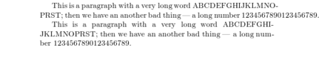
Another solution is to edit the text to avoid long words, numbers or URLs approaching the side margin.
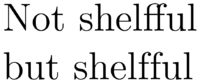
Ligatures
Some letter combinations are typeset not just by setting the different letters one after the other, but by actually using special symbols (like "ff"), called ligatures.
Ligatures can be prohibited by inserting {} or, if this does not work, {\kern0pt} between the two letters in question. This might be necessary with words built from two words. A classic example is shelfful:[2]
\Large Not shelfful\\
but shelf{}ful
|
|
If you are using LuaLaTeX, you can automate some of this work with the selnolig package.
Slash marks
The normal typesetting of the / character in LaTeX does not allow following characters to be "broken" onto new lines, which often create "overfull" errors in output (where letters push off the margin). Words that use slash marks, such as "input/output" should be typeset as "input\slash output", which allow the line to "break" after the slash mark (if needed). The use of the / character in LaTeX should be restricted to units, such as "mm/year", which should not be broken over multiple lines.
A word after / or \slash is not automatically hyphenated. This is a similar problem to non-hyphenation of words with a dash described under Hyphenation. One way to have both a line break and automatic hyphenation in both words is
input\slash\hspace{0pt}output
|
Both / and \slash can be used with a zero \hspace like this. \slash includes a penalty to make a line break there less desirable. This combination can be made into a new slash macro if desired. The hyphenat package includes an \fshyp which will add a hyphen after the slash like "input/- output" if the line breaks there.
Fonts
To change the font family, emphasize text, and other font-related issues, see Fonts.
Formatting macros
Even if you can easily change the output of your fonts using those commands, you're better off not using explicit commands like this, because they work in opposition to the basic idea of LaTeX, which is to separate the logical and visual markup of your document. This means that if you use the same font changing command in several places in order to typeset a special kind of information, you should use \newcommand to define a "logical wrapper command" for the font changing command.
\newcommand{\oops}[1]{\textit{#1}}

Do not \oops{enter} this room,
it’s occupied by \oops{machines}
of unknown origin and purpose.
|
Do not enter this room, it’s occupied by machines of unknown origin and purpose. |
This approach has the advantage that you can decide at some later stage that you want to use some visual representation of danger other than \textit, without having to wade through your document, identifying all the occurrences of \textit and then figuring out for each one whether it was used for pointing out danger or for some other reason.
See Macros for more details.
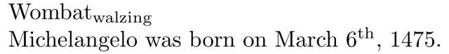
Text mode superscript and subscript
Sub and superscripting can be done quite easily using \textsubscript{} and \textsuperscript{}.
\documentclass{article}
\begin{document}
Wombat\textsubscript{walzing}

Michelangelo was born on March 6\textsuperscript{th}, 1475.
\end{document}
|
Note: A LaTeX version from 2015 or later, or the package fixltx2e, is needed to use text-mode subscripts in all contexts.[3]
Text figures ("old style" numerals)
Many typographers prefer to use titling figures, sometimes called lining figures, when numerals are interspersed with full caps, when they appear in tables, and when they appear in equations, using text figures elsewhere. LaTeX allows this usage through the \oldstylenums{} command:
\oldstylenums{1234567890}
|
Some fonts do not have text figures built in; the textcomp package attempts to remedy this by effectively generating text figures from the currently-selected font. Put \usepackage{textcomp} in your preamble. textcomp also allows you to use decimal points, properly formatted dollar signs, etc. within \oldstylenums{}.
One common use for text figures is in section, paragraph, and page numbers. These can be set to use text figures by placing some code in your preamble:
\usepackage{textcomp}

% Enclose everything in an \AtBeginDocument{}
\AtBeginDocument{%
  % Make \section{} use text figures
  \let\myTheSection\thesection
  \renewcommand{\thesection}{ \oldstylenums{\myTheSection} }

  % Make \paragraph{} use text figures
  \let\myTheParagraph\theparagraph
  \renewcommand{\theparagraph}{ \oldstylenums{\myTheParagraph} }

  % Make the page numbers in text figures
  \let\myThePage\thepage
  \renewcommand{\thepage}{ \oldstylenums{\myThePage} }
}
|
Should you use additional sectioning or paragraphing commands, you may adapt the previous code listing to include them as well.
- Note
A subsequent use of the \pagenumbering command, e.g., \pagenumbering{arabic}, will reset the \thepage command back to the original. Thus, if you use the \pagenumbering command in your document, be sure to reinstate your \myThePage definition from the code above:
...
\tableofcontents
\pagenumbering{roman}
\chapter{Preface}
...
\chapter{Introduction}
...
\pagenumbering{arabic}
% without this, the \thepage command will not be in oldstyle (e.g., in your Table of Contents}
\renewcommand{\thepage}{ \oldstylenums{\myThePage} }
\Chapter{Foo}
...
|
Dashes and hyphens
LaTeX knows four kinds of dashes: a hyphen (-), en dash (–), em dash (—), or a minus sign (−). You can access three of them with different numbers of consecutive dashes. The fourth sign is actually not a dash at all—it is the mathematical minus sign:
Hyphen: daughter-in-law, X-rated\\
En dash: pages 13--67\\
Em dash: yes---or no? \\
Minus sign: $0$, $1$ and $-1$
|
|

The names for these dashes are: ‘-’(-) hyphen , ‘--’(–) en-dash , ‘---’(—) em-dash and ‘’(−) minus sign. They have different purposes:

| Input | Output | Purpose |
|---|---|---|
| - | - | inter-word |
| -- | – | page range, 1–10 |
| --- | — | punctuation dash—like this |
| $-$ | − | minus sign |
Use \hyp{} macro from hyphenat package instead of hyphen if you want LaTeX to break compound words between lines.
The commands \textendash and \textemdash are also used to produce en-dash (–), and em-dash (—), respectively.
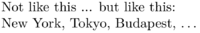
Ellipsis (…)
A sequence of three dots is known as an ellipsis, which is commonly used to indicate omitted text. On a typewriter, a comma or a period takes the same amount of space as any other letter. In book printing, these characters occupy only a little space and are set very close to the preceding letter. Therefore, you cannot enter ‘ellipsis’ by just typing three dots, as the spacing would be wrong. Instead, there is a special command for these dots. It is called \ldots:
Not like this ... but like this:\\
New York, Tokyo, Budapest, \ldots
|
|
Alternatively, you can use the \textellipsis command which allows the spacing between the dots to vary.
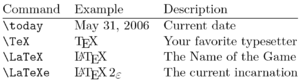
Ready-made strings
There are some very simple LaTeX commands for typesetting special text strings:
Notes and References
- ↑ hyphenat package documentation, p3
- ↑ Knuth, Donald. "Chapter 5: Grouping". The TeXbook. p. 19.
- ↑ http://tex.stackexchange.com/questions/1013/how-to-typeset-subscript-in-usual-text-mode
This page uses material from Andy Roberts' Getting to grips with LaTeX with permission from the author.