ß
In German orthography, the grapheme ß, called Eszett (IPA: [ɛsˈtsɛt]) or scharfes S (IPA: [ˈʃaɐ̯fəs ˈʔɛs], [ˈʃaːfəs ˈʔɛs], lit. "sharp S"), represents the [s] phoneme in Standard German, specifically when following long vowels and diphthongs, while ss is used after short vowels. The name Eszett combines the names of the letters of s (Es) and z (Zett) in German. The character's Unicode names in English are sharp s[1] and eszett.[1]
| ẞ | ß |


It originates as the sz digraph as used in Old High German and Middle High German orthography, represented as a ligature of long s and tailed z in blackletter typography (ſʒ), which became conflated with the ligature for long s and round s (ſs) used in Roman type.
The grapheme has an intermediate position between letter and ligature. It behaves as a ligature in that it has no separate position in the alphabet. In alphabetical order, it is treated as the equivalent of ⟨ss⟩ (not ⟨sz⟩). It behaves like a letter in that its use is prescribed by orthographical rules and conveys phonological information (use of ß indicates that the preceding vowel is long).[2][3] Traditionally, it did not have a capital form, although some type designers introduced de facto capitalized variants of ß. In 2017, the Council for German Orthography ultimately adopted capital ß (ẞ) into German orthography, ending a long orthographic debate.[4]
While ß has been used as a ligature for the ⟨ss⟩ digraph in early modern printing for languages other than German, its use in modern typography is limited to the German language. In the 20th century, it fell out of use completely in Swiss Standard German (used in Switzerland and Liechtenstein),[5] while it remains part of the orthography of Standard German elsewhere.
ß was encoded by ECMA-94 (1985) at position 223 (hexadecimal DF), inherited by Latin-1 and Unicode (U+00DF ß LATIN SMALL LETTER SHARP S).[6]
The HTML entity ß was introduced with HTML 2.0 (1995). The capital variant (U+1E9E ẞ LATIN CAPITAL LETTER SHARP S) was introduced by ISO 10646 in 2008.
History
Origin
The spelling of sz for the voiceless alveolar fricative ([s]), continuing Proto-Germanic /t/, originates in Old High German, contrasting with the voiceless alveolo-palatal fricative ([ɕ]), continuing Proto-Germanic /s/, spelled ss.[7]
The spelling survives in Middle High German even after the merger of the two phonemes [s] and [ɕ]. In the Gothic book hands and bastarda scripts of the high medieval period, ⟨sz⟩ is written with long s and tailed z, as ſʒ. The development of a recognizable ligature representing the sz digraph develops in handwriting in the early 14th century.[8] This ligature is also adopted as a separate type in the early blackletter types of the 15th century.
The ſs ligature is in origin separate from the development of the ſʒ ligature. It developed in early 16th-century humanist Latin manuscripts representing the digraph of ſ (long s) and s (round s). Brekle (2001) cites as the earliest appearance of the ligature the handwriting of Lodovico Vicentino, dated 1515. This ligature was adopted into Antiqua typefaces.
There was thus, in early printing, no direct contrast between an ſʒ and an ſs ligature in any single typeface: blackletter fonts designed for printing German would have an ſʒ but no ſs ligature (German ⟨ss⟩ being rendered as ſſ), while Antiqua fonts intended for printing Latin or Italian would have an ſs but no ſʒ ligature. When German texts began to be printed in Antiqua (see Antiqua–Fraktur dispute), the Antiqua ſs (i.e. ⟨ss⟩) ligature came to be used occasionally as an equivalent of the ſʒ (i.e. ⟨sz⟩) ligature in blackletter fonts. Thus, the modern (Antiqua) German letter ß is in some fonts derived from ſs graphically although it represents the historical ſʒ digraph continued from Middle High German and Early Modern High German orthography.

In the late 18th and early 19th century, when more and more German texts were printed in Roman type (Antiqua), typesetters looked for an exact Roman counterpart for the blackletter ſz ligature, which did not exist in Roman fonts. Printers experimented with various techniques, mostly replacing blackletter ß in Roman type with either sz, ss, ſs, or some combination of these. Although there are early examples in Roman type of a ſs-ligature that looks like the letter ß, it was not commonly used for sz.[9][10]
Sulzbacher form
It was only with the First Orthographic Conference in Berlin in 1876 that printers and type foundries started to look for a common letter form to represent the Eszett in Roman type. In 1879, a proposal for various letter forms was published in the Journal für Buchdruckerkunst. A committee of the Typographic Society of Leipzig chose the "Sulzbacher form". In 1903 it was proclaimed as the new standard for the Eszett in Roman type.[11]
Since then, German printing set in Roman type has used the letter ß (except in Switzerland, where it fell out of use in the 1930s). The Sulzbacher form, however, did not find unanimous acceptance. It became the default form, but many type designers preferred (and still prefer) other forms. Some resemble a blackletter sz-ligature, others more a Roman ſs-ligature.[9]
The letter ß proper has thus only been used in German typesetting. The use of ligatures similar to ß representing not a letter but the digraph ſs can be found in early modern printing in other languages (Italian and Latin); in English-language typesetting, the spelling ſs occurs mostly as two unligated letters.
Historical orthography
Johann Christoph Adelung (1732–1806) and Johann Christian August Heyse (1764–1829) were two German lexicographers who tried to establish consistent rules on the application of the letter s.
In Austria, Heyse's rule of 1829 prevailed from 1879 until the second orthographic conference of 1901, where it was decided to prefer Adelung's rule over Heyse's. The German orthography reform of 1996 reintroduced Heyse's variant, but without the long s.[12]
| Example shows | Difference between long s and round s | /s/ after long vowel | /s/ after short, stressed vowel (see #Usage in the traditional orthography) | "s" before and after an interstice | Interstice between /s/ (after short, stressed vowel) and "s" | Interstice between /s/ (after long vowel) and "s" |
| Fraktur according to Adelung | Hauseſel | Floſʒ | Waſſerschloſʒ | Grasſoden | Paſʒſtraſʒe | Maſʒſtab |
| Fraktur according to Heyse | Hauseſel | Floſʒ | Waſſerschloſs | Grasſoden | Paſsſtraſʒe | Maſʒſtab |
| Antiqua in the 20th century (Adelung) | Hausesel | Floß | Wasserschloß | Grassoden | Paßstraße | Maßstab |
| Antiqua in the 21st century (Heyse) | Hausesel | Floß | Wasserschloss | Grassoden | Passstraße, Pass-Straße | Maßstab |
| Translation | domestic donkey | raft | moated castle | (grass) sod | pass road | (map) scale |
Heyse used a ligature between long and round s, which looked different from the sz ligature. Because there is no modern character for it, this table uses ſs instead of the ligature.
Heyse's argument: Given that "ss" may appear at the end of a word, before an interstice and "s" being a common initial letter for words, "sss" is likely to appear in a large number of cases (the amount of these cases is even higher than all the possible triple consonant cases (e.g. "Dampfschifffahrt") together).[13] This problem of Adelung's rule was solved by Heyse who distinguished between the long s ("ſ") and the round s ("s"). Only the round s could finish a word, therefore also called terminal s (Schluß-s resp. Schluss-s). The round s also indicates the interstice in compounds. Instead of "Missstand" and "Messergebnis" one wrote "Miſsſtand" and "Meſsergebnis". Back then a special ligature for Heyse's rule was introduced: ſs. Amongst the common ligatures of "ff", "ft", "ſſ" and "ſt", "ſs" and "ſʒ" were two different characters in the Fraktur typesetting if applying Heyse's rule.
Representation
Graphical variants
The recommendation of the Sulzbacher form (1903) was not followed universally in 20th-century printing. There were four distinct variants of ß in use in Antiqua fonts:
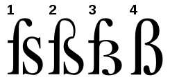
- ſs without ligature, but as a single type, with reduced spacing between the two letters
- the ligature of ſ and s inherited from the 16th-century Antiqua typefaces
- a ligature of ſ and tailed z, adapting the blackletter ligature to Antiqua
- the Sulzbacher form.
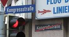
The first variant (no ligature) has become practically obsolete. Most modern typefaces follow either 2 or 4, with 3 retained in occasional usage, notably in street signs in Bonn and Berlin.

Use of typographic variants in street signs:
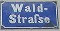 Unligatured ſs variant in a street sign in Pirna, Saxony
 Antiqua form of the ſz ligature (Berlin street signs)
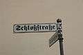 Blackletter form of the ſz ligature (Erfurt street signs)
 Sulzbacher form (Nürnberg street signs)
 Two distinct blackletter typefaces in Mainz. The red sign spells Straße with ſs; the blue sign uses the standard blackletter ſz ligature.
%2C_StVO_1992.svg.png) Sulzbacher form in the German Einbahnstraße ("one-way street") sign
Sulzbacher form in the German Einbahnstraße ("one-way street") sign
Capital form

Because ß is treated as a ligature, rather than as a full letter of the German alphabet, it had no capital form in early modern typesetting. There have however been proposals to introduce capital forms of ß for use in allcaps writing (where ß would usually be represented as either SS or SZ). This was first proposed in 1879, but did not enter official or widespread usage.[14] The preface to the 1925 edition of the Duden dictionary expressed the desirability of a separate glyph for capital ß:
Die Verwendung zweier Buchstaben für einen Laut ist nur ein Notbehelf, der aufhören muss, sobald ein geeigneter Druckbuchstabe für das große ß geschaffen ist.[15]
The use of two letters for a single phoneme is makeshift, to be abandoned as soon as a suitable type for the capital ß has been developed.
The Duden was edited separately in East and West Germany from the 1950s to the 1980s. The East German Duden of 1957 (15th ed.) introduced a capital ß in its typesetting without revising the rule for capitalisation. The 16th edition of 1969 stipulated that an uppercase ß was in development and would be introduced in the future. The 1984 edition removed this statement again and simply stated that there is no capital version of ß.[16]
Regardless of prescriptive or orthographical concerns, types for capital ß were designed in various typefaces in the 1920s and 1930s even though they were rarely used. In the 2000s, Andreas Stötzner, editor of the typographical magazine Signa campaigned for the introduction of the character. Stötzner deposited a corresponding proposal with the Unicode Consortium in 2004. The proposal was rejected at the time,[17] but a second proposal submitted in 2007 was successful and the character was introduced in 2008 (Unicode version 5.1.0), as U+1E9E ẞ LATIN CAPITAL LETTER SHARP S (Latin Extended Additional block).[18] In 2016, the Council for German Orthography proposed the introduction of optional use of ẞ in its ruleset (i.e. variants STRASSE vs. STRAẞE would be accepted as equally valid).[19] The rule was officially adopted in 2017.[20]
Keyboards and encoding
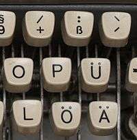
In Germany and Austria, the letter ß is present on computer and typewriter keyboards, normally to the right on the upper row. The German typewriter keyboard layout was defined in DIN 2112, first issued in 1928.[21]
In other countries, the letter is not marked on the keyboard, but a combination of other keys can produce it. Often, the letter is input using a modifier and the s key. The details of the keyboard layout depend on the input language and operating system, such as Ctrl+Alt+s, on some keyboards such as US-International also AltGr+s in Microsoft Windows or Option+s on the US, US-Extended, and UK keyboards in macOS. In Windows, one can also use alt code 0223.
Some modern virtual keyboards show ß when the user presses and holds the s key.
The HTML entity for ß is ß. Its code point in the ISO 8859 character encoding versions 1, 2, 3, 4, 9, 10, 13, 14, 15, 16 and identically in Unicode is 223, or DF in hexadecimal. In TeX and LaTeX, \ss produces ß. A German language support package for LaTeX exists in which ß is produced by "s (similar to umlauts, which are produced by "a, "o, and "u with this package).[22]
In modern browsers, "ß" will be converted to "SS" when the element containing it is set to uppercase using text-transform: uppercase in Cascading Style Sheets. The JavaScript in Google Chrome will convert "ß" to "SS" when converted to uppercase (e.g. "ß".toUpperCase()).
| Character | ẞ | ß | ||
|---|---|---|---|---|
| Unicode name | LATIN CAPITAL LETTER SHARP S | LATIN SMALL LETTER SHARP S | ||
| Encodings | decimal | hex | decimal | hex |
| Unicode | 7838 | U+1E9E | 223 | U+00DF |
| UTF-8 | 225 186 158 | E1 BA 9E | 195 159 | C3 9F |
| Numeric character reference | ẞ | ẞ | ß | ß |
| Named character reference | ß | |||
Usage
Usage in the reformed orthography of 1996
In the orthography of the German spelling reform of 1996, both ß and ss are used to represent /s/ between two vowels in Standard German, as follows:
- ß is used after diphthongs (beißen [ˈbaɪ̯sn̩] ‘to bite’)
- ß is used after long vowels (grüßen [ˈɡʁyːsn̩] ‘to greet’)
- ss is used after short vowels (küssen [ˈkʏsn̩] ‘to kiss’)
Thus it helps to distinguish words like Buße ('penance, fine': long vowel) and Busse ('buses': short vowel). It is also consistent with the general rule of German spelling that a doubled consonant letter serves to mark the preceding vowel as short (the consonant sound is never actually doubled or lengthened in pronunciation).
In words where the stem changes, some forms may have an ß but others an ss, for instance: sie beißen (‘they bite’) vs. sie bissen (‘they bit’).
The same rules apply at the end of a word or syllable, but are complicated by the fact that single s is also pronounced /s/ in those positions. Thus, words like groß ('large') require ß, while others, like Gras ('grass') use a single s. The correct spelling is not predictable out of context (in Standard German pronunciation), but is usually made clear by related forms, e.g., Größe ('size') and grasen ('to graze'), where the medial consonants are pronounced [s] and [z], respectively. Many dialects of German, however, have an even longer vowel, or an audibly less-sharp s, in cases single s is used.
Usage in the traditional orthography
In the traditional orthography, ß is always used at the end of a word or word-component, or before a consonant, even when the preceding vowel is short. For example, Fuß ('foot') has a long vowel, pronounced /fuːs/, and so was unaffected by the spelling reform; but Kuß ('kiss') has a short vowel, pronounced /kʊs/, and was reformed to Kuss. Other traditional examples included Eßunlust ('loss of appetite'), and wäßrig ('watery'), but Wasser ('water'). As in the reformed orthography, traditional orthography uses ß after long vowels and diphthongs, even when followed by a vowel. Words like Straße ('street'), pronounced /ʃtraːsə/, and beißen ('to bite'), pronounced /ˈbaɪ̯sn̩/, were unaffected by the spelling reform.
The spelling reform affected some German-language forms of foreign place names, such as Rußland ("Russia"), reformed Russland, and Preßburg ("Bratislava"), reformed Pressburg.[23] The orthography of personal names (first names and family names) and of names for locations within Germany proper, Austria and Switzerland were not affected by the reform of 1996, however; these names often use irregular spellings that are otherwise impermissible under German spelling rules, not only in the matter of the ß but also in many other respects.
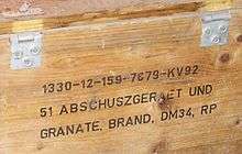
The traditional orthography encouraged the use of SZ in place of ß in words with all letters capitalized where a usual SS would produce an ambiguous result. One possible ambiguity was between IN MASZEN (in limited amounts; Maß, "measure") and IN MASSEN (in massive amounts; Masse, "mass"). Such cases were rare enough that this rule was officially abandoned in the reformed orthography. The German military still occasionally uses the capitalized SZ, even without any possible ambiguity, as SCHIESZGERÄT (“shooting materials”). Architectural drawings may also use SZ in capitalizations because capital letters and both Maß and Masse are frequently used. Military teleprinter operation within Germany still uses sz for ß (unlike German typewriters, German teleprinter machines never featured either umlauts or ß).
Substitution and all caps
If no ß is available, ss or sz is used instead (sz especially in Hungarian-influenced eastern Austria). This applies especially to all-caps or small-caps texts because ß had no generally accepted majuscule form until 2017. Excepted are all-caps names in legal documents; they may retain an ß to prevent ambiguity (for instance: STRAßER, since Straßer and Strasser are both possible names).
This ss that replaces an ß has to be hyphenated as a single letter in the traditional orthography. For instance: STRA-SSE (‘street’); compare Stra-ße. In the reformed orthography, it is hyphenated like other double consonants: STRAS-SE.[24]
Switzerland and Liechtenstein
In Swiss Standard German, ss usually replaces every ß. This is officially sanctioned by the reformed German orthography rules, which state in §25 E2: "In der Schweiz kann man immer „ss“ schreiben" ("In Switzerland, one may always write 'ss'"). Liechtenstein follows the same practice.
In Switzerland, ß was gradually phased out starting in the 1930s, when most cantons decided not to teach it any more, and the Swiss postal service stopped using it in place names. The Neue Zürcher Zeitung was the last Swiss newspaper to give up ß, in 1974. Today, Swiss publishing houses use ß only for books that address the entire German-speaking market.
Uncommon uses

Occasionally, ß has been used in unusual ways:
- As a surrogate for Greek lowercase beta (β), which looks fairly similar. This was used in older operating systems, whose character encodings (notably Latin-1 and Windows-1252) did not support easy use of Greek letters. Also, the original IBM DOS code page, CP437 (aka OEM-US) (which contains some Greek letters for technical and scientific usage) conflates the two characters, assigning them the same code point (0xE1) and a glyph that minimizes their differences.
- ß was used to represent /ʃ/ in a German-influenced spelling system for the Lithuanian language which was used in Lithuania Minor in East Prussia, which can be seen, for example, in some surnames.
- ß has also occasionally been used for transliterating Sumerian /ʃ/, the standard transliteration of which is ⟨š⟩.
- The writer Gabriela Mendling used word-initial ß in her two novels (1999, 2000) to indicate the voiceless /s/ of the local dialect in Frankfurt an der Oder, where /z/ (voiced) is expected in standard German. Example: "ßind ßie?" instead of "Sind Sie?".
See also
- Capital ẞ
- β, Greek letter β (Beta)
- 阝, Kangxi radical 163 & 170
- Long s (ſ)
- Sz (digraph)
- de:Heysesche s-Schreibung (in German)
- de:Adelungsche s-Schreibung (in German)
References
- Unicode Consortium (2018), "C1 Controls and Latin-1 Supplement, Range 0080–00FF" (PDF), The Unicode Standard, Version 11.0, retrieved 2018-08-09.
- ß (as well as ä, ö and ü) taught as "letters of the alphabet" in Germany, which is taken to consist of 26 letters.
Uhlitzsch, Julia. "Unterrichtsstunde: Wir lernen das Alphabet! Wörter nach dem ABC ordnen" (PDF) (in German). p. 2. Retrieved 17 March 2016.
In der deutschen Sprache besteht das Alphabet aus 26 Buchstaben.
- "Das Alphabet, Vokale und Konsonanten, besondere Laute und Buchstaben" (PDF) (in German). Retrieved 17 March 2016.
Das deutsche Alphabet besteht aus 26 Buchstaben, die groß- oder kleingeschrieben werden können.
"Wer hat unser Alphabet erfunden?" (in German). Retrieved 17 March 2016.Hast Du Dich schon mal gefragt, wer sich die 26 Buchstaben unseres Alphabets ausgedacht hat?
- Ha, Thu-Huong. "Germany has ended a century-long debate over a missing letter in its alphabet". Retrieved 9 August 2017.
According to the council’s 2017 spelling manual: When writing the uppercase [of ß], write SS. It’s also possible to use the uppercase ẞ. Example: Straße — STRASSE — STRAẞE.
- Leitfaden zur deutschen Rechtschreibung ("Guide to German Orthography"), 3rd edition (2007) (in German) from the Swiss Federal Chancellery, retrieved 22-Apr-2012
- C1 Controls and Latin-1 Supplement. glossed "uppercase is “SS”; nonstandard uppercase is 1E9E ẞ; typographically the glyph for this character can be based on a ligature of 017F ſ with either 0073 s or with an old-style glyph for 007A z (the latter similar in appearance to 0292 ʒ ). Both forms exist interchangeably today."
- Wolf-Dieter Michel, "Die graphische Entwicklung der s-Laute im Deutschen", Beiträge zur Geschichte der deutschen Sprache und Literatur 81 (1959), p. 461.
- Herbert E. Brekle: Zur handschriftlichen und typographischen Geschichte der Buchstabenligatur ß aus gotisch-deutschen und humanistisch-italienischen Kontexten. In: Gutenberg-Jahrbuch, Mainz 2001, 67–76.
- Mosley 2008.
- Jamra 2006.
- Zeitschrift für Deutschlands Buchdrucker, Steindrucker und verwandte Gewerbe. Leipzig, 9. Juli 1903. Nr. 27, XV. Jahrgang. Faksimile in Jamra 2006.
- Busch, Wolf. "Heysesche s-Schreibung in Frakturschrift" (in German). Retrieved 1 January 2012.
- Ickler, Theodor. "Laut-Buchstaben-Zuordnungen". Mein Rechtschreibtagebuch (in German). Forschungsgruppe Deutsche Sprache. Retrieved 1 January 2012.
- Signa – Beiträge zur Signographie. Heft 9, 2006.
- Vorbemerkungen, XII. In: Duden – Rechtschreibung. 9. Auflage, 1925
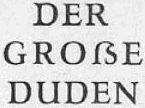
- Der Große Duden. 25. Auflage, Leipzig 1984, S. 601, K 41.
- Andreas Stötzner: Vorschlag zur Kodierung eines versalen ß in Unicode (n2888.pdf PDF). Unicode Consortium: Rejected Characters and Scripts. online (englisch); und als Kommentar dazu: Michael Kaplan: Every character has a story #15: CAPITAL SHARP S (not encoded) Michael Kaplan (englisch).
- Cord Wischhöfer: Proposal to encode Latin Capital Letter Sharp S to the UCS. (n3327.pdf). Resolutions of WG 2 meeting 50.Unicode 5.1.0
- 3. Bericht des Rats für deutsche Rechtschreibung 2011–2016 (2016), p. 7.
- "Deutsche Rechtschreibung Regeln und Wörterverzeichnis: Aktualisierte Fassung des amtlichen Regelwerks entsprechend den Empfehlungen des Rats für deutsche Rechtschreibung 2016" (PDF). §25, E3. Retrieved 29 June 2017.
E3: Bei Schreibung mit Großbuchstaben schreibt man SS. Daneben ist auch die Verwendung des Großbuchstabens ẞ möglich. Beispiel: Straße – STRASSE – STRAẞE.[When writing in all caps, one writes SS. It is also permitted to write ẞ. Example: Straße – STRASSE – STRAẞE.]
- Vom Sekretariat zum Office Management: Geschichte — Gegenwart — Zukunft, Springer-Verlag (2013), p. 68.
- "German". ShareLaTeX. 2016. Reference guide. Retrieved 17 March 2016.
- (in German) Wortschatz, Uni Leipzig, Searches for 'Rußland' and 'Preßburg'. Accessed March 20, 2008
- Peter Gallmann (1997): "Warum die Schweizer weiterhin kein Eszett schreiben. Zugleich: Eine Anmerkung zu Eisenbergs Silbengelenk-Theorie". In: Augst, Gerhard; Blüml, Karl; Nerius, Dieter; Sitta, Horst (Eds.) Die Neuregelung der deutschen Rechtschreibung. Begründung und Kritik. Tübingen: Niemeyer (= Reihe Germanistische Linguistik, Vol. 179) pages 135–140., p. 5.
External links
| Wikimedia Commons has media related to Sharp s. |
- Mosley, James (2008-01-31), "Esszet or ß", Typefoundry, retrieved 2019-05-05
- Jamra, Mark (2006), "The Eszett", Typefoundry, retrieved 2019-05-05