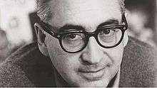
Saul Bass
Saul Bass (/ˈbæs/; May 8, 1920 – April 25, 1996) was an American graphic designer and Oscar-winning filmmaker, best known for his design of motion-picture title sequences, film posters, and corporate logos.
Saul Bass | |
|---|---|
 | |
| Born | May 8, 1920 The Bronx, New York, U.S. |
| Died | April 25, 1996 (aged 75) Los Angeles, California, U.S. |
| Nationality | American |
| Occupation | Graphic designer, title designer, film director |
| Spouse(s) |
|
| Children | 4 |
| Awards |
|
During his 40-year career, Bass worked for some of Hollywood's most prominent filmmakers, including Alfred Hitchcock, Otto Preminger, Billy Wilder, Stanley Kubrick and Martin Scorsese. Among his most famous title sequences are the animated paper cut-out of a heroin addict's arm for Preminger's The Man with the Golden Arm, the credits racing up and down what eventually becomes a high-angle shot of a skyscraper in Hitchcock's North by Northwest, and the disjointed text that races together and apart in Psycho.
Bass designed some of the most iconic corporate logos in North America, including the Bell System logo in 1969, as well as AT&T's globe logo in 1983 after the breakup of the Bell System. He also designed Continental Airlines' 1968 jet stream logo and United Airlines' 1974 tulip logo, which became some of the most recognized airline industry logos of the era. He died from non-Hodgkin's lymphoma in Los Angeles on April 25, 1996, at the age of 75.[1]
Early life
Saul Bass was born on May 8, 1920 in the Bronx, New York, United States, to Eastern European Jewish immigrant parents. He graduated from James Monroe High School in the Bronx and studied part-time at the Art Students League in Manhattan until attending night classes with György Kepes at Brooklyn College.[2] In 1938, Saul married Ruth Cooper and they had two children, Robert in 1942 and Andrea in 1946.[3]
He began his time in Hollywood in the 1940s, designing print advertisements for films including Champion (1949), Death of a Salesman (1951) and The Moon Is Blue (1953), directed by Otto Preminger. His next collaboration with Preminger was to design a film poster for his 1954 film Carmen Jones. Preminger was so impressed with Bass's work that he asked him to produce the title sequence as well. This was when Bass first saw the opportunity to create a title sequence which would ultimately enhance the experience of the audience and contribute to the mood and the theme of the movie within the opening moments. Bass was one of the first to realize the creative potential of the opening and closing credits of a movie.
Film title sequences
Bass became widely known in the film industry after creating the title sequence for Otto Preminger's The Man with the Golden Arm (1955). The subject of the film was a jazz musician's struggle to overcome his heroin addiction, a taboo subject in the mid-1950s. Bass decided to create an innovative title sequence to match the film's controversial subject. He chose the arm as the central image, as it is a strong image relating to heroin addiction. The titles featured an animated, white on black paper cut-out arm of a heroin addict. As he hoped, it caused quite a sensation.
For Alfred Hitchcock, Bass provided effective, memorable title sequences, inventing a new type of kinetic typography, for North by Northwest (1959), Vertigo (1958), working with John Whitney, and Psycho (1960). It was this kind of innovative, revolutionary work that made Bass a revered graphic designer. Before the advent of Bass's title sequences in the 1950s, titles were generally static, separate from the movie, and it was common for them to be projected onto the cinema curtains, the curtains only being raised right before the first scene of the movie.[4] In 1960, Bass wrote an article for Graphis magazine called "Film Titles – a New Field for the Graphic Designer," which has been revered as a milestone for "the consecration of the movie credit sequence as a design object."[5][6] One of the most studied film credit designers, Bass is known for integrating a stylistic coherence between the designs and the films in which they appear.[6]
Bass once described his main goal for his title sequences as being to "try to reach for a simple, visual phrase that tells you what the picture is all about and evokes the essence of the story".[7] Another philosophy that Bass described as influencing his title sequences was the goal of getting the audience to see familiar parts of their world in an unfamiliar way. Examples of this or what he described as "making the ordinary extraordinary" can be seen in Walk on the Wild Side (1962) where an ordinary cat becomes a mysterious prowling predator, and in Nine Hours to Rama (1963) where the interior workings of a clock become an expansive new landscape.[8] In the 1950s, Saul Bass used a variety of techniques, from cut-out animation for Anatomy of a Murder (1958), to fully animated mini-movies such as the epilogue for the Best Picture Oscar winner Around the World in 80 Days (1956), and live-action sequences.
In 1955, Elaine Makatura came to work with Bass in his Los Angeles office. By 1960, with the opening to Spartacus, she was directing and producing title sequences, and in 1961 the two married, beginning more than 40 years of close collaboration. After the birth of their children, Jennifer in 1964 and Jeffrey in 1967, they concentrated on their family, film directing, and title sequences. Saul and Elaine designed title sequences for more than 40 years, continuously experimenting with a variety of innovative techniques and effects, from Bunraku-style maneuvers in Spartacus (1960), live-action sequences in Walk On The Wild Side (1962), to time-lapse photography in The Age of Innocence (1993), and even chopped liver in Mr. Saturday Night (1992). Their live-action opening title sequences often served as prologues to their films and transitioned seamlessly into their opening scenes. These "time before" title sequences either compress or expand time with startling results. The title sequence to Grand Prix (1966) portrays the moments before the opening race in Monte Carlo, the title sequence to The Big Country (1958) depicts the days it takes a stage coach to travel to a remote Western town, and the opening montage title sequence to The Victors (1963) chronicles the twenty-seven years between World War I and the middle of World War II, where the film begins.
From the mid-1960s to the late '80s, Saul and Elaine moved away from main titles to focus on filmmaking and their children. About this time away from title design, Saul said:[9]
Elaine and I feel we are there to serve the film and to approach the task with a sense of responsibility. We saw a lot of pyrotechnics and fun and games and I suppose we lost interest. At the same time, an increasing number of directors now sought to open their own films in ambitious ways rather than hire someone else to do it. Whatever the reasons, the result was "Fade Out." We did not worry about it: we had too many other interesting projects to get on with. Equally, because we still loved the process of making titles, we were happy to take it up again when asked. "Fade In"...[10]
In the 1980s, Saul and Elaine were rediscovered by James L. Brooks and Martin Scorsese, who had grown up admiring their film work.[11] For Scorsese, Saul and Elaine Bass[12] created title sequences for Goodfellas (1990), Cape Fear (1991), The Age of Innocence (1993), and Casino (1995), their last title sequence. This later work with Martin Scorsese saw the Basses move away from the optical techniques that Saul had pioneered and move into the use of computerized effects. The Basses' title sequences featured new and innovative methods of production and startling graphic design.
Screenwriter Nicholas Pileggi said of Saul and Elaine Bass, "You write a book of 300 to 400 pages and then you boil it down to a script of maybe 100 to 150 pages. Eventually you have the pleasure of seeing that the Basses have knocked you right out of the ballpark. They have boiled it down to four minutes flat."[13]
In a sense, all modern opening title sequences that introduce the mood or theme of a film can be seen as a legacy of the Basses' innovative work. In particular, title sequences for some recent movies and television series, especially those whose setting is during the 1960s, have purposely emulated the graphic style of Saul Bass's animated sequences from the 1950s. Some examples of title sequences that pay homage to Bass's graphics and animated title sequences are Catch Me If You Can (2002),[14] X-Men: First Class (2011),[15] and the openings to the AMC series Mad Men[16] and TBS's Conan.[17]
Selected film title sequences
|
|
|
Logos and other designs
Bass was responsible for some of the best-remembered, most iconic logos in North America, including both the Bell Telephone logo (1969) and successor AT&T globe (1983). Other well-known designs were Continental Airlines (1968), Dixie (1969) and United Airlines (1974). Later, he would produce logos for a number of Japanese companies as well.
Selected logos by Saul Bass and their respective dates (note that the links shown point to articles on the entities themselves, and not necessarily to the logos):
- Alcoa (1963)
- Ajinomoto (1973)
- AT&T Corporation (1969 and 1983)
- Avery International (1975)
- Boys & Girls Clubs of America (1978)
- Celanese (1965)
- Continental Airlines (1968)[18]
- Dixie (1969)
- Frontier Airlines (1978)
- Fuller Paints (1962)
- Geffen Records (1980)
- General Foods (1984)
- Girl Scouts of the USA (1978)
- Japan Energy Corporation (1993)
- J. Paul Getty Trust (1993)
- Kibun Foods (1984)
- Kose Cosmetics (1991)
- Lawry's Foods (1959)
- Minami Sports (1991)
- Minolta (1978 and 1981)
- NCR Corporation (1996)
- Quaker Oats (1969)
- Rockwell International (1968)
- Security Pacific Bank (1966)
- United Airlines (1974)
- United Way (1972)
- US postage stamp, "Science and Industry" (1983)[19]
- Warner Communications (1974)
- Wienerschnitzel (1978)
- Wesson Oil (1964)
- YWCA (1988)
An analysis of a sample of Bass's corporate logos in 2011 found them to have an unusual longevity. The most common cause of the end of a Bass corporate logo (in the selection analyzed) was the demise or merge of the company, rather than a corporate logo redesign. The average lifespan of a Bass logo is more than 34 years.[20] In 2014, Frontier Airlines resurrected the stylized F logo originally designed for Frontier by Bass in 1978, and discontinued when the airlines when bankrupt in 1984.[21]
Movie posters
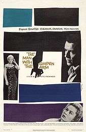
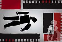
Saul Bass designed emblematic movie posters that transformed the visuals of film advertising. Before Bass's seminal poster for The Man with the Golden Arm (1955), movie posters were dominated by depictions of key scenes or characters from the film, often both juxtaposed with each other. Bass's posters, however, typically developed simplified, symbolic designs that visually communicated key essential elements of the film. For example, his poster for The Man with the Golden Arm, with a jagged arm and off-kilter typography, starkly communicates the protagonist's struggle with heroin addiction. Bass's iconic Vertigo (1958) poster, with its stylized figures sucked down into the nucleus of a spiral vortex, captures the anxiety and disorientation central to the film. His poster for Anatomy of a Murder (1959), featuring the silhouette of a corpse jarringly dissected into seven pieces, makes both a pun on the film's title and captures the moral ambiguities within which this court room drama is immersed.
He created some of his best known posters for films directed by Otto Preminger, Alfred Hitchcock, Billy Wilder, and Stanley Kubrick among others. His last commissioned film poster was created for Steven Spielberg's Schindler's List (1993), but it was never distributed.[22] His poster work spanned five decades and inspired numerous other poster and graphic designers. Bass's film posters are characterized by a distinctive typography and minimalistic style.
Selected posters by Saul Bass, and their respective dates:
1950s

- Carmen Jones (1954)
- The Man with the Golden Arm (1955)
- Edge of the City (1956)
- Storm Center (1956)
- Love in the Afternoon (1957)
- Saint Joan (1957)
- Bonjour tristesse (1958)
- The Big Country (1958) (style b poster)
- Vertigo (1958)
- Anatomy of a Murder (1959)
1960s

- Exodus (1960)
- The Magnificent Seven (1960) (design not used)
- One, Two, Three (1961)
- Advise & Consent (1962)
- It's a Mad, Mad, Mad, Mad World (1963)
- The Cardinal (1963)
- In Harm's Way (1964)
- Bunny Lake Is Missing (1965)
- The Firemen's Ball (1967)
- The Two of Us (1967)
- Why Man Creates (1968)
- Very Happy Alexander (1969)
1970s
.png)
- Such Good Friends (1971)
- Rosebud (1975)
- Brothers (1977)
- Notes on the Popular Arts (1977)
- Bass on Titles (1978)
- The Human Factor (1979)
- The Solar Film (1979)
1980s and 1990s
_designed_by_Saul_Bass_for_the_film%2C_Schindler's_List_(1993).jpg)
- The Shining (1980)
- Return from the River Kwai (1989) (not distributed)
- Schindler's List (1993) (rejected poster)
He received an unintentionally backhanded tribute in 1995, when Spike Lee's film Clockers was promoted by a poster that was strikingly similar to Bass's 1959 work for Preminger's film Anatomy of a Murder. Designer Art Sims claimed that it was made as an homage, but Bass regarded it as theft.[24] Many film posters have been considered to be homages to Saul Bass's posters. Some recent examples include the theatrical release poster for Burn After Reading (2008) which incorporates Bass's typography and style of figurative minimalism,[25] and a poster for Precious (2009) which includes elements from several of Bass's posters, including Anatomy of a Murder.[26] The cover art for The White Stripes' single The Hardest Button to Button is clearly inspired by the Bass poster for The Man with the Golden Arm.[27]
The comic book artist J. H. Williams III's designs for the Batman story "The Black Glove" pay homage to Bass's designs as well.[28]
In addition to movie posters, Bass designed numerous posters for film festivals, and several magazine, book, and album covers. He also designed five Academy Award Presentation posters and the Student Academy Award for the Academy of Motion Picture Arts and Sciences.[29] In 1962 he illustrated his only children's book, Henri's Walk to Paris, written by Lenore Klein.[30]
Filmmaker
During the 1960s, Bass was asked by directors and producers to produce not only title sequences for their films, but also to visualize and storyboard key scenes and sequences within them. Bass has the unusual credit of "visual consultant" or "pictorial consultant" on five films. For Spartacus (1960), Bass as "visual consultant" designed key elements of the gladiator school and storyboarded the final battle between slaves and Romans. John Frankenheimer, the director of Grand Prix (1966), had Bass storyboard, direct, and edit all but one of the racing sequences for his film. For West Side Story (1961) Bass filmed the prologue, storyboarded the opening dance sequence, and created the ending title sequence.[2]
It is Bass's credited role as "pictorial consultant" for Alfred Hitchcock on Psycho (1960); however, that has caused some controversy and debate. Bass claimed that he participated in directing the highlight scene of Psycho, the tightly edited shower-murder sequence, though several on set at the time (including star Janet Leigh) disputed this claim.[31]
The research of several film scholars on Hitchcock's production of Psycho validates the claim that Bass in his capacity as a graphic artist did indeed have a significant influence on the visual design and pacing of that famous scene. Hitchcock had asked Bass to design and produce storyboards for the shower murder scene and for some other scenes in the film. For this, Bass received a credit as Pictorial Consultant as well as Title Designer. Janet Leigh told Donald Spoto that "the planning of the shower scene was left up to Saul Bass, and Hitchcock followed his storyboard precisely. Because of this ... [the shooting] went very professionally,"[32] and she told Stephen Rebello that "Mr. Hitchcock showed Saul Bass's storyboards to me quite proudly, telling me in exact detail how he was going to shoot the scene from Saul's plans".[33]
Bill Krohn has noted that Bass's 48 story board panels for the scene introduced all the key aspects of the final shower murder scene – most notably, the fact that the attacker appears as a silhouette, close-ups of a slashing knife, the shower curtain torn down, a shot of the shower head from below, Marion's desperate outstretched arm, and the famous shot of the transition from the drain hole of the bathtub to Marion Crane's dead eye. Krohn notes that this final transition is highly reminiscent of Bass's iris titles for Vertigo.[34] Krohn also concludes that Bass did not literally direct the shower scene, proving Hitchcock's presence on the set throughout the shooting of that scene.[34]
Bass introduced the idea of using a montage of fast cuts and tight framing to render a violent, bloody murder as an impressionistic and nearly bloodless one. Hitchcock felt uncertain about Bass's conception of the scene fearing that audiences might not accept such a stylized and quickly cut sequence. In an interview with film historian Pat Kirkham, Bass recalled, "Having designed and storyboarded the shower sequence, I showed it to Hitch. He was uneasy about it. It was very un-Hitchcockian in character. He never used that kind of quick cutting; he loved the long shot".[2]
To convince Hitchcock that the scene would work as planned, eight days before shooting of the final shower scene, Bass used a newsreel camera and Janet Leigh's stand-in Marli Renfro to shoot footage on the set to plan the shots in more detail. Working with Hitchcock's editor George Tomasini, he edited this footage following the storyboards to show Hitchcock how the scene could work. In the end, Hitchcock gave his approval but, according to Kirkham, made two additions: a spray of blood on the chest of Marion Crane/Janet Leigh as she slides down the tiles, and a close-up of her belly getting stabbed.[2]
In 1964, Saul and his wife and creative partner Elaine directed the short film The Searching Eye shown during the 1964 New York World's Fair, co-produced with Sy Wexler.[35] The Basses also directed a short documentary film called Why Man Creates[36] which won the Academy Award for Documentary Short Subject in 1968.[37] An abbreviated version of that film was broadcast on the first episode of the television newsmagazine 60 Minutes. In 2002, this film was selected for the United States National Film Registry by the Library of Congress as being "culturally, historically, or aesthetically significant".[38] Saul, in collaboration with his wife and creative partner Elaine, directed several other short films, two of which were nominated for Academy Awards: Notes on the Popular Arts, in 1977,[39][40] and The Solar Film, in 1979.[41][42]
In 1974, Saul Bass made his only feature-length film as a director, the visually splendid though little-known science fiction film Phase IV, a "quiet, haunting, beautiful, ... and largely overlooked, science-fiction masterwork".[43]
Legacy
The moving image collection of Saul Bass is held at the Academy Film Archive and consists of 2,700 items. The film material is complemented by the Saul Bass papers at the Academy's Margaret Herrick Library.[44] The Academy Film Archive has preserved two of Bass's films: Why Man Creates, in 2011, and Notes on the Popular Arts (also known as An Essay: The Popular Arts Today), in 2012.[45]
On May 8, 2013, Bass's 93rd birthday was celebrated by a Google Doodle, which featured the tune "Unsquare Dance" by Dave Brubeck.[46][47]
See also
| Wikiquote has quotations related to: Saul Bass |
- Elaine Makatura Bass
- Motion graphics
- Paul Rand
- Richard Amsel
- Tom Jung
- Frank McCarthy
- Bob Peak
- Drew Struzan
- Howard Terpning
- Pablo Ferro
References
- Times, Los Angeles. "SAUL BASS, 75, LOGO AND TRADEMARK DESIGNER". Sun-Sentinel.com.
- Kirkham, Pat (10 February 2011). "Reassessing the Saul Bass and Alfred Hitchcock Collaboration". West 86th. 18.
- Horak, Jan-Christopher (2014). Saul Bass: Anatomy of Film Design. The University of Kentucky Press. ISBN 0813147190.
- "GranneBlog » Saul Bass changed how audiences view movie credits". Blog.granneman.com. Retrieved 2012-06-06.
- Bass, Saul (1960). "Film Titles – a New Field for the Graphic Designer". Graphis. 16 (89).
- Straw, Will (2010). "Letters of Introduction: Film Credits and Cityscapes". Design and Culture. 2 (2).
- Kael, Pauline. "One, Two, Three." Film Quarterly Vol. 15, No. 3. (Spring, 1962): 62–65
- Bass, Saul (1977) Bass on Titles. Pyramid Films. Santa Monica, CA
- "Saul Bass". Art of the Title. Retrieved 13 June 2015.
- Jennifer Bass and Pat Kirkham, Saul Bass: A Life in Film & Design, Laurence King Publishing, 2011, p. 264
- "Library | Exhibitions and Events | Saul Bass: biography". BFI. 2012-05-11. Archived from the original on 2011-07-06. Retrieved 2012-06-06.
- Sloman, Tony (30 April 1996). "OBITUARY : Saul Bass". The Independent.
- Jennifer Bass and Pat Kirkham, Saul Bass: A Life in Film & Design, Laurence King Publishing, 2011, pg.263
- Interview with Olivier Kuntzel and Florence Degas, designers of the Catch Me If You Can title sequence. Artofthetitle.com. Retrieved 2011-12-10
- Interview with Simon Clowes, designer of the X-Men First Class title sequence. Watchthetitles.com
- Mad Men Q&A: Mad Men Title Designers Mark Gardner and Steve Fuller Retrieved 2011-12-19
- Ashe, Rob. "Designing Conan". Creative Cow. p. 1. Retrieved June 11, 2011.
- Serling, Robert J. (1974). Maverick: The story of Robert Six and Continental Airlines. Doubleday & Company. ISBN 0-385-04057-1.
- "A postage stamp by Saul Bass". Retrieved 2011-04-02.
- Parekh, Rupal (May 8, 2013). "A Few of Our Favorite Saul Bass Logos". Advertising Age.
- Sumers, Brian (September 10, 2014). "Frontier Airlines Looks to the Past to Set Designs on Its Future". Skift.
- Kirkham, Pat & Jennifer Bass (2011) Saul Bass: A Life in Film & Design (pp. 406 and 420). London: Laurence King
- "The Shining Vintage Movie Posters | Original Film Posters @ Film Art Gallery". filmartgallery.com. Retrieved 2019-10-18.
- Schaefer, Stephen (September 08, 1995). "Poster Imposter". Entertainment Weekly. 2011-04-02.
- "Burn After Reading Poster Inspired by Saul Bass". /Film. June 17, 2008.
- "Saul Bass". Dieselation. 2009-05-30. Retrieved 2012-06-06.
- SOUND AND VISION: THE WHITE STRIPES-VoxPop
- Singer, Marc. Grant Morrison: Combining the Worlds of Contemporary Comics. (Univ. Press of Mississippi, Jackson, MS, 2012) p. 272. Link at Google Books.
- "Student Academy Award". Oscars.org. Retrieved 2011-12-20.
- "grain edit · Henri's walk to Paris : Designed by Saul Bass". Grainedit.com. 2012-02-14. Retrieved 2012-06-06.
- Harris, Aisha (February 20, 2014) "Did Saul Bass Direct the Shower Scene in Psycho?" Slate.com. Retrieved 2014-2-23
- Spoto, Donald (1999 [1983]). The Dark Side Of Genius: The Life Of Alfred Hitchcock. New York: Da Capo Press. (pp. 454–455)
- Rebello, Stephen (1990). Alfred Hitchcock and the Making of Psycho. New York: St. Martin's Griffin. (p. 102) ISBN 0-312-20785-9.
- Krohn, Bill (2003). Hitchcock at Work. (pp. London: Phaidon Press. (p. 231)
- "HUMANITIES : Searching Eye, The". www.pyramidmedia.com.
- Why Man Creates (1968) Theatrical Cartoon - BCDB
- “Why Man Creates”: Saul Bass’s short film on the nature of creativity—Night Flight
- "Librarian of Congress Adds 25 Films to National Film Registry". Library of Congress, Washington, D.C. 20540 USA.
- "HUMANITIES : Notes On The Popular Arts". www.pyramidmedia.com.
- "Notes on the Popular Arts (1978) - Elaine Bass, Saul Bass | Synopsis, Characteristics, Moods, Themes and Related". AllMovie.
- "ACADEMY AWARD : Solar Film, The". www.pyramidmedia.com.
- "The Science of Creativity - The Solar Film". www.thescienceofcreativity.com.
- Scalzo, Thomas (August 8, 2005). "Phase IV (review)". Not Coming to a Theater Near You (notcoming.com). Retrieved 2008-10-16.
- "Saul Bass Collection". Academy Film Archive.
- "Preserved Projects". Academy Film Archive.
- "Saul Bass: Designer, artist, and auteur of the opening credits (+video)" by Matthew Shaer, The Christian Science Monitor, May 8, 2013
- Doodle for Saul Bass' 93rd Birthday on YouTube
Further reading
External links
- Saul Bass on IMDb
- Saul Bass Archive at FilmArt Gallery
- Saul Bass Poster Archive The Saul Bass Estate
- Titles Designed by Saul Bass (still sequences & commentary)
- Saul Bass Title Sequences on Art of the Title
- Title Sequences from Saul Bass (videos & commentary)
- Saul Bass title sequences: ten of the best compiled by The Guardian
- Saul Bass papers, Margaret Herrick Library, Academy of Motion Picture Arts and Sciences
| Authority control |
|
|---|