Logo
A logo (abbreviation of logotype,[4] from Greek: λόγος, romanized: logos, lit. 'word' and Greek: τύπος, romanized: typos, lit. 'imprint') is a graphic mark, emblem, or symbol used to aid and promote public identification and recognition. It may be of an abstract or figurative design or include the text of the name it represents as in a wordmark.
In the days of hot metal typesetting, a logotype was one word cast as a single piece of type (e.g. "The" in ATF Garamond), as opposed to a ligature, which is two or more letters joined, but not forming a word.[5] By extension, the term was also used for a uniquely set and arranged typeface or colophon. At the level of mass communication and in common usage, a company's logo is today often synonymous with its trademark or brand.[6]
History
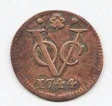
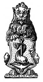
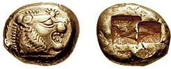
Numerous inventions and techniques have contributed to the contemporary logo, including cylinder seals (c. 2300 BCE), coins (c. 600 BCE),[7][8] trans-cultural diffusion of logographic languages, coats of arms,[9] watermarks,[10] silver hallmarks, and the development of printing technology.
As the industrial revolution converted western societies from agrarian to industrial in the 18th and 19th centuries, photography and lithography contributed to the boom of an advertising industry that integrated typography and imagery together on the page.[11] Simultaneously, typography itself was undergoing a revolution of form and expression that expanded beyond the modest, serif typefaces used in books, to bold, ornamental typefaces used on broadsheet posters.[12]
The arts were expanding in purpose—from expression and decoration of an artistic, storytelling nature, to a differentiation of brands and products that the growing middle classes were consuming. Consultancies and trades-groups in the commercial arts were growing and organizing; by 1890, the US had 700 lithographic printing firms employing more than 8,000 people.[13] Artistic credit tended to be assigned to the lithographic company, as opposed to the individual artists who usually performed less important jobs.
Innovators in the visual arts and lithographic process—such as French printing firm Rouchon in the 1840s, Joseph Morse of New York in the 1850s, Frederick Walker of England in the 1870s, and Jules Chéret of France in the 1870s—developed an illustrative style that went beyond tonal, representational art to figurative imagery with sections of bright, flat colors.[13] Playful children's books, authoritative newspapers, and conversational periodicals developed their own visual and editorial styles for unique, expanding audiences. As printing costs decreased, literacy rates increased, and visual styles changed, the Victorian decorative arts led to an expansion of typographic styles and methods of representing businesses.[14]
The Arts and Crafts Movement of late-19th century, partially in response to the excesses of Victorian typography, aimed to restore an honest sense of craftsmanship to the mass-produced goods of the era.[15] A renewal of interest in craftsmanship and quality also provided the artists and companies with a greater interest in credit, leading to the creation of unique logos and marks.
By the 1950s, Modernism had shed its roots as an avant-garde artistic movement in Europe to become an international, commercialized movement with adherents in the United States and elsewhere. The visual simplicity and conceptual clarity that were the hallmarks of Modernism as an artistic movement formed a powerful toolset for a new generation of graphic designers whose logos embodied Ludwig Mies van der Rohe’s dictum, "Less is more." Modernist-inspired logos proved successful in the era of mass visual communication ushered in by television, improvements in printing technology, and digital innovations.
Contemporary logos
The current era of logo design began in the 1870s with the first abstract logo, the Bass red triangle. As of 2014, many corporations, products, brands, services, agencies, and other entities use an ideogram (sign, icon) or an emblem (symbol) or a combination of sign and emblem as a logo. As a result, only a few of the thousands of ideograms in circulation are recognizable without a name. An effective logo may consist of both an ideogram and the company name (logotype) to emphasize the name over the graphic, and employ a unique design via the use of letters, colors, and additional graphic elements.
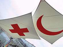
Ideograms and symbols may be more effective than written names (logotypes), especially for logos translated into many alphabets in increasingly globalized markets. For instance, a name written in Arabic script might have little resonance in most European markets. By contrast, ideograms keep the general proprietary nature of a product in both markets. In non-profit areas, the Red Cross (varied as the Red Crescent in Muslim countries and as the Red Star of David in Israel) exemplifies a well-known emblem that does not need an accompanying name. The red cross and red crescent are among the best-recognized symbols in the world. National Red Cross and Red Crescent Societies and their Federation as well as the International Committee of the Red Cross include these symbols in their logos.
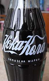
Branding can aim to facilitate cross-language marketing.[16] Consumers and potential consumers can identify the Coca-Cola name written in different alphabets because of the standard color and "ribbon wave" design of its logo. The text was written in Spencerian Script, which was a popular writing style when the Coca-Cola Logo was being designed.[17]
Logo design
Since a logo is the visual entity signifying an organization, logo design is an important area of graphic design. A logo is the central element of a complex identification system that must be functionally extended to all communications of an organization. Therefore, the design of logos and their incorporation in a visual identity system is one of the most difficult and important areas of graphic design. Logos fall into three classifications (which can be combined). Ideographs, such as Chase Bank, are completely abstract forms; pictographs are iconic, representational designs; logotypes (or wordmarks) depict the name or company initials. Because logos are meant to represent companies' brands or corporate identities and foster their immediate customer recognition, it is counterproductive to frequently redesign logos.
The logo design profession has substantially increased in numbers over the years since the rise of the Modernist movement in the United States in the 1950s.[18] Three designers are widely[19] considered the pioneers of that movement and of logo and corporate identity design: The first is Chermayeff & Geismar,[20] which is the firm responsible for many iconic logos, such as Chase Bank (1964), Mobil Oil (1965), PBS (1984), NBC (1986), National Geographic (2003), and others. Due to the simplicity and boldness of their designs, many of their earlier logos are still in use today. The firm recently designed logos for the Library of Congress and the fashion brand Armani Exchange. Another pioneer of corporate identity design is Paul Rand,[21] who was one of the originators of the Swiss Style of graphic design. He designed many posters and corporate identities, including the famous logos for IBM, UPS, and ABC. The third pioneer of corporate identity design is Saul Bass.[22] Bass was responsible for several recognizable logos in North America, including both the Bell Telephone logo (1969) and successor AT&T Corporation globe (1983). Other well-known designs were Continental Airlines (1968), Dixie (1969), and United Way (1972). Later, he would produce logos for a number of Japanese companies as well. An important development in the documentation of logo design is the study of French trademarks by historian Edith Amiot and philosopher Jean Louis Azizollah.[23]
Logo color
Color is a key element in logo design and plays an important role in brand differentiation. The importance of color in this context is due to the mechanics of human visual perception wherein color and contrast play critical roles in visual detail detection. In addition, we tend to acquire various color connotations and color associations through social and cultural conditioning, and these play a role in how we decipher and evaluate logo color. While color is considered important to brand recognition and logo design, it shouldn't conflict with logo functionality, and it needs to be remembered that color connotations and associations are not consistent across all social and cultural groups. For example, in the United States, red, white, and blue are often used in logos for companies that want to project patriotic feelings but other countries will have different sets of colors that evoke national pride.
Choosing an organisation's logo's color is an important decision because of its long term implications and its role in creating differentiation among competitors' logos. A methodology for identifying potential logo colors within an industry sector is color mapping, whereby existing logo colors are systematically identified, mapped, and evaluated (O'Connor, 2011).[24]
Logo design process
Designing a good logo often requires involvement from a marketing team teaming with the graphic design studio. Before a logo is designed, there must be a clear definition of the concept and values of the brand as well as understanding of the consumer or target group. Broad steps in the logo design process include research, conceptualization, investigation of alternative candidates, refinement of a chosen design, testing across products, and finally adoption and production of the chosen mark.
Dynamic logos
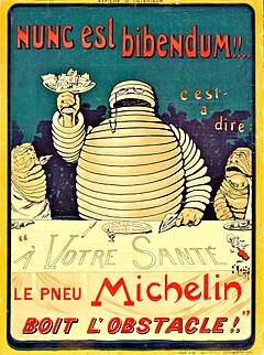
In 1898, the French tire manufacturer Michelin introduced the Michelin Man, a cartoon figure presented in many different contexts, such as eating, drinking, and playing sports. By the early 21st century, large corporations such as MTV, Nickelodeon, Google, Morton Salt, and Saks Fifth Avenue had adopted dynamic logos that change over time from setting to setting.[25]
Internet-compatible logos
A company that uses logotypes (wordmarks) may desire a logo that matches the firm's Internet address. For short logotypes consisting of two or three characters, multiple companies are found to employ the same letters. A "CA" logo, for example, is used by the French bank Credit Agricole, the Dutch clothing retailer C&A, and the US software corporation CA Technologies, but only one can have the Internet domain name CA.com.
In today's digital interface adaptive world, a logo will be formatted and re-formatted from large monitors to small handheld devices. With the constant size change and re-formatting, logo designers are shifting to a more bold and simple approach, with heavy lines and shapes, and solid colors. This reduces the confusion when mingled with other logos in tight spaces and when scaled between media. Social networks like Twitter, Facebook, LinkedIn, and Google+ use such logos.
Design protection
Logos and their design may be protected by copyright, via various intellectual property organisations worldwide which make available application procedures to register a design to give it protection at law. For example, in the UK, the Intellectual Property Office (United Kingdom)[26] govern registered designs, patents, and trademarks. Ordinarily, the trademark registration will not 'make claim' to colors used, meaning it is the visual design that will be protected, even if it is reproduced in a variety of other colors or backgrounds.
Sports
For many teams, a logo or "crest" is an important way to recognize a team's history and can intimidate opponents. For certain teams, the logo and color scheme are synonymous with the team's players. For example, Manchester United, the Toronto Maple Leafs, or New York Yankees all have a recognizable logo that can be identified by any fan of the respective sport.
See also
| Wikimedia Commons has media related to Logos. |
- Graphic design
- Heraldry
- Icon
- Logogram
- Monogram, a motif made by overlapping or combining two or more letters or other graphemes to form one symbol
- Seal (emblem)
- Slogan
- Sound trademark
References
- Brook, Timothy: Vermeer's Hat: The Seventeenth Century and the Dawn of the Global World. (New York: Bloomsbury Press, 2008), p. 16
- Zuber, Charles. "VOC: The logo that lasted". Designonline.org.au. Retrieved 22 Jan 2017.
- Lucas, Gavin (2006). 'The Archaeology of Dutch Capitalism and the Colonial Trade,'. In Gavin Lucas, An Archaeology of Colonial Identity: Power and Material Culture in the Dwars Valley, South Africa. (New York: Springer, 2006)
- "logo: definition of logo in Oxford dictionary (British & World English)". Oxford University Press. Retrieved 2014-03-05.
- Fyffe, Charles. Basic Copyfitting, Studio Vista, London, 1969, SBN 289797055, p.54.
- Wheeler, Alina. Designing Brand Identity © 2006 John Wiley & Sons, Inc. (page 4) ISBN 978-0-471-74684-3
- Herodotus. Histories, I, 94.
- A. Ramage, "Golden Sardis," King Croesus' Gold: Excavations at Sardis and the History of Gold Refining, edited by A. Ramage and P. Craddock, Harvard University Press, Cambridge, 2000, p. 18.
- C. A. Stothard, Monumental Effigies of Great Britain (1817) pl. 2, illus. in Wagner, Anthony, Richmond Herald, Heraldry in England (Penguin, 1946), pl. I.
- Meggs 1998, p. 58.
- Meggs 1998, pp. 138–159.
- Meggs 1998, pp. 126–134.
- Meggs 1998, p. 148–155.
- Meggs 1998, pp. 159–161.
- Meggs 1998, pp. 162–167.
- "TICoRD'13: Global Product Development". Springer. Springers. Retrieved 26 November 2016.
- "The Coca-Cola logo story". Coca-Cola Official Website. The Coca-Cola Company. Retrieved 28 January 2016.
- Meggs 1998, p. 363.
- Meggs 1998, pp. 369–374.
- Meggs 1998, pp. 373–374.
- Meggs 1998, p. 369.
- Meggs 1998, p. 375.
- Les Marques Francaises 1824–1974
- Zena O'Connor (2011). "Logo Colour and Differentiation: A New Application of Environmental Colour Mapping". Color Research and Application. 36 (1): 55–60. doi:10.1002/col.20594.
- Rawsthorn, Alice (2007-02-11). "The new corporate logo: Dynamic and changeable are all the rage". International Herald Tribune. Retrieved 2008-05-21.
- "Intellectual Property Office (United Kingdom)". UK Patent Office.
Sources
- Meggs, Philip B. (1998). A History of Graphic Design (Third ed.). John Wiley & Sons. ISBN 978-0-471-29198-5.CS1 maint: ref=harv (link)
External links
| Look up logo in Wiktionary, the free dictionary. |
- Northern Army Preservation Society: A gallery of noted Canadian corporate logos.