Line length
In typography, line length is the width of a block of typeset text, usually measured in units of length like inches or points or in characters per line (in which case it is a measure). A block of text or paragraph has a maximum line length that fits a determined design. If the lines are too short then the text becomes disjointed; if they are too long the content loses rhythm as the reader searches for the start of each line.
Line length is determined by typographic parameters based on a formal grid and template with several goals in mind; balance and function for fit and readability with a sensitivity to aesthetic style in typography. Typographers adjust line length to aid legibility or copy fit. Text can be flush left and ragged right, flush right and ragged left, or justified where all lines are of equal length. In a ragged right setting line lengths vary to create a ragged right edge of lines varying in length. Sometimes this can be visually satisfying. For justified and ragged right settings typographers can adjust line length to avoid unwanted hyphens, rivers of white space, and orphaned words/characters at the end of lines (e.g.: "The", "I", "He", "We").
Printed text
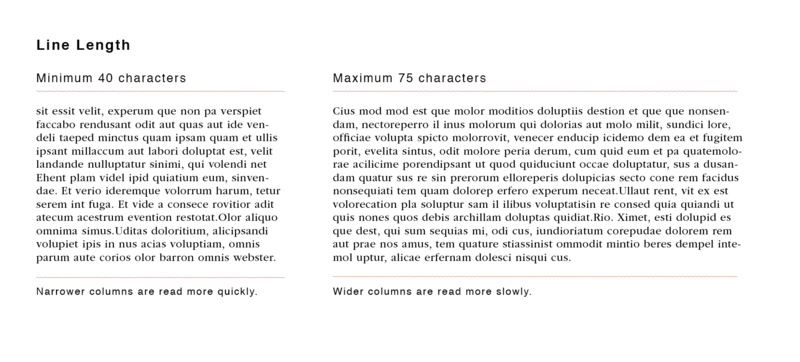
Traditional line length research, limited to print based text, resulted in a variety of results but generally for printed text it is widely accepted that line length fall between 45–75 characters per line (cpl), though the ideal is 66 cpl (including letters and spaces).[1] For conventional books line lengths tend to be 30 times the size of the type, but between 20 and 40 times is considered acceptable (i.e. 30 x 10pt font = 300 pt line).[1] Early studies considered line lengths between 59–97 mm (about 57 cpl) is optimum for 10 point font.[2] For printed works with multiple columns, 40–50 cpl is often better.[1] For justified, English language text the minimum number of characters per line is 40 characters; anything less than 38–40 characters often results in splotches of white spaces (or rivers) or too many hyphenations in the block of text.[1] Longer lines (between 85–90 cpl) may be acceptable for discontinuous text such as in bibliographies or footnotes, but for continuous text lines with more than 80 characters may be too long. Short text, such as ragged marginal notes, may be as little as 12–15 characters per line.[1] Studies have shown that short lines are often preferred over long lines by study participants, likely because they feel more at ease with format, which contradicts research suggesting longer lines are best for quick reading.[3] Punctuation should preferably hang outside the measure.[4] Generally, if the measure is wide, the leading of a text should be increased—if the measure is short, it can safely be decreased. Reverse text, i.e. white text on black also requires more leading.[5][6]
The experience of the reader can also be considered as a factor when determining the count of characters within text lines. For novice readers, text lines should contain between 34 and 60 characters, being 45 the optimal number of characters. Alternatively, texts for expert readers could contain between 45 and 80 characters, with an optimal count of 60 characters.[7]
Electronic text
Screen reading poses additional challenges, making the adoption of traditional line length research to the digital format problematic.[8] Unlike printed text, writing for digital media must accommodate factors such as glare, flicker, and scrolling/paging.[9]
Legibility research specific to digital text has shown that, like with printed text, line length can affect reading speed. If lines are too long it is difficult for the reader to quickly return to the start of the next line (saccade) whereas if lines are too short more scrolling or paging will be required.[10] Researchers have suggested that longer lines are better for quick scanning, while shorter lines are better for accuracy.[3] Longer lines would then be better suited for cases when the information will likely be scanned, while shorter lines would be appropriate when the information is meant to be read thoroughly.[3] One proposal advanced that, in order for on-screen text to have the best compromise between reading speed and comprehension, about 55 cpl should be used.[10] On the other hand, there have been studies indicating that digital text at 100 cpl can be read faster than text with lines of 25 characters, while retaining the same level of comprehension.[8]
Subjective factors also play a role in line length selection for digital text. One study has found that CPL had only small effects on readability, including factors of speed and comprehension; but when asked for preferences, 60% of respondents indicated a preference for either the shortest (35 CPL) or longest (95 CPL) lines used in the study. At the same time, 100% of respondents selected either one of these quantities as being the least desirable.[11]
Calculation methods
.jpg)
There are a few methods to calculate line length to fit the intended average count of characters that such line should contain based on the factors listed above. Most, if not all of these methods, use the length of the lowercase alphabet or LCA as a reference for its calculation.[12] The lowercase alphabet (a measurement of the array of characters of the hegemonic roman alphabet from a to z in typographic points) was sometimes included in type specimen booklets. If not available, the first step to calculate the line length for all these methods is the measurement of the LCA at the size that will be ultimately used.
The first of these methods consists in an adjacency matrix that positions the LCA in points on the x axis and the line length in picas on the y axis. The matrix is used by locating the number closest to the previously calculated LCA on the left column of the matrix and then scan across the columns the number of characters that one would like to set in the text line. Once the number is located, the top row of the selected column will indicate the ideal line length.[12]
The second method consists of a formula that uses the LCA as a unit in a rule of three calculation.[7] Given that the lowercase alphabet has 26 characters, multiplying LCA times 1.75 roughly yields the optimal number of characters for novice readers (26 × 1.75 = 45.5 [≈ 45]). Multiplying the optimal number of character times 0.75 yields the minimum number of characters for novice readers (45.5 × 0.75 = 34.125 [≈ 34]), while multiplying this same number by 1.5 roughly yields the maximum number of characters for novice readers (45.5 × 1.5 = 68.25 [≈ 60].
The third known method is also a formula (LCA’ × Cρ[S] = Ll) that consists in multiplying a modified version of LCA (the lowercase alphabet plus a space character [LCA’]) by the desired number of characters (Cρ) multiplied by a constant of 0.0345 (S).[13]
References
- Bringhurst, R. (1992). Horizontal Motion. The Elements of Typographic Style, pp 25-36. Point Roberts, WA: Hartley & Marks.
- Tinker, M. A., & Paterson, D. G. (1929). Studies of typographical factors influencing speed of reading. III. Length of line. Journal of Applied Psychology, 13(3), 205-219.
- Ling, J., & Van Schaik, P. (2006). The influence of font type and line length on visual search and information retrieval in web pages. International Journal of Human-Computer Studies, 64(5), 395-404.
- "10 Great Tips For Improving Your Web Typography - SpyreStudios". 14 May 2010. Retrieved 6 February 2017.
- "Choose a comfortable measure - The Elements of Typographic Style Applied to the Web". Retrieved 6 February 2017.
- http://www.markboulton.co.uk/journal/comments/five-simple-steps-to-better-typography
- 1956-, Buen Unna, Jorge de. (2014). Manual de diseño editorial (4a ed., corr. y aum ed.). Somonte-Cenero, Gijón: Ediciones Trea. ISBN 9788497047623. OCLC 880551642.CS1 maint: numeric names: authors list (link)
- Dyson, M. C., & Kipping, G. J. (1998). The Effects of Line Length and Method of Movement on Patterns of Reading from Screen. Visible Language, 32(2), 150-181.
- Nanavati, A. A., & Bias, R. G. (2005). Optimal line length in reading - a literature review. Visible Language, 29(2), 121-145.
- Dyson, M. C., & Haselgrove, M. (2001). The influence of reading speed and line length on the effectiveness of reading from screen. International Journal of Human-Computer Studies, 54(4), 585-612.
- Shaikh, A. Dawn (July 2005). "The Effects of Line Length on Reading Online News". Usability News. 7 (2). Archived from the original on June 19, 2015.
- Robert., Bringhurst (2012). The elements of typographic style (4th ed. (version 4.0) ed.). Seattle, WA: Hartley & Marks. ISBN 9780881792119. OCLC 808199932.
- Peña, Ernesto (2016). "Calculating line length: an arithmetic approach". Visible Language. 50 (1): 112–125.