Large-print
Large-print (also large-type or large-font) refers to the formatting of a book or other text document in which the typeface (or font), and sometimes the medium, are considerably larger than usual, to accommodate people who have poor vision. Often public special-needs libraries will stock large-print versions of books, along with versions written in Braille.

History
Among the first large print book publishers, the Clear Type Publishing Company published a collection of books in 36 point type, circa 1910.[1] The Ohio based company specialized in large print, publishing books in 36pt and 24pt.[2]
In 1914 Robert Irwin produced a series of textbooks in 36 point, for low-vision children in Cleveland, Ohio, schools. This type proved to be too large and was soon abandoned for the more popular 24 point. Research sponsored by Irwin in 1919 indicated 24 point type to be the most readable of the sizes evaluated. Further research by others in 1952 and 1959 supported 18 point or 24 point type.[3]
History of Large Print in the Commonwealth
In 1964 Frederick Thorpe began publishing standard print titles with type set twice the size of the original printing. The books were given plain dust jackets, color-coded to indicate categories like mysteries (black), general fiction (red), romances (blue), Westerns (orange), etc. These physically large editions were difficult for some readers to handle and in 1969 Thorpe's company, Ulverscroft, began producing the books in 16 point type and normal-sized bindings.[4] In 1990 Ulverscroft expanded their large print output by acquiring the Yorkshire based large print publisher Magna Publishing.[5]
In 2002, W F Howes began publishing their own range of large print with their Clipper imprint.[6]
Today, the RNIB describe large print as "generally 16 to 18 point size" with anything larger being giant print.[7] Many, if not most public libraries in the English-speaking world have Large Print sections with most bookstores do carry some Large Print editions.
Publishing standards
The American National Association for Visually Handicapped (NAVH) provides the NAVH Seal of Approval to commercial publishers in the US, for books that meet their large print standards.[8] (Lighthouse International acquired NAVH in 2010).[9]
The standards[10] call for:
- Maximum limits on size, thickness, and weight
- Minimum limits on margins
- Type size at least 14 point, preferably 18 point[11]
- Sans serif or modified serif font recommended
- Adequate letter and word spacing
- Flexible binding recommended to allow open book to lie flat
Readable fonts
For many people with visual impairment enlarging the type is not enough. Fonts designed for legibility make it easier to distinguish one character from another. Some characteristics of such fonts are:[12]
- Sans serif
- Consistent tracking, so that groups like "ill" don't blend together
- Clear descenders
- Optically circular counters (enclosed areas, like the bottom of the letter "b" or the whole letter "o")
- Larger punctuation marks
Examples of more-easily read fonts are APHont, Antique Olive, Helvetica, Tahoma, Tiresias and Verdana. APHont was developed for the non-profit AmericanPrinting House for the Blind. They also make it available as a free download for individual use by those with vision problems.[13]
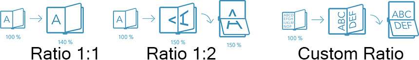
Ratios
Companies offering the large-print formatting uses diverse formats (also called ratios) to support the larger font size.[14] Among these ratios, we find:
- Ratio 1:1, the content is enlarged on a single (1) portrait page and the common typological size is 18 points.
- Ratio 1:2, the content is enlarged on two (2) landscape page and the common typological size is 18 points.
- Custom ratios, the content is enlarged on multiple landscape pages and the common typological size is 28 points.
Recent developments
Since 2005 some companies have begun offering a variety of font sizes for large print books.
See also
References
- The Unseen Minority: A Social History of Blindness in the United States "Google Books"
- Books for the Tired Eyes: A List of Books in Large Print "Google Books"
- The Visually Handicapped Child in School "Google Books"
- "Our History". Ulverscroft Foundation. 29 January 2020. Retrieved 29 January 2020.
- "History". Ulverscroft. 29 January 2020. Retrieved 29 January 2020.
- "Our Story". W F Howes. 29 January 2020. Retrieved 29 January 2020.
- "Large and giant print". RNIB. 29 January 2020. Retrieved 29 January 2020.
- "National Association for Visually Handicapped - NAVH". U.S. Department of Health & Human Services. Archived from the original on 11 March 2012.
- "Lighthouse International Acquires National Association for Visually Handicapped (NAVH)". Vision Monday. Retrieved 29 April 2017.
- "NAVH Standards & Criteria for Large Print Publications" (PDF). National Association for Visually Handicapped. 2006. Archived from the original (PDF) on 4 March 2016. Retrieved 20 February 2012.
- "NLS Reference Guide". Library of Congress. Retrieved 10 July 2019.
- Kitchel, J. Elaine. "APH Guidelines for Print Document Design". American Publishing House for the Blind. Retrieved 26 January 2012.
- "APHont: A Font for Low Vision". American Publishing House for the Blind. Retrieved 26 January 2012.
- "Large Print Strategies". Jymico. Retrieved 29 April 2017.