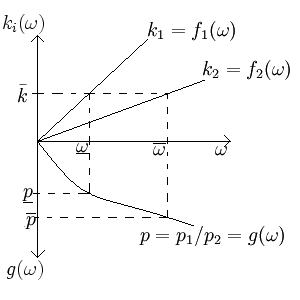
Harrod–Johnson diagram
In two-sector macroeconomic models, a Harrod–Johnson diagram is a way of visualizing the relationship between the output price ratios, the input price ratios, and the endowment ratio of the two goods. Often the goods are a consumption and investment good, and this diagram shows what will happen to the price ratio if the endowment changes. The diagram juxtaposes a graph which has input price ratios as its horizontal axis, endowment ratios as its positive vertical axis, and output price ratios as its negative vertical axis. This may seem unintuitive, but doing this makes it easier to see the relationship between the output price ratios and the endowment. The diagram is named after economists Roy F. Harrod and Harry G. Johnson.
Derivation


If good 1 is an investment good governed by the equation

and good 2 be a consumption good governed by the equation
- ,

then rental and wage rates can be calculated by optimizing a representative firm's profit function, giving

for the rental rate of capital, r, and

for the wage rate of labor, w, so the input price ratio, , is
- for


Normalizing this equation by letting , and solving for provides the formulas to be graphed in the first quadrant.


On the other hand, normalizing the equation
- (or , which is presumably equivalent),


and solving for the price ratio, provides the formula which is to be graphed in the fourth quadrant. Graphing these three functions together shows the relationship.
