Bubble chart
A bubble chart is a type of chart that displays three dimensions of data. Each entity with its triplet (v1, v2, v3) of associated data is plotted as a disk that expresses two of the vi values through the disk's xy location and the third through its size. Bubble charts can facilitate the understanding of social, economical, medical, and other scientific relationships.
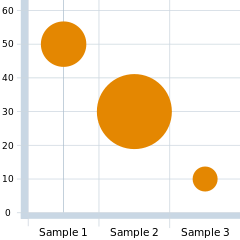

Bubble charts can be considered a variation of the scatter plot, in which the data points are replaced with bubbles. As the documentation for Microsoft Office explains, "You can use a bubble chart instead of a scatter chart if your data has three data series that each contain a set of values. The sizes of the bubbles are determined by the values in the third data series.".[1]
Choosing bubble sizes correctly
The human visual system naturally experiences a disk's size in terms of its area. And the area of a disk—unlike its diameter or circumference—is not proportional to its radius, but to the square of the radius. So if one chooses to scale the disks' radii to the third data values directly, then the apparent size differences among the disks will be non-linear (quadratic) and misleading. To get a properly weighted scale, one must scale each disk's radius to the square root of the corresponding data value v3. This scaling issue can lead to extreme misinterpretations, especially where the range of the data has a large spread. And because many people are unfamiliar with—or do not stop to consider—the issue and its impact on perception, those who are aware of it often have to hesitate in interpreting a bubble chart because they cannot assume that the scaling correction was indeed made. So it is important that bubble charts not only be scaled in this way, but also be clearly labeled to document that it is area, rather than radius or diameter, that conveys the data.[2]
Displaying zero or negative data values in bubble charts
The metaphoric representation of data values as disk areas cannot be extended for displaying values that are negative or zero. As a fallback, some users of bubble charts resort to graphic symbology to express nonpositive data values. As an example, a negative value can be represented by a disk of area in which is centered some chosen symbol like "×" to indicate that the size of the bubble represents the absolute value of a negative data value. And this approach can be reasonably effective in situations where data values' magnitudes (absolute values) are themselves somewhat important—in other words, where values of and are similar in some context-specific way—so that their being represented by congruent disks makes sense.


To represent zero-valued data, some users dispense with disks altogether, using, say, a square centered at the appropriate location. Others use full circles for positive, and empty circles for negative values.
Incorporating further dimensions of data
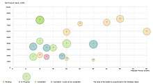
Additional information about the entities beyond their three primary values can often be incorporated by rendering their disks in colors and patterns that are chosen in a systematic way. And, of course, supplemental information can be added by annotating disks with textual information, sometimes as simple as unique identifying labels for cross-referencing to explanatory keys and the like.
Other uses
- In architecture, the term "bubble chart" is also applied to a first architectural sketch of the layout constructed with bubbles.[3]
- In software engineering, "bubble chart" can refer to a data flow, a data structure or other diagram in which entities are depicted with circles or bubbles and relationships are represented by links drawn between the circles.
- In Information visualization, a "bubble chart" is a technique in which a set of numeric quantities is represented by closely packed circles whose areas are proportional to the quantities. Unlike a traditional bubble chart, such displays don't assign meaning to x- or y-axis positions, but seek to pack circles as tightly as possible to make efficient use of space. Bubble charts were introduced by Fernanda Viegas and Martin Wattenberg[4] and have since become a popular method of displaying data. Bubble charts are included in popular visualization toolkits such as D3[5] and have been used by the New York Times.[6]
See also
- Pivot chart
References
- Present your data in a bubble chart Microsoft Office Online. Accessed 16 August 2015.
- Edward Tufte, The Visual Display of Quantitative Information. Cheshire, CT: Graphics Press. (2001, 2nd edition, ISBN 0-9613921-4-2)
- Bryan Lawson (2004). What Designers Know. Elsevier, 2004. ISBN 0-7506-6448-7. p.44.
- 2007: Many Eyes: A Site for Visualization at Internet Scale. Fernanda B. Viégas, Martin Wattenberg, Frank van Ham, Jesse Kriss, Matt McKeon. IEEE Symposium on Information Visualization.
- "Bubble Chart". bl.ocks.org. Retrieved 25 May 2014.
- Carter, Shan. "Four Ways to Slice Obama's 2013 Budget Proposal". New York Times.
Wolfer, Tom (5 May 2017). "Bubble Chart Analytics for Business". LinkedIn. Retrieved 20 July 2018.
External links

- Example of bubble chart with d3.js (FDI G20)