Book design
Book design is the art of incorporating the content, style, format, design, and sequence of the various components and elements of a book into a coherent unit. In the words of renowned typographer Jan Tschichold (1902–1974), book design, "though largely forgotten today, [relies upon] methods and rules upon which it is impossible to improve, [and which] have been developed over centuries. To produce perfect books, these rules have to be brought back to life and applied".[1] Richard Hendel describes book design as "an arcane subject", and refers to the need for a context to understand what that means.[2]

Structure
Modern books are paginated consecutively, and all pages are counted in the pagination whether or not the numbers appear. The page number, or folio, is most commonly found at the top of the page, flush left verso, flush right recto. The folio may also be printed at the bottom of the page, and in that location it is called a drop folio. Drop folios usually appear either centered on each page or flush left verso and flush right recto.[3]
Front matter
Front matter (or preliminaries; shortened to "prelims") comprises the first section of a book, and is usually the smallest section in terms of the number of pages. Front-matter pages are traditionally numbered in lower-case Roman numerals (i, ii, iii, iv, v, etc.), which prevents renumbering the remainder of a book when front-matter content is added at the last moment, such as a dedication page or additional acknowledgments. Page number is omitted on blank pages and display pages (i.e., such stand-alone pages as those for the half title, frontispiece, title page, colophon, dedication, and epigraph), and it is either omitted or a drop folio is used on the opening page of each section of the front matter (e.g., table of contents, foreword, preface).[3] Front matter generally appears only in the first of a multi-volume work, although some elements (such as a table of contents or index) may appear in each volume.
The following table defines some common types of front matter, and the "voice" (or point of view) in which each can be said to be given:
| Name | Voice | Purpose |
|---|---|---|
| Half title | Publisher | A mostly-blank page at the front of the book block which precedes the title page and contains only the title (omitting the subtitle, author, publisher, etc. found on the full title page) and occasionally includes some slight ornamentation. The title traditionally appears on the page as a single line in capital letters, but modern half title pages may be scaled-down versions of the typography from the full title page. The half title page faces a blank verso or an endpaper. |
| Frontispiece | Author or publisher | A decorative illustration on the verso facing the title page. It may be an image related to the book's subject or a portrait of the author. Frontispieces have become less common, with a list of the author's previous works or other titles in a multi-author series frequently taking the place of the frontispiece. |
| Title page | Publisher | Repeats the title and author as printed on the cover or spine, often using typographic elements carried over from either the cover design or from the rest of the book's interior. Title pages may also include the publisher's logo accompanied by the city and/or year of publication. |
| Colophon | Publisher and printer | Technical information such as edition dates, copyrights, typefaces and translations used, and the name and address of the publisher or printer. It usually appears in modern books on the verso of the title page, but in some books is placed at the end (see Back matter). Lengthy colophons for books collecting material from multiple copyrighted works may continue onto pages in the back matter if it will not fit on a single page. Also known as the Edition notice or Copyright page. |
| Dedication | Author | A dedication page is a page in a book that precedes the text, in which the author names the person or people for whom he/she has written the book. |
| Epigraph | Author | A phrase, quotation, or poem. The epigraph may serve as a preface, as a summary, as a counter-example, or to link the work to a wider literary canon, either to invite comparison, or to enlist a conventional context. |
| Table of contents | Publisher | This is a list of chapter headings and sometimes nested subheadings, together with their respective page numbers. This includes all front-matter items listed below, together with chapters in the body matter and back matter. The number of levels of subheadings shown should be limited, so as to keep the contents list short, ideally one page, or possibly a double-page spread. Technical books may include a list of figures and a list of tables. |
| Foreword | Some person other than the author | Often, a foreword will tell of some interaction between the writer of the foreword and the writer of the story, or a personal reaction and significance the story elicited. A foreword to later editions of a work often describes the work's historical context and explains in what respects the current edition differs from previous ones. |
| Preface | Author | A preface is generally the author recounting the story of how the book came into being, or how the idea for the book was developed. This is often followed by thanks and acknowledgments to people who were helpful to the author during the time of writing. |
| Acknowledgments | Author | Sometimes part of the preface rather than a separate section in its own right, or sometimes placed in the back matter rather than the front, it acknowledges those who contributed to the creation of the book. |
| Introduction | Author | A beginning section which states the purpose and goals of the following writing. |
| Prologue | Narrator (or a character in the book) | Usually present in fiction or narrative nonfiction, the prologue is an opening to the story that establishes the setting and gives background details, often from some earlier or later timeframe that ties into the main one. As such, it is generally considered part of the body in modern book organization (cf. Chicago Manual of Style). |
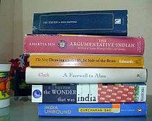
Body matter
.jpg)
The structure of a work—and especially of its body matter—is often described hierarchically.
- Volumes
- A volume is a set of leaves bound together. Thus each work is either a volume, or is divided into volumes.
- Books and parts
- Single-volume works account for most of the non-academic consumer market in books. A single volume may embody either a part of a book or the whole of a book; in some works, parts encompass multiple books, while in others, books may consist of multiple parts.
- Chapters and sections
- A chapter or section may be contained within a part or a book. When both chapters and sections are used in the same work, the sections are more often contained within chapters than the reverse.
- Modules and units
- In some books the chapters are grouped into bigger parts, sometimes called modules. The numbering of the chapters can begin again at the start of every module. In educational books, especially, the chapters are often called units.
The first page of the actual text of a book is the opening page, which often incorporates special design features, such as initials. Arabic numbering starts at this first page. If the text is introduced by a second half title or opens with a part title, the half title or part title counts as page one. As in the front matter, page numbers are omitted on blank pages, and are either omitted or a drop folio is used on the opening page of each part and chapter. On pages containing only illustrations or tables, page numbers are usually omitted, except in the case of a long sequence of figures or tables.[3]
The following are two instructive examples:
- The Lord of the Rings has three parts (either in one volume each, or in a single volume), with each part containing two books, each containing, in turn, multiple chapters.
- The Christian Bible (usually bound as a single volume) comprises two "testaments" (which might more typically be described as "parts", and differ in length by a factor of three or four), each containing dozens of books of varying lengths. In turn, each book (except for the shortest) contains multiple chapters, which are traditionally divided (for purposes of citation) into "verses" each containing roughly one independent clause.
Back matter (end matter)
The back matter, also known as end matter, if used, normally consists of one or more of the following components:
| Name | Voice | Purpose |
|---|---|---|
| Epilogue | The narrator (or a character in the book) | This piece of writing at the end of a work of literature or drama is usually used to bring closure to the work. |
| Extro or Outro | The conclusion to a piece of work; this is considered the opposite of the intro. These terms are more commonly used in music. | |
| Afterword | The author, or some other real person | An afterword generally covers the story of how the book came into being, or of how the idea for the book was developed. |
| Conclusion | Author | |
| Postscript | ||
| Appendix or Addendum | Author | This supplemental addition to a given main work may correct errors, explain inconsistencies or otherwise detail or update the information found in the main work. |
| Glossary | Author | The glossary consists of a set of definitions of words of importance to the work. They are normally alphabetized. The entries may consist of places and characters, which is common for longer works of fiction. |
| Bibliography | Author | This cites other works consulted when writing the body. It is most common in non-fiction books or research papers. |
| Index | Publisher | This list of terms used in the text contains references, often page numbers, to where the terms can be found in the text. Most common in non-fiction books. |
| Colophon | Publisher | This brief description may be located at the end of a book or on the verso of the title page. It describes production notes relevant to the edition and may include a printer's mark or logotype. |
| Postface |
Arabic numbering continues for the back matter.
Front cover, spine, and back cover of the dust-jacket
The front cover is the front of the book, and is marked appropriately by text or graphics in order to identify it as such (namely as the very beginning of the book). The front cover usually contains at least the title or author, with possibly an appropriate illustration.
On the inside of the cover page, extending to the facing page is the front endpaper sometimes referred as FEP. The free half of the end paper is called a flyleaf. Traditionally, in hand-bound books, the endpaper was just a sheet of blank or ornamented paper physically masking and reinforcing the connection between the cover and the body of the book. In modern publishing it can be either plain, as in many text-oriented books, or variously ornamented and illustrated in books such as picture books, other children's literature, some arts and craft and hobbyist books, novelty/gift-market and coffee table books, and graphic novels. These books have an audience and traditions of their own where the graphic design and immediacy is especially important and publishing tradition and formality are less important.
The spine is the vertical edge of a book as it normally stands on a bookshelf. Early books did not have titles on their spines; rather they were shelved flat with their spines inward and titles written with ink along their fore edges. Modern books display their titles on their spines.
In languages with Chinese-influenced writing systems, the title is written top-to-bottom, as is the language in general. In languages written from left to right, the spine text can be pillar (one letter per line), transverse (text line perpendicular to long edge of spine) and along spine. Conventions differ about the direction in which the title along the spine is rotated:
- top-to-bottom (descending):
In texts published or printed in the United States, the United Kingdom, the Commonwealth, Scandinavia and the Netherlands, the spine text, when the book is standing upright, runs from the top to the bottom. This means that when the book is lying flat with the front cover upwards, the title is oriented left-to-right on the spine. This practice is reflected in the industry standards ANSI/NISO Z39.41[4] and ISO 6357.,[5] but ″... lack of agreement in the matter persisted among English-speaking countries as late as the middle of the twentieth century, when books bound in Britain still tended to have their titles read up the spine ...″.[6]
- bottom-to-top (ascending):
In most of continental Europe and Latin America, the spine text, when the book is standing upright, runs from the bottom up, so the title can be read by tilting the head to the left. This allows the reader to read spines of books shelved in alphabetical order in accordance to the usual way left-to-right and top-to-bottom.[7]
The spine usually contains all, or some, of four elements (besides decoration, if any), and in the following order: (1) author, editor, or compiler; (2) title; (3) publisher; and (4) publisher logo.
On the inside of the back cover page, extending from the facing page before it, is the endpaper. Its design matches the front endpaper and, in accordance with it, contains either plain paper or pattern, image etc.
The back cover often contains biographical matter about the author or editor, and quotes from other sources praising the book. It may also contain a summary or description of the book
Binding
Books are classified under two categories according to the physical nature of their binding. The designation hardcover (or hardback) refers to books with stiff covers, as opposed to flexible ones. The binding of a hardcover book usually includes boards (often made of paperboard) covered in cloth, leather, or other materials. The binding is usually sewn to the pages using string stitching.
A less expensive binding method is that used for paperback books (sometimes called softback or softcover). Most paperbacks are bound with paper or light cardboard, though other materials (such as plastic) are used. The covers are flexible and usually bound to the pages using glue (perfect binding). Some small paperback books are sub-classified as pocketbooks. These paperbacks are smaller than usual—small enough to barely fit into a pocket (especially the back pocket of one's trousers). However, this capacity to fit into a pocket diminishes with increasing number of pages and increasing thickness of the book. Such a book may still be designated as a pocketbook.
Other items
Some books such as Bibles or dictionaries may have a thumb index to help find material quickly. Gold leaf may also be applied to the edges of the pages, so that when closed, the side, top, and bottom of the book have a golden color. On some books, a design may be printed on the edges, or marbling or a simple colour applied. Some artist's books go even further, by using fore-edge painting. Pop-up elements and fold-out pages may be used to add dimensions to the page in different ways. Children's books commonly incorporate a wide array of design features built into the fabric of the book. Some books for preschoolers include textured fabric, plastic on other materials. Die-cut techniques in the work of Eric Carle are one example. Clear or reflective surfaces, flaps, textiles and scratch-and-sniff are other possible features.
Page spread

A basic unit in book design is the page spread. The left page (called verso) and right page (called recto) are of the same size and aspect ratio, and are centered on the gutter where they are bound together at the spine.
The design of each individual page, on the other hand, is governed by the canons of page construction.
The possible layout of the sets of letters of the alphabet, or words, on a page is determined by the so-called print space, and is also an element in the design of the page of the book. Clearly, there must be sufficient space, at the spine of the book, if the text is to be visible. On the other hand, the other three margins of the page, which frame the book, are made of the appropriate size for both practical and aesthetic reasons.
Print space
The print space or type area (German Satzspiegel) determines the effective area on the paper of a book, journal or other press work. The print space is limited by the surrounding borders, or in other words the gutters outside the printed area.
The German term comes originally from hot-metal typesetting: above the desktop was a mirror (German: Spiegel) where the typesetter could read the inverted letters.
References
Citations
- Tschichold 1991.
- Hendel 1998.
- University of Chicago Press 2003.
- ANSI/NISO Z39.41-1997 Printed Information on Spines Archived 14 November 2008 at the Wayback Machine
- ISO 6357 Spine titles on books and other publications, 1985.
- Petroski 1999.
- Drösser, Christoph (9 April 2011). "Linksdrehende Bücher". Die Zeit. Retrieved 9 April 2011.
- Van de Graaf 1946.
Sources
- Hendel, Richard (1998). On Book Design. Yale University Press. ISBN 978-0-300-07570-0.CS1 maint: ref=harv (link)
- Petroski, Henry (1999). The Book on the Bookshelf. Alfred A. Knopf. ISBN 0-375-40649-2.CS1 maint: ref=harv (link)
- Tschichold, Jan (1991). The Form of the Book: Essays on the Morality of Good Design. Hartley & Marks. ISBN 978-0-88179-116-7.CS1 maint: ref=harv (link)
- University of Chicago Press (2003), The Chicago Manual of Style (15th ed.), Chicago, Ill.: University of Chicago Press, ISBN 0-226-10403-6CS1 maint: ref=harv (link)
Further reading
- Bruno, Michael H. (2007). Pocket Pal: A Graphic Arts Production Handbook (19th ed.). Memphis, TN: International Paper. ISBN 978-0-9772716-1-0.CS1 maint: ref=harv (link)
- Hochuli, Jost; Kinross, Robin (1996). Designing books: practice and theory. London: Hyphen Press.CS1 maint: ref=harv (link)
- Lee, Marshall (2004). Bookmaking: Editing, Design, Production (3rd ed.). New York: W. W. Norton and Company. ISBN 978-0-393-73018-0.CS1 maint: ref=harv (link)
- Lommen, Mathieu (2012). The Book of Books: 500 Years of Graphic Innovation. Thames & Hudson. ISBN 978-0-500-51591-4.CS1 maint: ref=harv (link)
- Van de Graaf, J. A. (1946). Nieuwe berekening voor de vormgeving [A new calculation for giving form] (in Dutch).CS1 maint: ref=harv (link)
External links
- Dutch Art Nouveau and Art Deco Book Design
- Binding design and paper conservation of antique books, albums and documents
- The Rollo Books by Jacob Abbott: an example of first edition designs
- "Signs – Books – Networks" virtual exhibition of the German Museum of Books and Writing, i.a. with a thematic module on book design
| Page | |||||||||
|---|---|---|---|---|---|---|---|---|---|
| Paragraph | |||||||||
| Character |
| ||||||||
| Classifications |
| ||||||||
| Punctuation | |||||||||
| Typesetting | |||||||||
| Typographic units | |||||||||
| Digital typography | |||||||||
| Related articles | |||||||||
| Related tables |
| ||||||||
| |||||||||