No symbol
The general prohibition sign (official name, according to ISO 7010[1]), also known as a no symbol, no sign, circle-backslash symbol, nay, interdictory circle or universal no, is a red circle with (in some jurisdictions) a red diagonal line through it (running from top left to bottom right), completely enclosing a pictogram to indicate something is not permitted.
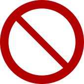
According to the ISO standard (and also under a UK Statutory Instrument), the red area must take up at least 35 percent of the total area of the sign within the outer circumference of the "prohibition sign". Therefore, 35 percent of everything within the outer edge of the "no symbol" must be the symbol. Additionally, for printed signs under the UK rules, the width of a "no symbol" is set at 80 percent the height of the area to which it is printed.
For computer display and printing, the symbols are supported in Unicode by combining elements rather than with individual code points (see below).
Uses
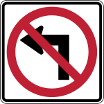
The "prohibition" symbol is used on traffic signs, so that drivers can interpret traffic laws quickly while driving. For example:


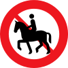
Sometimes the symbol is used to warn drivers who are not driving motorized vehicles of dangers or prohibitions:


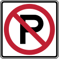
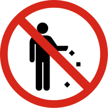
By analogy, the sign is used in public places to refer to prohibited actions not having to do with traffic:
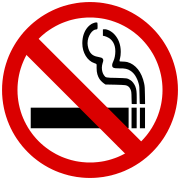


It is also used on packages sent through the mail and sealed boxes of merchandise that are sold in stores. Using a graphical symbol is useful when the item must be handled by people who may not all understand the same language. For example:
- Breakable; do not drop
- Keep away from magnetic fields
In product documentation, this may be accompanied by drawings of the product being threatened by the prohibited items: for instance, a cartoon of a floppy disk being menaced by horseshoe magnets.
It is also used on clothing, linens, and other household products to indicate the care, treatment or cleaning of the item. For example:
- Do not iron
Also, many companies use the "prohibition sign" when describing the services they offer, e.g. an insect deterrent spray brand symbol showing the "prohibition sign" over a mosquito. The Ghostbusters logo is a fictional example of this, although it uses a mirror image of the no symbol instead of the ISO 3864-1 version.
International standards
While the "prohibition sign" has been so widely used in advertising and promotions that now many variations of the design (for example, flipped left to right or varied in hue) are recognized by the public and considered acceptable, it is still governed by local and international standards. The standard definition of the no symbol comes from the International Organization for Standardization.
In 2002, ISO 3864-1 was published (a revision of a standard first published in 1984). The introduction includes language on the need for using as few words as possible to convey information.
ISO 3864-1 sets the rules for the color and shape of safety signage, as well regulating the incorporation of text according to viewing distance and sign size. The range of color and shape defined in this standard for the "prohibition symbol" or "no symbol" is defined as "a prohibition surround shape (red circular band with a red slash going from the upper left to the lower right) over the top of a black graphical symbol."
Since the standard is not published freely and many examples seen in public diverge from the standard, many symbols and public signs using it have not actually been based on the official standard, but instead on inexact copies or interpretations of signs or symbols seen by each graphic artist. This has led to wide variations in color and dimensions. The most common variations seen are brighter reds than specified in the standard and either a much thinner width for the line and slash, or about the right dimensions but using the same width for the slash as the circle (the standard specifies a width that is 80% as wide as the circle). For example, compare Image:No smoking symbol.png (a non-compliant representation) with Image:ProhibitionSign.svg (a representation drawn using the ISO standard).
Variants
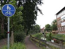
A blue filled circle with an illustration or legend means that a lane is restricted to a particular class of users as shown (buses, cyclists, pedestrians, for example) and no other traffic may use it. In contrast, a blue filled circle without a diagonal line through it is used as a Mandatory Action Symbol, indicating that the activity represented inside the circle is mandatory and must be executed.[2]
Circles with red borders and no oblique line are used under the Vienna Convention on Road Signs and Signals to indicate "No entry to vehicles with the following characteristics" (often given on a plate beneath) such as height, width, mass or speed. Per the European Agreement on the Vienna Convention, an oblique bar may not be used for any sign other than signs indicating no turning. An alternative use for red bordered circles is as a Mandatory Action Symbol type B.[3]
In many jurisdictions, (such as Germany) 'no entry' is indicated by a solid red disc with white horizontal bar.
Unicode
The Unicode code point for the prohibition sign is U+20E0 ⃠ COMBINING ENCLOSING CIRCLE BACKSLASH ( ⃠ ). It is a combining character, which means that it appears on top of the character immediately before it. Thus, for example, putting W ⃠ will display the letter W inside the prohibition sign: W ⃠ (if and only if the user's system supports it).
There are also two prohibition sign emojis, located at U+26D4 ⛔ NO ENTRY and U+1F6AB 🚫 NO ENTRY SIGN, which do not combine with anything.[4]
Other
It also appears in the Webdings and Wingdings 2 fonts, but these are not standards compliant and will not display on non-Microsoft systems.[5]
References
- "ISO Symbol P001: General prohibition sign". www.iso.org. Retrieved 2019-03-17.
- "ISO Online Browsing platform". ISO. ISO. Retrieved 2014-07-30.
- "Vienna Convention on Road Signs and Signals" (PDF). United Nations Economic Commission for Europe. UNECE. Retrieved 2016-08-19.
- https://www.unicode.org/charts/PDF/U1F680.pdf
- "Character sets: Webdings character set and equivalent Unicode characters". alanwood.net.
Webdings font should not be used in Web pages. Specifying Webdings font is contrary to the published specifications, has never been a documented feature of HTML and is not reliable.
- Official ISO template for prohibition sign (but not a true circle, so not ideal for vector usage)
- UK Highway Code - Signs & markings
- International Organization for Standardization
External links
- UK legislation regarding health and safety signs, The Health and Safety (Safety Signs and Signals) Regulations 1996 (SI 341)
- UK legislation regarding road signs
- Working drafts for UK road signage