Lightness
In colorimetry and color theory, lightness, also known as value or tone, is a representation of variation in the perception of a color or color space's brightness. It is one of the color appearance parameters of any color appearance model.
Various color models have an explicit term for this property. The Munsell color model uses the term value, while the HSL color model, HCL color space and Lab color space use the term lightness. The HSV model uses the term value a little differently: a color with a low value is nearly black, but one with a high value is the pure, fully saturated color.
In subtractive color (i.e. paints) value changes can be achieved by adding black or white to the color. However, this also reduces saturation. Chiaroscuro and Tenebrism both take advantage of dramatic contrasts of value to heighten drama in art. Artists may also employ shading, subtle manipulation of value.
Lightness and human perception
While HSL, HSV, and related spaces serve well enough to, for instance, choose a single color, they ignore much of the complexity of color appearance. Essentially, they trade off perceptual relevance for computation speed, from a time in computing history (high-end 1970s graphics workstations, or mid-1990s consumer desktops) when more sophisticated models would have been too computationally expensive.[upper-alpha 1]
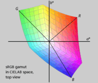
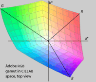
HSL and HSV are simple transformations of the RGB color model which preserve symmetries in the RGB cube unrelated to human perception, such that its R, G, and B corners are equidistant from the neutral axis, and equally spaced around it. If we plot the RGB gamut in a more perceptually uniform space, such as CIELAB, it becomes immediately clear that the red, green, and blue primaries do not have the same lightness or chroma, or evenly spaced hues. Furthermore, different RGB displays use different primaries, and so have different gamuts. Because HSL and HSV are defined purely with reference to some RGB space, they are not absolute color spaces: to specify a color precisely requires reporting not only HSL or HSV values, but also the characteristics of the RGB space they are based on, including the gamma correction in use.
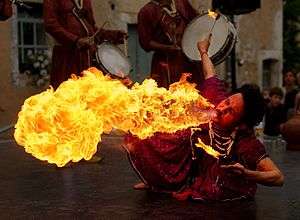
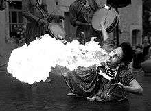
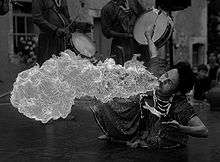
If we take an image and extract the hue, saturation, and lightness or value components, and then compare these to the components of the same name as defined by color scientists, we can quickly see the difference, perceptually. For example, examine the following images of a fire breather (fig. 1). The original is in the sRGB color space. CIELAB L* is a CIE-defined achromatic lightness quantity (dependent solely on the perceptually achromatic luminance Y, but not the mixed-chromatic components X or Z, of the CIE XYZ color space from which the sRGB color space itself is derived), and it is plain that this appears similar in perceptual lightness to the original color image. Luma is roughly similar, but differs somewhat at high chroma, where it deviates most from depending solely on the true achromatic luminance (Y, or equivalently L*) and is influenced by the colorimetric chromaticity (x,y, or equivalently, a*,b* of CIELAB). HSL L and HSV V, by contrast, diverge substantially from perceptual lightness.
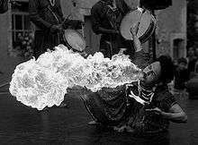
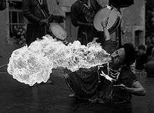
_I.jpg)
Relationship to value and relative luminance
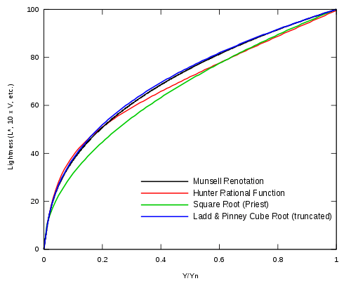
The Munsell value has long been used as a perceptually uniform lightness scale. A question of interest is the relationship between the Munsell value scale and the relative luminance. Aware of the Weber–Fechner law, Munsell remarked "Should we use a logarithmic curve or curve of squares?"[1] Neither option turned out to be quite correct; scientists eventually converged on a roughly cube-root curve, consistent with the Stevens' power law for brightness perception, reflecting the fact that lightness is proportional to the number of nerve impulses per nerve fiber per unit time.[2] The remainder of this section is a chronology of lightness approximations, leading to CIE LAB.
Note. – Munsell's V runs from 0 to 10, while Y typically runs from 0 to 100 (often interpreted as a percentage). Typically, the relative luminance is normalized so that the "reference white" (say, magnesium oxide) has a tristimulus value of Y = 100. Since the reflectance of magnesium oxide (MgO) relative to the perfect reflecting diffuser is 97.5%, V = 10 corresponds to Y = 100/97.5% ≈ 102.6 if MgO is used as the reference.[3]
- 1920
- Priest et al. provide a basic estimate of the Munsell value (with Y running from 0 to 1 in this case):[4]

- 1933
- Munsell, Sloan, and Godlove launch a study on the Munsell neutral value scale, considering several proposals relating the relative luminance to the Munsell value, and suggest:[5][6]

- 1943
- Newhall, Nickerson, and Judd prepare a report for the Optical Society of America. They suggest a quintic parabola (relating the reflectance in terms of the value):[7]

- 1943
- Using Table II of the O.S.A. report, Moon and Spencer express the value in terms of the relative luminance:[8]

- 1944
- Saunderson and Milner introduce a subtractive constant in the previous expression, for a better fit to the Munsell value.[9] Later, Jameson and Hurvich claim that this corrects for simultaneous contrast effects.[10][11]

- 1955
- Ladd and Pinney of Eastman Kodak are interested in the Munsell value as a perceptually uniform lightness scale for use in television. After considering one logarithmic and five power-law functions (per Stevens' power law), they relate value to reflectance by raising the reflectance to the power of 0.352:[12]
- Realizing this is quite close to the cube root, they simplify it to:


- 1958
- Glasser et al. define the lightness as ten times the Munsell value (so that the lightness ranges from 0 to 100):[13]

- 1964
- Wyszecki simplifies this to:[14]
- This formula approximates the Munsell value function for 1% < Y < 98% (it is not applicable for Y < 1%) and is used for the CIE 1964 color space.

- 1976
- CIE LAB uses the following formula:
- where Yn is the CIE XYZ Y tristimulus value of the reference white point (the subscript n suggests "normalized") and is subject to the restriction Y/Yn > 0.01. Pauli removes this restriction by computing a linear extrapolation which maps Y/Yn = 0 to L* = 0 and is tangent to the formula above at the point at which the linear extension takes effect. First, the transition point is determined to be Y/Yn = (6/29)^3 ≈ 0.008,856, then the slope of (29/3)^3 ≈ 903.3 is computed. This gives the two-part function:[15]
- The lightness is then:


At first glance, you might approximate the lightness function by a cube root, an approximation that is found in much of the technical literature. However, the linear segment near black is significant, and so the 116 and 16 coefficients. The best-fit pure power function has an exponent of about 0.42, far from 1/3.[16]
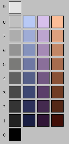
An approximately 18% grey card, having an exact reflectance of , has a lightness value of 50. It is called "mid grey" because its lightness is midway between black and white.

Other psychological effects
This subjective perception of luminance in a non-linear fashion is one thing that makes gamma compression of images worthwhile. Beside this phenomenon there are other effects involving perception of lightness. Chromacity can affect perceived lightness as described by the Helmholtz–Kohlrausch effect. Though the CIE LAB space and relatives do not account for this effect on lightness, it may be implied in the Munsell color model. Light levels may also affect perceived chromacity, as with the Purkinje effect.
See also
Notes
- ↑ Most of the disadvantages below are listed in Poynton (1997), though as mere statements, without examples.
References
- ↑ Kuehni, Rolf G. (February 2002). "The early development of the Munsell system". Color Research & Application. 27 (1): 20–27. doi:10.1002/col.10002.
- ↑ Hunt, Robert W. G. (May 18, 1957). "Light Energy and Brightness Sensation". Nature. 179 (4568): 1026. doi:10.1038/1791026a0.
- ↑ Valberg, Arne (2006). Light Vision Color. John Wiley and Sons. p. 200. ISBN 0470849029.
- ↑ Priest, Irwin G.; Gibson, K.S.; McNicholas, H.J. (September 1920). "An examination of the Munsell color system. I: Spectral and total reflection and the Munsell scale of Value". Technical paper 167 (3). United States Bureau of Standards: 27.
- ↑ Munsell, A.E.O.; Sloan, L.L.; Godlove, I.H. (November 1933). "Neutral value scales. I. Munsell neutral value scale". JOSA. 23 (11): 394–411. doi:10.1364/JOSA.23.000394. Note: This paper contains a historical survey stretching to 1760.
- ↑ Munsell, A.E.O.; Sloan, L.L.; Godlove, I.H. (December 1933). "Neutral value scales. II. A comparison of results and equations describing value scales". JOSA. 23 (12): 419–425. doi:10.1364/JOSA.23.000419.
- ↑ Newhall, Sidney M.; Nickerson, Dorothy; Judd, Deane B (May 1943). "Final report of the O.S.A. subcommittee on the spacing of the Munsell colors". Journal of the Optical Society of America. 33 (7): 385–418. doi:10.1364/JOSA.33.000385.
- ↑ Moon, Parry; Spencer, Domina Eberle (May 1943). "Metric based on the composite color stimulus". JOSA. 33 (5): 270–277. doi:10.1364/JOSA.33.000270.
- ↑ Saunderson, Jason L.; Milner, B.I. (March 1944). "Further study of ω space". JOSA. 34 (3): 167–173. doi:10.1364/JOSA.34.000167.
- ↑ Hurvich, Leo M.; Jameson, Dorothea (November 1957). "An Opponent-Process Theory of Color Vision". Psychological Review. 64 (6): 384–404. doi:10.1037/h0041403. PMID 13505974.
- ↑ Jameson, Dorothea; Leo M. Hurvich (May 1964). "Theory of brightness and color contrast in human vision". Vision Research. 4 (1–2): 135–154. doi:10.1016/0042-6989(64)90037-9. PMID 5888593.
- ↑ Ladd, J.H.; Pinney, J.E. (September 1955). "Empirical relationships with the Munsell Value scale". Proceedings of the Institute of Radio Engineers. 43 (9): 1137. doi:10.1109/JRPROC.1955.277892.
- ↑ Glasser, L.G.; A.H. McKinney; C.D. Reilly; P.D. Schnelle (October 1958). "Cube-root color coordinate system". JOSA. 48 (10): 736–740. doi:10.1364/JOSA.48.000736.
- ↑ Wyszecki, Günther (November 1963). "Proposal for a New Color-Difference Formula". JOSA. 53 (11): 1318–1319. doi:10.1364/JOSA.53.001318. Note: The asterisks are not used in the paper.
- ↑ Pauli, Hartmut K.A. (1976). "Proposed extension of the CIE recommendation on "Uniform color spaces, color spaces, and color-difference equations, and metric color terms"". JOSA. 66 (8): 866–867. doi:10.1364/JOSA.66.000866.
- ↑ Poynton, Charles; Funt, Brian (Feb 2014). "Perceptual uniformity in digital image representation and display". Color Research and Application. 39 (1): 6–15. doi:10.1002/col.21768.
External links
![]()
Color topics | ||||||||
|---|---|---|---|---|---|---|---|---|
| Color science |
|  | ||||||
| Color philosophy |
| |||||||
| Color terms |
| |||||||
| Color organizations | ||||||||
| Lists | ||||||||
| Related | ||||||||
| ||||||||