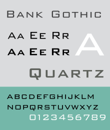
Bank Gothic
 | |
| Category | Sans-serif |
|---|---|
| Classification | Geometric |
| Designer(s) | Morris Fuller Benton |
| Foundry | American Type Founders |
| Re-issuing foundries | Bitstream, FontHaus, Linotype |
Bank Gothic is a rectilinear geometric sans-serif typeface designed by Morris Fuller Benton for the American Type Founders in 1930. The typeface is an exploration of geometric forms, and is contemporary with the rectilinear slab serif typeface City by Georg Trump. The typeface also bears comparison with late-nineteenth-century engraving faces.
In the 1980s, Mergenthaler Linotype Company created a digital version that includes small caps characters to map onto the lowercase keys of the keyboard. At the time, Linotype only digitized the medium weight of the family, and no PostScript version has been made.
Cuts
Bank Gothic Pro
In 2010 FontHaus released an updated revival of the original Bank Gothic complete with a lowercase, a complement of small caps and a new suite of punctuation glyphs. The family consists of Light, Medium and Bold weights in both a regular and a condensed style. The new lowercase characters did not exist with the original release and were modeled after many similar Morris Fuller Benton designs released by The American Type Founders Company in the 1930s. Bank Gothic is a registered trademark of Grosse Pointe Group LLC, and is licensed exclusively through DsgnHaus, Inc. operating as FontHaus.
DeLuxe Gothic
In 2003 letterforms artist Michael Doret began work on DeLuxe Gothic—a derivative version of American Type Founder's Bank Gothic. Unlike the 1930s original, Doret’s font contains lowercase characters. The DeLuxe Gothic Family was released in OpenType format in 2010 by Alphabet Soup Type Founders with both regular and condensed styles as well as traditional shortcaps. DeLuxe Gothic was the name originally used by the Intertype Corporation for its version of Morris Fuller Benton's Bank Gothic. Prior to its September 8, 2010 release, it was known as Bank Gothic AS.
Morris Sans
In 2005, Linotype editor Dan Reynolds began work on the Morris Sans family, a revised and extended Bank Gothic. The revised design includes lowercase letters, and redesigned letters %, ‰, Ø, §, ƒ, Ç. A base is also added to the numeral 1.
The font family comes in 3 weights and 2 widths. OpenType features include small caps, old style figures, proportional lining figures. It supporting ISO Adobe 2, Adobe CE, Latin extended Character sets.
Squarish Sans CT
Squarish Sans is a typeface under development as of September 2014. It was developed specifically to address the need of open-source software having access to this popular design, and is thus under the terms of the Open Font License. It was first publicly distributed, in a preliminary but very usable state, with Aleph One 1.0 in 2011.[1] It follows DeLuxe Gothic and Morris Sans in containing true lowercase characters, as well as small caps. While other cuts usually include only Latin and maybe Cyrillic characters, Squarish Sans offers Greek, Hebrew, and a large number of non-alphabetic (e.g. mathematical) symbols as well.[2]
Popular use
TV series
Bank Gothic is often used for opening credits in TV series, such as 24, Battlestar Galactica, Drake & Josh, The King of Queens, ER, NCIS, Robot Wars, The Event, Falling Skies, Terra Nova, Crisis, and Agents of S.H.I.E.L.D..
The Amazing Race replaced Microgramma with Bank Gothic as the main font used in the show, although Microgramma is still used on the logo and clues. The sitcom Just Shoot Me! also used the font for its title logo and credit type from the start of the third season until midway through its fifth season. The Nick GaS logo has the letters "G" and "S" set in Bank Gothic. It was also used as the font for Series 1 and 2 of the UK Channel 4 game show The Crystal Maze.
Bank Gothic is also used in the motifs of graphical user interfaces on several shows (often referred to in art direction terms as "playback"), including Stargate SG-1, Stargate Atlantis, Stargate Universe and Dark Matter.
Telecasts of the XFL used Bank Gothic as the base font for all on-screen graphics.
Movies
Bank Gothic has been used heavily in posters and advertising for movies in the 2000s, particularly action movies; it has been used for either the opening credits, closing credits or the promotional materials of The Day After Tomorrow (2004), Hancock (2008), Jumper (2008), Eagle Eye (2008), Knowing (2009), The International (2009), X-Men Origins: Wolverine (2009), A Perfect Getaway (2009), Moon (2009), Clash of the Titans (2010), Despicable Me (2010), Seeking Justice (2011), Battle: Los Angeles (2011), Real Steel (2011), Cars 2 (2011) The Hunger Games (2012), Wrath of the Titans (2012), Despicable Me 2 (2013), and Edge of Tomorrow (2014).
Bank Gothic was also used in the movie RoboCop (1987) when the view transitions to RoboCop's point of view.
Video games
It has also been used in these video games: GoldenEye 007, Descent: FreeSpace, FreeSpace 2, StarCraft, Hitman: Contracts, Call of Duty 4: Modern Warfare, Call of Duty: Modern Warfare 2, Call of Duty: Ghosts, and Call of Duty: Black Ops. The typeface was used extensively in packaging and advertising of Bungie's Marathon series, and entire manuals were laid out in Bank Gothic. A derivative of Bank Gothic is used as the official Nintendo GameCube logo typeface.
Some of the games from the Grand Theft Auto series, most notably Grand Theft Auto: San Andreas and Grand Theft Auto IV also make use of the font for packaging, manuals and various game interface elements.
Television news
The typeface is a popular font for the use of digital on-screen graphics for local and national television news, seeing heavy use by the stations owned by Hearst Television since the 1990s, along with CBS News. Between 1998 and 2001, it was also used for a time on Granada Television's regional news programme, Granada Tonight (now called ITV News Granada Reports).
YouTube
The rapper DeStorm Power often uses Bank Gothic for showing the lyrics to his raps. The professional gaming organization SoaR Gaming uses it as its text logo and in its intro.
Computers and electronics
The Das Keyboard Professional uses Bank Gothic for its keycap font. Also, Quantum Accessories uses Bank Gothic for its logo.
Mac OS X installation
Mac OS X contains a Bank Gothic release in Light and Medium weights. Intended for use by a limited number of applications such as iWork and iDVD, it is not made available to all programs as with other fonts. It may be installed for general use by copying the font files out of their location with other application support files, and installing them in the same way as third-party fonts.[3] Apple's reasons for hiding this font have not been made public, but licensing reasons have been suggested as the cause.
References
- ↑ "Aleph One 1.0 release notes". Retrieved 2014-09-19.
- ↑ "Christ Trek Fonts". Retrieved 2014-09-17.
- ↑ Tomalty, Fletcher. "Hidden fonts on Mac OS X". Retrieved 4 October 2014.
- Blackwell, Lewis. 20th Century Type. Yale University Press: 2004. ISBN 0-300-10073-6.
- Fiedl, Frederich, Nicholas Ott and Bernard Stein. Typography: An Encyclopedic Survey of Type Design and Techniques Through History. Black Dog & Leventhal: 1998. ISBN 1-57912-023-7.
- Jaspert, W. Pincus, W. Turner Berry and A.F. Johnson. The Encyclopedia of Type Faces. Blandford Press Lts.: 1953, 1983. ISBN 0-7137-1347-X.