Flat design
Flat design is a minimalist user interface (UI) design genre, or design language, commonly used in graphical user interfaces (such as web applications and mobile apps), especially in such graphical materials as posters, arts, guide documents, publishing products.
Definition and purpose
Flat design is a style of interface design emphasizing minimum use of stylistic elements that give the illusion of three dimensions (such as the use of drop shadows, gradients or textures)[1] and is focused on a minimalist use of simple elements, typography and flat colors.[2] Designers may prefer flat design because it allows interface designs to be more streamlined and efficient. It is easier to quickly convey information while still looking visually appealing and approachable.[3] Additionally, it makes it easier to design an interface that is responsive to changes in browser size across different devices. With minimal design elements, websites are able to load faster and resize easily, and still look sharp on high-definition screens.[1] As a design approach, it is often contrasted to skeuomorphism[4] and rich design,[1] although flat design can use skeuomorphs just as much as a realistically designed UI.
History
Flat design is primarily influenced by the International Typographic Style (also known as Swiss Style), Text User Interface, Modernism, and the styles emerging from Bauhaus.[1][5][6][7] The International Typographic style is often considered the most substantial influence on flat design, and its emergence and popularization during the 1950s and 1960s is regarded as the starting point of flat design, although it would not make an appearance in the digital world for some time thereafter.[8]
Flat design was initially introduced by Microsoft with its Metro design and later on they used an alternative flat design. In 2002, Microsoft released Windows Media Center, and in 2006, the Zune MP3 player, both of which contained elements of flat design. The design of the Zune was clean and simple, with a focus on large lowercase typography, silhouette-style logos, and monochromatic font colors.[8] Microsoft continued this style of design with the 2010 release of Windows Phone 7, which built on the flat design elements introduced with the Zune. The design was dominated by large and bright shapes accompanied by sans-serif typography, flat images, and a menu with a grid-like pattern. Because of the success of the Windows Phone 7 design, Microsoft released the Windows 8 operating system based on Metro, with the same flat design elements. Use of bold colours, simple typography, long shadow and ghost buttons are some of the crucial elements of flat web design. Again, the design is dominated by grid shapes, sharp edges, bright colours, and clean typography. Microsoft has since moved its current products to the Metro design language, including the Xbox 360, Microsoft Office, and the Microsoft website.[1]
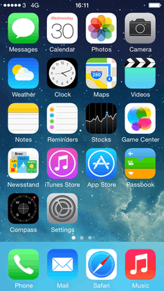
In 2013, Apple released iOS 7 featuring flat UI design elements,[9] moving away from skeuomorphic design.[8]
In 2014, Google released Material Design to developers to incorporate into their design language for Android and Chrome OS apps. Material Design has been called flat design,[10] although it includes some elements of skeuomorphism like drop shadows.[11][12]
Also in 2014, Apple also updated their macOS with a flat UI design that was similar to their iOS counterpart on OS X Yosemite.
In late 2014, Flat 2.0 made use of subtle gradients and shadows to serve a better user experience to end users. Designers adapted Flat 2.0 as it was a challenge to present interactions with core flat design previously.
In 2016, most of the major mobile operating systems had adapted flat UI designs, including BlackBerry 10 OS, Samsung Electronics/Linux Foundation Tizen OS, KDE Plasma 5, and most Android OEMs such as Samsung Experience, LG UX, and Huawei EMUI.

Criticism
Flat design has been criticized for making user interfaces unintiuitive and less usable. By making all design elements (menus, buttons, links, etc.) flat, distinguishing what function an element serves may become more difficult, for example, determining whether an element is a button or an indicator.[13] Research has shown that flat design is more popular with young adults than older adults. Research also showed that, while young people seem faster at navigating flat designs, they also have trouble with understanding the user interface.[14] In 2013 Jakob Nielsen, an expert in user interface design and usability, dubbed flat design as a "threat to tablet usability". Nielsen also proposed an alternative, namely a middle-ground between skeuomorphism and flat design.[15] Neilsen group conducted research in 2017 that showed that use of interfaces using flat design were 22% slower on average.[16]
References
- 1 2 3 4 5 Turner, Amber Leigh (March 19, 2014). "The history of flat design: How efficiency and minimalism turned the digital world flat". The Next Web. Retrieved April 11, 2014.
- ↑ Carrie Cousins (May 28, 2013). "Flat design principles". designmodo.com.
- ↑ Clum, Luke (May 13, 2013). "A Look at Flat Design and Why It's Significant". UX Magazine. Retrieved April 11, 2014.
- ↑ Yair Grinberg (September 11, 2013). "iOS 7, Windows 8, and flat design: In defense of skeuomorphism". VentureBeat. Retrieved April 13, 2014.
- ↑ Diogo Terror (July 17, 2009). "Lessons From Swiss Style Graphic Design". Smashing magazine. Retrieved March 28, 2014.
- ↑ "A brief history of flat design". Tech Samurais. July 31, 2013.
- ↑ Xavier Bertels (March 5, 2014). "The History of Flat Design". Xavier Bertels. Retrieved December 23, 2014.
- 1 2 3 Taimur Asghar (July 9, 2014). "The True History of Flat Design". Web Design Ai.
- ↑ Verve (August 17, 2015). "The History of Flat Design". Infographics.
- ↑ Summers, Nick (2014-06-26). "9 Principles Google Created for its 'Material Design' UI Refresh". Retrieved 2016-07-04.
- ↑ "Flat Design vs. Material Design: How Are They Different? - Designmodo". 2015-04-10. Retrieved 2016-07-04.
- ↑ "Flat Design vs. Material Design: What Makes Them Different? | Creative blog by Adobe". Adobe Dreamweaver Team Blog. Retrieved 2016-07-04.
- ↑ "Why the Flat Design Trend is Hurting Usability". Vandelay Design. 2015-04-07. Retrieved 2017-07-06.
- ↑ "The Problem With Flat Design, According To A UX Expert". Co.Design. 2016-03-23. Retrieved 2017-07-06.
- ↑ "Tablet Usability: Findings from User Research". www.nngroup.com. Retrieved 2017-07-06.
- ↑ "Flat UI Elements Attract Less Attention and Cause Uncertainty". www.nngroup.com. Retrieved 2018-05-08.