Conder plot
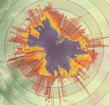
Example of a Conder Plot used for coordination of a satellite Earth station with co-frequency microwave fixed links
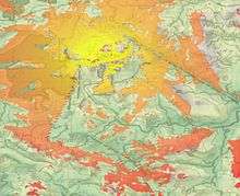
Example of a Conder Plot overlaid against a map. Depicts radio coverage (with varying signal strength) provided by a hilltop base station
A Conder plot is a two-dimensional visualisation of radiofrequency power flux density and/or interference with reference to geographical location. It can range from monochromatic coverage plots used for broadcast or mobile radiocommunications planning to multi-coloured diagrams representing varying levels of power flux density at a given radio frequency. It may or may not be projected over a map or satellite image for geographic context, and may otherwise be colloquially referred to as a ‘splat diagram'.
References
This article is issued from
Wikipedia.
The text is licensed under Creative Commons - Attribution - Sharealike.
Additional terms may apply for the media files.