Choropleth map
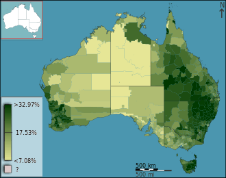
A choropleth map (from Greek χῶρος ("area/region") + πλῆθος ("multitude")) is a thematic map in which areas are shaded or patterned in proportion to the measurement of the statistical variable being displayed on the map, such as population density or per-capita income.
Choropleth maps provide an easy way to visualize how a measurement varies across a geographic area or show the level of variability within a region. A heat map is similar but does not use geographic boundaries.
Overview
The earliest known choropleth map was created in 1826 by Baron Pierre Charles Dupin.[1] They were first called "cartes teintées" (coloured map in French). The term "choroplethe map" was introduced in 1938 by the geographer John Kirtland Wright in "Problems in Population Mapping".[2]
Choropleth maps are based on statistical data aggregated over previously defined regions (e.g., counties), in contrast to area-class and isarithmic maps, in which region boundaries are defined by data patterns. Thus, where defined regions are important to a discussion, as in an election map divided by electoral regions, choropleths are preferred.
Where real-world patterns may not conform to the regions discussed, issues such as the ecological fallacy and the modifiable areal unit problem (MAUP) can lead to major misinterpretations, and other techniques are preferable.[3] Similarly, the size and specificity of the displayed regions depend on the variable being represented. While the use of smaller and more specific regions can decrease the risk of ecological fallacy and MAUP, it can cause the map to appear to be more complicated. Although representing specific data in large regions can be misleading, it can make the map clearer and easier to interpret and remember.[4] The choice of regions will ultimately depend on the map's intended audience and purpose.
The dasymetric technique can be thought of as a compromise approach in many situations. Broadly speaking, choropleths represent two types of data: spatially extensive or spatially intensive.
- Spatially extensive data are things like populations. The population of the UK might be 65 million, but it would not be accurate to arbitrarily cut the UK into two halves of equal area and say that the population of each half of the UK is 32.5 million.
- Spatially intensive data are things like rates, densities and proportions, which can be thought of conceptually as field data that is averaged over an area. Though the UK's 60 million inhabitants occupy an area of about 240,000 km2, and the population density is therefore about 250/km2, arbitrary halves of equal area would not both have the same population density.
Normalization
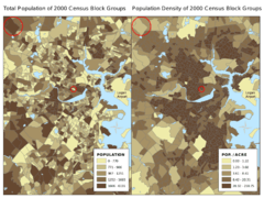
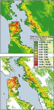
Another common error in choropleths is the use of raw data values to represent magnitude rather than normalized values to produce a map of densities.[5] This is problematic because the eye naturally integrates over areas of the same color, giving undue prominence to larger polygons of moderate magnitude and minimizing the significance of smaller polygons with high magnitudes. The problem with using data in total counts arises when the polygons are not all the same size (in area or total population), as in the figure at right. Because a single color, representing a single value, is spread over the entire area of the district, large areas will be more dominant in the visual hierarchy than they should be, and are commonly misinterpreted as having larger values than smaller districts with the same color. To solve this issue, one can normalize the variable by dividing it by the total area, thus deriving density, which is a field. Another solution is to represent total amounts using a proportional symbol map.
Classification
- Equal intervals
- Equal frequency
- Geometric progressions
- Standard deviation
- Jenks natural breaks optimization
- Head/tail Breaks
Color progression
When mapping quantitative data, a specific color progression should be used to depict the data properly. There are several different types of color progressions used by cartographers. The following are described in detail in Robinson et al. (1995)[6]
Single-hue progressions fade from a dark shade of the chosen color to a very light or white shade of relatively the same hue. This is a common method used to map magnitude. The darkest hue represents the greatest number in the data set and the lightest shade representing the least number.
Two variables may be shown through the use of two overprinted single color scales. The hues typically used are from red to white for the first data set and blue to white for the second, they are then overprinted to produce varying hues. These type of maps show the magnitude of the values in relation to each other.
Bi-polar progressions are normally used with two opposite hues to show a change in value from negative to positive or on either side of some either central tendency, such as the mean of the variable being mapped or other significant value like room temperature. For example, a typical progression when mapping temperatures is from dark blue (for cold) to dark red (for hot) with white in the middle. When one extreme can be considered better than the other (as in this map of life expectancy[7]) then it is common to denote the poor alternative with shades of red, and the good alternative with green.
Complementary hue progressions are a type of bi-polar progression. This can be done with any of the complementary colors and will fade from each of the darker end point hues into a gray shade representing the middle. An example would be using blue and yellow as the two end points.
Blended hue progressions use related hues to blend together the two end point hues. This type of color progression is typically used to show elevation changes. For example, from yellow through orange to brown.
Partial spectral hue progressions are used to map mixtures of two distinct sets of data. This type of hue progression will blend two adjacent opponent hues and show the magnitude of the mixing data classes.
Full spectral progression contains hues from blue through red. This is common on relief maps and modern weather maps. This type of progression is not recommended under other circumstances because certain color connotations can confuse the map user.
Value progression maps are monochromatic. Although any color may be used, the archetype is from black to white with intervening shades of gray that represent magnitude. According to Robinson et al. (1995).[8] this is the best way to portray a magnitude message to the map audience. It is clearly understood by the user and easy to produce in print.
Usability
When using any of these methods, there are two important principles: first is that darker colors are perceived as being higher in magnitude; second is that, while there are millions of color variations, the human eye is limited as to how many colors it can easily distinguish. Generally, five to seven color categories are recommended. The map user should be able to easily identify the implied magnitude of the hue and to match it with the legend.
Additional considerations include color blindness and various reproduction techniques. For example, the red–green bi-polar progression described in the section above is likely to cause problems for dichromats. A related issue is that color scales which rely primarily on hue with insufficient variation in saturation or intensity may be compromised if reproduced in black and white. Conversely, if a map is legible in black and white, then a prospective user's perception of color is irrelevant.
Color can greatly enhance the communication between the cartographer and their audience, but poor color choice can result in a map that is neither effective nor appealing to the map user. Sometimes simpler is better.[9]
See also
| Look up choropleth map in Wiktionary, the free dictionary. |
- Cartograms, which are often colored as choropleths.
- Heat map
- MacChoro
Footnotes
- ↑ Michael Friendly (2008). "Milestones in the history of thematic cartography, statistical graphics, and data visualization".
- ↑ John Kirtland Wright (1938). "Problems in Population Mapping" in "Notes on statistical mapping, with special reference to the mapping of population phenomena".
- ↑ T. Slocum, R. McMaster, F. Kessler, H. Howard (2009). Thematic Cartography and Geovisualization, Third Edn, pages 85–86. Pearson Prentice Hall: Upper Saddle River, NJ.
- ↑ Rittschof, Kent (1998). "Learning and Remembering from Thematic Maps of Familiar Regions". Educational Technology Research and Development. 46: 19–38.
- ↑ Mark Monmonier (1991). How to Lie with Maps. pp. 22–23. University of Chicago Press
- ↑ Robinson, A.H., Morrison, J.L., Muehrke, P.C., Kimmerling, A.J. & Guptill, S.C. (1995) Elements of Cartography. (6th Edition), New York: Wiley.
- ↑ Patricia Cohen (9 August 2011). "What Digital Maps Can Tell Us About the American Way". New York Times.
- ↑ Robinson et al. (1995), op. cit.
- ↑ Light; et al. (2004). "The End of the Rainbow? Color Schemes for Improved Data Graphics". Eos. 85 (40): 385–91. doi:10.1029/2004EO400002.
- ↑ "Western Geographic Science Center". Retrieved 13 November 2015.
References
- Dent, Borden; Torguson, Jeffrey; Hodler, Thomas. Cartography Thematic Map Design. McGraw-Hill. ISBN 978-0-072-94382-5.
External links
| Wikimedia Commons has media related to |