Architype van der Leck
 | |
| Category | Sans-serif |
|---|---|
| Classification | Geometric Sans-serif |
| Designer(s) |
Freda Sack David Quay Bart van der Leck |
| Foundry | The Foundry |
| Date created | 1941 |
| Date released | 1997 |
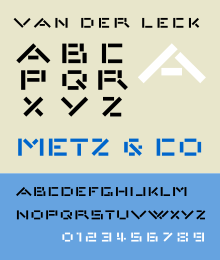
Architype van der Leck is a geometric sans-serif typeface based upon the 1941 typeface designed by Bart van der Leck for the Dutch magazine Flax, a journal of the De Stijl art movement.
The face is geometrically constructed, and based upon an earlier stencil lettering alphabet van der Leck designed in the early 1930s for use in branding and advertising Jo de Leeuw's prestigious Dutch department stores Metz & Co. The face shares structural similarities with Theo van Doesburg's 1919 geometric alphabet, and anticipates later typographic explorations of geometric reductionism of Wim Crouwel's 1967 New Alphabet and early digital faces like Zuzana Licko's faces Lo-Res and Emperor 8. The Architype van der Leck typeface is part of a collection of several revivals of early twentieth century typographic experimentation designed by Freda Sack and David Quay of The Foundry.
See also
- Architype Albers
- Architype Aubette
- Architype Bayer
- Architype Renner
- Architype Schwitters
References
- Blackwell, Lewis. 20th Century Type. Yale University Press: 2004. ISBN 0-300-10073-6.
- Haley, Allen. Type: Hot Designers Make Cool Fonts. Rockport Publishers Inc, Gloucester; 1998. ISBN 1-56496-317-9
- Hoek, Els, Marleen Blokhuis, Ingrid Goovaerts, Natalie Kamphuys, et al. Theo van Doesburg: Oeuvre Catalogus. Centraal Museum: 2000. ISBN 90-6868-255-5.
- Meggs, Philip. B and McKelvey, Roy. Revival of the Fittest: Digital Versions of Classic Typefaces. RC Publications; 2002. ISBN 1-883915-08-2