Sample Horizontal Tab Menu
This is an example of a horizontal tab menu using CSS and the XForms switch and case statements. Both the tab inside the horizontal tab menu and the div inside the case have the same background color giving the appearance of the selected tab popping to the front of the others.
Screen Image
You should see a menu that looks similar to this when running under the FireFox browser:
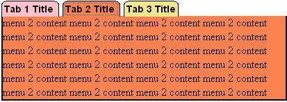
Note that the tab that is selected has the same color of the content.
Link to XForms Application
Sample Program
<?xml version="1.0" encoding="UTF-8"?>
<html xmlns="http://www.w3.org/1999/xhtml" xmlns:ev="http://www.w3.org/2001/xml-events" xmlns:xf="http://www.w3.org/2002/xforms">
    <head>
        <title>XForms Colored Horizontal Tab Menu</title>
        <style>
        @namespace xf url("http://www.w3.org/2002/xforms");
        /* all the attributes of each tab, except the background color */
        body {font-family: Arial, Helvetica, sans-serif;}

        /* instructions for styling the horizontal tabs at the top of the form */
        #horiz-tab-menu {
        padding-bottom: 2px;
        }
        #horiz-tab-menu xf|trigger {
            border-left: gray solid 1px;
            border-top: gray solid 1px;
            border-right: gray solid 1px;
            border-bottom: 0px; /* so the tab blends into the region under the tab */
            font-weight: bold;
            font-size: .9em;
            /* spacing between the tabs */
            margin-right: 9px;
            padding: 3px;
            /* round corners at the top of the tab - does not work on older versions of IE */
            -webkit-border-top-left-radius: 5px;
            -webkit-border-top-right-radius: 5px;
            -moz-border-radius-topleft: 5px;
            -moz-border-radius-topright: 5px;
            border-top-left-radius: 5px;
            border-top-right-radius: 5px;
                    }

        /* properties common to all the swapped views */
        #div-1,#div-2,#div-3 {
             width: 500px;
             padding: 5px;
             border-left: solid gray 1px;
             border-right: solid gray 1px;
             border-bottom: solid gray 1px;
        }
        #tab-1, #div-1  {
            background-color: #DDD; /* light gray */
        }
        #tab-2, #div-2  {
            background-color: lightblue;
        }
        #tab-3, #div-3  {
            background-color: khaki;
        }

        </style>
    </head>
    <body>
        <h2>Using switch and case to simulate a tab-view.</h2>
        <div id="horiz-tab-menu">
            <xf:trigger id="tab-1" appearance="minimal">
                <xf:label>Tab 1 Title</xf:label>
                <xf:toggle case="case-1" ev:event="DOMActivate"/>
            </xf:trigger>
            <xf:trigger id="tab-2" appearance="minimal">
                <xf:label>Tab 2 Title</xf:label>
                <xf:toggle case="case-2" ev:event="DOMActivate"/>
            </xf:trigger>
            <xf:trigger id="tab-3" appearance="minimal">
                <xf:label>Tab 3 Title</xf:label>
                <xf:toggle case="case-3" ev:event="DOMActivate"/>
            </xf:trigger>
        </div>
        <xf:switch>
            <xf:case id="case-1" selected="true">
                <div id="div-1">
                    This view is only displayed when tab 1 is selected.<br/>
                    This view is only displayed when tab 1 is selected.<br/>
                    This view is only displayed when tab 1 is selected.<br/>
                    This view is only displayed when tab 1 is selected.<br/>
                </div>
            </xf:case>
            <xf:case id="case-2">
                <div id="div-2">
                    This view is only displayed when tab 2 is selected.<br/>
                    This view is only displayed when tab 2 is selected.<br/>
                    This view is only displayed when tab 2 is selected.<br/>
                    This view is only displayed when tab 2 is selected.<br/>
                </div>
            </xf:case>
            <xf:case id="case-3">
                <div id="div-3">
                    This view is only displayed when tab 3 is selected.<br/>
                    This view is only displayed when tab 3 is selected.<br/>
                    This view is only displayed when tab 3 is selected.<br/>
                    This view is only displayed when tab 3 is selected.<br/>
                </div>
            </xf:case>
        </xf:switch>
        <p>This XForms example shows how the switch and case statements can be
        used to simulate a multi-part form with a row of horizontal tabs at
        the top of the form.  Background colors are used to show which
        tab is the currently selected tab.</p>
    </body>
</html>
Testing
Note that the text under the selected tab changes when you click on the tab.
Discussion
One of the best ways to reduce your JavaScript is to start converting your menus to use XForms.
This example can be modified to also conditionally display tabs based on state variables in the model.
This example should be made consistent with the XUL tabbox element. If XForms used all the XUL elements this entire example would be much easier to be a standard.
Hopefully XUL and XForms will be consistent in the future.
Using the target pseudo element
Here is an example that uses the CSS-3 target pseudo element:
We could also modify the example to work with XForms.
Using the Non-Standard Attribute Value Templates (AVT)
XForms version 1.0 does not include the ability to put conditional statements within attribute values. Attribute values are text right of the equal sign usually enclosed in double quotes.
Some vendors that have implemented a feature called "AVT" that can be used to conditionally change the values of class attributes. For example:
<div class="{if (instance('selected-item') = .) then 'selected' else 'not-selected')}">
This effectively will change the style for each tab to use the selected or not-selected style.
Future versions of XForms standards may include AVT functions.