< Programming for Palm OS
trade-offs
For a font to appear neat, the minimum size is guided by a few difficult characters:

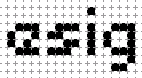
"e" and "s" both need five rows for clear definition. "i" and "j" both benefit from two rows above the mean line while "g" and "y" look best when using two rows below the baseline.
Pushing glyphs with descenders up from the baseline or pushing glyphs with ascenders below the mean line is possible but not so tidy:

Using less than four rows for "e" and "s" is also possible but definition is lost:
examples
An example of a 9 pixel high bitmap font:
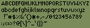
..and pushing the limits of legibility: a 5 pixel high bitmap font:

This article is issued from
Wikibooks.
The text is licensed under Creative
Commons - Attribution - Sharealike.
Additional terms may apply for the media files.